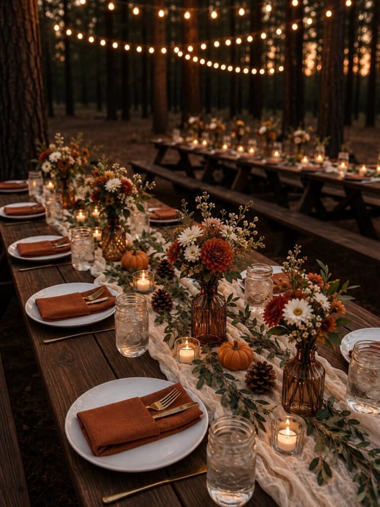
The palettes here run from near-black (black, burgundy, and purple) to soft pumpkin, sage, and blush, and the one that fits depends on your venue and how much light it gets.
Dim rooms swallow dark colors like black, burgundy, and purple, while an open field or a stone path gives rust, burnt orange, and cream a backdrop for free.
A palette’s depth often comes less from the hues than from layering, so the section on mixing textures matters as much as the color pairs, and a quick look at your room should come before you commit to a color.
1. Black, Burgundy, and Purple
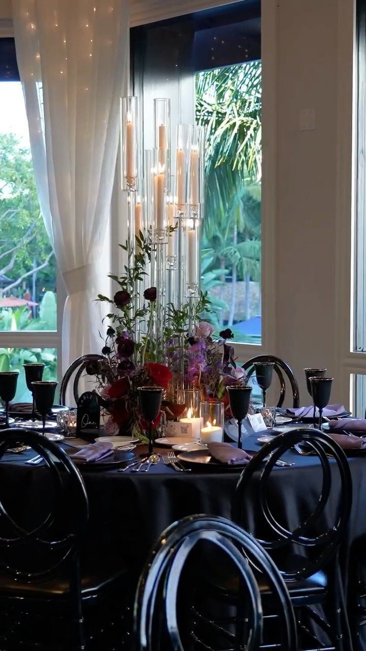
Black linens make burgundy and purple look almost wet with color, and that is the whole appeal. The tall glass candle holders already in this setting add the light that keeps the dark base from going flat.
I would keep black to the tablecloth and let purple show up in the napkins, so the palette reads as layers instead of one heavy block. Burgundy flowers work best as the focal point.
Dim rooms swallow dark colors, so plan candles generously.
2. Pumpkin, Sage, and Blush
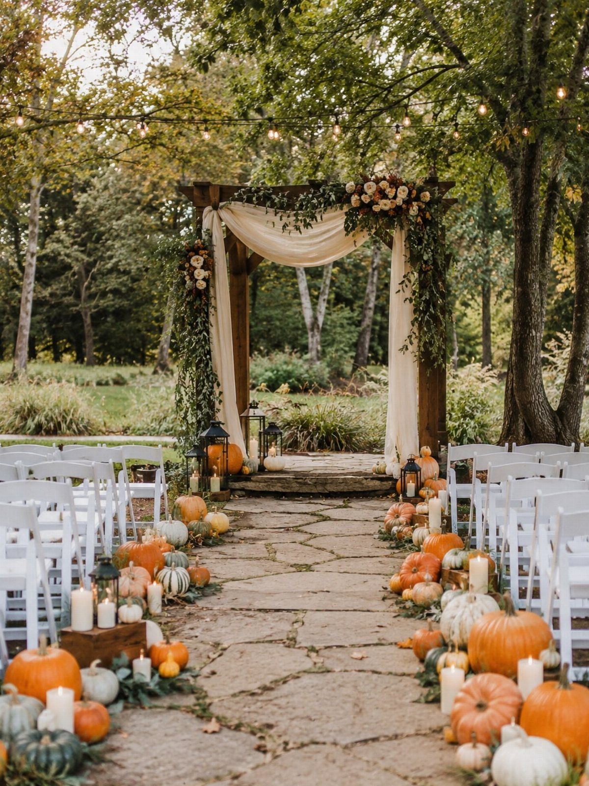
Pumpkins do the work of a color palette here: orange arrives as real produce, lined along a stone path, while sage and blush stay soft in the florals and the cream fabric on the arbor.
I like this mix for couples who want fall without heavy, dark tones. Let orange be the loudest color and keep blush as an accent.
Pumpkins are also an easy way to fill space cheaply, since the path itself becomes the decor. Candles near the altar add a warm glow.
3. Plum and Navy
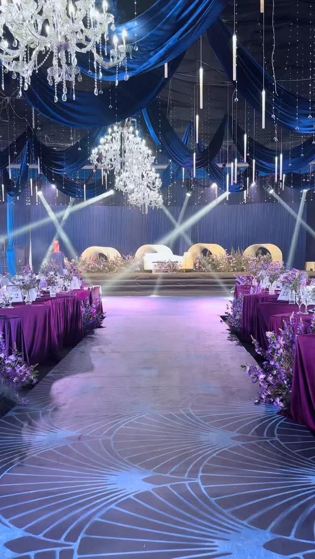
Plum and navy sit close enough on the color wheel to blend, which is why a ballroom in these two can feel formal without any fuss.
Plum and navy work best when you split them by height: navy goes up top in ceiling drapes, velvet ribbon, or a dark linen backdrop, while plum takes the tables in runners, napkins, and dahlias.
Gold is the piece I would add, as the circular backdrops behind the stage show. A metallic keeps two dark colors from merging into one murky mass.
Crystal chandeliers help too, since they bounce light back into the room.
4. Autumn Sunset Colors
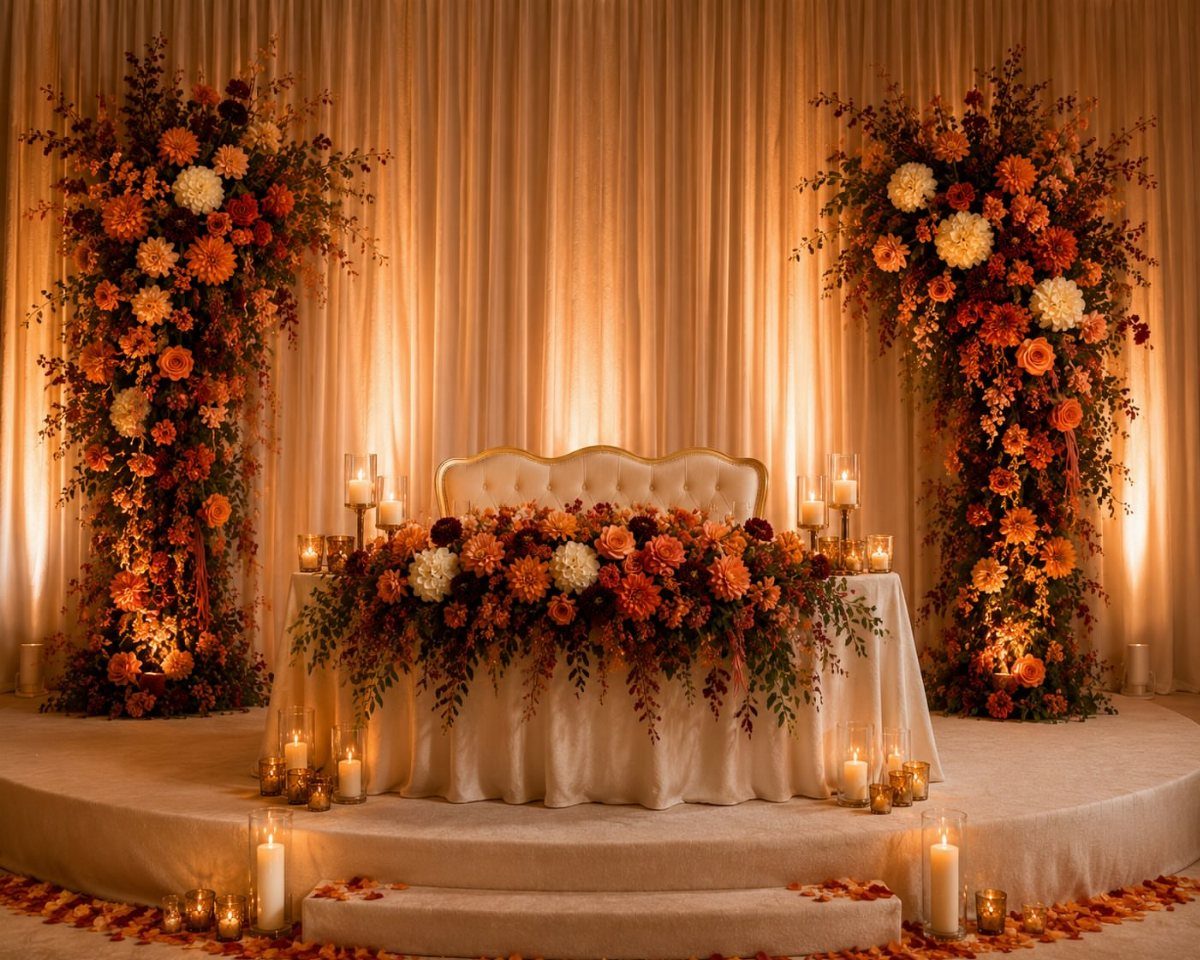
Orange, red, and cream flowers on one table read like a pile of fallen leaves, especially against a pleated beige backdrop that stays quiet behind them.
For a sweetheart table, this is a smart place to spend. One concentrated arrangement with candles carries more punch than the same flowers spread thin across a whole room.
Keep the linens white so the warm colors do all the talking. Warm lighting finishes the effect.
Early fall is truly the best season of all, and this caramel and apricot combo goes out to all the hardcore PSL lovers out there. Sprinkle in some apricot shades into your flower arrangements, or weave caramel hues throughout your stationery suite.
5. Earthy Elegance: Browns and Greens
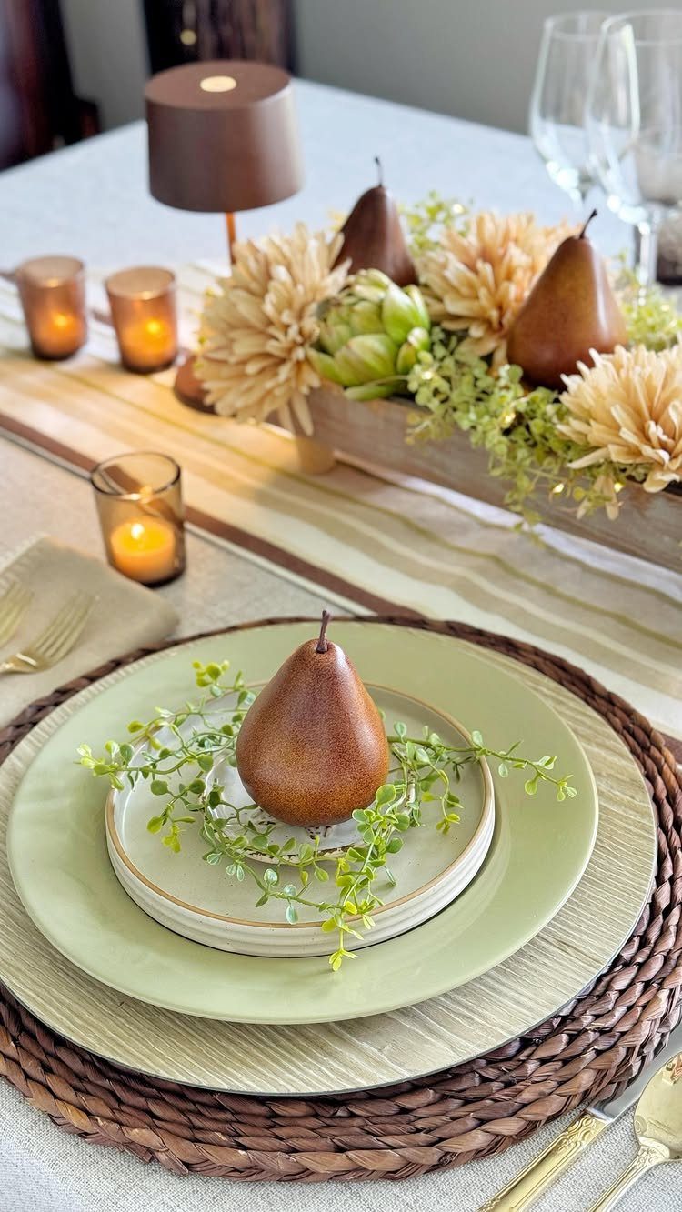
Brown pears beside green plates make a fall palette that feels grown, not bought. Beige flowers and greenery in the centerpiece keep everything in the same soft range.
I would choose this over brighter palettes for a couple who wants calm tables. Fruit is a smart centerpiece material because it adds shape and color without extra flowers.
A striped tablecloth adds pattern, so keep the rest of the table plain and let the green and brown do the work.
6. Burgundy and Blush
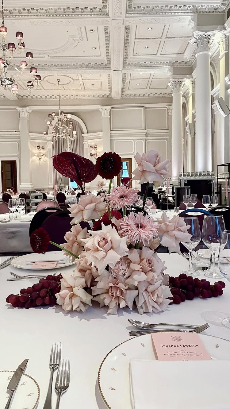
Burgundy gives depth, and pale pink and white roses keep that depth from turning somber. The result is a centerpiece that feels romantic and a little traditional.
In a grand ballroom with white tables, this works because the blooms carry all the color. I would put the darkest burgundy in the center and let the pale pink and white spill toward the edges.
Place cards in a neutral tone keep the focus on the flowers.
7. Emerald Green
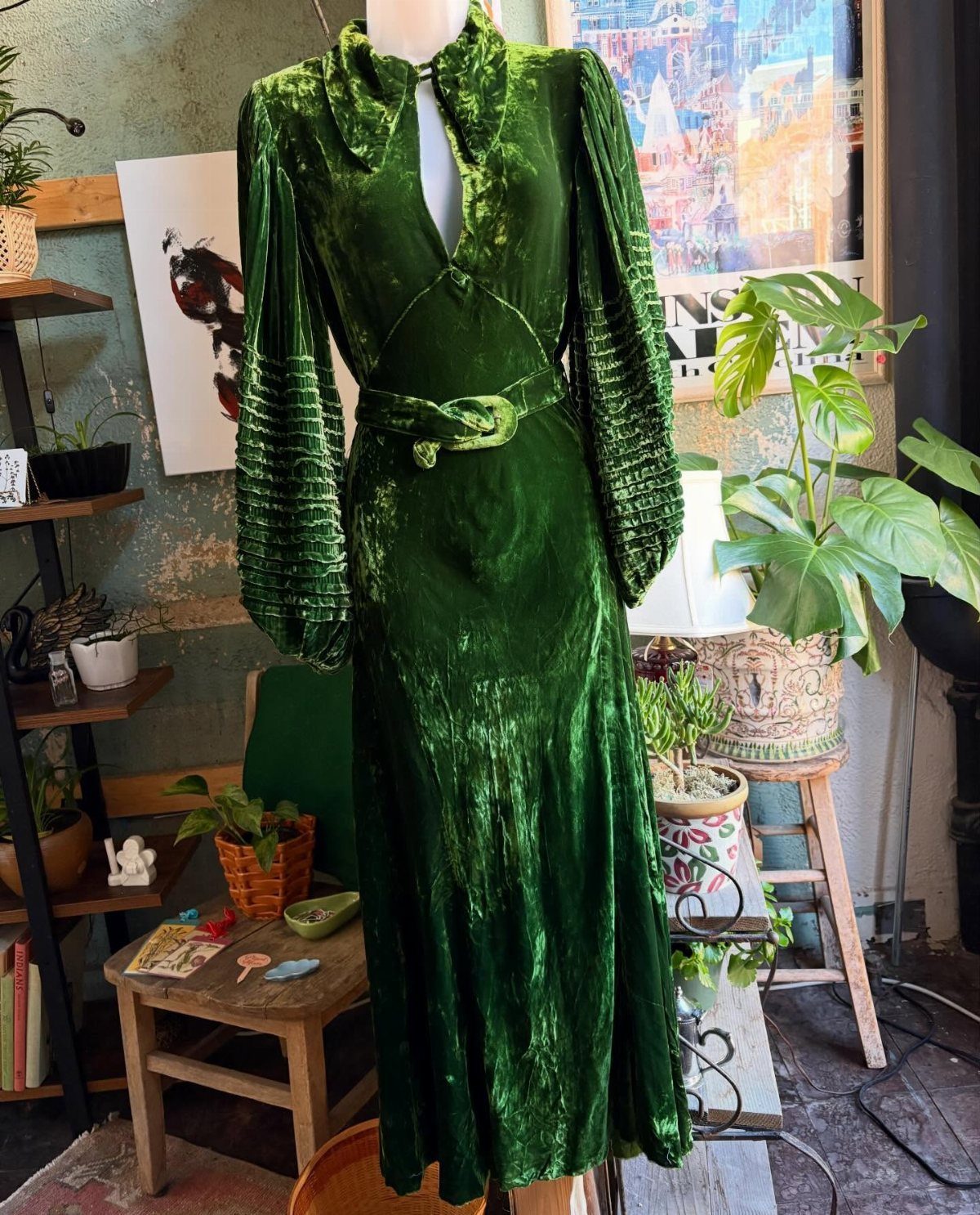
A velvet gown in emerald is a palette in one piece of clothing: the pile of the fabric deepens the green until it reads almost jewel-dark, and that depth is hard to get from flowers alone.
Because the dress already carries the color, I would keep everything around it quiet. Cream or wood tones for the tables, and a few green plants rather than a heavy floral spread, so nothing competes with the fabric.
Velvet suits a fall wedding better than a summer one, since the weight feels right against cool weather.
8. Orange, Burgundy, and Peach
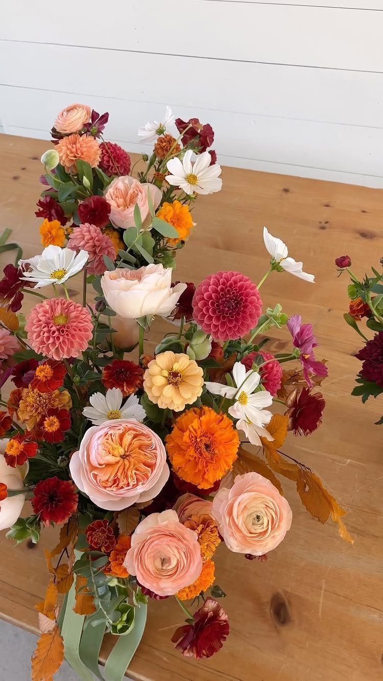
Peach roses soften the orange, and the burgundy gives the bouquet an anchor, so the 3 colors read as a gradient from light to dark instead of a clash.
Marigold-style orange is the loudest note here. I would use it in smaller amounts than the peach and let burgundy sit near the center, with foliage tucked around the edges to separate the colors.
Carry the same trio into boutonnieres and table arrangements, and the day holds together without extra decor.
9. Rust, Burnt Orange, and Cream
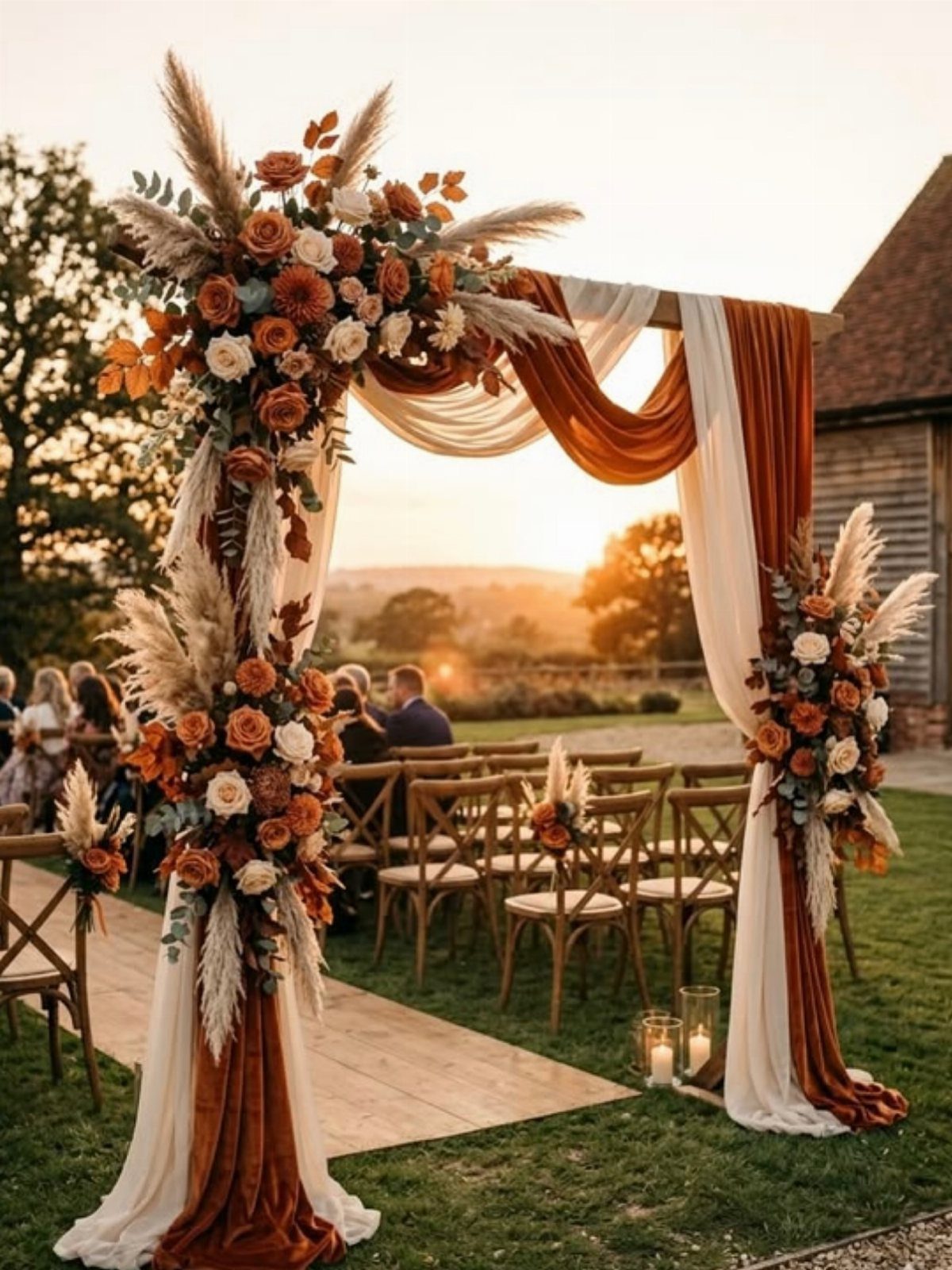
A wooden arch gives rust and cream something to hang from, and fabric does most of the work: drape burnt orange and white panels down the sides, then add cream flowers and pampas grass at the top.
I like this for an outdoor ceremony because the open field supplies the backdrop for free. Spend on the arch dressing and skip heavy aisle decor.
Pampas grass is light and neutral, so it lets the orange stay the focus. Wooden chairs keep the rustic look consistent.
10. Navy Blue and Burnt Orange
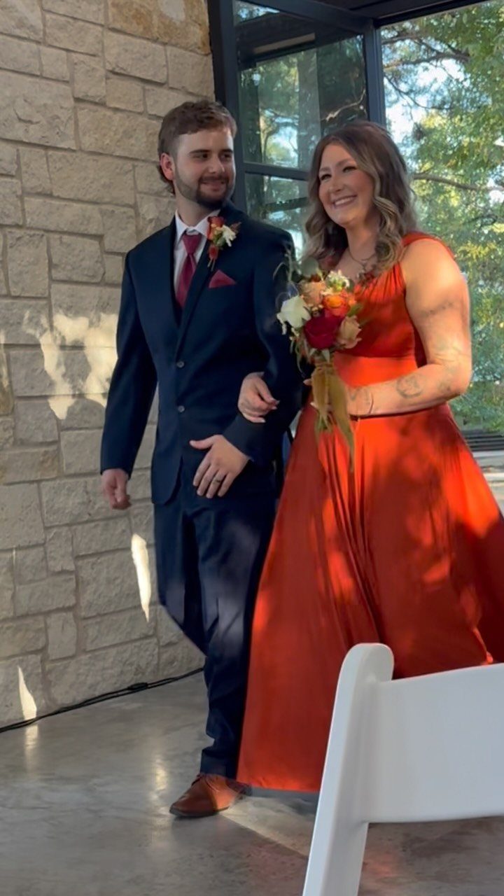
A navy suit beside a burnt orange gown is a pairing where each color makes the other look richer: cool blue against warm orange is nearly opposite on the color wheel.
For the couple’s clothing, this is one of the easiest ways to bring a palette into the day without buying much decor.
I would let the bouquet repeat the orange with a few autumn blooms, and keep the groom’s accessories simple.
Stone or other neutral settings suit it best, since they stay out of the way of 2 strong colors.
Choosing a Primary Color
Pick one color to lead before you pick any others.
Burnt orange is the classic fall choice. A deep teal is the unexpected one, and it stands out because few other weddings in the season use it.
Each popular fall color also carries a meaning, and I would check that yours says what you want it to say.
Settle the lead color first, then test it against your venue, your skin tone in your attire, and your budget.
Mixing Textures and Layers
A palette made of flat colors can look thin, even when the shades are right. Finish is what gives it depth.
Mix glossy with matte.
A matte burgundy runner on a table with glossy mahogany chiavari chairs gives the eye 2 surfaces to read. Metallic gold chargers beside hammered copper flatware do the same job with shine.
Pair neutrals with your bold hues, and use more than one shade of each color. That layering is cheap, since it costs nothing extra to choose a different finish for the item you were buying anyway.
Limit the metallics to one or two so they stay an accent.
Integrating Colors Seamlessly
Settle on the style of the wedding first, then buy only the colors that suit it.
A rustic wedding suits wood, burlap, and foliage colors, with earthy reds, greens, and neutrals. A romantic one leans toward soft roses, blushes, and champagne.
Then run the palette through every piece you have planned: flowers, invitations, and attire.
I would lay swatches or sample items side by side before ordering, because a color that looks right on a screen often shifts on paper or fabric.
If one item won’t match, let it be a neutral rather than a near miss.
Frequently Asked Questions
Can purple be a fall wedding color?
Yes, purple works well in fall, especially deep shades like plum. Pair it with black and burgundy for a moody look, or with navy and gold for a formal ballroom feel.
Purple works best as an accent: a few plum napkins or a runner down the table, with black or navy holding the base so the colors stack instead of competing.
What are the best colors to wear to a wedding in October?
Rich, warm shades suit October best: wine, deep orange, hunter green, navy, and marsala.
They echo the turning leaves and the season’s darker evenings. Velvet in a deep color like emerald also fits, since its weight feels right in cool weather.
What color theme should my wedding be?
Pick the style of the wedding first, then buy only the colors that suit it.
Say your venue is a barn: wood, burlap, and leaf tones with brick red and moss green will look right at home, while a ballroom wedding does better with blush, soft rose, and champagne.
Then carry the palette through flowers, invitations, and attire, and lay swatches side by side before ordering, since screen colors often shift on paper or fabric.





