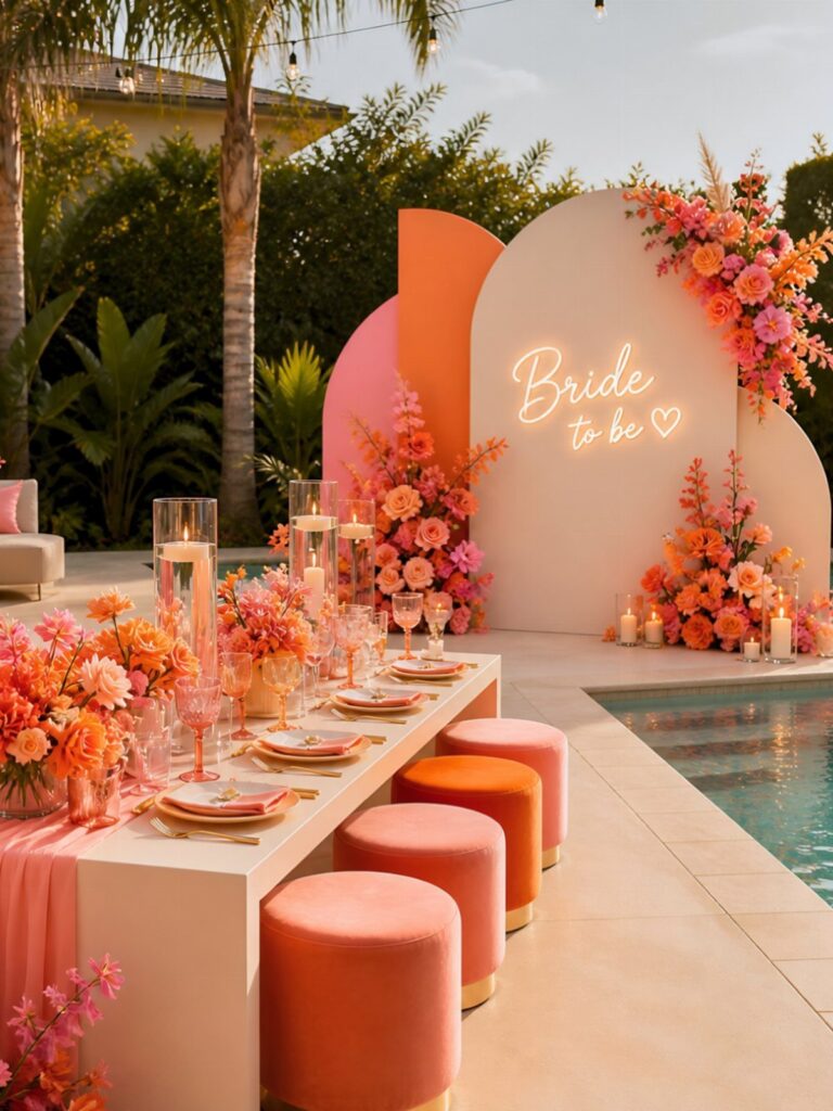
Bright color at a wedding can cost as little as a silver tinsel backdrop or pink fabric bows tied on chair backs, or it can mean a full floral canopy over a dessert table and a bride dressed in a multi-colored lehenga.
Pick your idea by where guests and the camera will look most: put the loud color there, whether that’s the flowers, the bar or the dessert table, and let plain walls and neutral linens stay quiet around it.
A 60-30-10 split keeps the whole room from competing with itself.
1. Bright Color Flowers
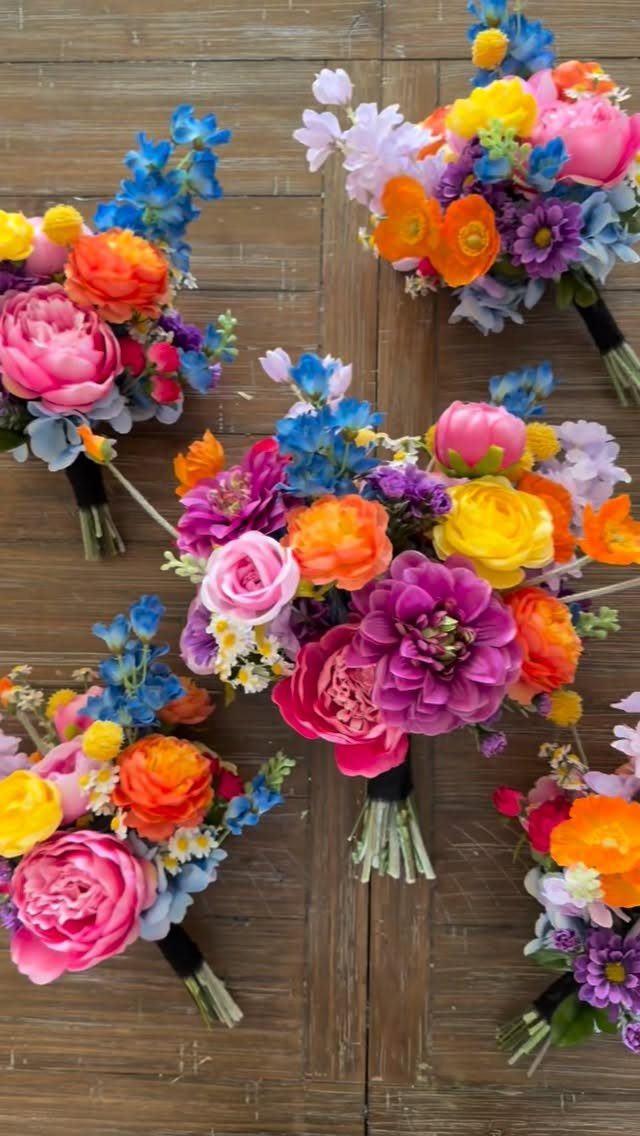
Pink, orange, yellow and blue blooms in one bouquet read as a color theme before anything else on the day does.
Bouquets this saturated need very little around them, so I would keep greenery light and let the flowers carry the palette.
Repeat a few of those shades in other spots, like a boutonniere or a ceremony arrangement, so the color feels planned rather than random.
Artificial stems are an option if you want bouquets that can be made well ahead of the date, and good silk ones hold bright color without fading or wilting.
Perky tones of pink and blue can brighten up any design. Apply it to traditional wedding design elements like florals, but be careful not to swamp the design with too much bright colors.
— Canva
2. Mismatched Bridesmaid Dresses
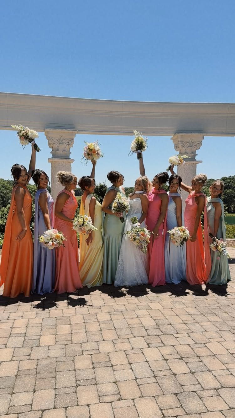
A full row of bridesmaids in mismatched gowns sounds chaotic, yet it works when the colors share the same brightness.
Choose a set of jewel or sorbet shades and hand each person her color, so no one ends up in a dull one.
Silhouette can vary too, but hemlines look best when they stay at the same length. That one match holds the group together.
Letting bridesmaids pick their own dress also spares them from buying something they dislike.
3. Bright Color Invitations
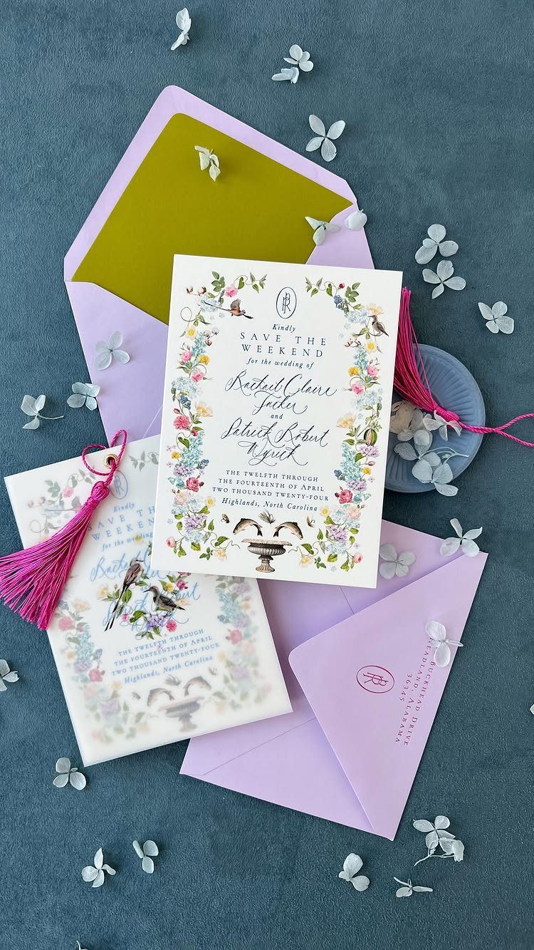
A Save the Weekend card is the first thing guests hold, so color does real work here.
Floral and bird illustrations on the invitation, with a purple or yellow envelope to match, tell people the day will be playful before they read a word.
Envelopes are the cheap place to add bold color: the card can stay simple while the envelope carries the brights.
Pink tassels add a finishing touch, though they add handling time and may add postage, so check the weight at the post office before you order.
4. Colorful Table Settings
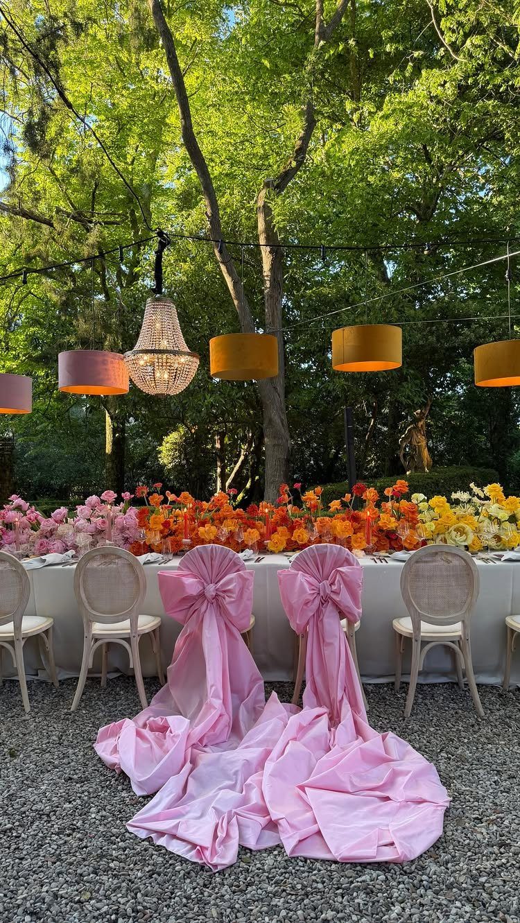
White linens are my pick for a bright table. They act as a clean base, so orange and pink flowers in a runner look sharper than they would on a patterned cloth.
Chairs are the overlooked spot. Pink fabric tied in bows on each back adds a whole layer of color for far less than extra centerpieces, and it shows in every photo of the room.
Hanging lamps overhead, if your venue has trees, soften all that saturation in the evening.
5. Neon Wedding Decor
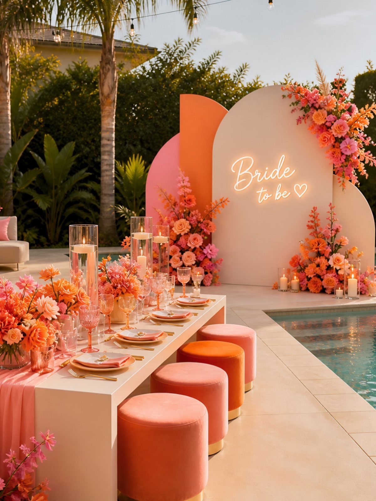
A neon sign is the quickest way to get glowing color without building anything.
Whether it says "Bride to be" or your names, it gives a room one focal point, and a peach or white backdrop lets the light stand out.
Rent rather than buy if you can, since you will use it for one night. Pair it with velvet seating in coral or orange so the sign feels part of the setup.
Keep neon to one or two pieces; more starts to feel like a bar.
6. Bright Color Signage
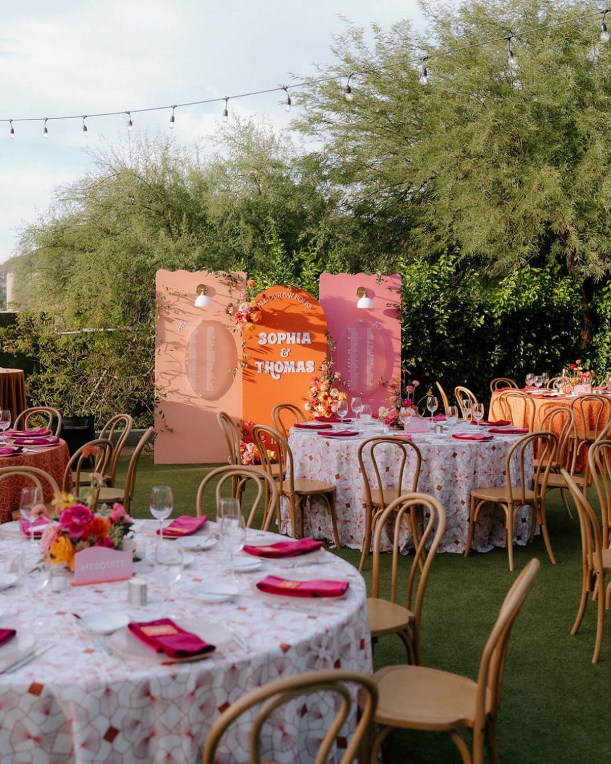
Signage is where names and color can sit together. A peach backdrop with the couple’s names in large letters works as a photo spot and a welcome in one piece, and it holds its own against green trees and grass.
Use the same shades on smaller signs for the bar, the seating chart and directions, so the palette repeats.
Arched sign shapes in pink and orange feel softer than rectangles. Keep the lettering simple and large enough to read from the back of the room.
7. Colorful Photo Booth Backdrops
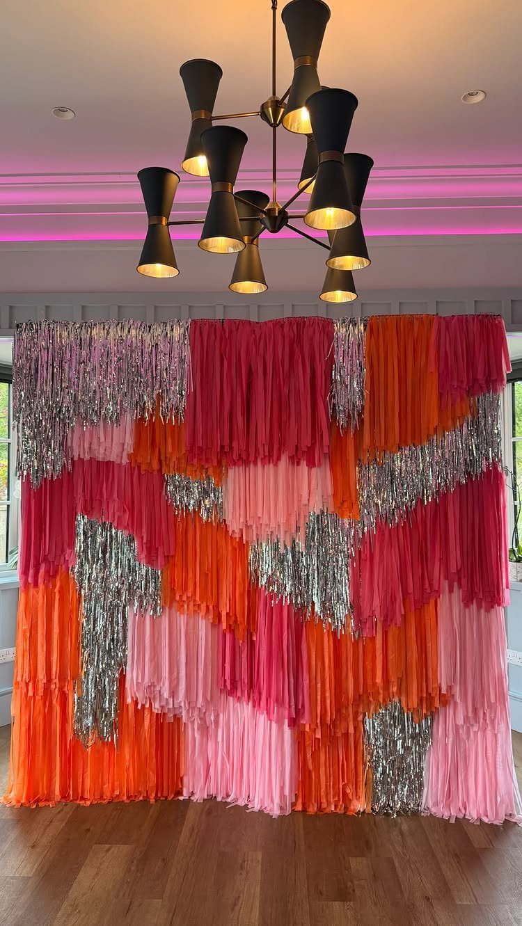
Tinsel fringe in pink, orange and silver gives you a backdrop with movement, and the silver catches light so the colors read as bright even in a dim room.
Hang the strands in a tight, full curtain; gaps show the wall behind and flatten the effect.
Keep the space around it plain.
Pick shades that match your flowers and bridesmaid dresses so the photos look like one palette.
8. Bright Colorful Wedding Jewelry
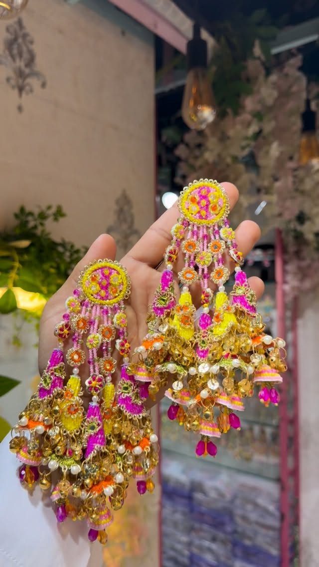
Large beaded earrings in pink, yellow and gold with sequins and tassels can be the single brightest piece on a bride, so I would build the look around them.
Keep the neckline simple and the hair swept back, so the earrings are not competing with anything.
If you wear a full jewelry set, match the pink and yellow to your bouquet. Gold ties the colors together and works with most outfits.
Heavy earrings get tiring over a long day, so wear them for a few hours at home first.
9. Colorful Wedding Bar Setup
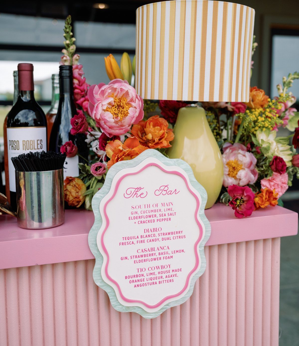
A pink ribbed bar counter does the work of a decor piece and a serving station at once.
Add a yellow lamp and a loose bunch of bright flowers at one end, and the bar becomes a focal point guests walk toward.
A short cocktail menu fits the look: two named drinks, like the "South of Main" and "Diablo" on this one, read as personal and keep the line moving.
Wine bottles lined up on the counter fill the space without extra props.
10. Bright Dessert Table Display
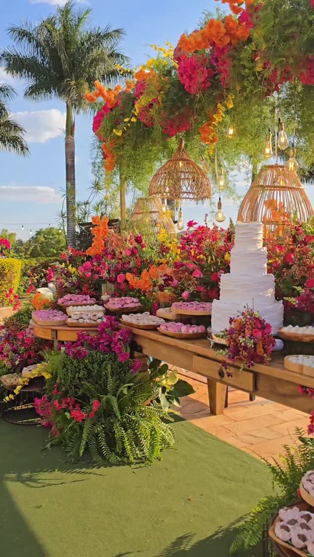
A white tiered cake is the easiest thing to put in front of bright flowers, because the pink, orange and red have a plain surface to stand against.
Ring the base with blooms and let a few spill onto the table.
Woven lamps and a floral canopy overhead add height, so the table reads as a scene rather than a cake on a counter.
For a modest budget, spend on the flowers around the cake rather than a more elaborate cake; white frosting does the job.
11. Vibrant Floral Lehenga Bridal Attire
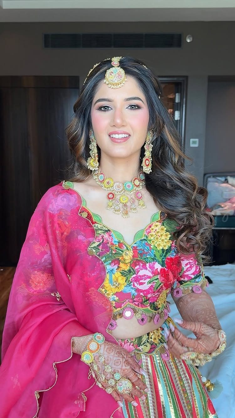
A multi-colored floral lehenga with a bold pink dupatta is already a full palette in one outfit, so I would let it set the colors for the whole day.
Pull the pink into your decor and flowers, and the bride stands out without clashing with the room.
Ornate gold jewelry suits the busy pattern well, since gold sits quietly between all those shades. Keep the rest of the accessories simple.
Choosing Color Palettes
Start with the venue and the season, because both limit what looks right.
Daylight garden ceremonies look best in sage, blush and sky blue, but a ballroom after dark can handle deep jewel shades, gold or silver, and rich neutrals like cream and taupe.
Then decide where your strongest shade will sit.
Spend the loud color where people look most: bridesmaid dresses and the big floral pieces. Then let the quieter neutrals sit in candles, table linens, programs and place cards.
Meaning counts too.
In many Asian cultures red signals luck, prosperity and a good start, and couples often build a palette around it. A shade with that kind of family meaning will hold up better than whatever happens to be trending this year.
For complementary pairings, pick colors that sit opposite each other, then let one lead and the other support.
Mixing Colors
Mixing many colors goes wrong when every shade gets equal weight. A 60-30-10 split fixes that, and I use it as a quick check before anything gets ordered.
Give 60% to the dominant color, which usually means linens and backdrops.
Give 30% to a secondary color, such as florals and attire. Keep the last 10% for an accent in small details like foil stamping, wax seals and typography.
The same ratio works on paper goods and on the room, so the invitation and the reception feel related. If a table looks busy, the fix is usually to cut the accent, not add more of the base.
Trendy Color Combinations
Saturated color is where weddings are headed right now, with hot pink and magenta turning up in nearly every feed. If you want a contrast-heavy palette, you can run vivid shades throughout the day.
If a full wash of magenta sounds like too much, a few bright accents, say a ribbon, a napkin or a single bouquet stem, will nod to the trend without taking over.
A few bright details against a calm base cost less and age more gently in photos.
To stand out, look at shades that are newer to weddings.
Some of the more saturated, non-traditional colors have barely appeared in real weddings yet, so your guests have probably not seen them either. A bridesmaid dress is an easy place to try one.
Frequently Asked Questions
What are some good bright colors for a wedding?
Pink, orange and yellow are the safest bright picks, and blue works well alongside them.
Jewel and sorbet shades also hold together nicely when you want several colors at once. Hot pink and magenta are especially popular right now, and a bridesmaid dress is an easy place to try a newer shade.
What is the best color theme for a wedding?
Start with the venue and the season, then pick the palette that actually sounds like the two of you.
A color tied to your family, like your grandmother’s favorite rose, will still feel right in 20 years when this year’s trend is gone.
How do I mix bright colors without it looking messy?
Use a 60-30-10 split so no shade competes with the others.
A 60-30-10 split keeps bright colors in order: the main shade covers linens and backdrops, a second one goes into florals and attire, and a small 10% accent handles details like napkins, ribbon and place cards.
What are the trendy wedding theme colors for 2026?
Bold contrast is the direction: black grounding a scheme, with natural-looking reds and teals as accents.
For a modern, magazine-style look, I’d pair crisp white or cream with a strong cobalt blue or charcoal. Hot pink and magenta also keep showing up, and you can use them throughout or only as small pops.





