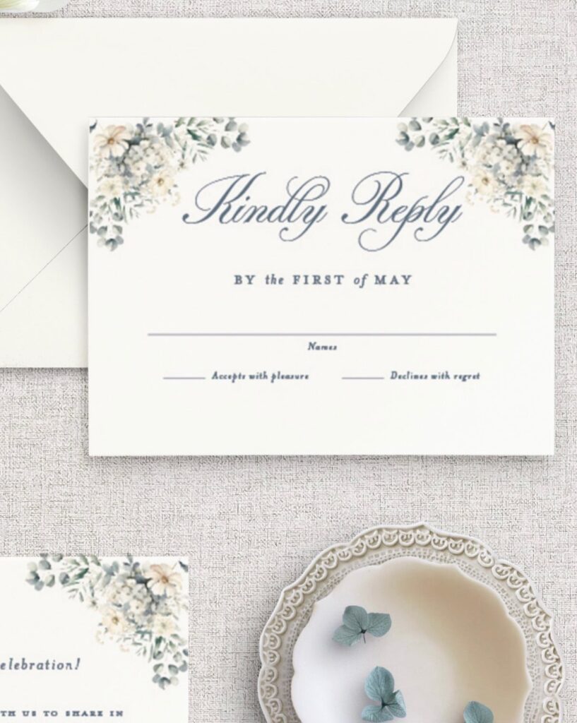
Blue and green can run from a navy suit with greenery to a teal reception covered in silver, so the shade of blue you start with decides most of what follows.
Pick the blue first, then let the green answer it.
1. Teal and Sage
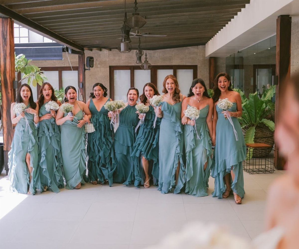
Teal carries the weight in this pairing and sage softens it, which is why the 2 read as vintage rather than loud. 9 bridesmaids in a mix of both shades look collected, not matched.
White bouquets keep the dresses from blurring together. Neutral blooms in white or cream work better than colored ones here, since the gowns already supply 2 tones.
For a rustic day, let the teal anchor the group and use sage as the lighter shade beside it.
2. Ocean Blue and Teal Cake Decorations
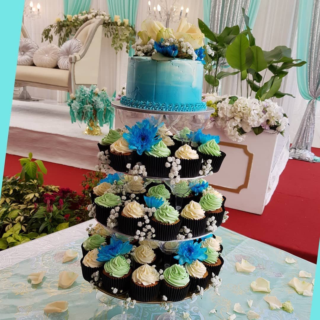
A blue frosted cake on top of a tiered stand, with blue and green cupcakes on the layers below, gives you a dessert table that carries your palette without a custom multi-tier cake.
Fresh flowers on the cupcakes tie the stand back to the room. I like this setup for couples watching a budget, because cupcakes cost less to decorate than a large cake, though the exact savings depend on your baker.
Have the baker test the blue and green frosting shades against your swatches before anything gets ordered.
3. Dusty Blue, White and Green
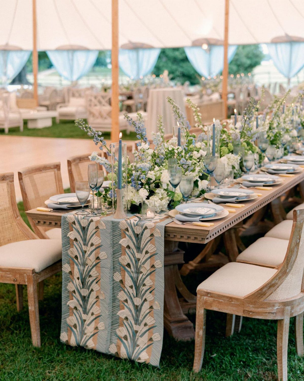
Dusty blue behaves like a neutral, so white and green slide in beside it without a fight.
Blue glassware and a blue and beige runner repeat the color at 2 heights, and white and blue florals fill the middle. I would copy that layering before adding anything new.
Keep the greenery in the arrangements, not on the linens, so the runner stays the one pattern on the table.
4. Navy Blue and Green Reception
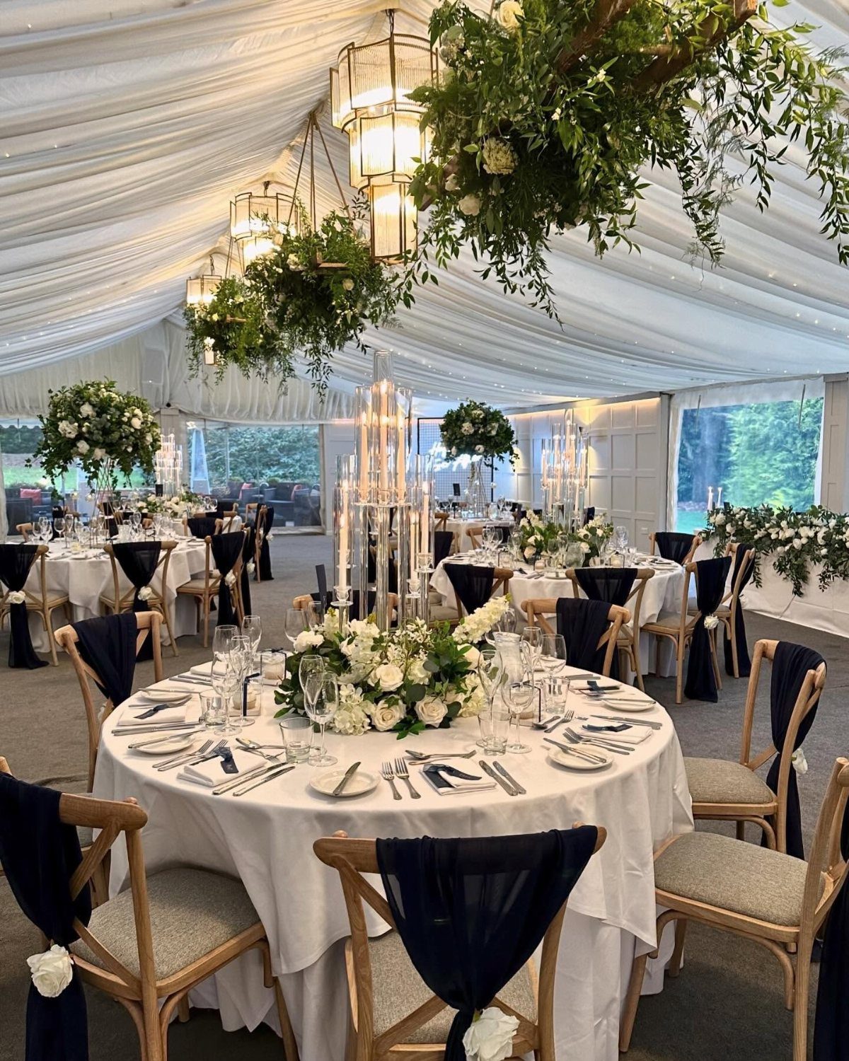
Navy chair sashes on white-linen rounds give a marquee reception its structure, and hanging greenery overhead supplies the green without crowding the tables.
White floral centerpieces keep the table level low and clean, so the eye goes up to the installations. That is the version I would choose: navy at seat height, green at ceiling height, white in between.
Hanging greenery usually costs more than table arrangements, so price it before you promise it to yourself.
5. Navy Blue Suit with Greenery
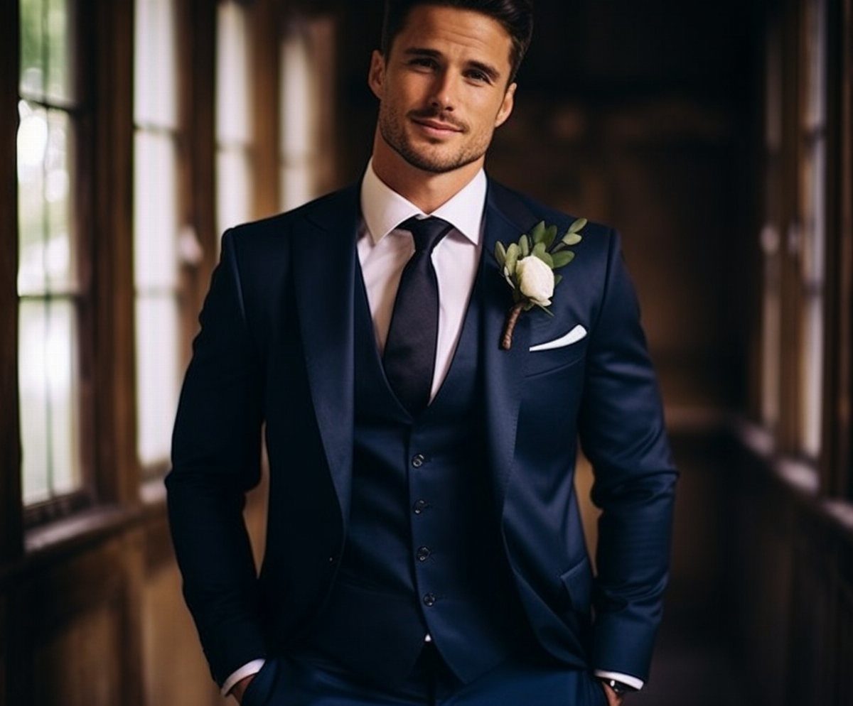
A navy three-piece suit with a white rose and green leaf boutonniere is a small, exact way to wear blue and green. The vest adds a layer that works even if the jacket comes off at the reception.
Keep the boutonniere to one rose and a leaf or two so it reads against the dark cloth. Pin it on the left lapel.
6. Navy and Sky Blue Tablescape
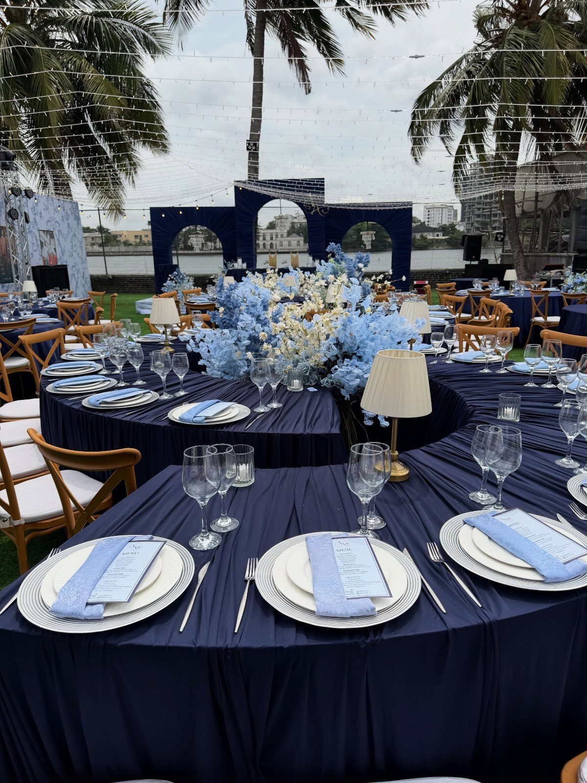
Navy linens with light blue napkins give an outdoor table 2 blues that do different jobs: the navy grounds it and the pale napkin lifts each place setting.
Blue floral centerpieces keep the palette tight, and menus laid on the plates save a step at the table.
I would use this against a tropical backdrop like palm trees, where the dark cloth holds its own against all that green.
Choose napkins a clear step lighter than the navy; close shades look like a mistake.
7. Teal and Silver Reception Decor
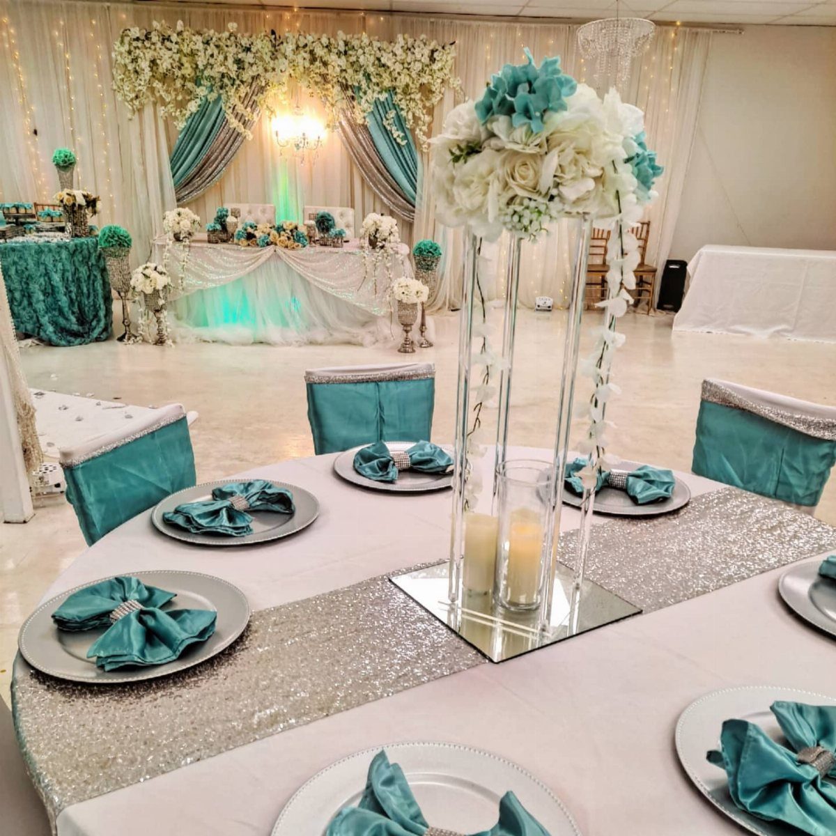
Silver sequins do the sparkle work on a teal table, so the flowers and napkins can stay quiet. A sequin runner catches candlelight and room light alike, and the teal napkins keep that shine from looking cold.
Repeat the teal in fabric draping behind the head table, and the room reads as one color story from the first row of seats to the couple’s table.
I would keep the florals teal too, rather than adding a third color.
Choose one shiny element per table. The runner is enough.
8. Mismatched Blue and Sage Bridesmaids
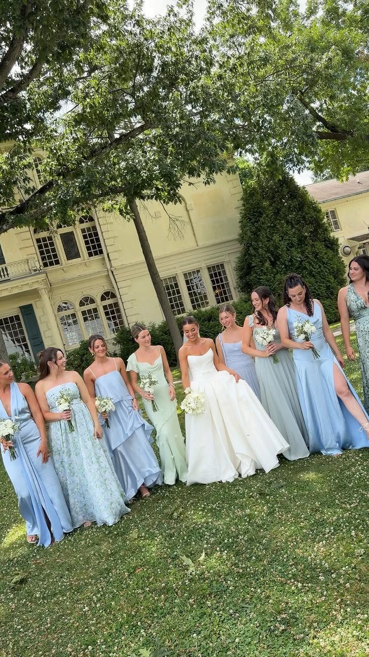
Bridesmaids in sage green, dusty blue and light blue look gathered over time, not ordered from one catalog page. The bride in white stands out easily because every dress around her is a soft, muted shade.
I would let each bridesmaid pick her own style in her assigned shade; that keeps the group relaxed. Assign the shades yourself so the blues and greens split fairly evenly across the row.
Hold fabric swatches side by side in daylight before anyone orders, since muted shades can drift apart under indoor lighting.
9. Teal and Light Green Suits
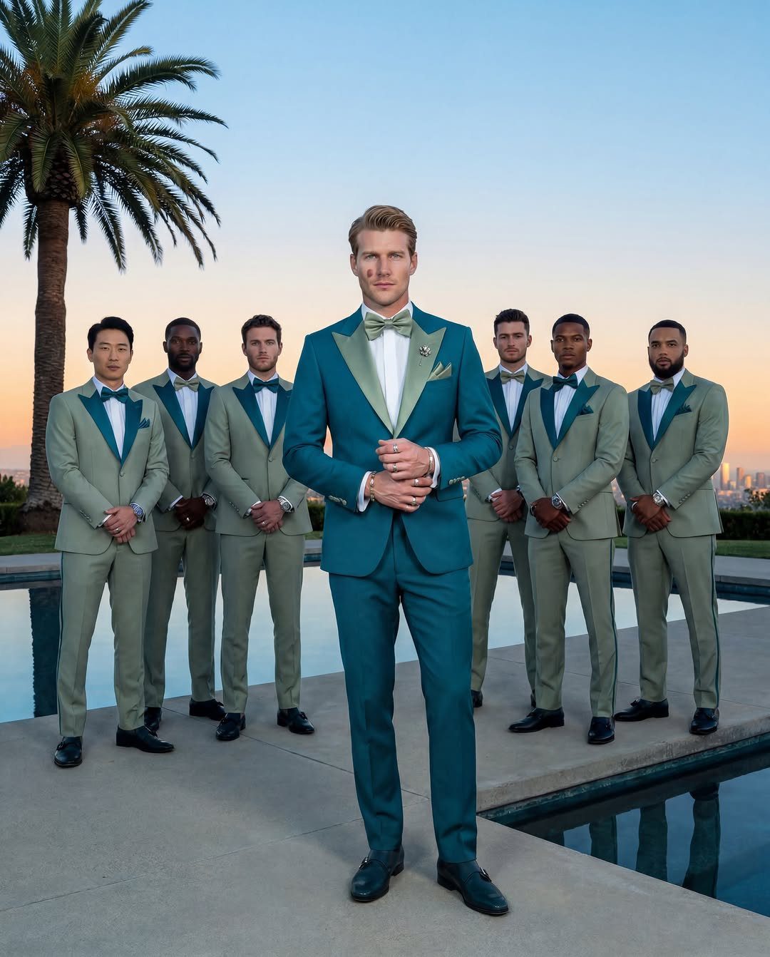
Teal jackets with mint green accents give a groomsmen group 2 colors without a single patterned piece. Contrasting lapels do the work here: they frame the chest and make seven men in similar suits look deliberately styled.
I like this for a warm, outdoor evening wedding, where the bright shades suit a pool and palm trees.
Pick the teal and the mint from one swatch card so the two never fight. Then let the groom’s suit differ by one detail, such as lapel color, so he stays easy to spot in photos.
Color Symbolism in Weddings
Green brings nature and renewal to mind. Put them together and you get a palette that feels calm and alive at once, which is why it suits a garden ceremony as easily as a ballroom, in any season.
Use the meaning as a tiebreaker when you can’t choose between shades.
If you want the day to feel relaxed, lean on the blue. If you want it to feel fresh and lively, let the green lead.
Slate blue and teal green fit a relaxed beach ceremony just as well. Spread them across small, repeated places like bouquets, ribbons and invitations, so the palette shows up everywhere without any one piece shouting.
A ribbon in slate blue tied around a place setting can echo a sage green plate underneath. That is a cheap way to make 2 colors look planned.
Choosing a Wedding Theme
Your theme is the first decision, and many later ones follow from it. Settle it early, because napkins, flowers, stationery and signage all get easier once a theme is set.
Write down 3 words that describe how you and your partner want the day to feel, then check every purchase against them.
If a centerpiece fits the words, keep it. If it only looks pretty, skip it.
A pairing as flexible as green and blue can go playful or elegant, so the colors alone won’t make the day yours. Your choices in style and detail will.
If the choices pile up and the planning stops being fun, a wedding planner can help you settle on a theme and handle the details, down to the napkins. Price that against your budget before you decide.





