
The palettes here run from Sandy Neutrals and an All-White Beach Wedding Palette to Electric Fuchsia, Turquoise, and Tangerine, and the one that suits you depends on where and when you’re marrying.
Check your venue at the hour of the ceremony, because pale blue linens that read as water and sky in one place can fall flat in another.
1. Tranquil Blue
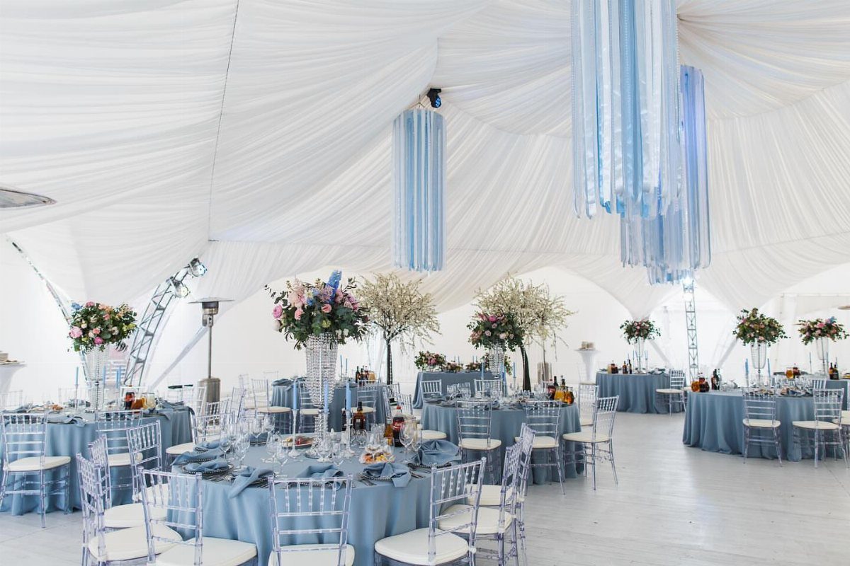
Pale blue linens under a white tent read as water and sky without a single seashell.
Keep the blue to one shade family, light for the tablecloths and a touch deeper in the hanging pieces, so the room feels calm instead of themed.
White draping and clear acrylic chairs do the quiet work at a blue-toned beach wedding, because they add no competing color and let the water and sky carry the palette.
Tall centerpieces in white or cream keep the tables from going flat. Linens are the cheapest place to commit to the color, so spend there first.
2. Coastal Sunset Color Palette

Sunset is a palette you mostly borrow from the sky, so I would build the rest around it with restraint.
Keep the flowers and candles white at a sunset ceremony, so the orange of the horizon stays the loudest color present.
Schedule the ceremony so the golden light lands on the vows or the portraits, and check your date’s sunset time before you commit. Warm accents like apricot or coral can join the table, but keep them small.
3. Sandy Neutrals
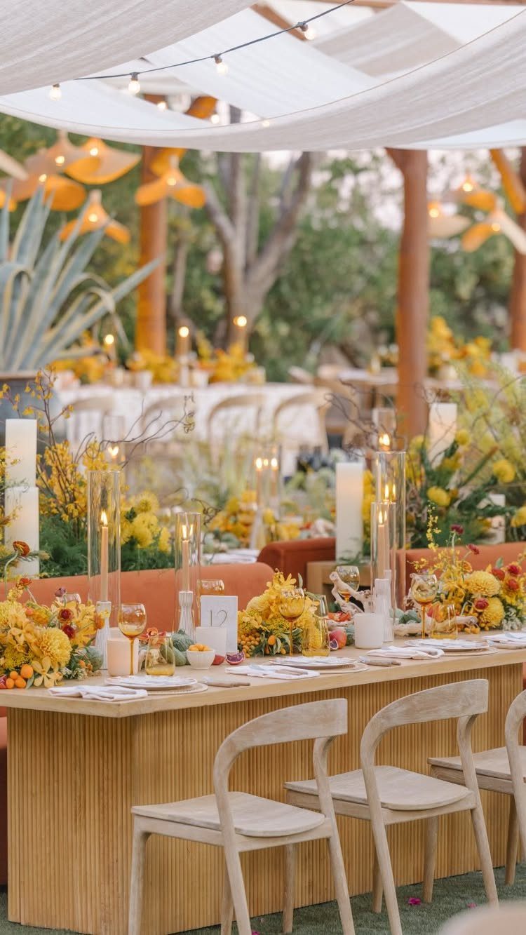
Sand tones are easy to love and easy to make dull. Light wood chairs and white fabric supply the neutral base, and a single punch of yellow flowers keeps the table from disappearing into the beach behind it.
For sandy neutrals, one accent repeated on every table works better than three scattered ones, and candles add warmth once dinner starts. Neutrals also forgive budget limits: plain chairs and simple linens look intentional when the palette is this quiet.
4. Electric Fuchsia, Turquoise, and Tangerine
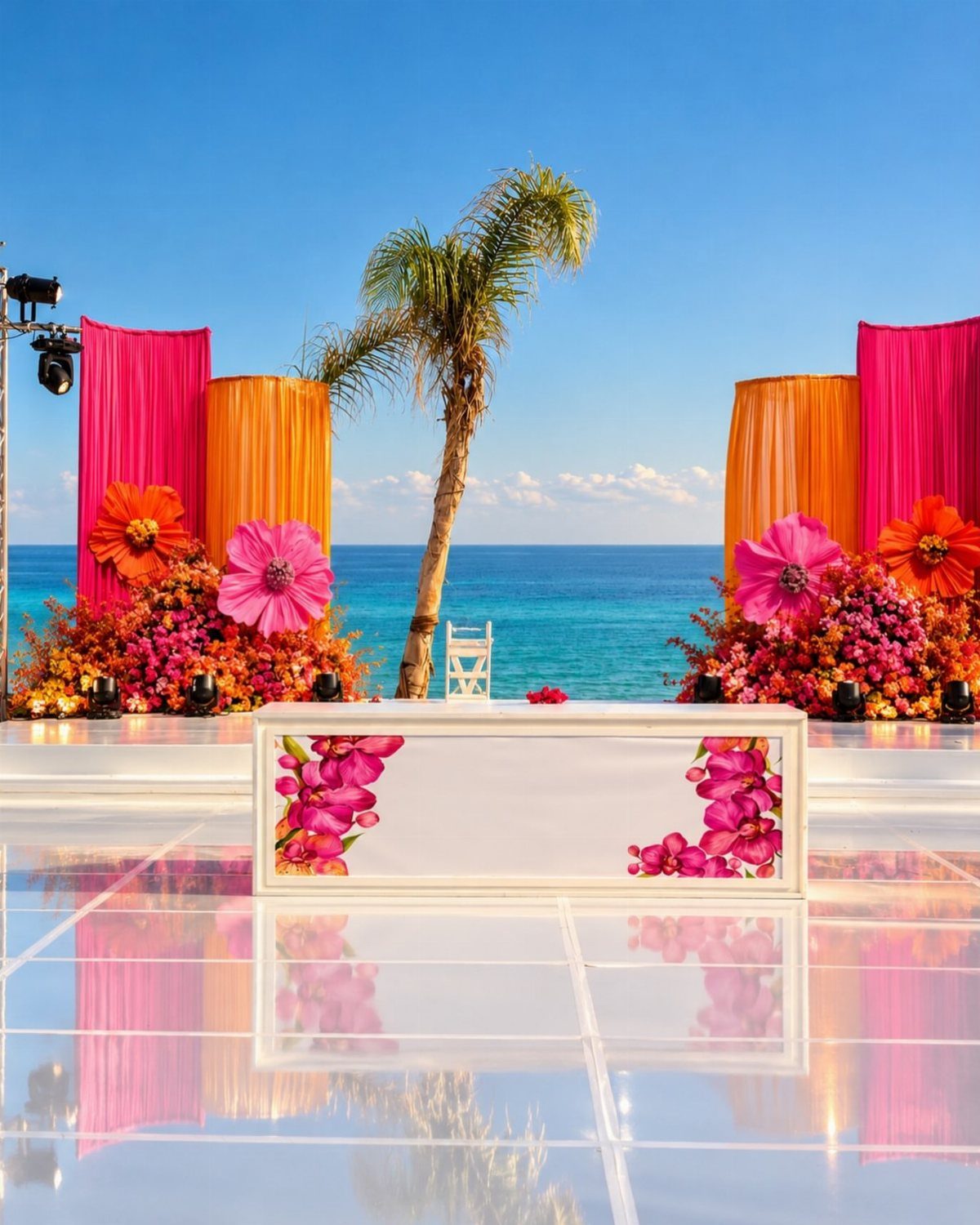
Fuchsia against turquoise water is not a subtle pairing, and it works because the ocean does half the job.
Fuchsia and orange fabric on the altar, with a palm tree behind it, gives the ceremony a tropical statement before a single guest sits down.
Keep the table linens and the rest of the setup white so the brights have room to stand out. I would limit the third color, tangerine, to a few touches rather than splitting attention 3 ways.
5. Lavender and Palm Green
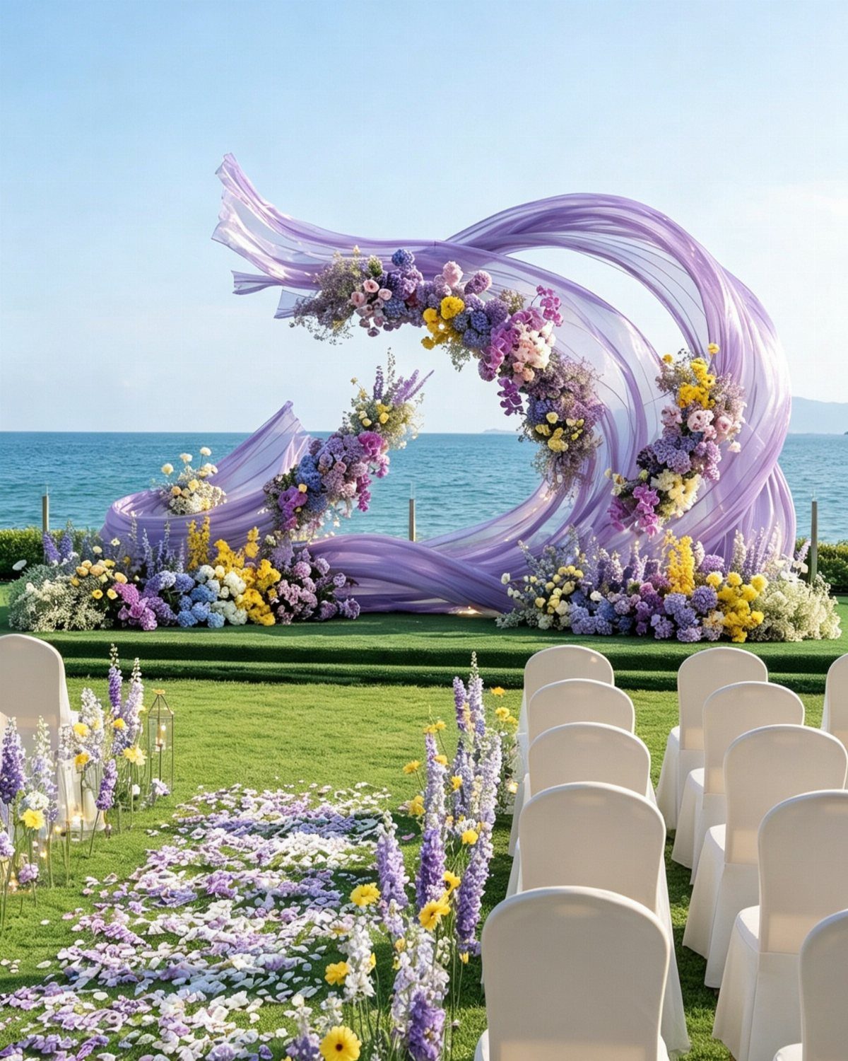
Lavender fabric swirled into an arch softens a green lawn faster than flowers alone. Purple and yellow blooms add a little contrast, and white chairs keep the whole scene light.
For the palette, treat palm green as the backdrop and lavender as the lead.
Petals down the aisle repeat the color at ground level, which helps the arch feel connected to the seating. Yellow works best as an accent, not a third equal partner.
6. All-White Beach Wedding Palette
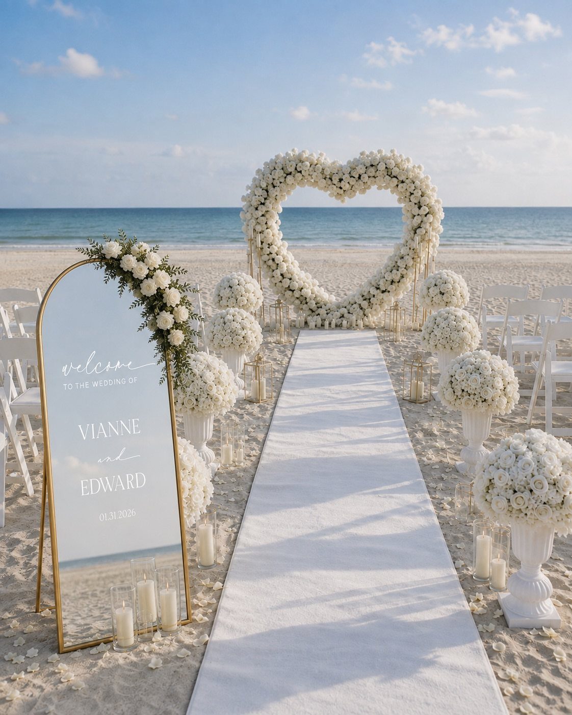
White on white sand needs texture, or it vanishes. A heart-shaped floral arch gives the eye a shape to land on, and a white runner defines the aisle against pale sand.
I would put the budget into the florals and let the sign and runner stay simple.
Keep the whites consistent, since cream next to bright white looks like a mistake in daylight. Use varied bloom shapes so the arch has depth.
7. Soft Pink and Lilac
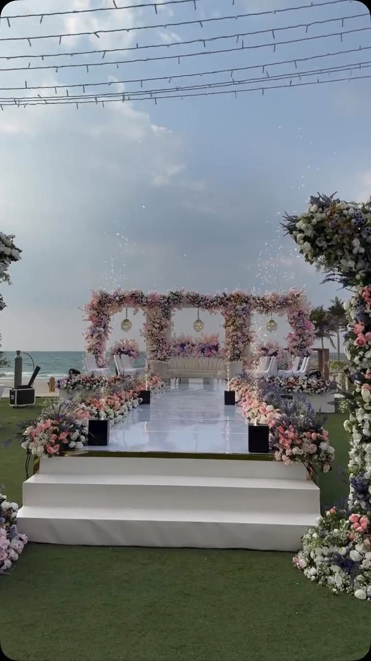
Pink and lilac sit close enough on the color wheel that they blend, so the arch can carry both without looking busy.
Mix pink, purple and white blooms rather than splitting them into separate sections, and the color reads as one soft wash against the sea.
White runners and white seating keep the palette light. I would let the florals be the only color on the aisle, since a third hue would crowd a pairing this gentle.
8. Champagne and Burgundy Palette
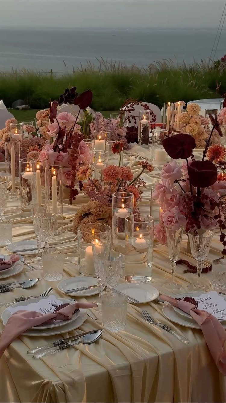
Champagne satin gives burgundy a warm, glowing base, and the pairing feels evening-ready even on a beach. Burgundy blooms with a few pink ones soften the depth so the table does not turn heavy.
Candles and clear glassware repeat the champagne tone without adding another color.
Satin beats plain cotton for the cloth, because the sheen holds up against the ocean light. Keep the burgundy in the flowers and let the linens stay pale.
9. Emerald and White Beach Palette
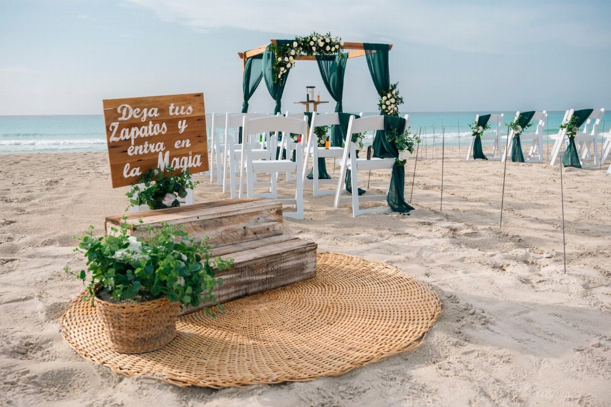
Dark green fabric on a beach arch looks bolder than you would expect, because the sand and white chairs leave it nothing to compete with.
Draping it loosely gives movement, and white flowers at the base keep the emerald from feeling severe.
Stay with 2 colors here: emerald and white.
A hand-lettered wooden sign fits the palette easily, in whatever language suits your guests. Skip extra accents, since the contrast is the whole appeal.
10. Warm Terracotta and Orange Palette
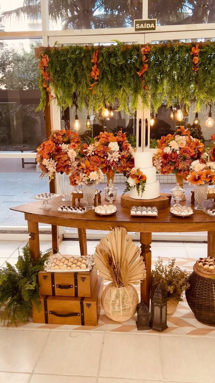
Terracotta and orange feel warmest indoors or under cover, where the colors glow instead of competing with a blue sky.
Orange and white flowers on a wooden dessert table do the work, and a plain white cake lets the orange stand out.
Hanging greenery adds a cooling green.
Lanterns tie in the warm tone after dark. I would keep the cake white and spend on the florals, since that is where the palette lives.
Choosing the Right Color Palette
Start with the calendar and the coastline, because the same palette reads differently on a Maine shore in October than on a Florida beach in June.
Light, water color and even the sand shift by region and month, so a shade that looks right in a photo from somewhere else may not suit your venue.
2 directions cover most beach weddings.
One is warm and tropical. The other is cool and ocean-inspired, built on blues, grays and greens.
Before you pick, visit the venue at the hour you plan to marry, or look at photos taken there in your month. Then choose the direction that sits comfortably against what you see.
Emotional Impact of Colors
Color affects how the day feels to you and your partner, more than it does for any guest. Ask which mood you want to be standing in for a few hours.
Blues and greens lean toward serenity and calm. Coral and turquoise push the energy up, which suits a party-first crowd and a dance floor that fills early.
If you and your partner disagree, say so early. One of you may want hush and the other may want noise, and a calm base with one lively accent is a fair compromise.
Seasonal Color Considerations
Summer calls for brighter colors, and spring is kind to softer pastels. Use that as a starting point, then check it against your actual date.
Light, temperature and blooms all change with the season, so bridesmaid dresses should change with them too. Pick dress colors that photograph well in that month’s light without leaving the bridal party sweating or shivering.
Heavy fabrics in a hot month will cost you comfort, so ask for swatches and test them outdoors first.
Frequently Asked Questions
What colors are good for a beach wedding?
Soft blues, sandy neutrals, sunset tones, turquoise, coral and pastels like pink and lilac all suit a beach.
Sand, water and sky already supply a lot of color, so a palette of one or two shades usually looks better than a crowded one.
What are some nice wedding colors?
For a beach, pale blue, sand neutrals with one yellow accent, and white with emerald are all easy to pull off. Champagne with burgundy feels evening-ready, and pink with lilac gives a gentle wash against the sea.
What are the trendy summer wedding colors for 2027?
No one can hand you a verified forecast for a future year, but a summer beach generally calls for brighter colors, such as fuchsia against turquoise water with white linens, or coral and tangerine accents.
Trends matter less than your date and coastline, since light and water color shift by region and month. Check your palette against your actual venue and season before committing.





