The palettes here run from Dusty Blue and Soft White, a single soft color on pale linens, to Deep Burgundy and Crimson, and the budget gap between them comes mostly from how much surface the color has to cover.
Volume decides which palette is yours: a color that spreads across drapery, chairs and tablecloths costs more than one that lives in a few blooms or a napkin.
On a tight budget, I would pick a palette like Olive Green and White, where white does most of the work and the color shows up in one place, such as the head table alone.
1. Dusty Blue and Soft White
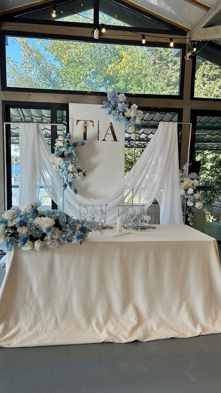
Dusty blue works because it is a gray-leaning blue, so it sits quietly beside white instead of competing with it. That is why this pairing reads as soft but still looks formal.
Most of the coverage should be white: linens, backdrop fabric, the bulk of the flowers.
Then let the blue appear in a few blooms and nowhere else. I would pick one blue, hold it across every table, and skip a second accent color.
2. Marigold Yellow
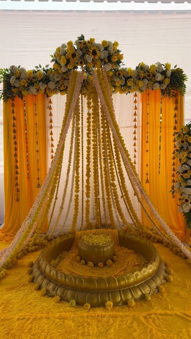
Marigold is the rare yellow that feels warm instead of loud, and it pairs naturally with the flower it is named for. Garlands do the heavy lifting here: they add color and texture in one piece.
Pair the marigold with white blooms and a yellow fabric drape so the orange-gold doesn’t turn heavy. I’d keep metallic accents to one spot, like a gold pedestal, so the yellow stays the star.
3. Chocolate Brown and Ivory
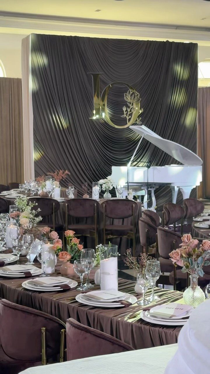
Chocolate brown is easiest to handle when ivory carries the light. Napkins, florals and a pale focal piece break up the brown so a room doesn’t feel like a cave.
Since brown covers a lot of surface in drapery, chairs and tablecloths, choose one of them to be your main brown and keep the others minimal.
On a tight budget, I would rent brown linens and spend the savings on ivory flowers.
4. Spring Green and White
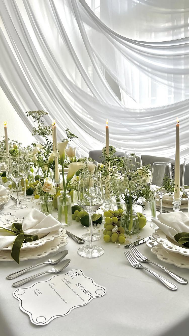
Spring green is best used as a green you can eat: grapes, stems and leafy sprigs, with white doing everything else. Fruit as decor costs far less than extra flowers and fills a table fast.
Add candles and white drapery behind the table, and the whole setup stays airy. I’d skip dark greens here, since they pull the palette toward something heavier.
5. Silver Decor and Tablescapes
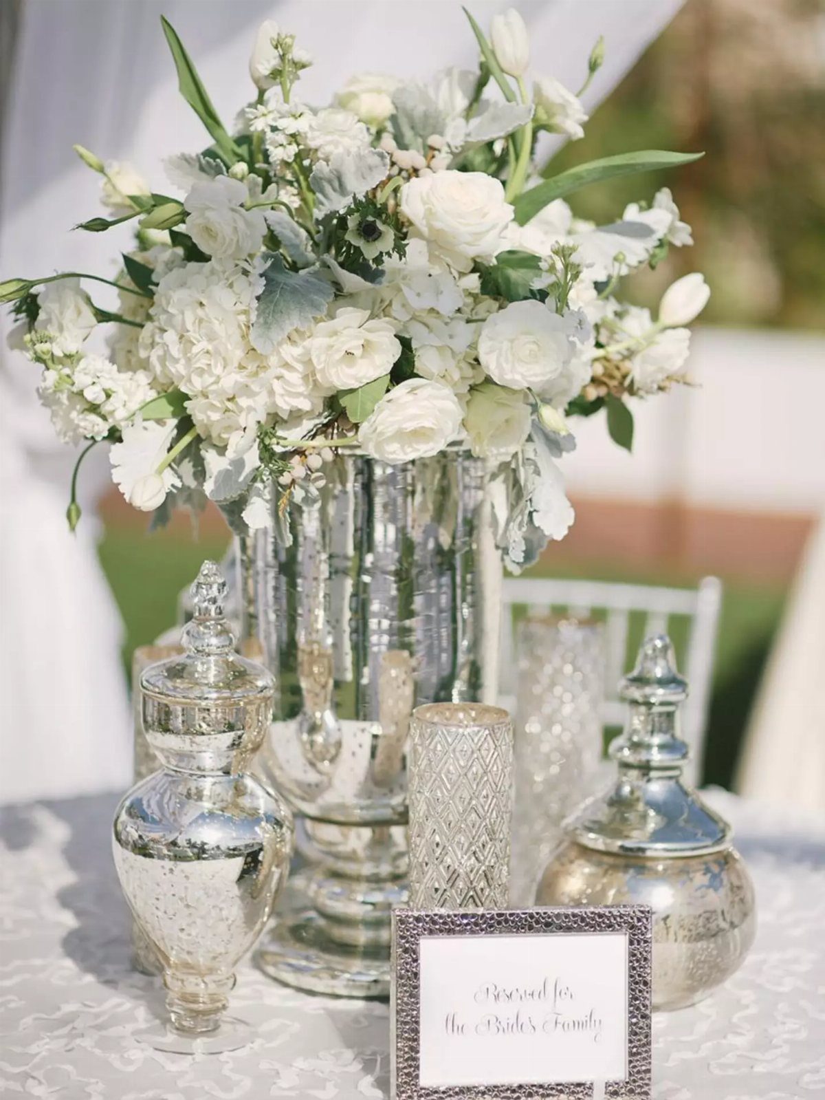
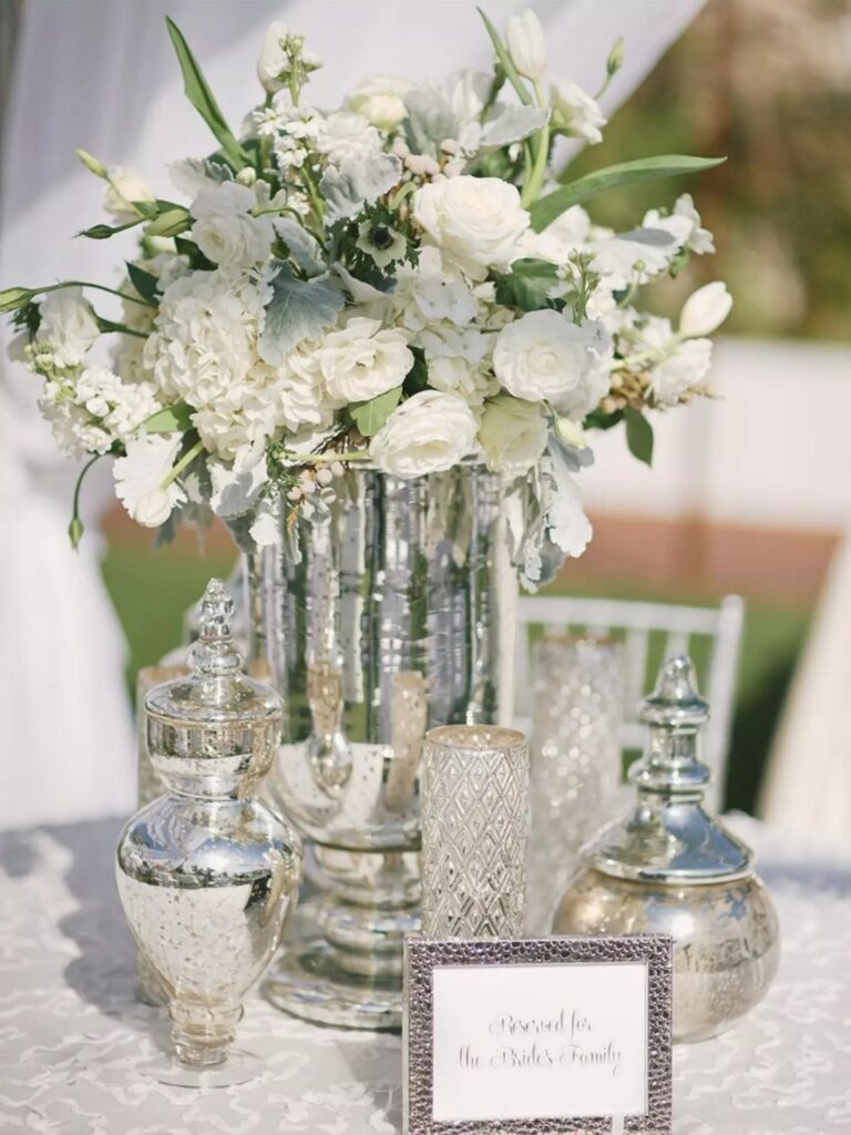
Silver is the cooler cousin of gold, and it flatters white flowers more than almost any other metal. A silver vase and silver candle holders give you shine without adding color.
Thrifted or rented silver pieces cost less than buying new, and matching the finish matters more than how many pieces you set out.
6. Emerald and Gold
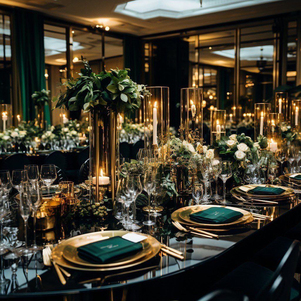
Emerald and gold is the palette to choose if you want a room to feel like a dinner party in a grand hotel. Deep green napkins against gold chargers do most of the work on their own.
Add tall candles and white flowers so the green doesn’t swallow the table.
Mirrors help too, since they double the candlelight. I’d keep the gold to the tabletop and let the emerald stay in the napkins.
7. Moody Mauve and Copper
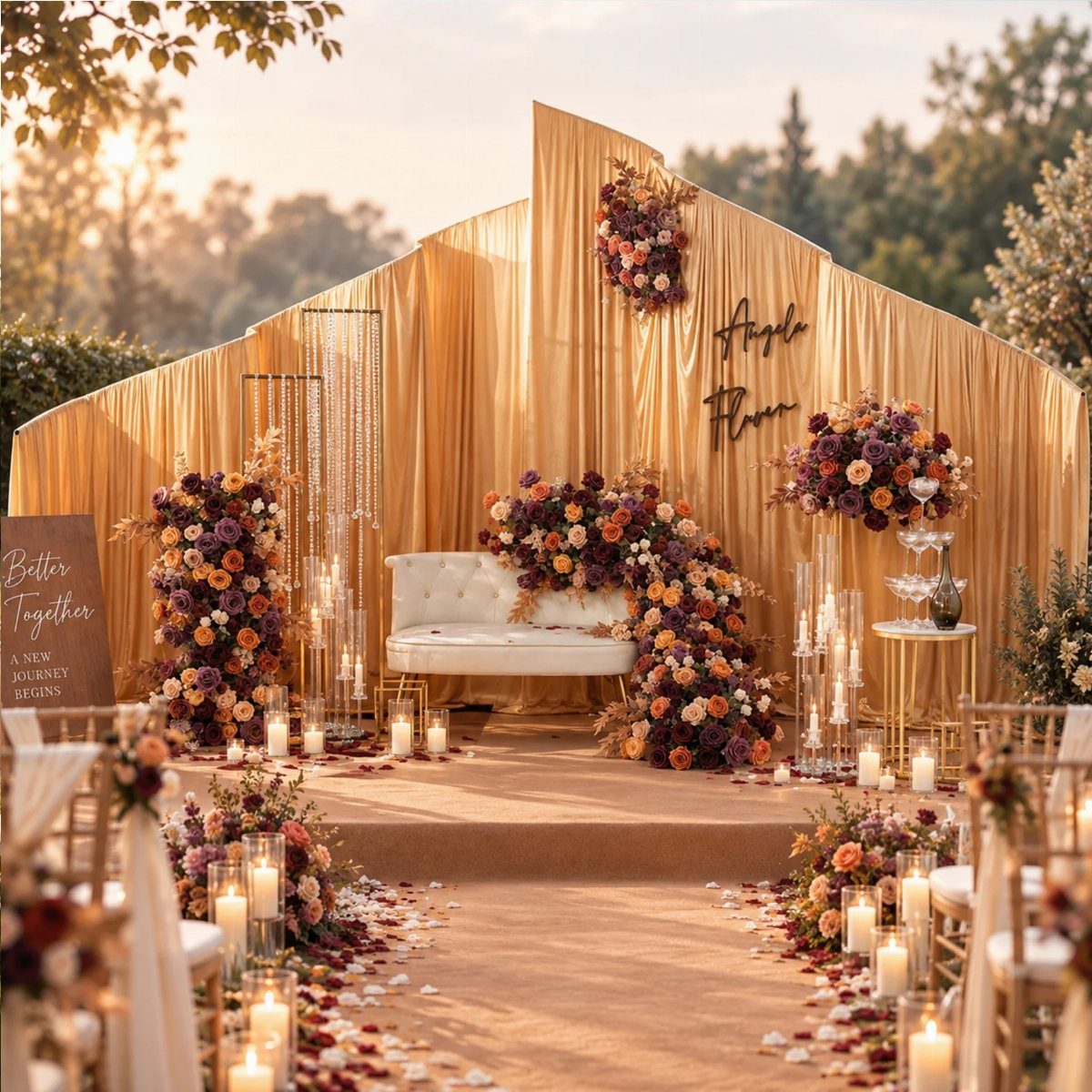
Mauve with copper reads as dusk: a dusty purple-pink cooled down by a warm metal. Copper curtains behind a white sofa give the backdrop its glow, and mauve flowers sit against them without getting lost.
Keep the sofa white so the 2 deep tones have somewhere to rest. I’d let copper take the large surface, the drapery, and keep mauve to the florals, so neither color fights for the lead.
8. Bold Pink, Orange, and Chartreuse
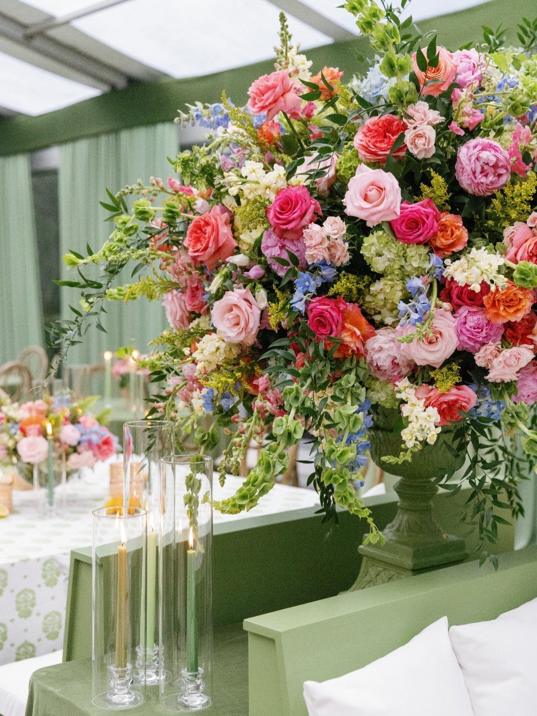
Pink, orange and chartreuse only work when one of them is treated as the base.
Chartreuse is the easiest choice: a green urn and green accents on the table hold the arrangement together, so the pink and orange blooms can be loud.
Pick one color for every vase and let plain white candles do the rest. I’d rather see one big arrangement per table than several small ones, since a single mass of color looks planned.
9. Tropical Orange
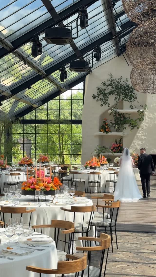
Bright orange flowers hit hardest against white tablecloths and natural wood, especially under clear glass overhead. Stick to a single flower tone so the centerpieces read as one family.
Let white do the supporting work: tables, linens, and any greenery.
I’d skip extra accent colors entirely. Orange this strong doesn’t need a partner, and adding one makes a table look busy fast.
10. Regency Romance Soft Pastels
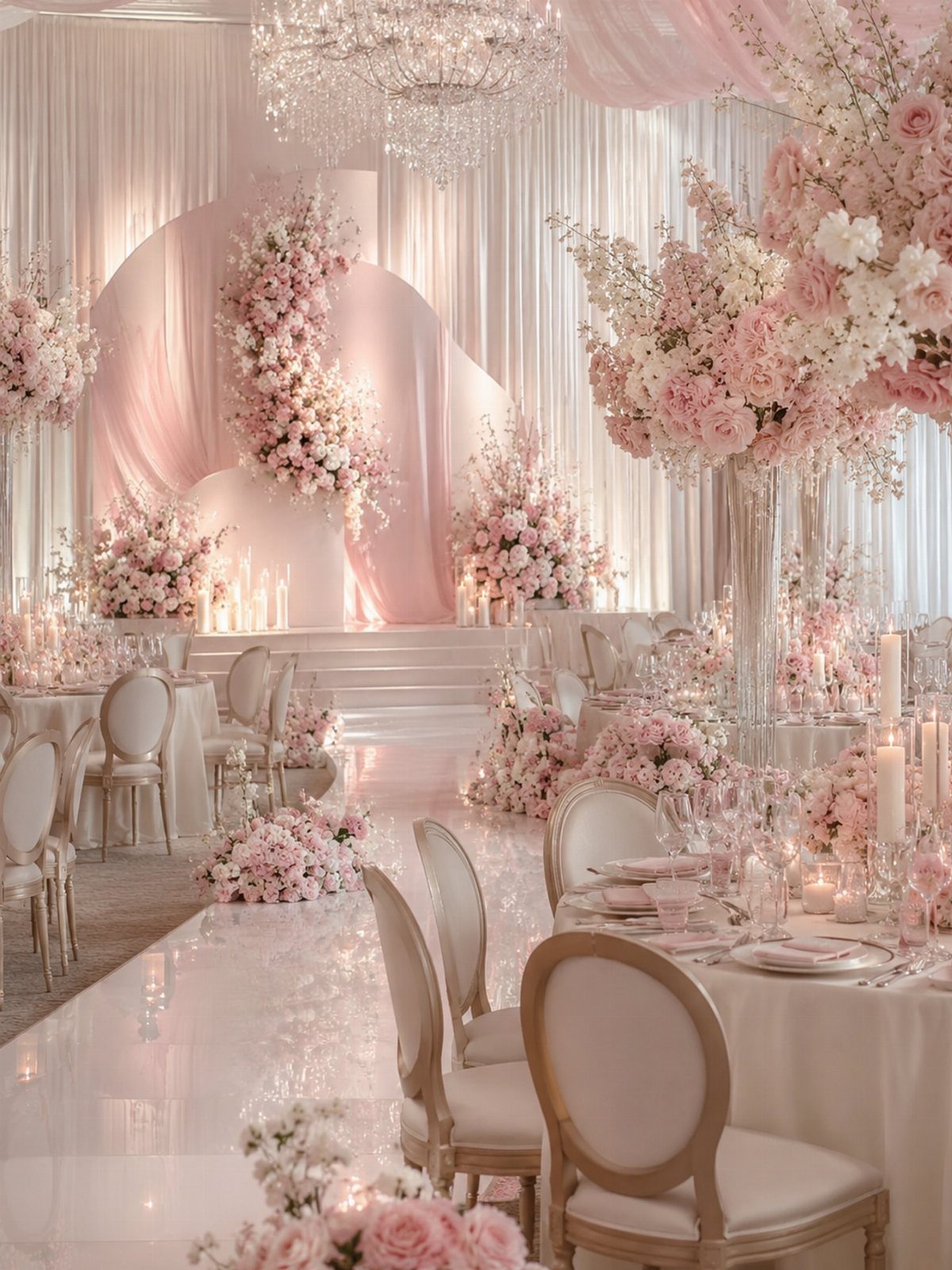
Soft pink flowers in quantity are the heart of this look, and a crystal chandelier gives them a place to shine.
Load the pink onto the tables and leave the chairs, fabric and linens white so the color stays where you want it.
Abundance matters more than variety here, so I’d choose one pale pink and repeat it instead of mixing shades. Expect the flower count to drive the cost, since sparse pastel arrangements look thin on a large table.
11. Deep Burgundy and Crimson
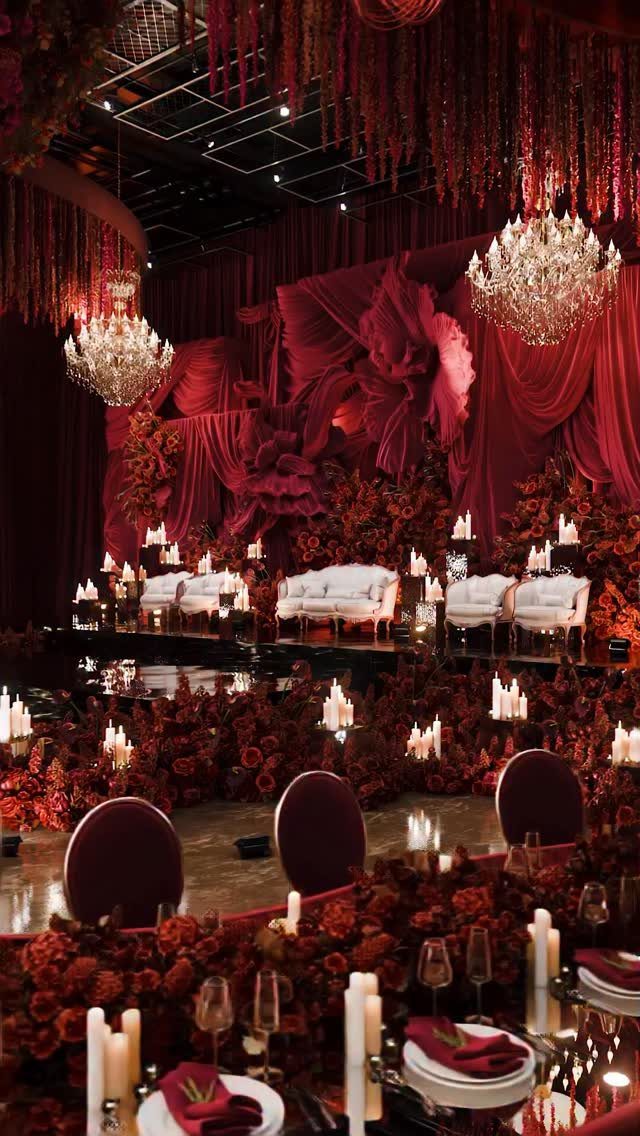
Burgundy and crimson get their drama from layering: draped fabric on the walls, red florals on the tables, and white candles scattered on tables and the floor. The white sofas and candlelight keep all that red from turning flat.
I’d treat the drapery as the main spend and the candles as the cheap fix, because they add glow for very little money. Choose one red fabric and match the florals to it.
12. Olive Green and White
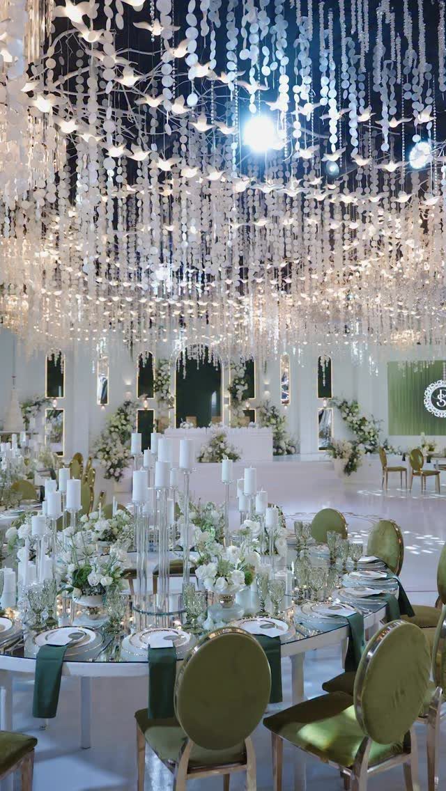
Olive green is best placed on the furniture. Velvet chairs in olive carry the color, which frees the table to stay crisp and white with floral centerpieces.
That split keeps flowers affordable, since you only need white blooms.
Velvet has a soft, rich texture that makes olive look more formal than it would in a napkin. If chair rentals stretch the budget, I’d put olive on the head table alone.
13. Rich Purple and Violet
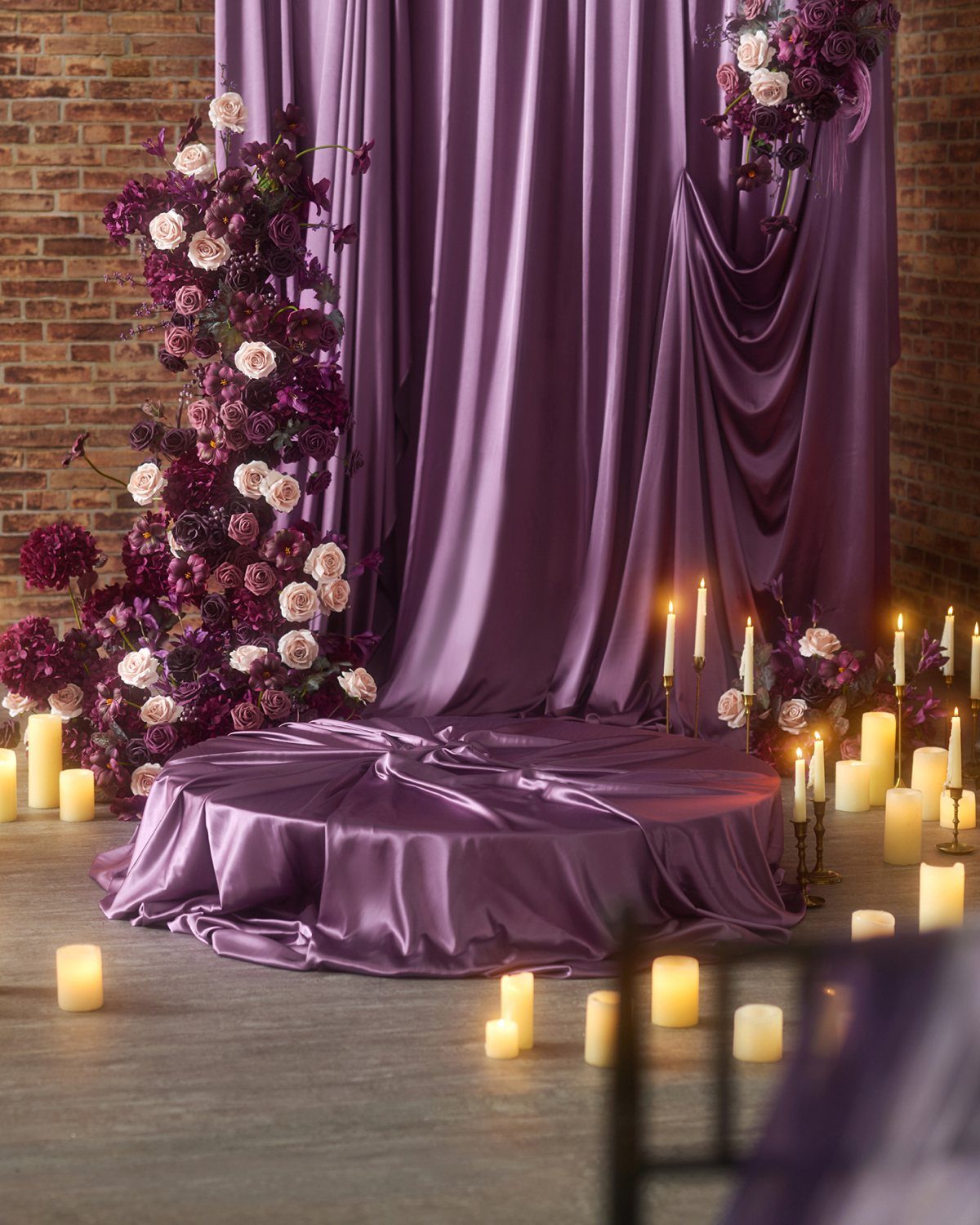
Purple satin drapes give a rich color its own surface to shine on, and a circular platform turns that drape into a stage for the ceremony or the sweetheart table.
Satin catches candlelight, so the purple shifts from deep to bright as the pillar candles flicker.
Mix white blooms in with the purple ones so the arrangements don’t read as one dark mass. I’d keep the candles white and let the purple stay in the fabric and flowers.
Brick behind the drape adds texture for free, so you can skip extra backdrop decor and spend on the flowers.
Choosing a Color Palette
Start with volume, not color.
Light is the next filter.
Candlelight pulls moody palettes into focus, while daylight suits garden, quiet and color field palettes. From there, let the venue and the time of year make the final calls.
If you want a shortcut, use green.
Don’t forget what people wear. A brown suit, a powder blue accessory or a pale green dress puts color on the couple and guests, and that costs far less than adding it to the room.
A sound palette has one anchor color, two or three complementary tones, and one or two accents.
Seasonal Color Trends
Season is one of the most practical filters you have, so check your palette against your date before you order anything.
Match the mood to the weather.
A natural, polished look suits spring and summer best. An immersive theme, like a Regency romance, feels right indoors in autumn or winter.
If your favorite palette fights your season, keep the colors and change the delivery. Pull the shade into fabric, candles or guest attire rather than trying to force out-of-season flowers.
Guest Experience Focus
Guests remember how the night felt more than what they took home. If your budget is tight, moving money from favors to one experience is a trade I would make.
Good options include:
- Espresso bar
- Cannoli station
- Late-night snacks
- Live musicians
- Interactive food displays
- Photo booth
- Cozy lounge space
Pick one or two, not all seven. One well-run station can hold guests’ attention from the ceremony right through the last dance.
Let your theme guide the choice, so the food, the music and the decor feel like one consistent experience.
Frequently Asked Questions
What colors will be trending in 2027?
Silver, chocolate brown, spring green and deep jewel tones lead the list, with a bolder counter-trend of pink, orange and chartreuse.
Cool silver is edging out warm gold for metallic accents, and brown looks best when plenty of ivory sits beside it to keep things light.
Green is the most consistent color across 2027 palettes, so it is the easiest one to build around.
What are the floral trends for weddings in 2027?
Bouquets are getting louder in color, with violet taking the place of sage and marigold standing in for butter yellow, while deep burgundy and crimson hold their ground as the rich anchor shades.
Soft pink blooms in quantity also have a place, as do white blooms mixed in with deep tones.
I would pick one flower color per table and repeat it, since one mass of color looks more planned than several small mixed arrangements.





