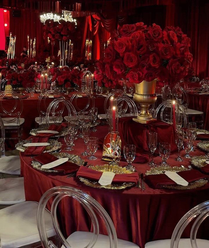
The ideas run from a full crimson ballroom to a single red accent: one embroidered lehenga, one deep red suit, or just the invitation stock. The deciding fact is how much of the room your venue already fills with color.
Dark walls and dim light call for white linens or one red tablecloth, while a plain backdrop or cream drapes can carry red flowers, a red gown, or both.
The post’s own test is simple: if red covers more than about half of what a guest sees from their seat, add a neutral.
1. Crimson Red Wedding Theme
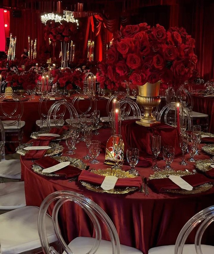
Crimson leans toward blue-red, which is why it reads as formal rather than playful. Against gold accents and a red tablecloth, it looks like a ballroom dinner.
Clear acrylic chairs, like the ones in this setup, keep the room from turning heavy when the curtains and linens are already red.
If your venue has dark walls, I would stay with one red tablecloth and let the gold vase and candles do the shine.
2. Scarlet Red Wedding Theme
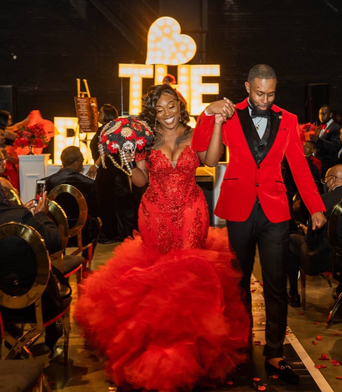
Scarlet is the orange-leaning red, the one that looks lit from within, and a sequined gown or a red tuxedo shows it off better than any centerpiece can.
Matching the couple is a bold move, and I like it.
Keep the rest of the room quiet, in neutral linens and simple decor, so the red still stands out. Summer and fall suit it best.
3. Burgundy Red Wedding Theme
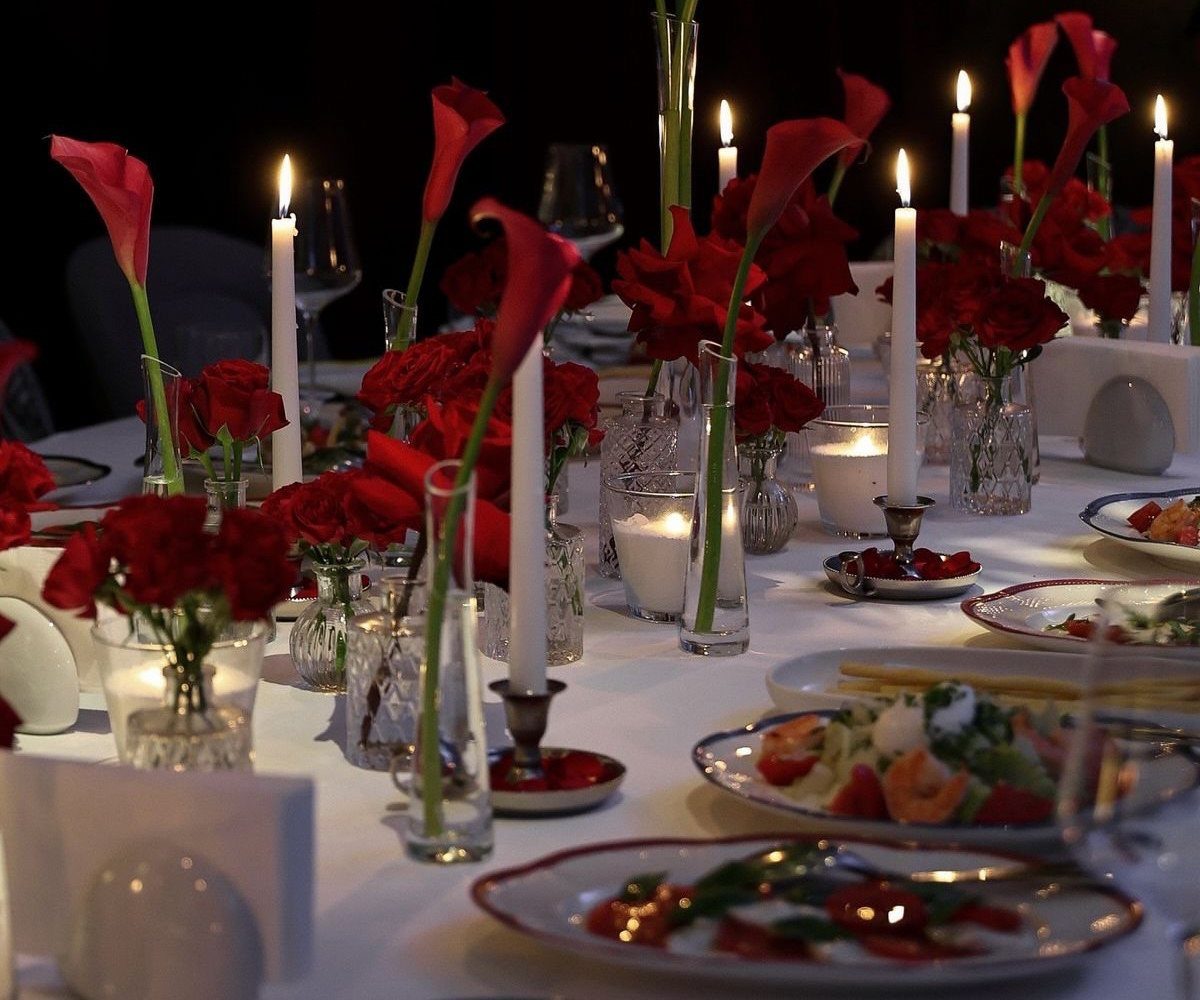
Burgundy gets its depth from red with a little brown and purple in it, and white taper candles give that darkness something to push against.
Red calla lilies beside red roses, as on this long table, keep the palette in one family while the shapes differ.
I would choose white linens over dark ones: a dim room already supplies the moodiness, so the table can supply contrast. Autumn is the natural season for it.
4. Rose Red Wedding Theme
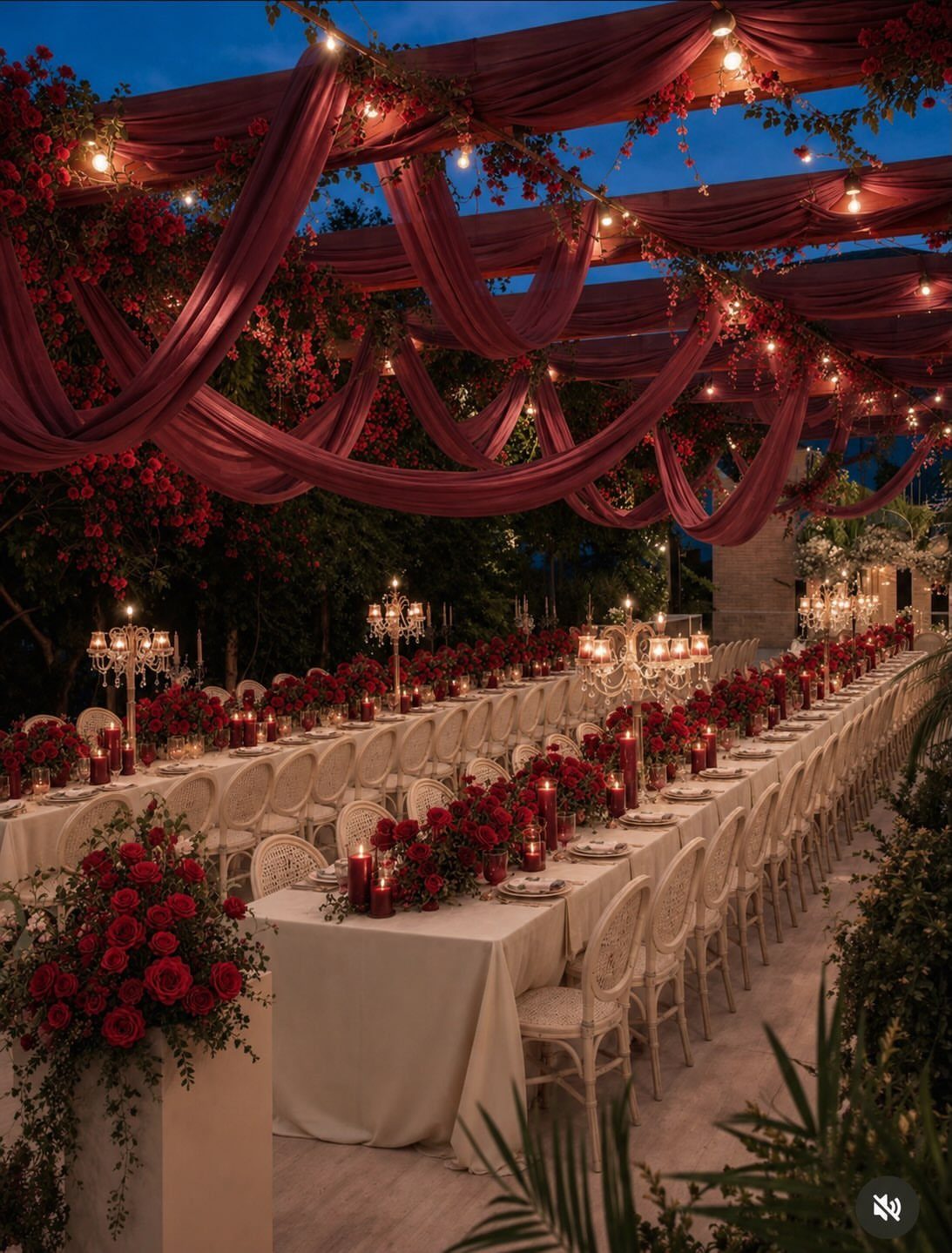
Rose red sits between a true red and a pink, so it feels romantic without turning sweet. A long banquet table with white linens and white chairs lets red roses carry the whole color story.
Draped red fabric overhead is the move I would copy. Fairy lights then add warmth as dusk falls, and the canopy makes an open space feel like a room.
5. Red Floral Arrangements
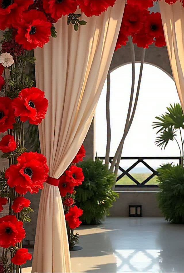
Red blooms pinned onto cream drapes make florals part of the architecture instead of something that sits on a table. Cream fabric lets the red read clearly, and nearby greenery keeps it looking natural.
Look at the venue first.
A tall arched window or a plain backdrop is where this works best. Keep the red flowers to one spot so they stay the focal point.
6. Red, Peach, and Greenery
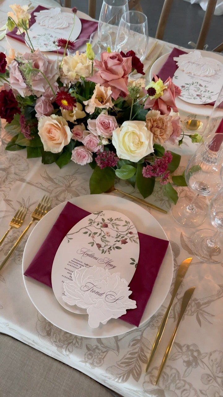
Red, peach, and white roses in a single centerpiece soften red without losing its warmth, and it is a combination I would pick over a stark red-and-white scheme.
Burgundy napkins on white plates ground the pale blooms, and gold cutlery ties the colors together.
Add greenery between the roses if the arrangement feels too sweet. Peach is the color to keep an eye on, since too much of it will pull the whole table away from red.
7. Burgundy, Blush, and Gold
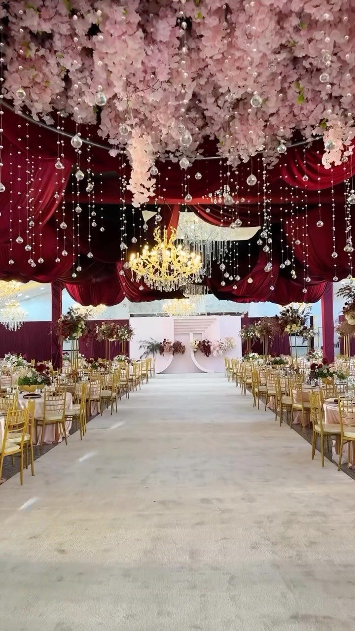
Burgundy velvet, blush florals and gold chairs make a palette that feels classic because each color has a job: burgundy grounds the room, blush softens it, gold adds light.
Hanging florals overhead keeps the tables free for centrepieces, place settings, and anything else you want to put down there.
I would repeat the gold in the chairs and nothing else, so the room reads as three colors and not four. Let the chandelier do the sparkle.
8. Red Groom’s Attire
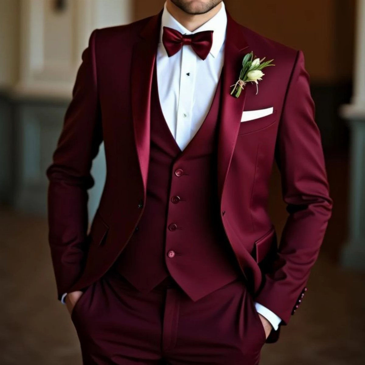
A deep red three-piece suit with a matching bow tie lets a groom wear color without going costume. Keeping the tie in the suit’s own shade looks deliberate and polished.
The white boutonniere is the detail I would keep.
It gives the dark fabric one clean point of contrast right at the chest. If the suit is already bold, choose a white shirt and skip patterned accessories.
9. Red, Dark Green, and Gold
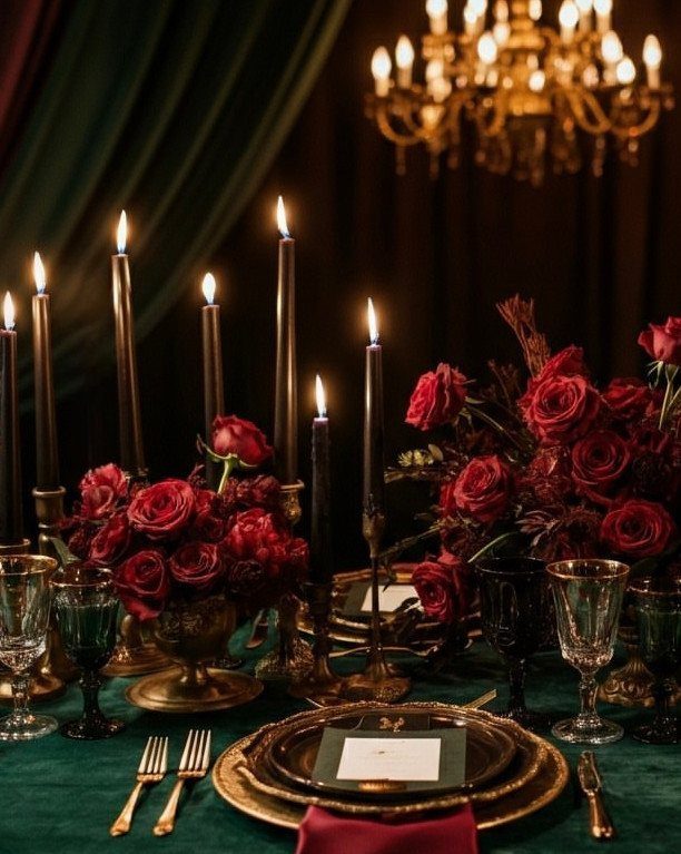
Deep red roses, black tapers and a dark green tablecloth make a dinner table that feels like candlelit evening, and gold plates and cutlery stop it from sinking into the dark.
I would let the gold carry the shine and keep the green plain, with no pattern or runner competing with the roses.
Tall tapers add height without hiding faces across the table. A chandelier overhead finishes the glow.
10. Red and Gold Bridal Attire
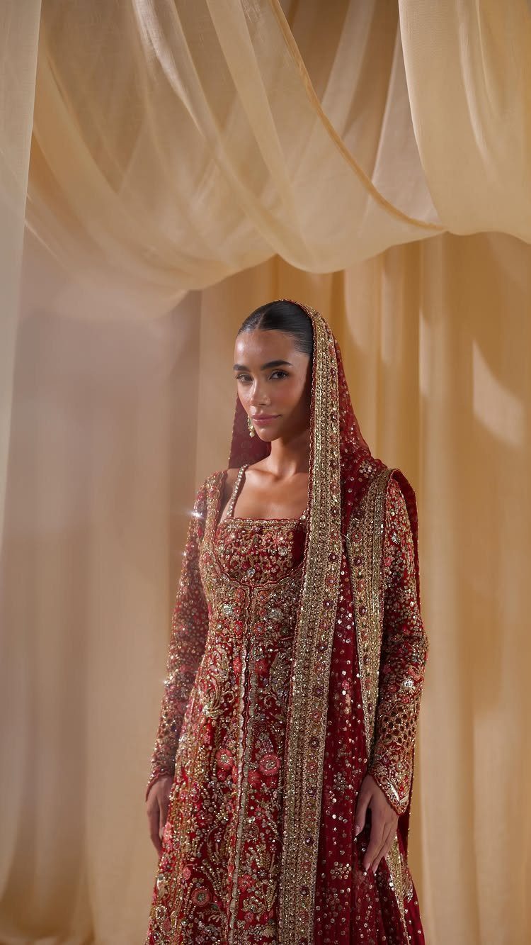
A heavily embroidered red and gold lehenga with a matching veil puts the whole color story on the bride, so the setting can stay calm.
Plain cream drapes behind her, as here, are the right call: the embroidery is detailed enough that busy decor would only fight it.
Keep the florals and linens simple, and let the gold work in the garment be the richest thing in the room.
Choosing Wedding Invitations
Paper is where a red palette first reaches your guests, so choose the stock before the font. Matte or textured paper makes deep reds look rich, while a glossy finish can push them toward a flat, shiny look.
If you want shine, keep it to one detail, such as glitter gold lettering, so the red still does the talking.
Let the typeface follow the mood of your colors. A script suits a formal burgundy palette, and a plain, clean font keeps a bolder red from feeling busy.
If your pattern is already loud, keep the type simple. Pairing burgundy with dusty and dark grey tones is one way to quiet an invitation that might otherwise feel heavy.
Order a sample before you commit, because red shifts between screen and print.
Using Red in Decor
Decide early whether red is your lead or your accent, because that choice sets how much of everything else you buy.
As an accent, red flowers can warm up an otherwise neutral palette, especially on a ceremony arch or in centerpieces. Shades like burgundy, maroon and crimson all work this way, so you can mix them without a clash.
As the lead color, red needs a partner to give the eye a rest. White and gold are the safest pairings, and blue gives a livelier contrast if you want something less expected.
A simple test: if red covers more than about half of what a guest sees from their seat, add a neutral. That keeps the room balanced and your budget from drifting into red everything.
Timelessness of Red
Red is a safe bet if you worry about looking dated in 10 years. It has been popular for centuries, and it fits rustic, modern and minimalist weddings alike.
Building a wedding palette around classic red is the cheapest way to get that timeless, dramatic effect, too.
If you want the safest version, pair red with white and gold, a combination that has held up for a long time.
Then put your own taste into the details, so the day looks like yours and not like a catalog.





