The 12 palettes below run from blush pink bouquets and dusty blue table settings to deep plum or chocolate brown bridesmaid gowns, so the right one depends on the space you’ve booked.
A dark ballroom can carry deep plum and olive, while a beach already supplies the ocean blue and sandy beige before you buy anything.
1. Blush Pink Bouquets
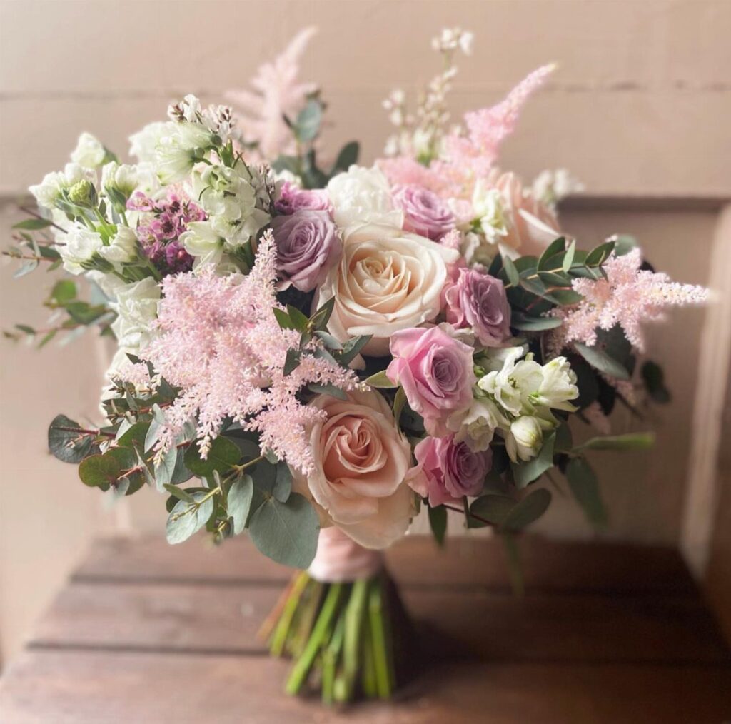
Blush pink does its best work in a bouquet when something cooler sits beside it. Lavender roses and white blooms keep the pink from going sugary, and the greenery gives the whole bunch an outline.
A ribbon in the same pink ties the palette together without adding another color. For a 2027 wedding, I would keep the flowers within three shades so the bouquet reads as one soft gradient.
2. Olive Green Decor
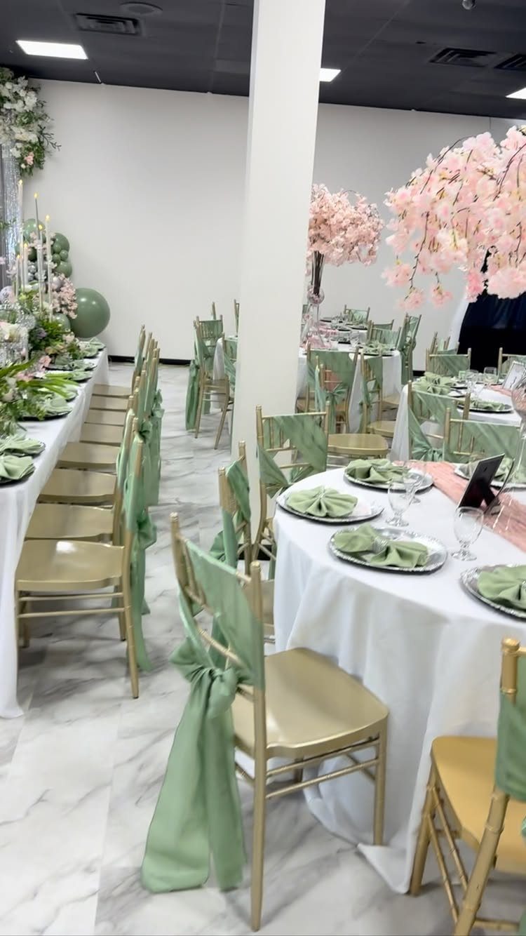
Olive green is easiest to use as an accent on a neutral base.
Pink blossoms give the green a warm partner, so the room doesn’t turn muddy. I like this approach for a large hall, where bare walls need color but you don’t want to cover every surface.
Pick the sash shade in daylight. Olive can drift toward sage under yellow banquet lighting.
3. Dusty Blue Bridesmaid Dresses
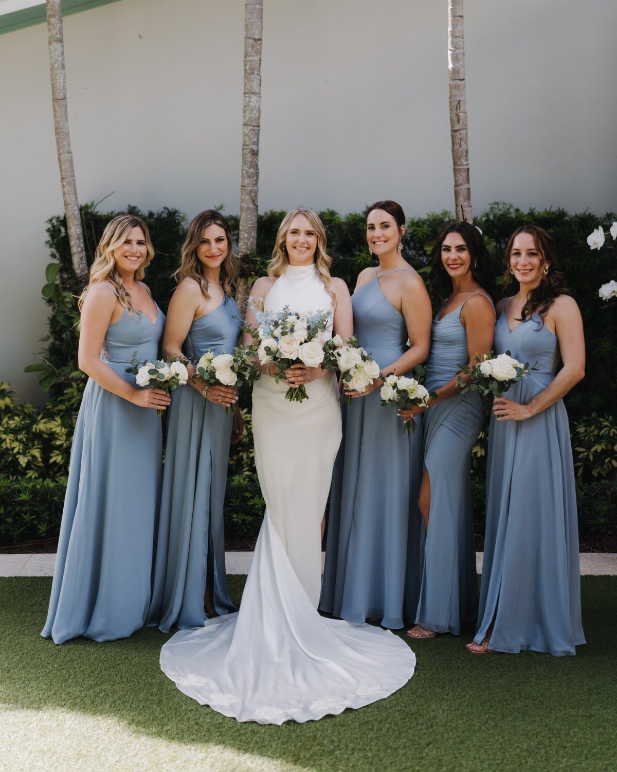
Dusty blue flatters almost every skin tone and sits quietly beside a white gown. That makes it a low-risk call when bridesmaids differ in coloring.
Bouquets with white flowers and plenty of green keep the group looking fresh outdoors against stone or foliage. I would add a little warmth through ivory or soft peach blooms, since blue on blue can feel cold in photos.
Let bridesmaids choose their own neckline in the same fabric and shade. They’ll wear it more happily.
4. Deep Plum Bridesmaid Gowns
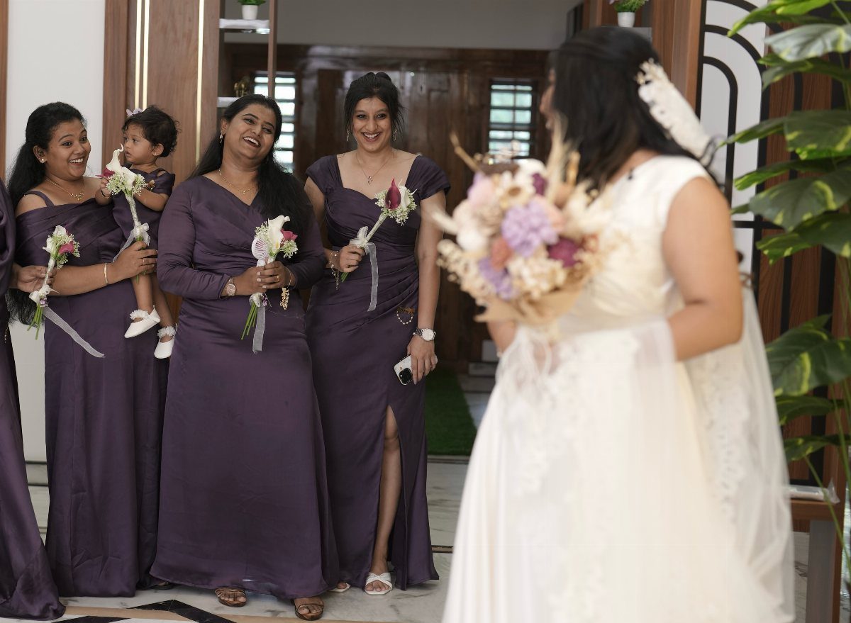
Deep plum gives a bridal party weight. In a floor-length gown it looks formal, and it holds its own indoors where lighting is dim and the walls are dark.
Small bouquets suit it well, because the dress already carries the drama. Keep the flowers pale, in white or blush, so the plum stands out against them and the bride’s white gown stays the brightest thing in the group.
Plum suits a fall or winter date, where the richness fits the season.
5. Rust, Mauve, and Olive
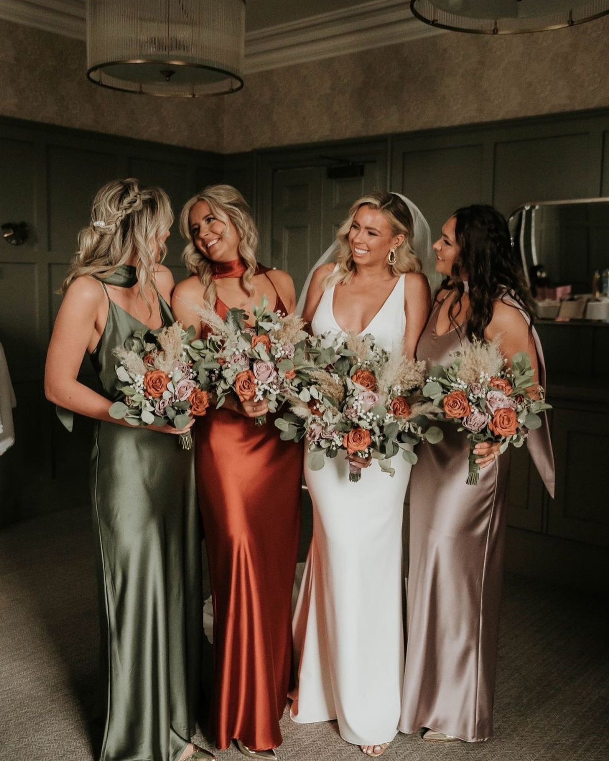
Rust, mauve, and olive borrow from a sunset: warm orange-brown, dusty pink-purple, and a mossy green to ground them. Mixing the 3 across bridesmaid dresses lets each woman wear a different shade without clashing.
Matching bouquets tie the mix together, so repeat all 3 colors in the flowers. Dark green walls make the palette glow, while a white room makes it quieter.
I’d choose one color as the lead, usually olive, and let the others play support.
6. Champagne and Blush
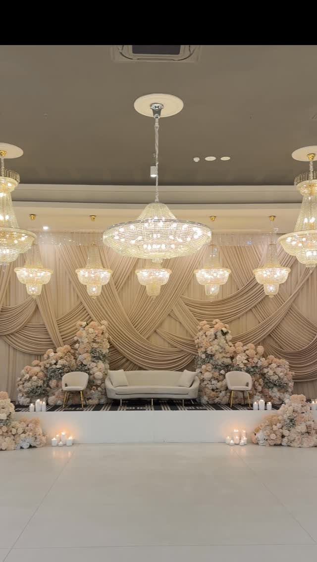
Champagne and blush share a warm undertone, which is why they blend so easily. Draped champagne fabric makes a soft backdrop, and blush and cream flowers add a little life in front of it.
Crystal chandeliers push the look toward formal, so this suits a banquet hall best. Fabric drapery is a cheaper way to get that effect than building a custom backdrop.
Keep the florals in two or three shades only, or the pale palette starts to look washed out.
7. Ocean Blue and Sandy Beige
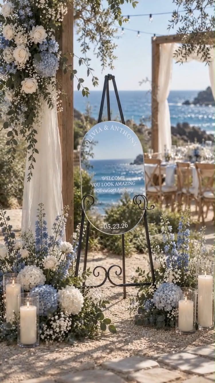
Ocean blue and sandy beige work because they are the 2 colors a beach already gives you. Blue and white flowers around a welcome sign pick up the water, and the sand supplies the neutral for free.
I’d let the sand do the beige work outdoors and skip extra beige decor. Keep the flowers to blue and white, and the ceremony backdrop stays clean enough that the sign and candles hold attention.
Pick the blue shade against the actual water color if you can.
8. Blue, White, and Persimmon
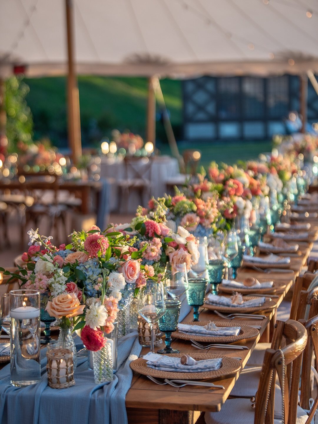
Blue, white, and persimmon is a bolder trio than most 2027 palettes, and persimmon is the color that makes it work. A warm orange-peach against cool blue linens and glassware gives each side a reason to stand out.
Keep persimmon to the flowers and let blue carry the linens and glasses. White blooms between the two calm the contrast.
I’d choose one light blue and stay with it, since the orange already supplies the surprise. A white tent keeps the whole table bright.
9. Espresso Linens and Ivory Plateware
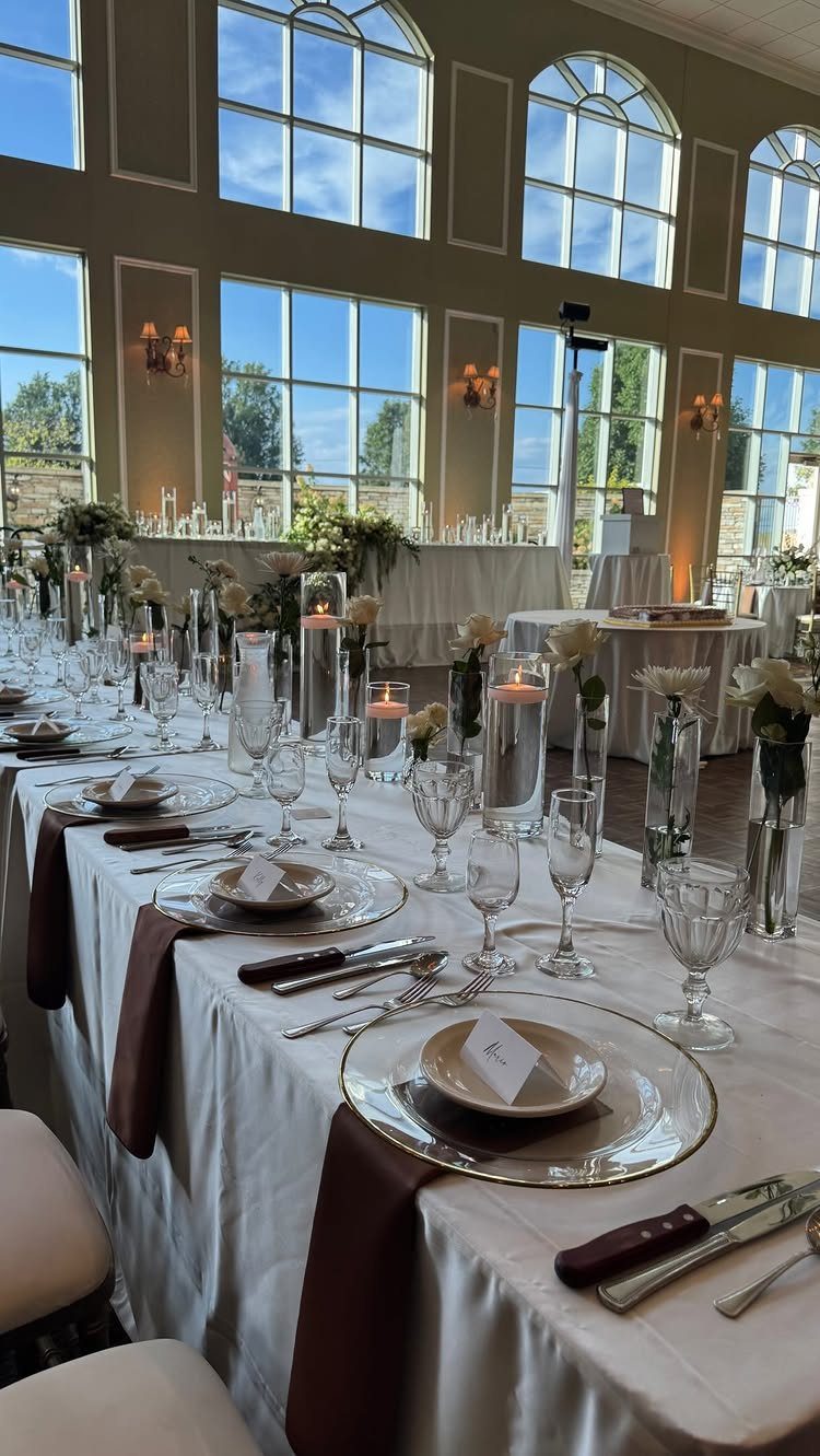
Espresso brown against ivory is a quiet, grown-up pairing. Brown napkins or runners on white linens give a long table structure, and ivory plates soften the dark tone so it doesn’t feel heavy.
White flowers keep the center of the table light, which matters when the brown is doing so much. Large windows help too, since daylight stops espresso from reading as dull.
I’d use brown only in narrow bands, such as runners and napkins, and leave the cloths white.
10. Chocolate Brown Bridesmaid Dresses
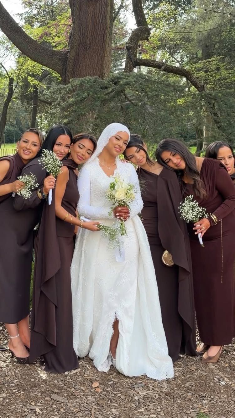
Chocolate brown dresses in a long cut give a bridal party a rich, grounded look, and a white gown stands out clearly against them. White bouquets for the bridesmaids repeat the bride’s color and lift the dark fabric.
Woods and other outdoor greenery suit the shade, since brown belongs among trees. I’d have everyone wear the same brown, because small differences in dark fabric show up fast in photos.
Hold swatches next to the gown before ordering.
11. Dusty Blue Table Settings
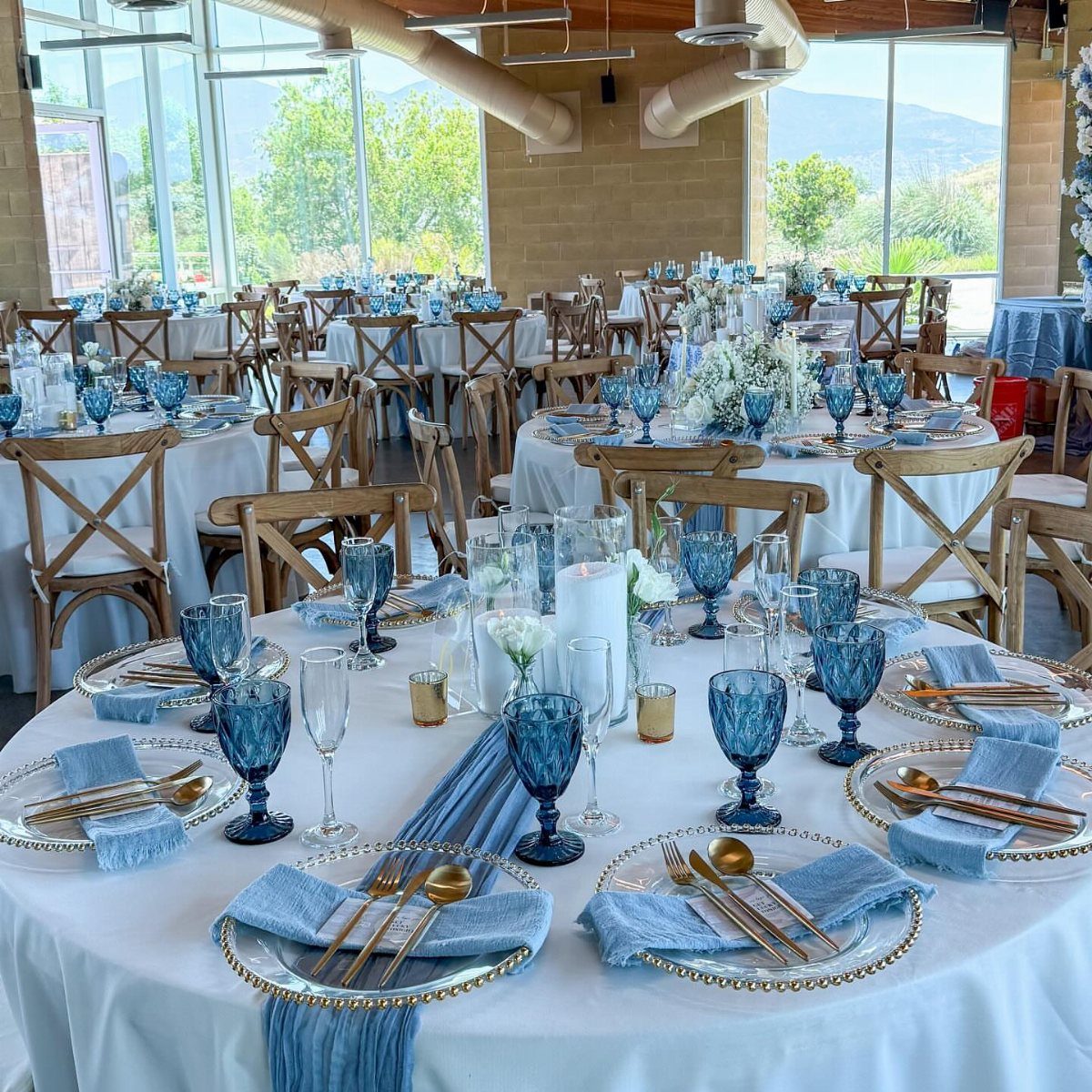
Dusty blue on a table works best when it appears in several small forms: runners, napkins and glassware. Repeating the shade that way reads as a plan rather than an accident.
Gold cutlery warms the blue, and white centerpieces keep round tables fresh. I’d put the color in the runner and glassware first, since those are the pieces guests see most.
A bright room suits this palette. In a dim one, dusty blue can go gray, so check it under your venue’s lighting.
12. Deep Purple Floral Accents
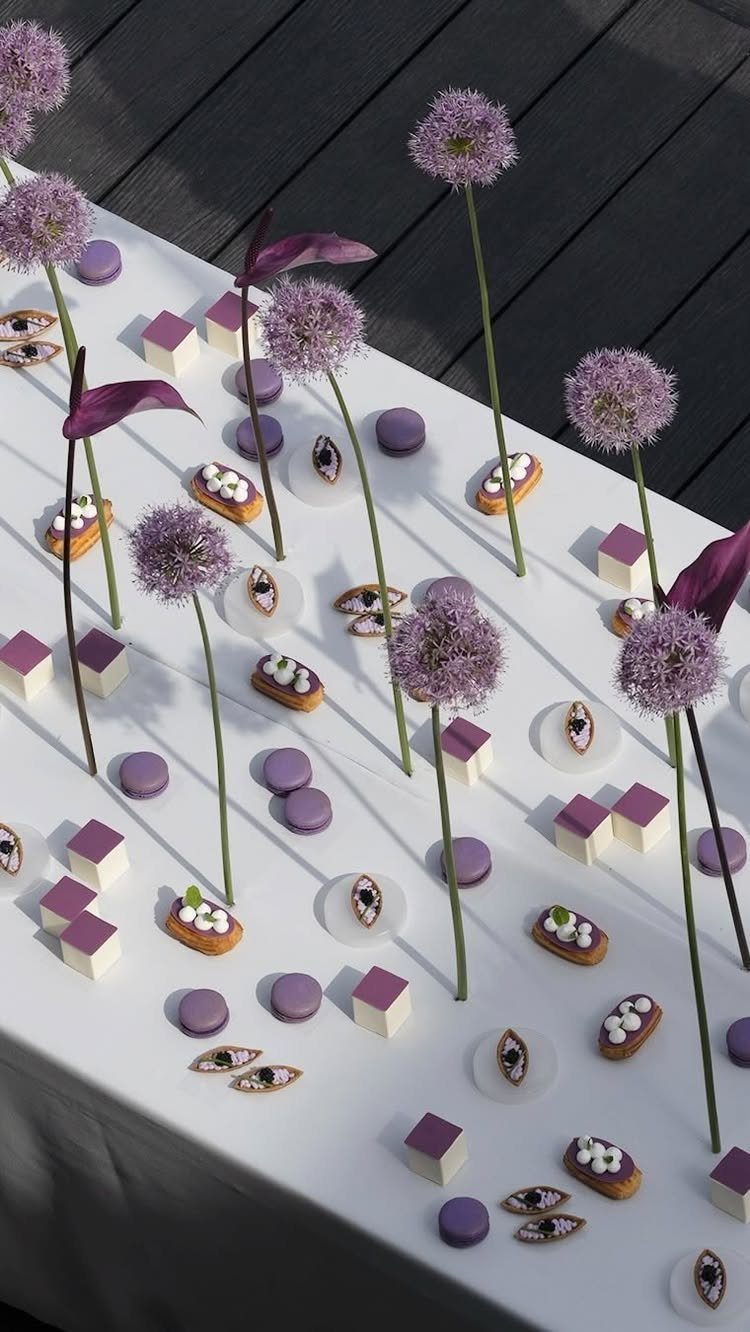
Purple allium has a round, globe-like head that looks almost like a dessert garnish, which is why it pairs so well with purple macarons and small cakes on a white table.
The shared color makes the flowers and sweets read as one display.
Keep the table white so the purple is the only color. I’d go deep rather than pastel on the flowers, since a few tall stems give the display height.
This is a small, affordable way to use purple without dressing the whole wedding in it.
Choosing Your Wedding Color Palette
Start with the room or outdoor space where you’ll actually stand. Its walls, floors, and greenery are already a color scheme, so choose shades that either match them or clearly contrast.
A three-part split works well: one dominant shade sets the mood, a second color adds contrast, and a quiet neutral gives the eye somewhere to rest, which also keeps menus and signs legible.
If you want more, 3 colors is a safer ceiling, since spreading attention across four or five shades is where a palette tends to fall apart.
Season and style come next.
Soft blue, yellow, lavender, and sage suit spring, while peach and brighter blues feel fresh in summer. Burgundy, chocolate brown, terracotta, and warmer neutrals settle into fall.
Lay fabric swatches or a digital mood board side by side first, and only then start placing orders. Colors that look right on a screen can shift once they sit next to each other.
Why Color Is Trending
Color is the fastest way to make a wedding look like yours. A palette can carry your culture, your story, or just your taste, and guests read it before they notice anything else.
Color also decides how the room feels, whether that is calm and romantic or loud and happy. Choose the feeling first, then the shades that deliver it.
Photos benefit too. A deliberate palette makes images look cohesive, so your album reads as one day instead of a pile of unrelated shots.
My read on 2027 is that couples are pairing soft tones with bold ones and borrowing shades from landscapes and paintings.
Blues, pistachio green, berry shades, and sunset colors show up again and again. Beige-only weddings are losing ground.
Mixing Wedding Colors
Your colors no longer have to match in the old sense. Pairing tones that tell your own story is now a legitimate approach, and a palette can feel fresh because of an unexpected pairing.
Look at the palette as a whole rather than asking if each color counts as a "wedding color."
Your paper goods don’t have to match exactly, but a guest should be able to tell at a glance that they belong together.
I like a simple formula: one main color, one neutral to support it, and a single accent. Spreading attention across four or five shades is where mixed palettes tend to fall apart.
If the look still needs a final touch, add silver or gold metal instead of a whole new color.





