Your venue’s walls, carpet and wood tones should steer the palette more than any trend, since a shade that clashes with them costs extra to cover.
The ideas in this list run from cobalt with warm cream to a mix of jewel and earth tones, and most of the savings come from putting color into fabric and napkins instead of a florist’s installation.
1. Cobalt Blue and Warm Cream
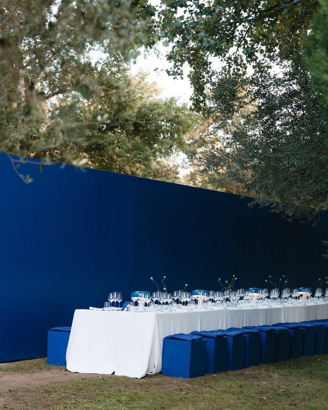
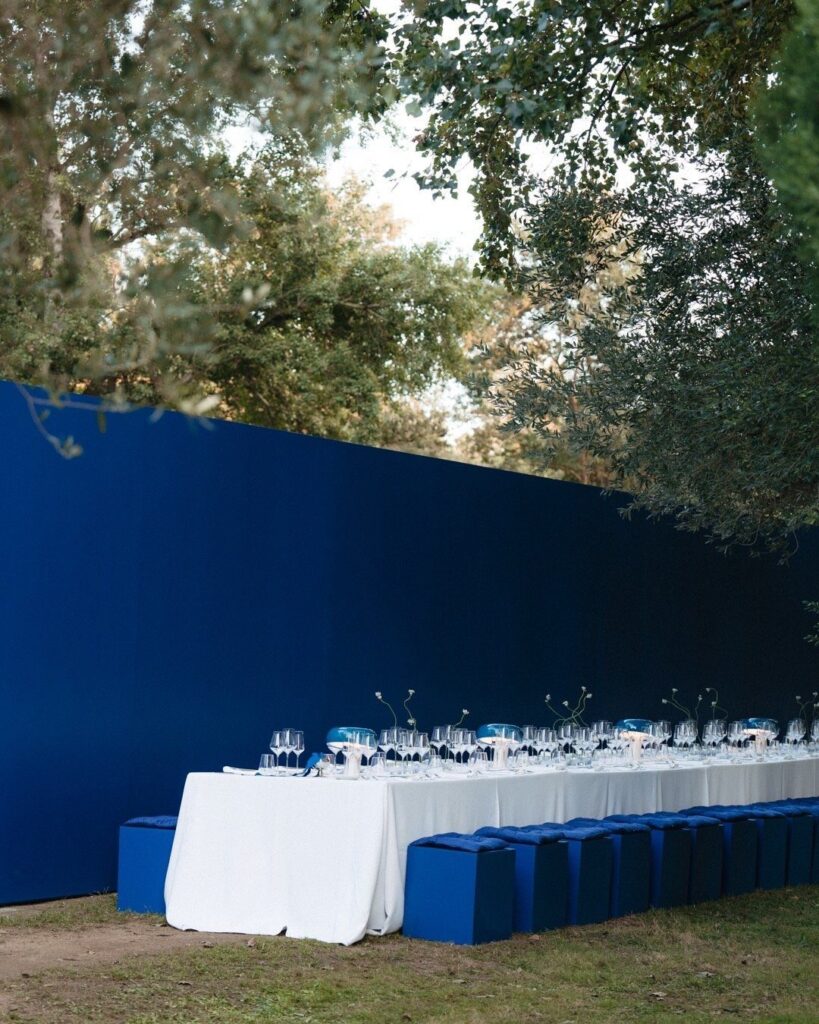
Cobalt works best when you let it be the loud one. A saturated blue wall or a row of blue stools does the heavy lifting, so everything else can stay quiet: white linens, glassware, a little cream.
For August, I like that it reads cool against summer heat. Repeat the blue in just 2 or 3 places, such as seating, centerpieces and one backdrop, and keep the table itself pale so the color doesn’t tire the eye.
2. Chocolate Brown and Ivory
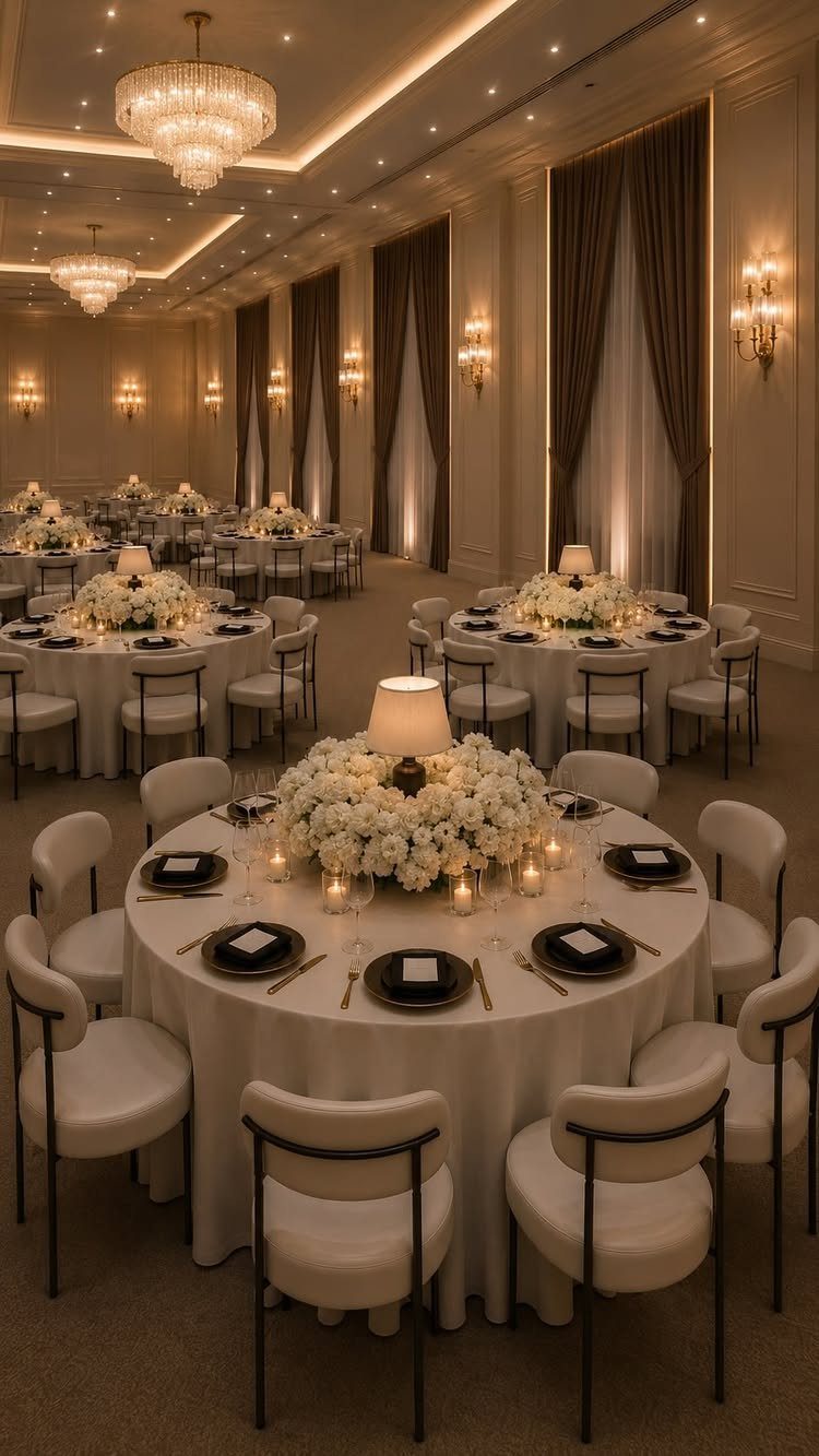
Brown is the color most couples overlook, and a ballroom is where it earns its place. Chocolate curtains frame the room, while ivory linens and white flowers keep it from feeling heavy.
Put the brown in what’s already there or cheap to add, like drapes, ribbon and napkins, and leave tables and florals light. A dark room with pale tables photographs warmly, and white blooms stand out sharply against the drapery.
3. Dusty Blue and Soft White
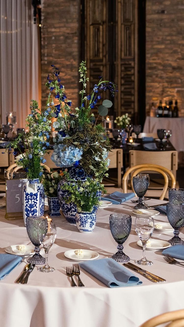
Blue and white china is the whole reference here, and it gives you a clear palette: dusty blue, navy and cobalt, with ivory and a touch of light green as accents, according to the designer behind this table.
I’d vary the blues instead of matching them.
Blue napkins, blue glassware and blue-and-white florals in porcelain-style vases look layered, not flat, and the white cloth keeps it calm. It’s an easy palette to build from thrifted vases.
4. Moody Mauve
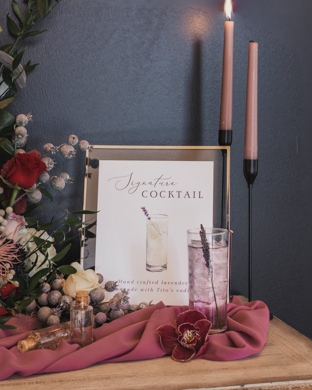
Mauve turns moody once it sits against something dark. A mauve drape on a wooden table, with candles in front of a charcoal wall, feels closer to dusk than to a pastel.
A bar or cocktail corner is the cheapest place to try it.
A lavender signature drink with a framed menu sign carries a mauve palette without touching the walls or the florals; it costs a few dollars a head and one printed sign.
Candlelight does most of the work, so keep the room lighting low.
5. Tropical Orange
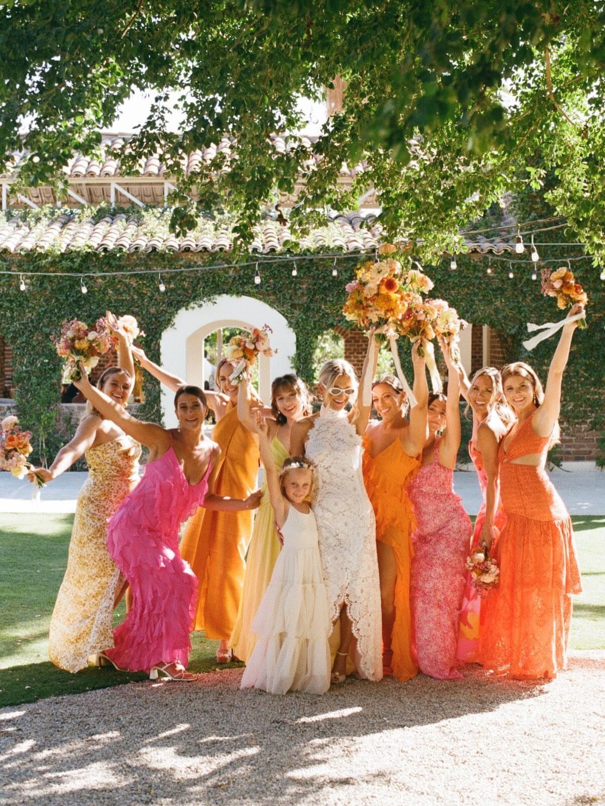
Orange asks for company, and pink is its best partner. Mix shades from pale peach to deep tangerine across the bridal party, with the bride in white, and the group reads as one bouquet instead of a uniform.
I’d keep the bouquets matched even when the dresses aren’t. Repeating the same flowers ties together a range of oranges and pinks, and it lets bridesmaids of any age wear a shade that suits them.
6. Sage and Ivory
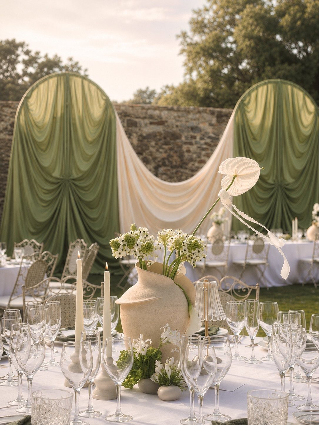
Sage and ivory suit a stone wall, where the greens echo moss and the ivory softens the gray. Hang long fabric panels in both colors behind the table and you get a backdrop with no florist bill attached.
Sage and ivory work best when the table stays quiet: white linens, white candles, clear glassware, and white flowers, so the green does the talking.
Fabric in two tones costs far less than a floral installation, which makes this one of the easier palettes to do on a modest budget.
7. Deep Plum
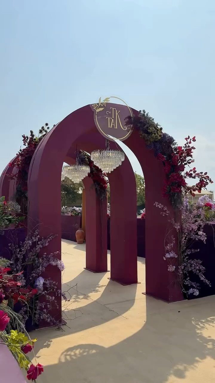
Deep plum reads as formal without needing much else.
I’d pair plum with one warm accent, like deep red blooms, and keep the other purples in the same dusky family.
Red stops it from looking flat, and the chandeliers do the glamour so you can skip extra props. A gold monogram at the top is a small, cheap way to make the arch yours.
8. Peach Light Blue and Sage
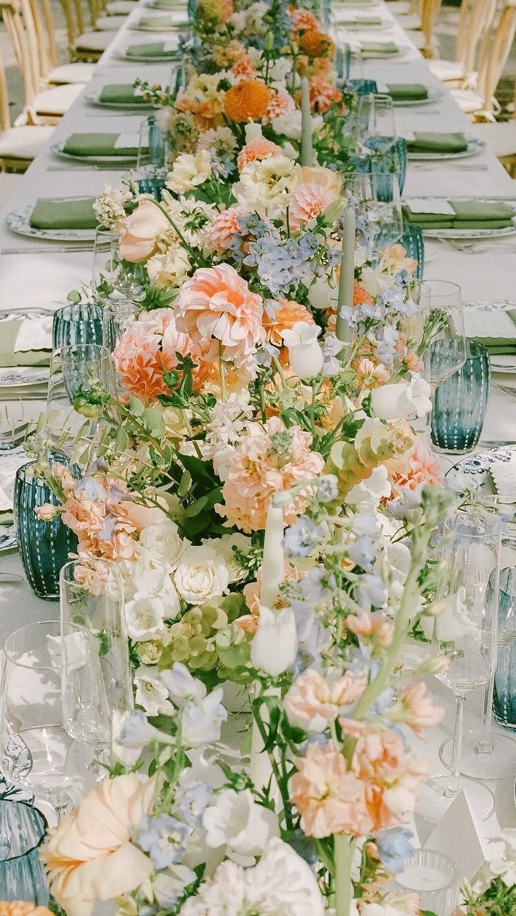
Peach and light blue sit close enough in softness that they blend, and sage napkins give the pair somewhere calm to land. Keep the flowers in those 2 colors, with napkins carrying the green.
I’d put the blue in glassware as well as florals, because it repeats the color at eye level without more flowers.
Bright daylight suits this palette best. A long floral runner does the work of individual centerpieces, which keeps the table simple to set.
9. Berry Red and Pale Pink
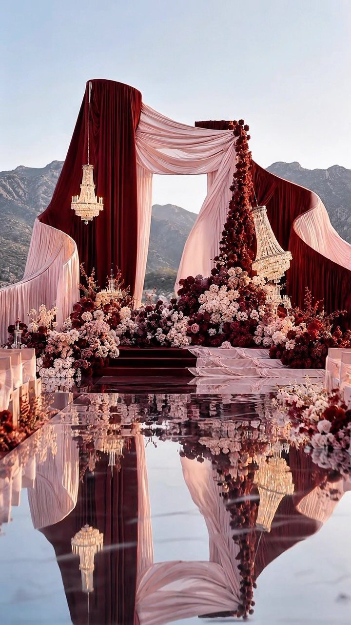
Berry red turns romantic once pale pink softens it. Drape both fabrics on the ceremony altar and match the flowers to them, so the whole structure reads as one color story.
Make the berry the deeper, heavier shade, with pink filling the gaps.
Crystal chandeliers add sparkle, and a glossy floor doubles the color in reflection. Put the money into the altar, since it is the one spot every guest faces and every photo includes.
10. Mismatched Jewel and Earth Tones
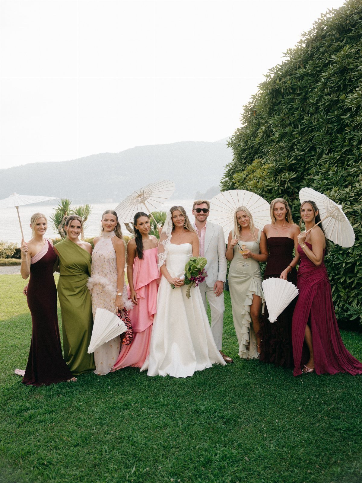
Burgundy, olive green, blush, champagne and plum share the same muted, dusty depth, so bridesmaids can wear different gowns and still look like a set. That shared softness is the rule to follow; hue matters less than depth.
Let each bridesmaid choose her own shade from the 5, and I’d keep accessories identical.
White parasols, as here, or matching bouquets give the eye a repeated element, so the mix looks planned. Mismatched dresses also spare you the one-color-fits-everyone argument.
11. Pale Yellow and White
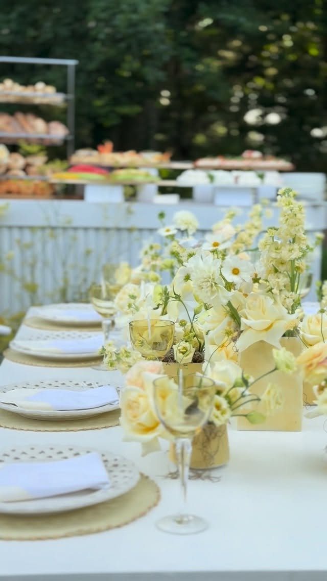
Pale yellow needs white beside it, or it can wash out. A centerpiece of yellow and white flowers is the simplest way to use it, and gold vases warm the yellow without adding a new color.
I’d set white plates on gold placemats and keep everything else white, so the flowers are the only color on the table.
Yellow is a gentle choice for an August outdoor reception, and the gold accents mean one centerpiece style covers the whole look.
12. Burgundy and Forest Green
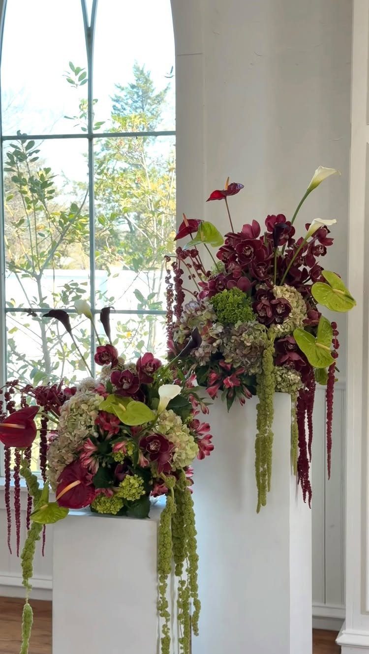
Burgundy calla lilies against green hydrangeas make a tall, dramatic pair, and white pedestals lift them to a height guests notice right away. One arrangement per pedestal is enough.
Use them as a pair flanking an entrance or the ceremony spot, near a bright window where the dark burgundy gets light behind it.
Keeping the pedestals white leaves the flowers as the only deep color. I’d pick them over scattered small arrangements: 2 big statements cost less to place and read better.
13. Coral and Red
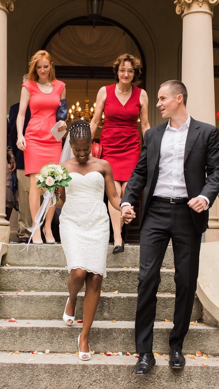
Coral and red sit so close on the color wheel that they read as one warm family, which is why bridesmaids in both shades look planned instead of mismatched. The bride in white gives the eye a place to rest.
I’d let the bridesmaids split between the two, with some in coral and some in red, rather than dressing everyone in a single shade.
The mix adds depth to a group photo, and stone steps or a pale backdrop keep it from competing with the outdoor setting.
Match the bouquets across the group so the 2 colors stay tied together. Warm shades suit an August day, and the range lets each bridesmaid choose the one that flatters her.
Choosing the Right Palette
Start with the room, not the Pinterest board.
Look at what is already there: wall color, carpet, wood tone, the view behind the ceremony spot. A palette that fights those fixed colors will cost you extra to cover up, so pick shades that sit comfortably beside them.
Next, think about your photos.
Before you commit, take your fabric swatches to the ceremony backdrop and the reception room, then lay them beside what the wedding party will wear. Do this in daylight if you can, since August light changes how colors read.
Then ask what feeling you want guests to have when they walk in.
Romantic, modern, editorial, playful and moody all point to different palettes. If you can’t pick one word, your palette isn’t settled yet.
Last, ask whether you will still like it when you open the album years from now. The best palette is the one that feels like you, so cut any color you chose only because it was popular.
Mixing Unexpected Colors
Matching is no longer the goal. Couples are mixing colors that don’t count as a traditional wedding palette, and the aim is simply that the colors feel right together.
Some pairings I’d try: butter yellow with cobalt blue, burgundy with blush, red with pink, emerald with champagne, or midnight blue with ivory. Chocolate brown with pale blue is another warm, unexpected one.
Layering works too.
Stack close tones, such as berry, crimson and dusty rose, so the mix reads as one family. Or keep to a single color and let texture do the variation.
A bold mix stays calm when one color takes the lead and the rest play supporting roles. Test the combination with real swatches before you order anything, since screens can lie.
Emerging Trends in Wedding Design
Weddings in 2027 are leaning toward intimacy and storytelling over spectacle. That is good news for a budget, because a few details that mean something to you beat a room full of props.
Spend where the story shows. A drink tied to how you met, a menu card in your own words, or a piece of family fabric in the decor will say more than an expensive installation.
Be choosy, too.
Every detail should earn its place by feeling like you, not by following a template. If you can’t say why an item is there, drop it and put the money toward something guests will notice or remember.
Keep your eye out because minimalist wedding cakes are set to take over in 2027.
Frequently Asked Questions
What are the trendy colors for weddings in 2027?
Nothing dominates the 2027 picture; couples are blending unexpected shades instead of sticking to one classic scheme. A few combinations on my short list: butter yellow against cobalt, burgundy softened with blush, emerald beside champagne, and midnight blue over ivory.
Berry red, deep plum, moody mauve and chocolate brown are all showing up too. Order fabric or paper swatches for any combination first, because a color on a phone screen rarely matches the real thing.
What is the best color for an August wedding?
Cobalt blue with cream is my pick for August, because the saturated blue reads cool against summer heat. Pale yellow with white and coral with red also suit the season, since they feel warm and gentle outdoors.
Carry your swatches outside at midday before you commit, since strong August sun can wash out pale shades and deepen dark ones.





