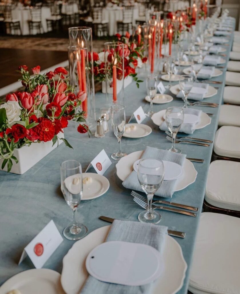
Blue and red can be as light as a pale blue drapery ceremony backdrop with red roses in front of it, or as heavy as a deep blue venue with red accents, and the cost follows how much of the space you have to dress.
The color your venue already has decides which idea is yours: if the walls are deep blue, a few red accents go a long way, and if the room is neutral, a blue drapery backdrop, a red velvet curtain, tablescapes and flowers have to carry both colors.
Burgundy cloth against light blue napkins is the pairing I would copy first.
1. Invitations
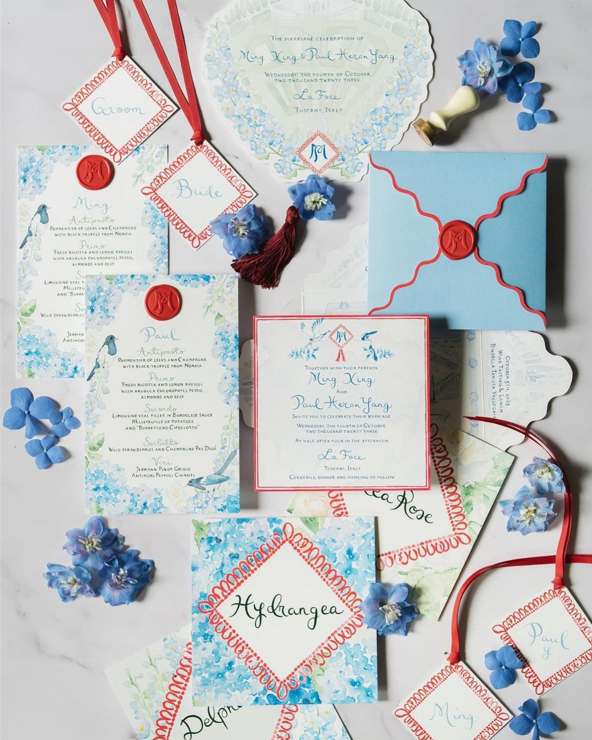
Blue florals with red wax seals and ribbon make a quiet pairing: the blue carries the pattern, and the red works as punctuation.
I would keep it that way, with red limited to the seal, the ribbon and maybe a line of type.
Reversing the ratio makes the suite feel heavy and loud before anyone opens the envelope. The same blue pattern across the invitation, envelope and menu ties the paper together, so the table later feels like a continuation of it.
2. Centerpieces
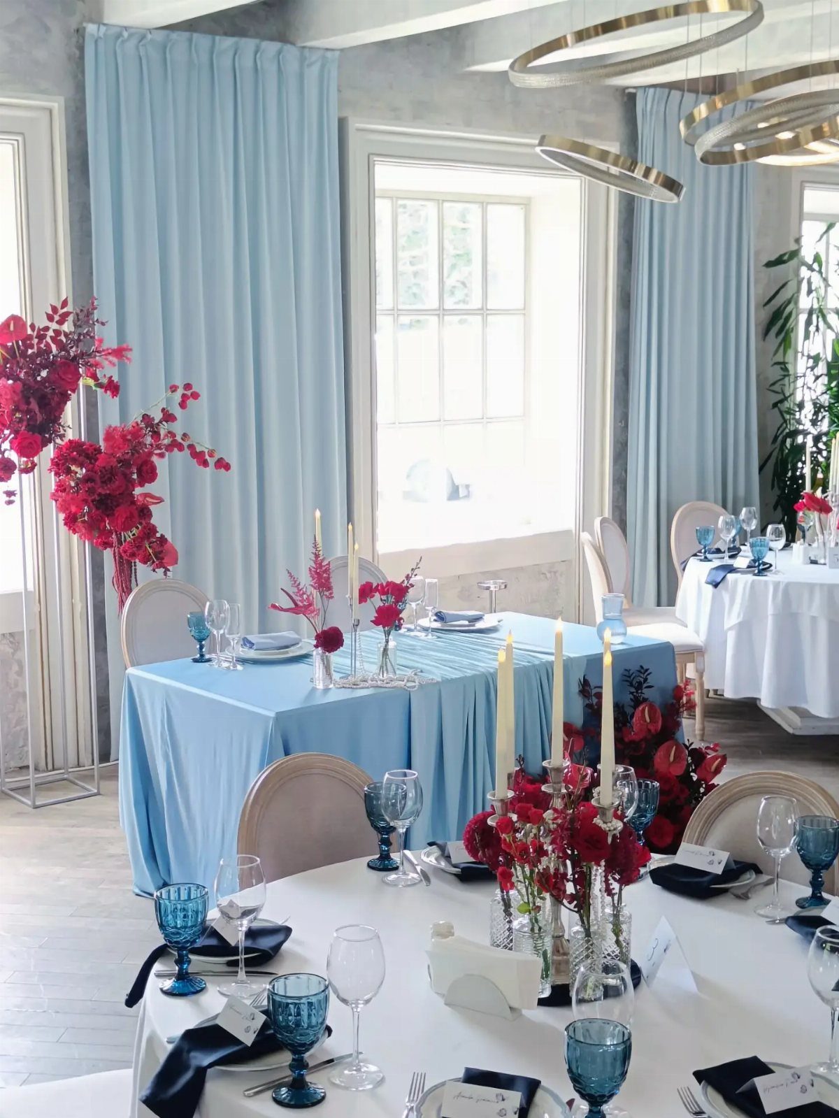
Red flowers against a blue room do the work here, so let the blooms be the only strong red on the table.
Blue curtains, blue tablecloths and blue glassware already supply the cool half; clear glass vases and white candles keep the red from competing with them.
Low arrangements suit this setup, since guests can still see the person seated opposite them without leaning around a vase. If the budget is tight, a few well-placed red stems in each vase beat a crowded, expensive bouquet.
3. Blue and Red Save-the-Dates
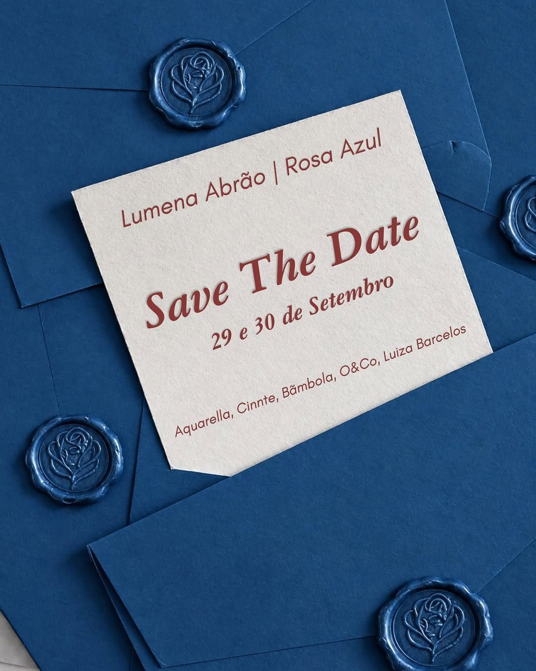
A white card with red lettering sitting on blue envelopes shows the whole palette in one small stack. Red text stays readable on white, which matters more than any flourish on a card people glance at once.
Blue envelopes with a rose-shaped wax stamp in the same blue keep the color story calm and let the red type stand out. For a tight budget, this is a cheap place to introduce both colors before the wedding itself.
4. Blue and Red Reception Tablescape
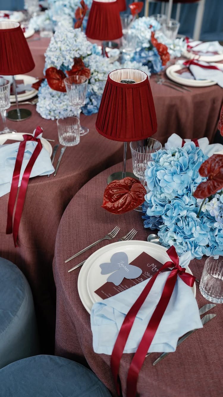
Burgundy is the choice that makes this table feel formal. It reads as a deeper, softer red than a bright tomato shade, so light blue napkins and blue hydrangeas can sit beside it without looking like a flag.
I like red lamps over the table in the same family as the linens. If you copy only one move, pair the burgundy cloth with the light blue napkins, because that contrast carries the whole look.
5. Deep Blue Venue with Red Accents
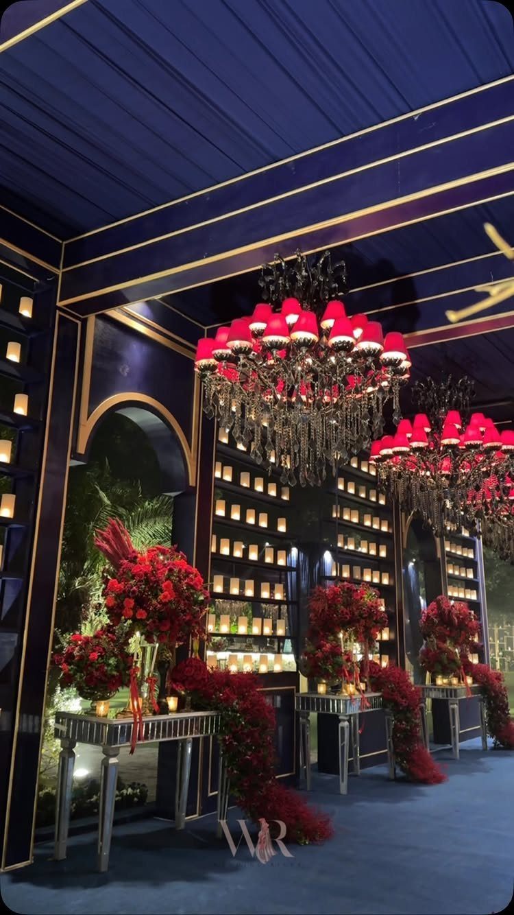
Deep blue walls and ceiling make a room feel like evening at any hour, which is exactly why red florals and red-shaded chandeliers read so strongly in it.
With that much dark blue, a small amount of red goes a long way.
Silver tables keep the room from swallowing the color, so I would choose silver or other pale metallic surfaces over dark ones. This is a look for a venue that already has the blue; repainting would be a large cost.
6. Navy Cake with Red Roses
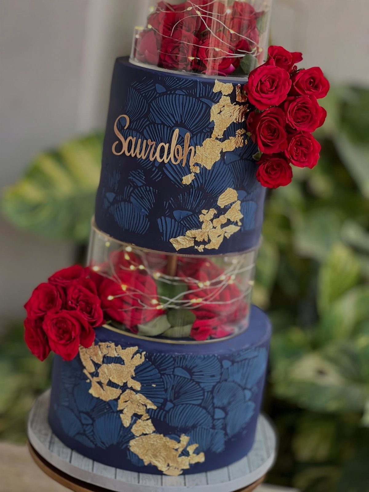
Navy fondant with gold leaf makes red roses look almost black-edged and rich, and that contrast is the reason to pick this cake. The roses are the only red, so keep them deep rather than bright.
Clear acrylic tiers with fairy lights add glow without adding more color, and gold script lettering suits the navy better than white would. Ask your baker whether the roses are real or sugar, since that changes both cost and handling.
7. Light Blue Dresses and Red Roses
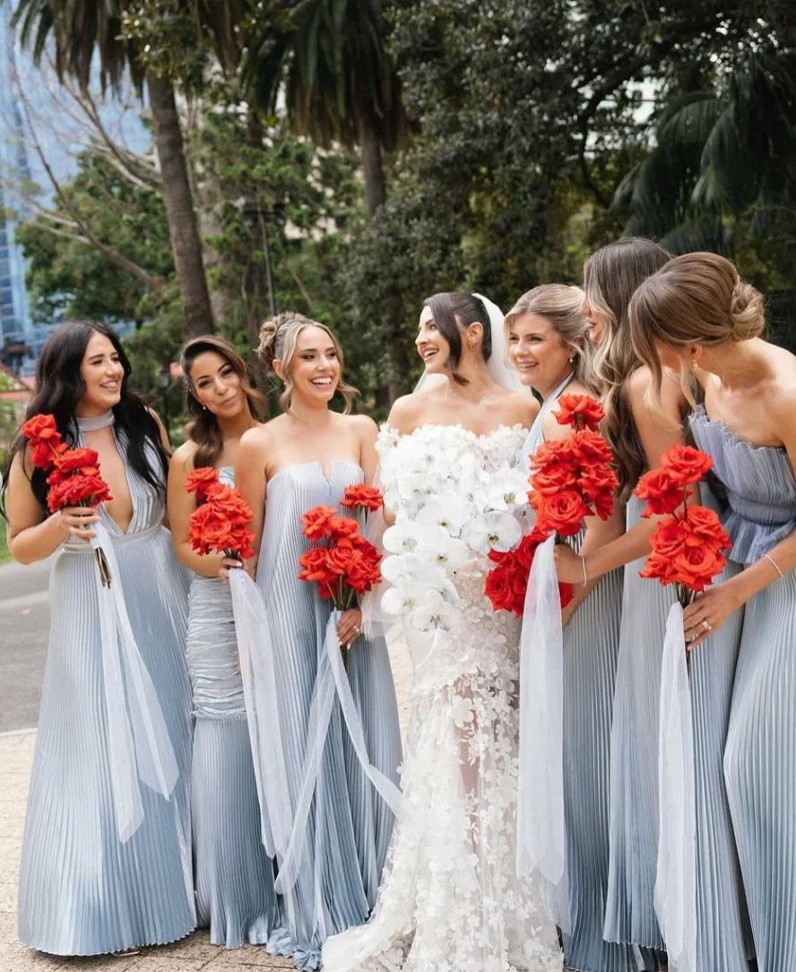
Pastel blue pleated gowns hold their own beside a white bridal dress, so the bouquets can do the loud part. Red roses are strong enough to carry the palette alone, and the soft blue keeps them from looking severe.
Pleated skirts move in outdoor air and photograph well in a park, which suits a ceremony without a built backdrop.
I would keep every bouquet the same red, with no blue flowers mixed in, so the dresses supply all the blue.
8. Blue Drapery Ceremony Backdrop
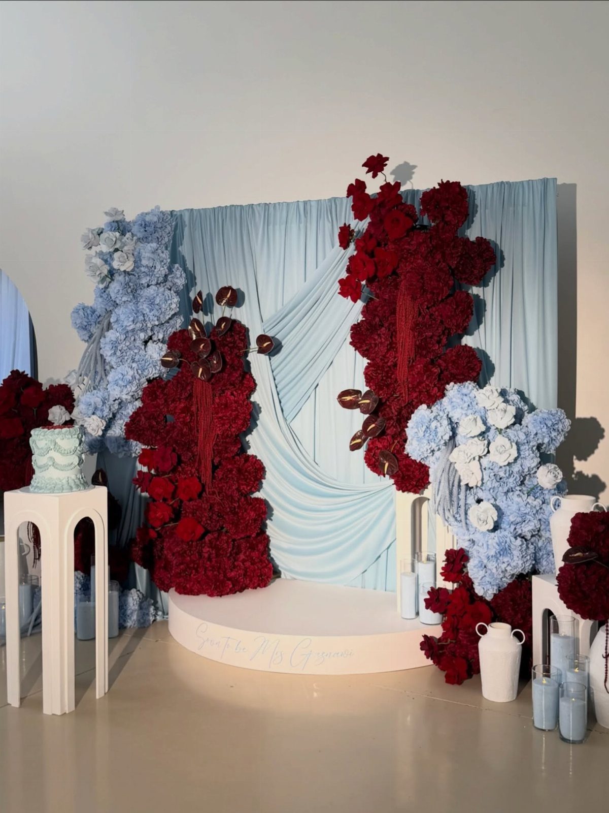
Light blue draping gives a ceremony a soft frame, and large red and blue floral installations tell guests the palette before anyone speaks. Keep the fabric pale so the flowers read as the focus.
Fabric and big arrangements add up fast, so I would spend on one big floral piece and let the drapery stay simple.
A cake or sign near the ceremony space can work too: a small blue cake on a white pedestal repeats the color without adding more red.
9. Red Velvet Curtain Backdrop
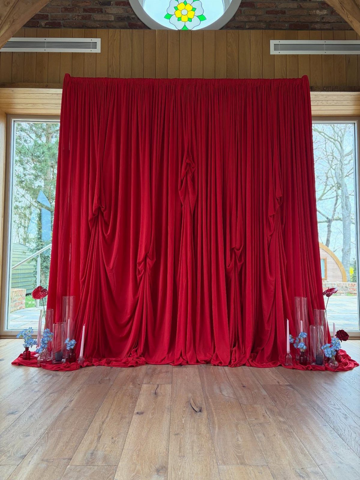
Red velvet is the richest red in this whole palette, and it works best when the blue arrives in small doses.
Floor arrangements of red and blue flowers with candles at the base soften the curtain, and they hold the eye low.
Against wooden floors and walls, the velvet already carries warmth, so I would choose blue flowers over more red ones for the arrangements. Let the candles supply the glow rather than adding extra decor around the curtain.
Frequently Asked Questions
What is a good color combination of blue and red?
Pair a deep or light blue with a burgundy or true red, and keep one of them in charge. Blue works best as the base on walls, linens and paper, with red as the accent in flowers, ribbon and type.
White or gold also helps, since a white card keeps red lettering readable and gold script suits navy better than white does.
What are the best color combinations for a wedding?
Blue and red is a classic that holds up across the whole day, from paper to flowers to cake. Keep red to the blooms, a seal or a ribbon and the pairing stays calm instead of loud.
What does the color blue mean at a wedding?
Blue stands for tranquility, loyalty and depth.
In practice it sets a calm, cool backdrop, whether in navy, light pastel or deep venue walls. That calm is why a small amount of red looks so strong beside it.





