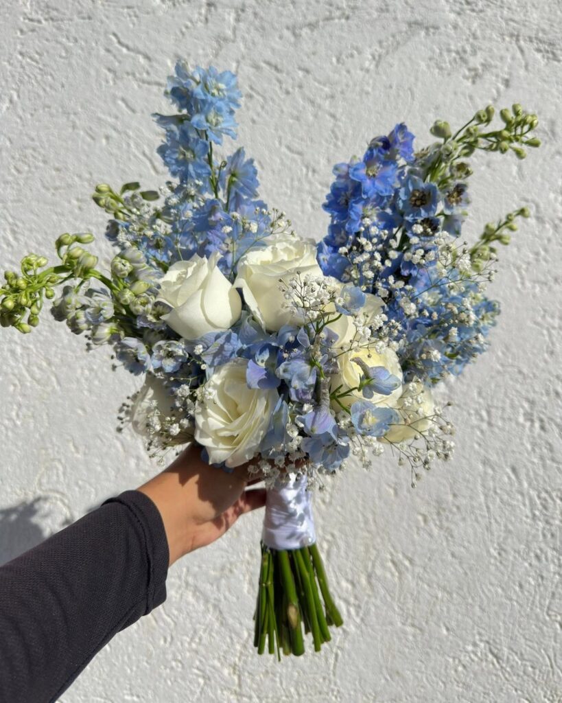
Blue runs from a pale ice or powder shade on a cake to a full royal blue scheme with tablescapes, an arch and invitations to match, so the shade you pick matters less than how much of the day you give it to.
On a tight budget, carry blue in one or two places, like napkins, candles or the bouquet, and keep everything else white or ivory.
Venue light is the other fact that decides it: midnight blue soaks up light after sunset, while ice blue and powder blue need very little help.
1. Dusty Blue
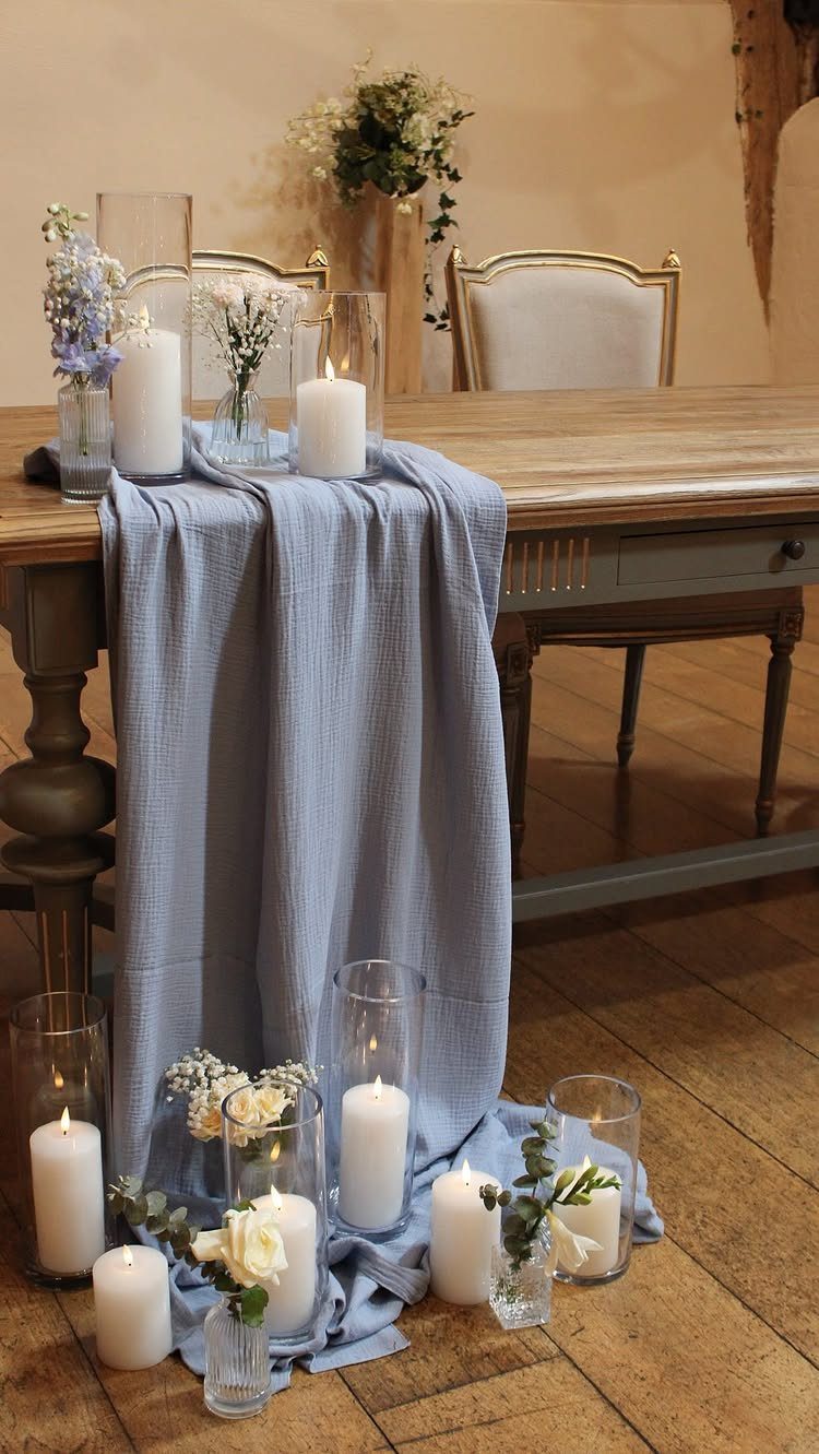
Dusty blue is blue with some gray stirred in, which is why it sits so calmly beside white candles and a wooden table.
A fabric runner is the cheapest way to bring it in, and it keeps the color low and quiet.
Nothing competes, so the soft color reads as intentional.
2. Blue Flowers
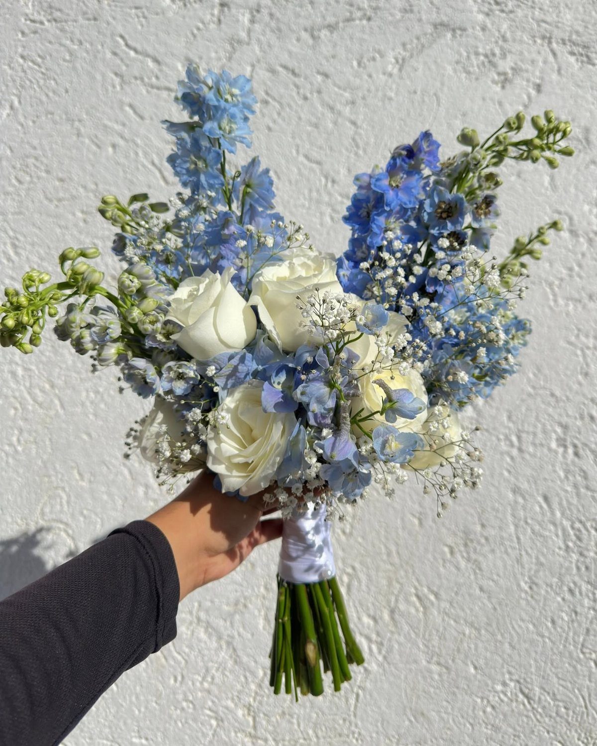
Delphiniums give a bouquet real blue, the kind most flowers only hint at. Pair them with white roses and baby’s breath, and the blue stands out without the arrangement feeling heavy.
Ask your florist about delphiniums early, since a true blue bloom is harder to source than most wedding flowers. Keep the supporting flowers white so the blue does the talking.
For a tight budget, carry blue only in the bouquet and let the tables stay simple.
3. Royal Blue
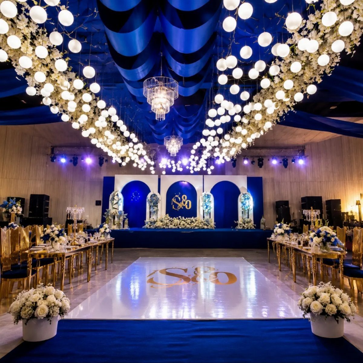
Royal blue is the saturated, jewel-toned end of the family, and gold is what turns it from bold to luxurious. Draping, chairs and even a dance floor decal can carry the pairing.
Pairing royal blue with soft neutrals like ivory or pale gold gives the eye somewhere to rest.
Draping and gold chairs add up fast, so pick one or two big surfaces for royal blue and keep the rest restrained.
4. Baby Blue and Ivory Palette
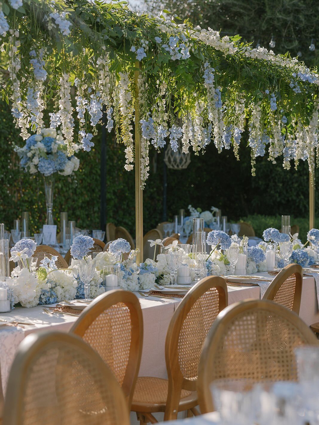
Baby blue with ivory is the gentlest pairing here, and it works because ivory brings warmth that softens the cool blue. Ivory linens keep the table from looking stark, which pure white can do next to pastel blue.
Choose ivory over white for linens, then let baby blue live in the flowers. A canopy of hanging blooms overhead repeats the palette without taking up table space.
5. Ice Blue
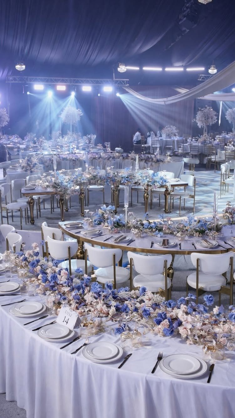
Ice blue is pale and cool, nearly a tint of silver, so it belongs with silver accents and white chairs. That combination suits a winter wedding, when a frosty look feels right.
Keep the blue in the flowers and let silver show up in small hits like holders and table numbers. I would skip warm tones entirely, since gold or blush will dull the chill you are after.
A dark tent with bright spotlights makes pale blooms glow, so lighting is worth a conversation with your venue.
6. Powder Blue
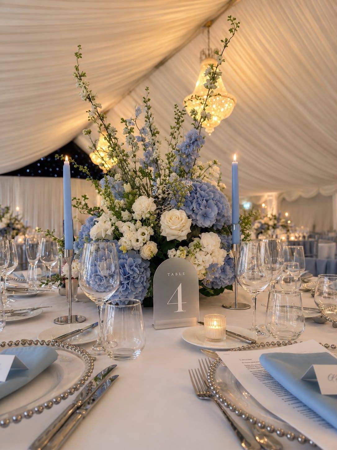
Powder blue does not need help. On its own or with white accents, powder blue reads soft and polished without needing much else.
Centerpieces in powder blue and white flowers, plus a few blue candles, carry the whole palette. I would resist adding a third color; the restraint is what makes it feel finished.
White draping and a chandelier will amplify the calm, but they are optional extras, not requirements.
7. Midnight Blue
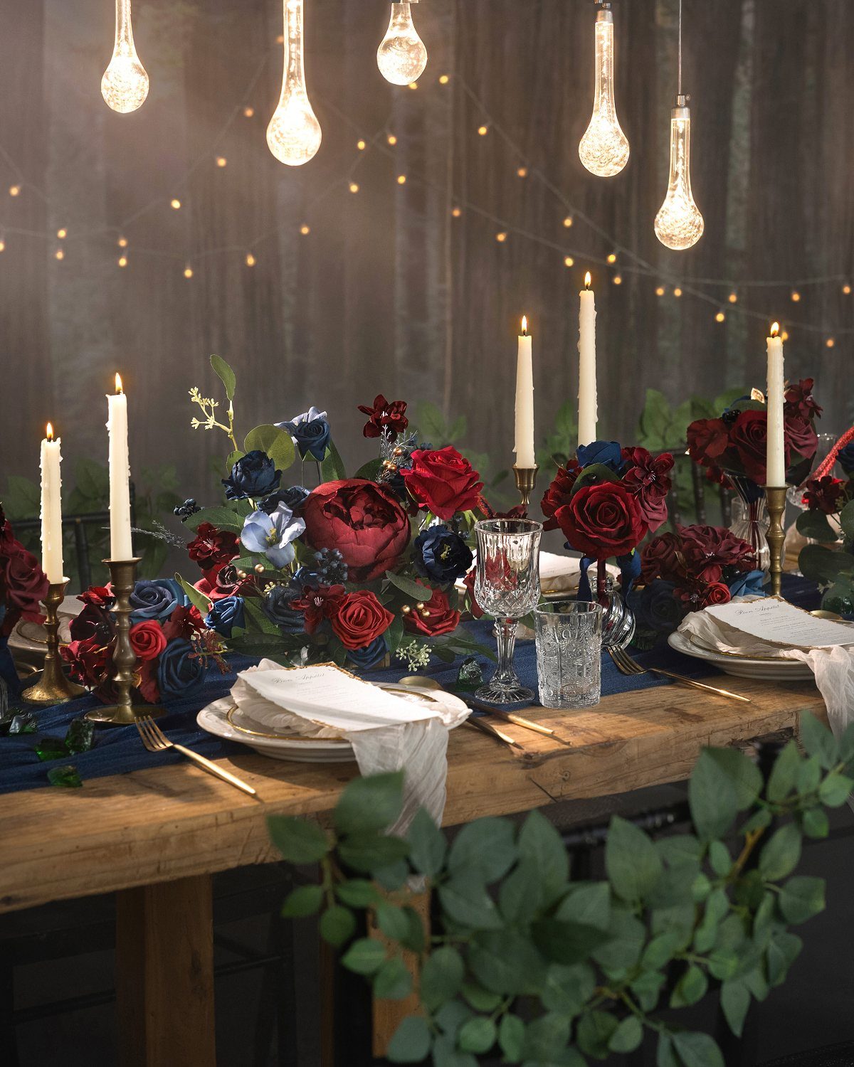
Midnight blue turns almost black by candlelight, which is exactly why burgundy beside it looks so rich.
Keep the white candles, since they hold the darker colors apart. Dark palettes soak up light, so ask your venue how much of it you will have after sunset.
8. Light Blue Bridesmaid Dresses
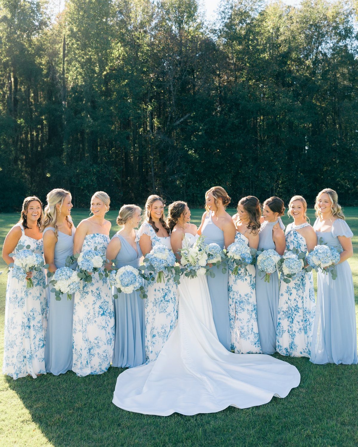
Light blue dresses let a bridal party read as a group without looking uniform. Mixing solid shades with a patterned one, as long as the blues stay close, gives each bridesmaid some room.
Hand everyone the same bouquet color and the palette holds together. I would pick one shade of blue for the solids and let a print add the variety, rather than letting every dress go its own way.
A white gown stands out clearly against pale blue, so the bride never gets lost in a big group.
9. Light Blue Suits
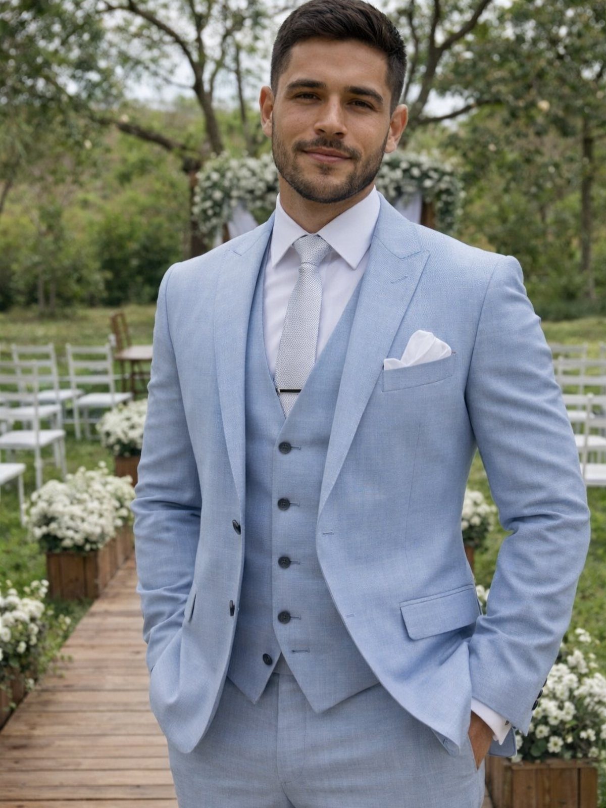
A light blue three-piece suit is a bolder choice than a gray one, and the tie lets you shift it from casual to formal. Outdoors, against white chairs and greenery, the color looks fresh rather than loud.
For groomsmen, match the suit shade across the group and vary only the tie or pocket square. Mismatched blues are the quickest way to make the group look accidental.
Suits for a whole party add up, so consider outfitting only the groom in the full three-piece.
10. Blue Wedding Invitations
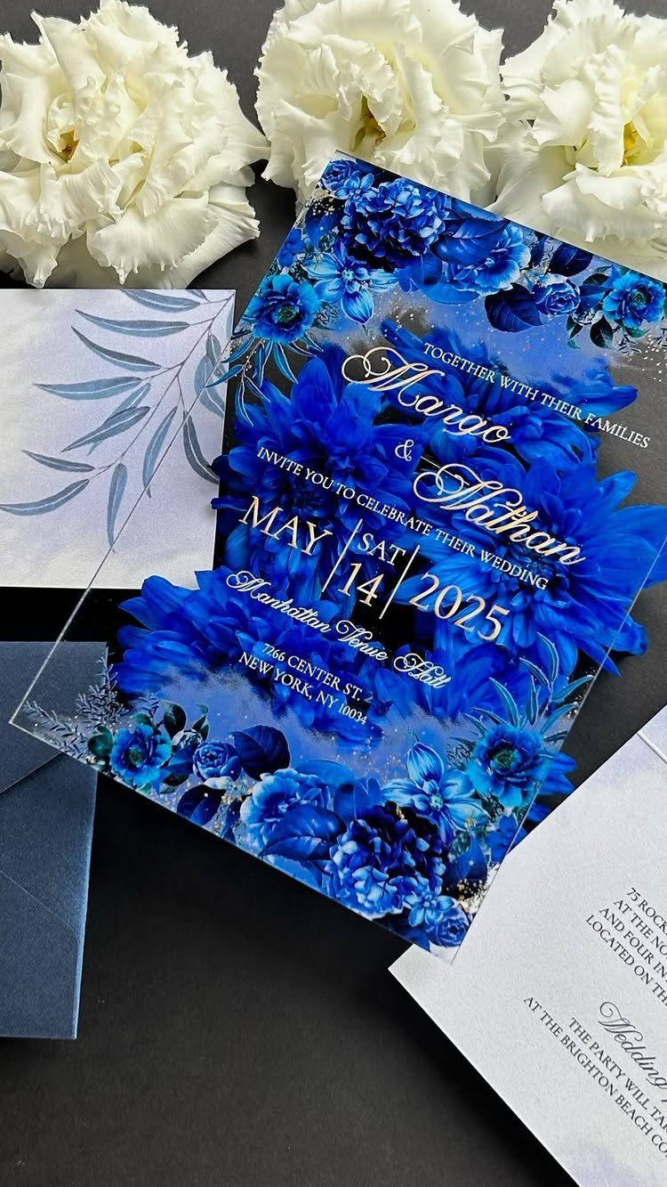
A blue invitation tells guests the palette before they arrive. Floral artwork on blue paper, with a matching envelope, makes the set feel complete and previews the flowers they will see.
Order the envelope in the same blue as the card so the suite looks planned. Put the date and venue in clear, high-contrast type, because a dark blue background can swallow small lettering.
Keep the extras to a minimum if the budget is tight; the card and envelope carry the color.
11. Blue Tablescapes
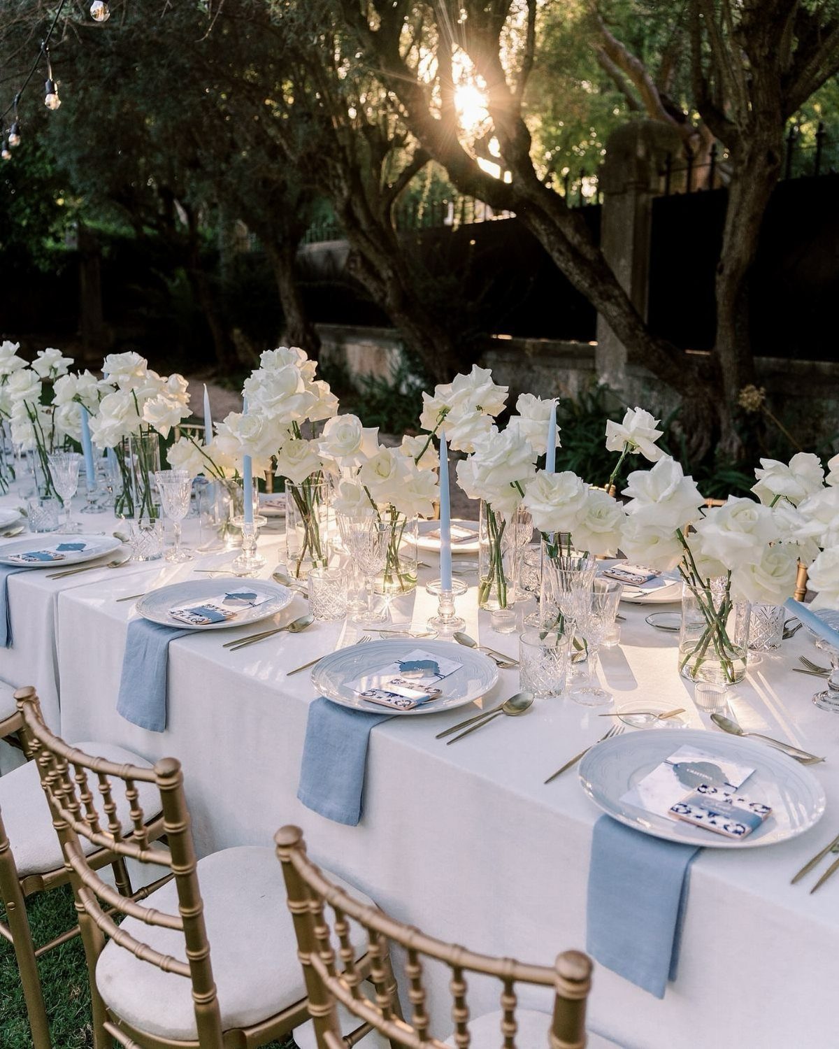
White linens give a blue table room to breathe, and light blue napkins are the easiest way to add the color. Blue candles repeat it at eye level, while white roses in vases keep the arrangement soft.
Napkins and candles cost far less than blue tablecloths for a long table. I would choose them for that reason alone, and let gold chairs supply the warmth.
Stop at 2 blue items per table, and the rest stays white.
12. Blue Wedding Arches
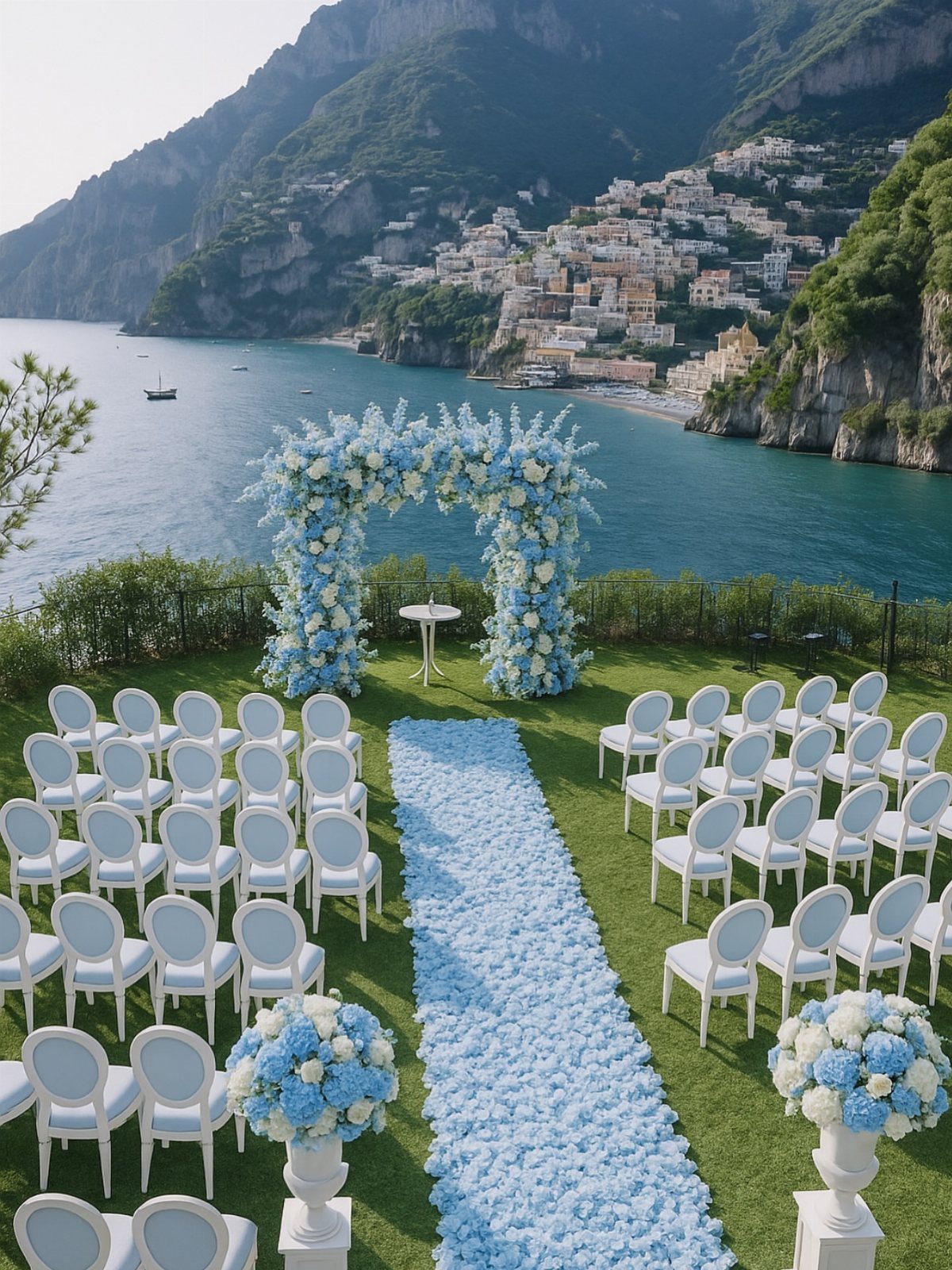
A light blue floral arch frames the vows in the pale color, and an aisle runner of petals extends it to the guests. On an open cliffside the soft blue stands out against sky and sea without competing with them.
Choose blue blooms in the arch and keep the white chairs plain. Petals on the aisle cost less than fresh floral arrangements along every row, so spend on the arch first.
Check with your florist how the arch will be anchored outdoors, since open ground means wind.
13. Light Blue Wedding Cake
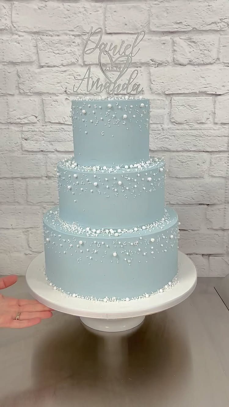
Pearls are what make a pale blue cake look finished: white ones set against the soft icing give a three-tier cake a bridal feel without any piped work.
A topper carrying your names and the date adds a personal touch, and it is the one detail you can order separately from the baker.
Ask your baker to match the icing to your invitations or napkins so the shade agrees across the day.
Three tiers cost more than two, so if the budget is tight, a smaller cake with the same pearls still reads the same.
Symbolism of Blue in Weddings
Blue carries a meaning guests already know. It stands for loyalty, trust and tranquility, so a blue palette says something about the marriage without a word of explanation.
"Something blue" is also an old good-luck tradition for the bride.
A blue ribbon on the bouquet, a blue garter or a small stitched label inside the dress costs almost nothing and gives the tradition a place to live, even if the rest of the day is mostly white.
If you want the symbolism to show, pick one spot where blue is easy to see.
Blue shifts under different light, so hold a swatch of your shade next to a real bloom and your bridesmaid fabric in both daylight and candlelight before you order anything.
Versatility of Blue
Blue works as a near-neutral, and that is why it fits a coastal wedding as easily as a formal one. Your second color decides which direction it goes.
Light blue pairs well with terra cotta, burgundy, chocolate brown, mauve, sage green, teal, gold or silver. Deep, saturated partners make pale blue look even softer, so I lean toward those when a palette feels too sweet.
Steel blue has gray undertones and behaves like a true neutral. Soft sage or eucalyptus with ivory keeps blue quiet and polished, and those greens cost little in a bouquet or table garland.
Before you commit, lay fabric swatches next to your flowers in daylight. A combination that looks fine online can shift a lot in real light.
Mood Setting with Blue
Shade sets the mood before anything else does.
Pale blue feels calm and open, like a clear sky. Brighter blues feel fresh, and deep, rich blues read regal.
Light blue works indoors and out, from a beach wedding at dusk to a ballroom. That flexibility means you can choose the shade for the feeling you want and not worry about the venue ruling it out.
A single neutral, like warm cream or soft gray, gives blue space so it reads as a choice rather than a flood of color.
If the mood you want is calm, I would keep the neutral quiet. If you want drama, let the blue go deeper and keep everything around it simple.
Frequently Asked Questions
What are shades of blue?
For weddings, the shades I’d look at are dusty blue, powder blue, baby blue, ice blue, light blue, steel blue, royal blue and midnight blue.
Pale ones like baby, powder and ice feel soft and calm, while royal and midnight go bold and dramatic. Gray undertones give steel blue a quiet, neutral feel, so it sits comfortably beside almost anything else in the palette.
What color palette is blue?
Blue pairs with a long list of partners, and your second color decides the direction. Next to a deep, saturated color, a pale blue reads softer; white or ivory keeps the whole scheme crisp.





