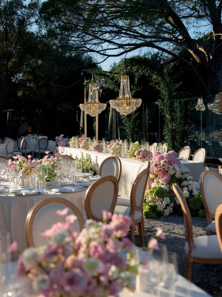
Green and pink can run from a sage and coral invitation suite to a staircase wound with greenery and pink florals, and the cost follows where the color lands: runners, sashes, and linens are cheap, while tall florals and emerald jewelry are not.
Pick by what your budget can actually fill, a single table, the staircase, or the whole banquet room, then choose the pairing that suits it, from sage and dusty rose to a dark green runner with pink roses.
Dusty rose and sage read grayed and quiet, coral and emerald read warmer, and the ideas below cover both.
1. Sage Green and Dusty Rose
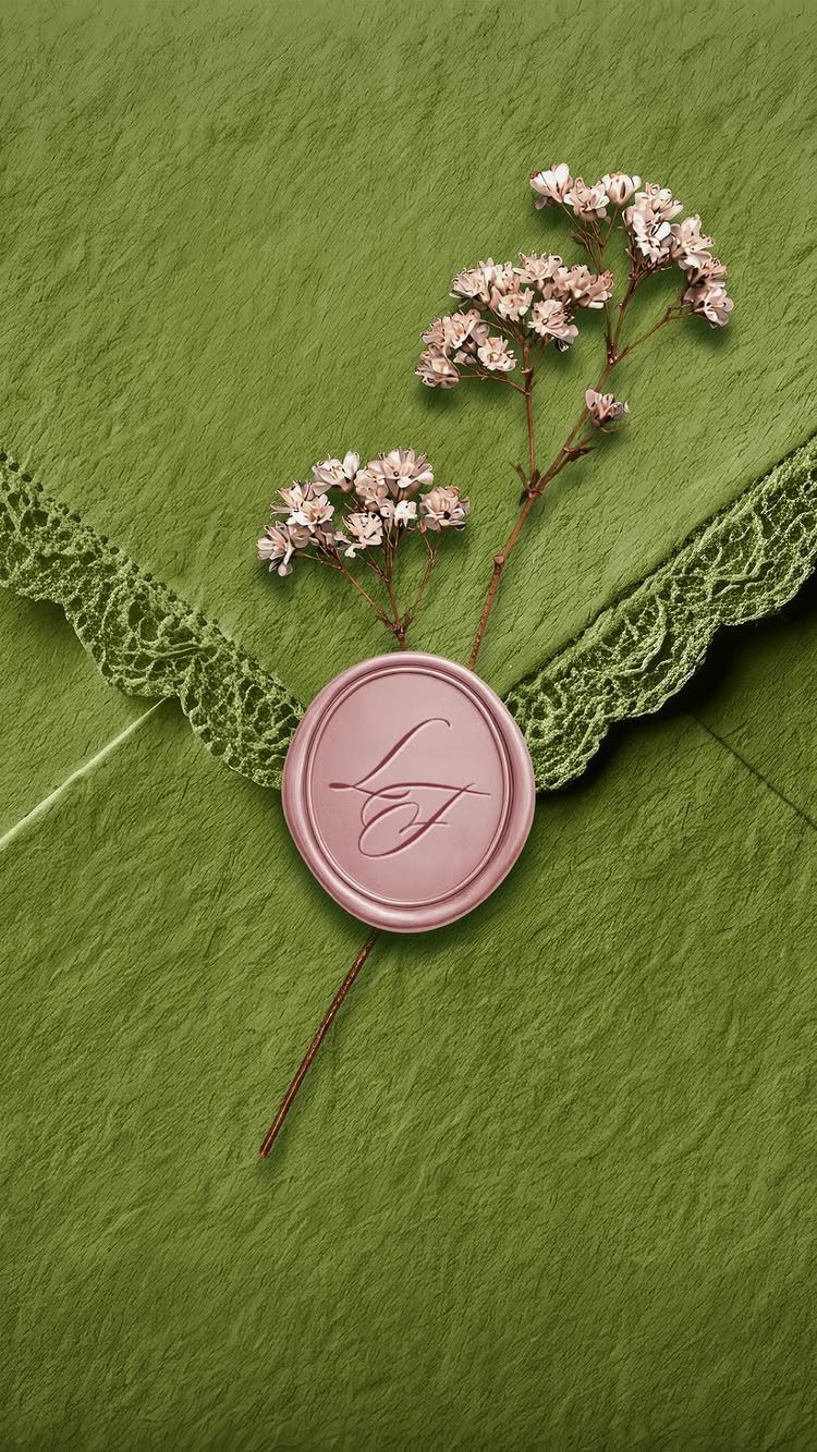
Dusty rose against sage works because both colors are grayed down, so neither one shouts. A wax seal in rose on a textured sage envelope is a small way to carry the pairing before anyone reaches the venue.
Lace trim adds softness, and dried pink flowers tucked under the seal tie the paper to the bouquet.
If the budget is tight, a wax seal and a single sprig of greenery on each envelope do most of the work for a few cents apiece.
2. Sage Green and Coral Invitation Design
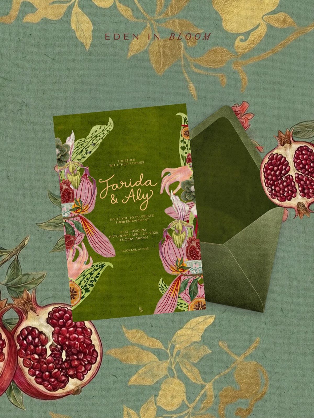
Coral sits warmer than most pinks, and on a deep green card it reads as fruit and blooms rather than sweetness. Illustrated pomegranates and florals give the invitation a story, and the names and wedding title can carry that theme.
A matching green envelope keeps the color going until the card slides out, and it costs little more than white if you order it with the suite.
Pick a palette first, then hand your designer the exact coral and green so the print stays true.
3. Sage Green and Dusty Blue
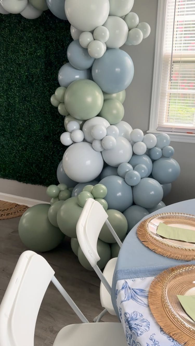
Blue and sage share a gray undertone, which is why they sit so calmly together. A balloon arch in both shades against a hedge gives a photo backdrop without needing a single flower.
Gold chargers on a blue tablecloth add a warm edge that keeps the palette from going flat. Balloons cost far less than a floral arch, so this is a sound choice when the decor budget is small.
4. Sage Green and Pink
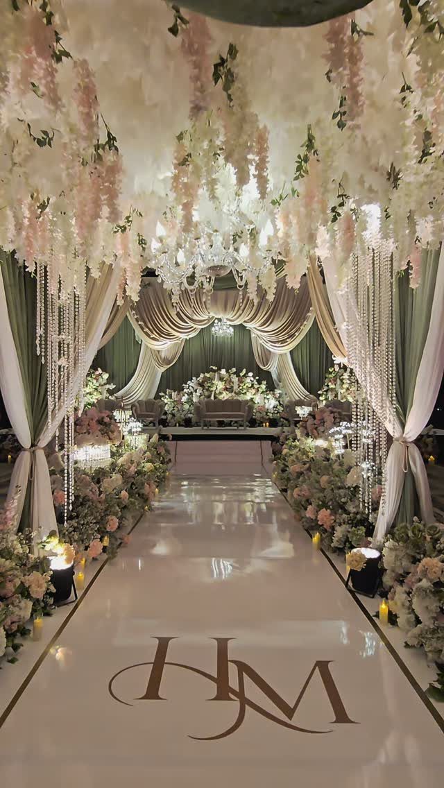
Pale pink and sage is the pairing I would trust first. Sage drapes along the aisle give a soft backdrop, and pink and white flowers hung overhead and lined along the walkway fill the room without crowding it.
Keep the flowers pale, because deeper pinks would fight the muted green.
5. Sage Green, Pink, Ivory, and Gold
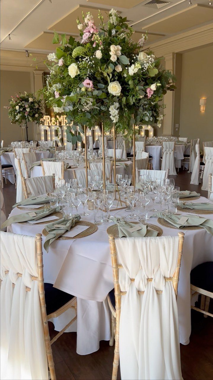
Gold stands lift a centerpiece off the table, so a large arrangement of pink, white, and green flowers gets height without hiding guests’ faces. Sage napkins on a white cloth keep the base quiet.
Ivory and white do the real balancing here, giving the pink and green room to breathe. Use gold sparingly: stands and lettering are plenty, and more would crowd the florals.
6. Sage Green and Gold
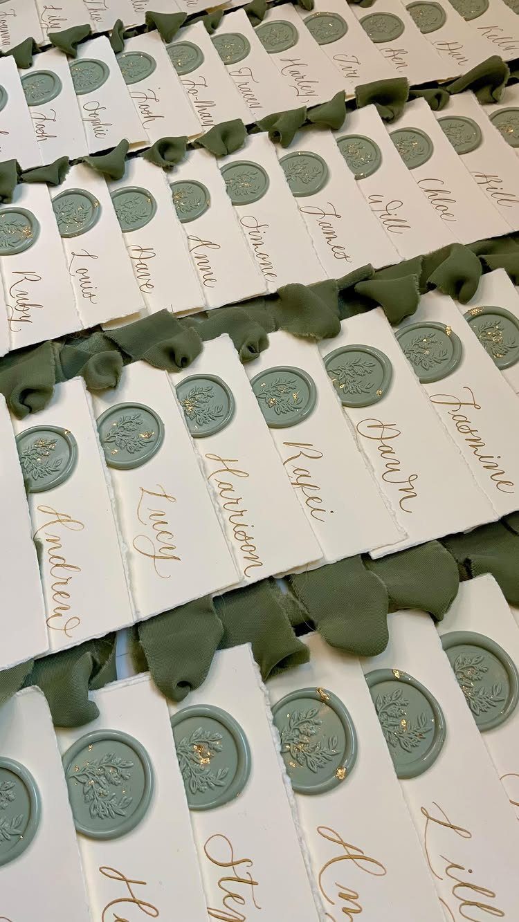
Laying the cards on sage fabric makes the display feel deliberate.
This is the least expensive way to bring in the palette: place cards cost little, and the colors read clearly even on a plain table. Choose a seal shade close to your napkins so the two match.
7. Sage Green and Lavender
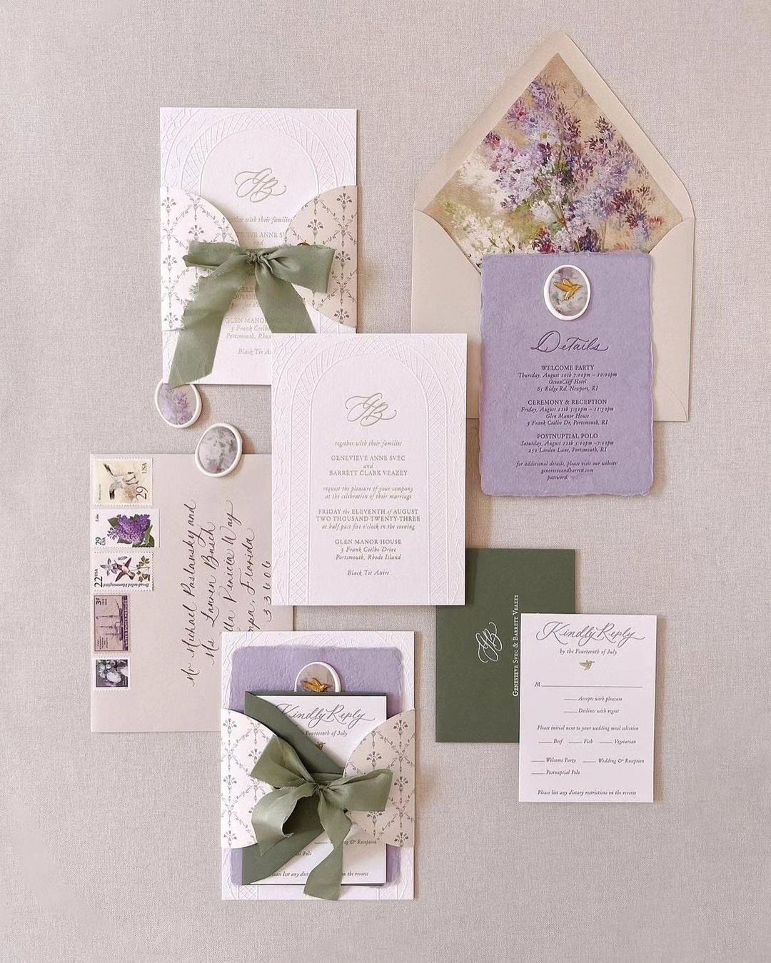
Lavender leans cool and sage leans gray, so together they read soft and a little old-fashioned in the best way.
To carry sage and lavender across your stationery, tie sage ribbon around lavender envelopes, or flip it with lavender ribbon on sage envelopes, so the invitation suite reads as one palette before guests reach the venue.
Keep the paper white or neutral so the 2 colors stay the focus. Pick ribbon and envelope shades from the same printed swatch, because lavender shifts toward pink or blue quickly under different light.
8. Pink Tablecloth with Green Foliage
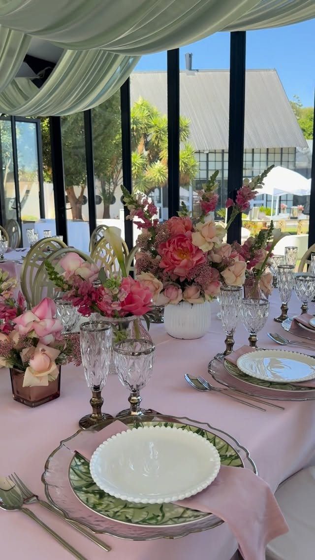
A soft pink tablecloth turns the whole table into the color, which lets the greenery work as an accent instead of a second base. Pink and peach flowers with green foliage tucked around them look natural against it.
Patterned plates add interest without another flower, so they are a good place to spend if the centerpieces stay small.
Keep the foliage loose and trailing rather than clipped, and let the plates carry the pattern while the cloth stays plain.
9. Pink Satin and Green Velvet
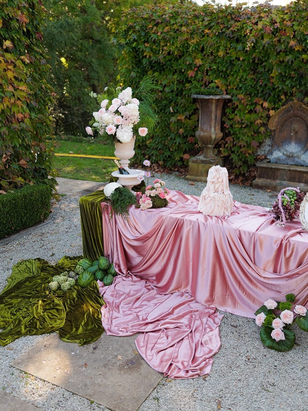
Satin catches light and velvet absorbs it, and that contrast is what makes this dessert table work. Pink satin as the cloth and emerald velvet draped over it give a white cake a rich frame.
Fabric is a cheaper way to dress one table than flowers across the room.
I would put the velvet in just one or two folds so it reads as an accent, then add pink arrangements beside the cake, not around it.
10. Staircase Greenery and Pink Florals
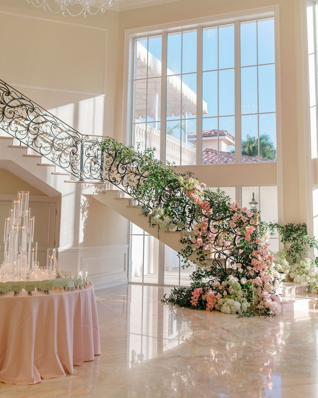
A staircase banister is decor you already own, so greenery wound along the rail covers a lot of space, but the pink florals tucked into it add real cost, and the full look is not a cheap one.
Pink and white blooms tucked in at intervals break up the green.
Start with the foliage as a continuous line, then place the flowers in clusters rather than evenly. A pink-draped table at the base, with tall candles, ties the stairs to the rest of the room.
11. Green Glassware and Pink Florals
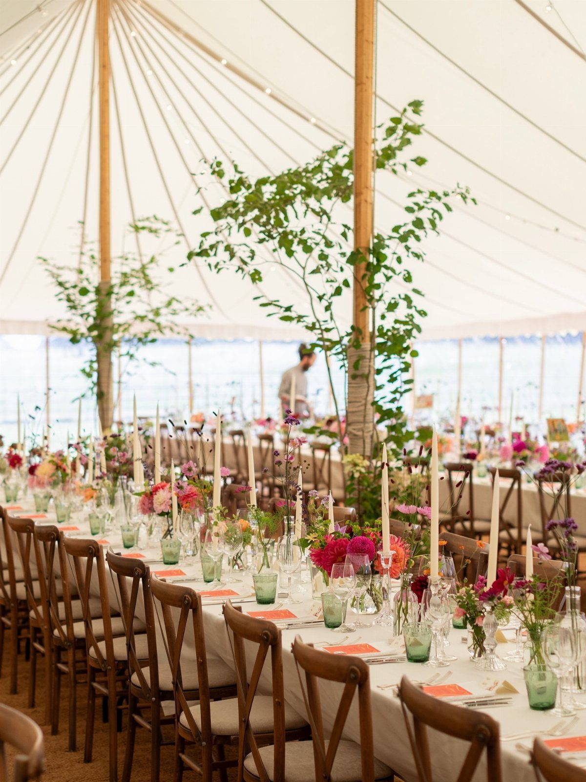
Light green glassware on white linens lets the flowers stay the star. Soft pink and red arrangements get a cool green partner that never competes with them.
Glasses are the easiest way to add the green here, since guests see them at every place setting. Keep the tablecloth plain white, and I would hold the red to a few stems so the pink still leads.
12. Pink Runner and Green Sashes
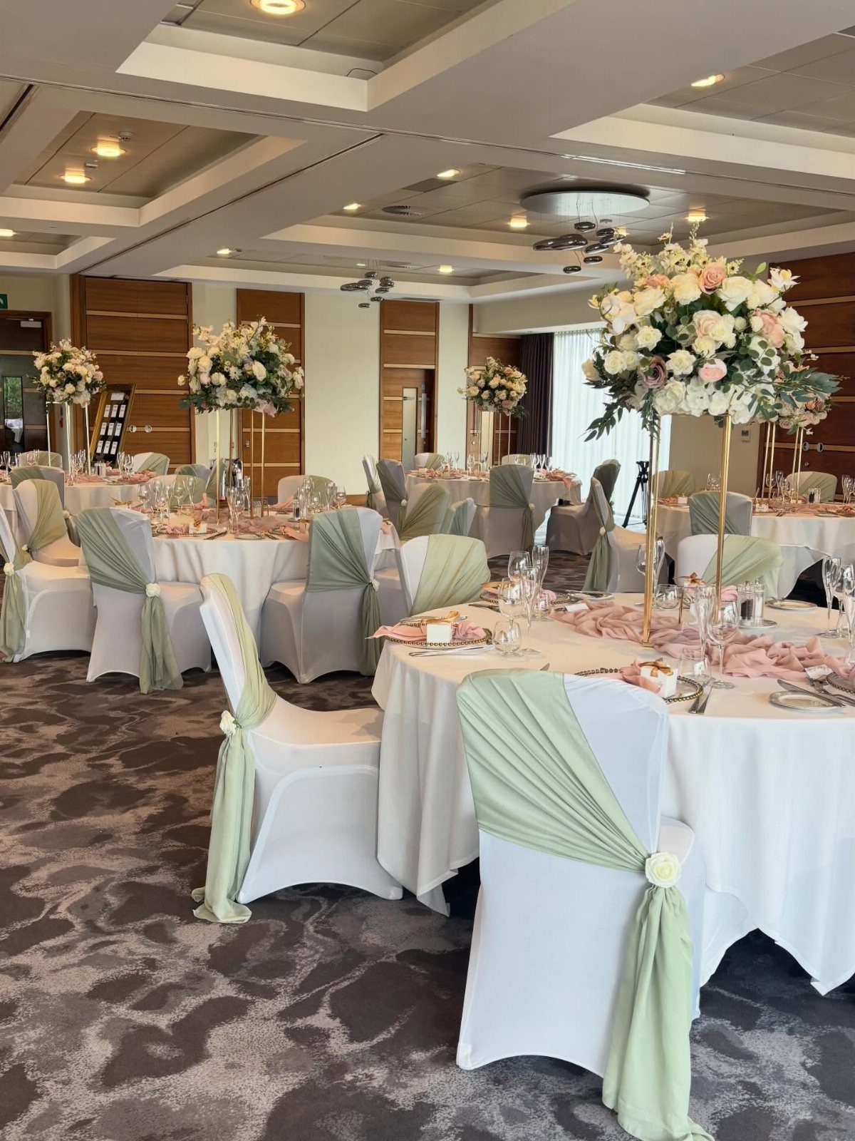
Pale green sashes on white chairs repeat the palette at a different height from the table, so the color surrounds guests instead of sitting in one spot. Light pink runners down white cloths keep the tables calm under tall florals.
Chair sashes cost far less than extra arrangements, which makes this a practical way to fill a banquet room. Match the sash green to the foliage in your centerpieces so the two read as one plan.
13. Pink and White Rose Bouquet
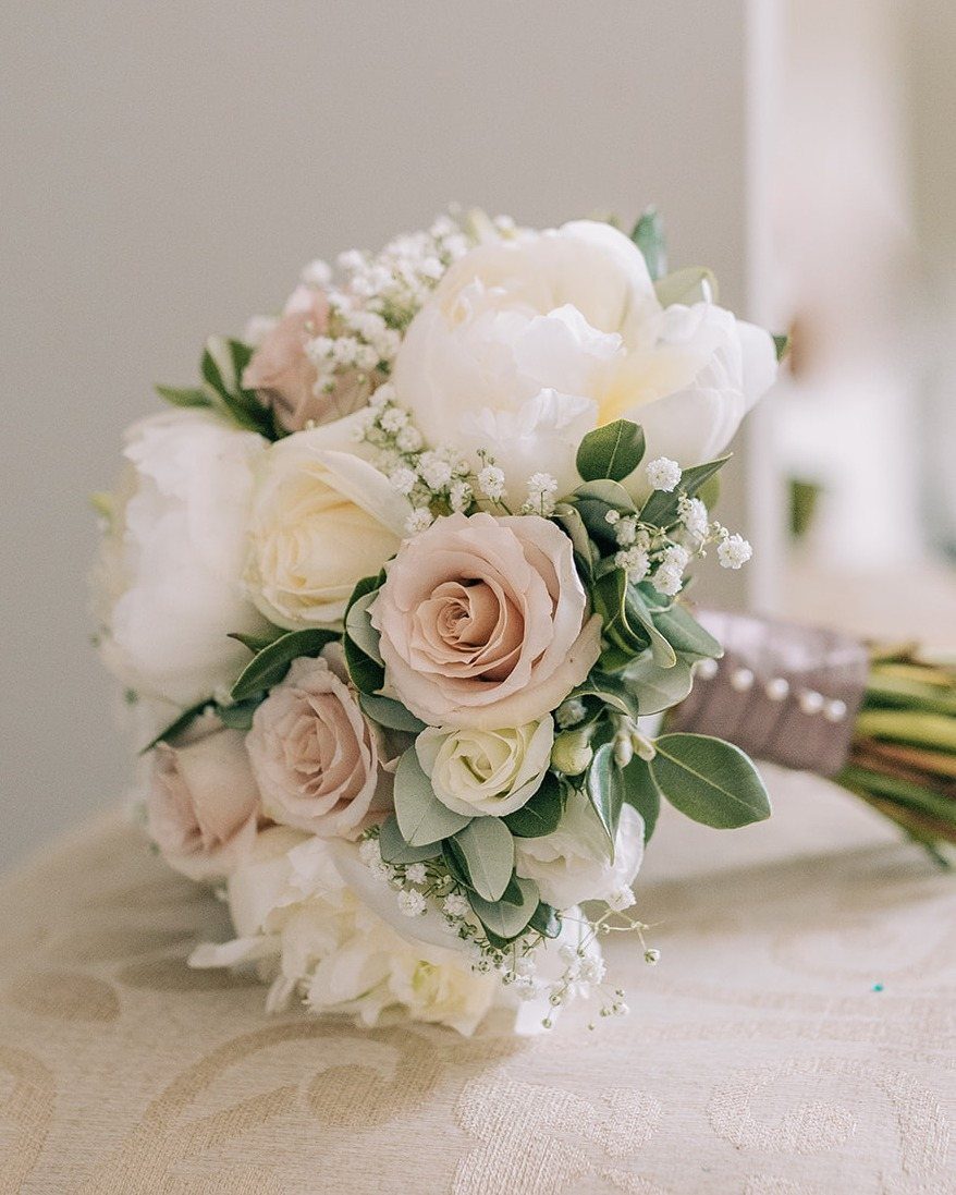
Pale pink roses beside white ones, with baby’s breath and green leaves, give a bouquet that stays soft and never fussy. Tying it with a ribbon in a matching soft tone finishes the stems without adding another color.
Roses are the one flower I would build around here, since the baby’s breath and foliage fill the gaps around them. Keep the pinks close in shade so the bouquet reads as one idea.
14. Pink and Green Floral Runner
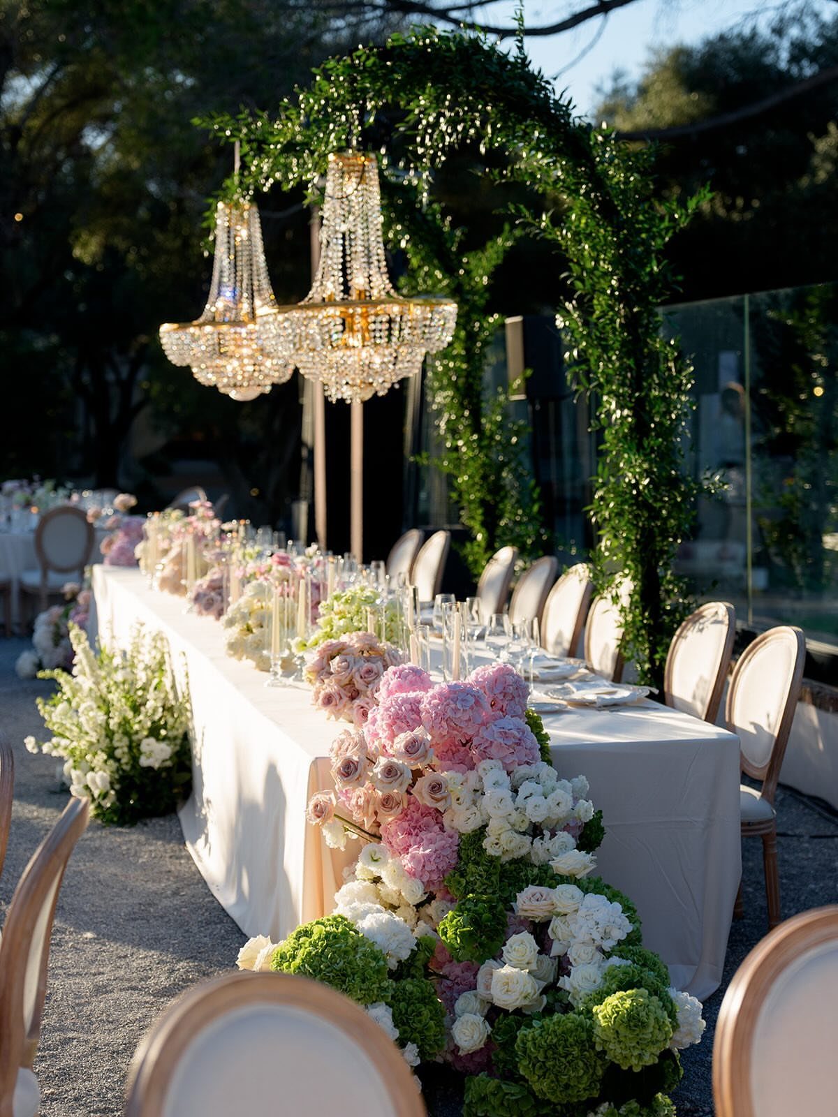
A long runner of pink and white flowers woven through deep green foliage gives one table a single, continuous line of color.
Because the greenery does the filling, you can keep the blooms to a few clusters spaced along the length.
Under a chandelier or an arch, keep the runner low enough that guests sitting opposite one another can still make eye contact. I would let the foliage trail over the edges and save the pink for the center third.
15. Green and White Gingham Tablescape
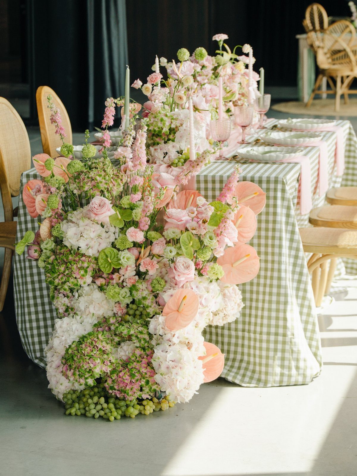
Gingham is a pattern doing the work of a centerpiece, so a green-and-white cloth lets pink florals sit on top like a bouquet on a picnic blanket. Pink runners over the check tie the cloth to the flowers.
Cascading arrangements need the cloth to stay quiet around them, so I would skip patterned napkins or plates here. Choose a small check; a large one competes with the blooms.
16. Olive Green Linens with Pink Accents
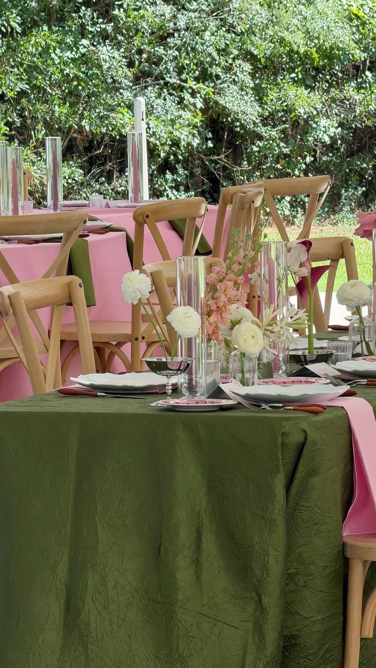
Olive is the green that makes pink look warm. A textured olive cloth with pink napkins and pink centerpieces keeps the palette to 2 colors, and outdoors the olive blends with the foliage behind the table.
Napkins are the cheapest place to add pink, since they cost far less than extra flowers. Pick a texture, like linen or a slubbed weave, over a shiny finish so the olive stays earthy.
17. Dark Green Runner with Pink Roses
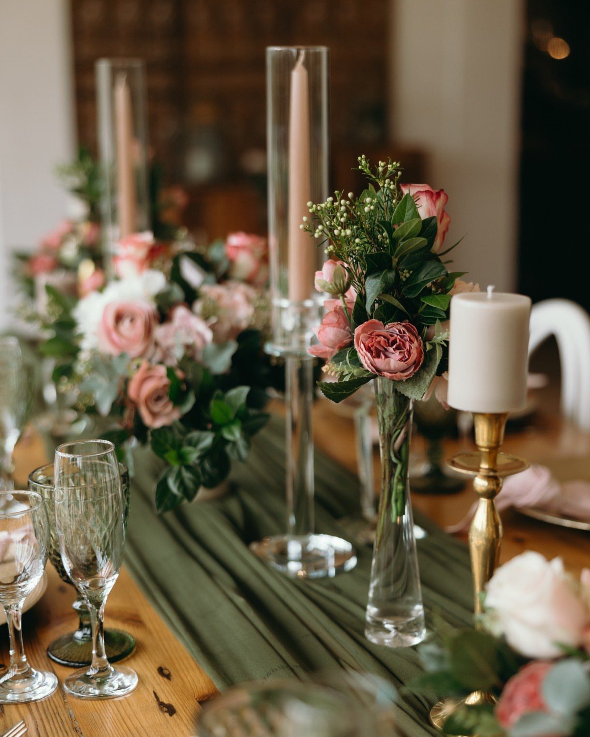
Dark green fabric on bare wood gives a table depth before a single flower goes down. Pink and white roses read brighter against it, and tall tapers in glass holders add height beside the arrangements.
Leaving the wood exposed on both sides of the runner saves on linens. I would keep the roses low and let the candles be the tall element, so guests can still see whoever’s sitting across from them.
18. Pink Bridal Veil with Emerald Jewelry
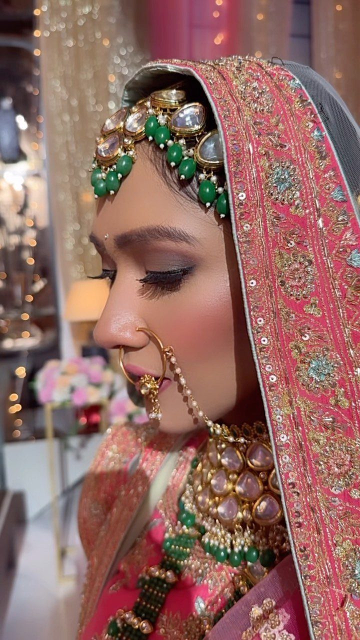
An embroidered pink veil paired with gold jewelry set with green stones puts the palette on the bride herself. The jewelry carries the green, so the veil can stay the only pink.
Choose one statement piece, such as a necklace or earrings, rather than several, so the embroidery still shows. Borrowing or renting jewelry costs less than buying, and a green that matches your table foliage ties it all together.
19. Pink and Green Illustrated Invitations
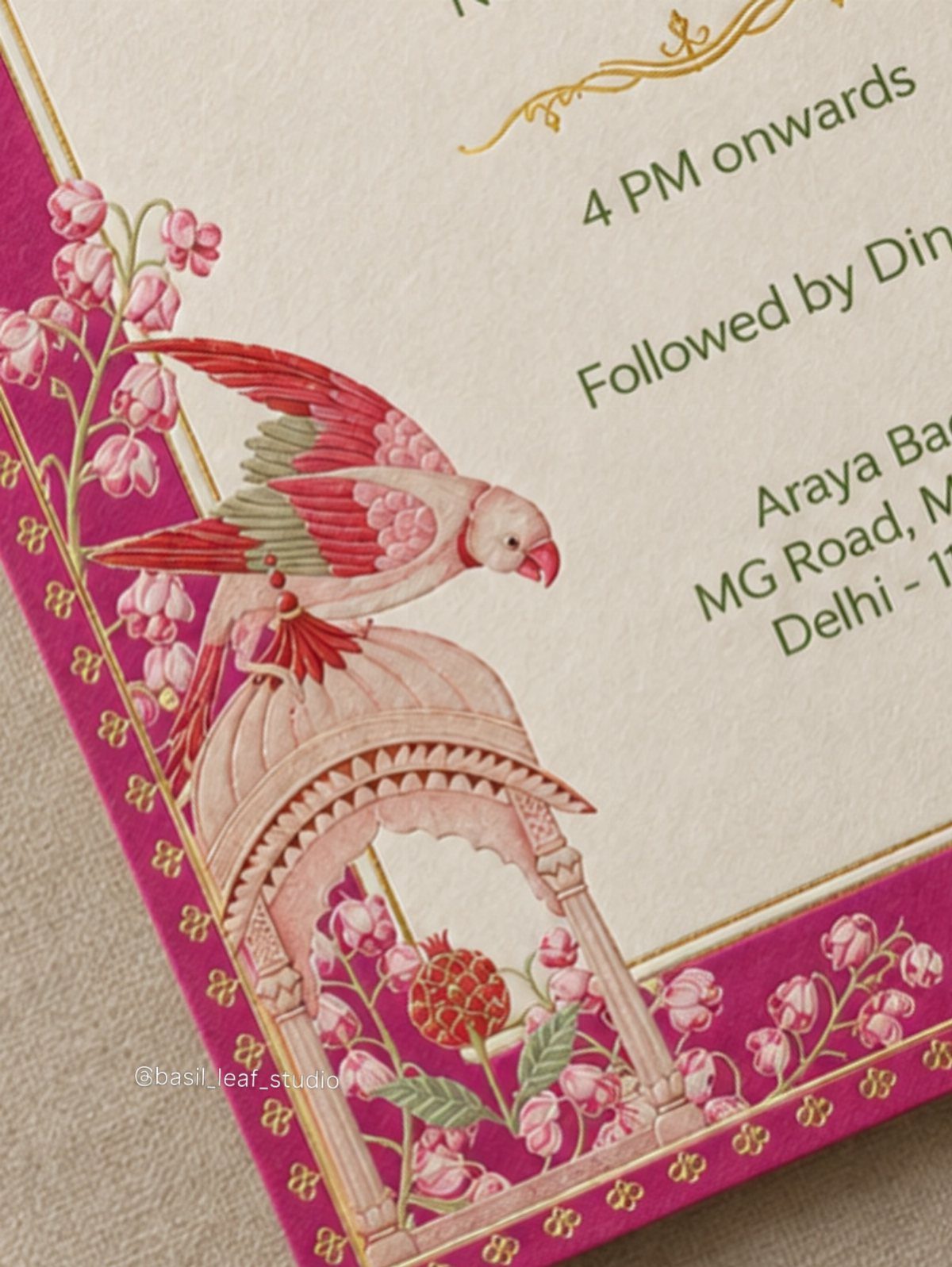
Magenta borders around a cream card do the heavy lifting here: the cream keeps the page calm, and the border frames the pink florals and green leaves like a picture mat.
A small bird among the flowers gives the illustration a focal point, so the card feels drawn for you rather than picked from a template.
Ask your designer to keep the border color and the pink in the florals as the same magenta, and to match the leaf green to your table foliage.
I would hold the illustration to one bird and let the wording stay plain, so the details a guest needs, like the time, are easy to find.
Frequently Asked Questions
Which color is the best match with pink?
For pink, my first pick is sage, and the pairing works best when the pink is a pale blush.
Both colors are muted, so neither one shouts. Saturated pinks clash with a muted, grayed green, so I would keep the blooms soft.
What color flowers go with sage green?
Pink and white flowers are the safest choice, and lavender works too.
A bouquet of blush roses, white roses, baby’s breath and leafy greenery looks gentle and unfussy. Stay within one or two shades of pink; a tight range makes the whole bouquet read as a single piece.
What are some cute wedding colors?
Sage green with pink is a soft, easy pairing, and dusty rose, dusty blue, lavender and gold all sit well with sage.
Ivory and gold added to pink and green give the palette some breathing room. Gold works best in small doses like cake stands, table numbers and calligraphy, so the flowers stay the focus.





