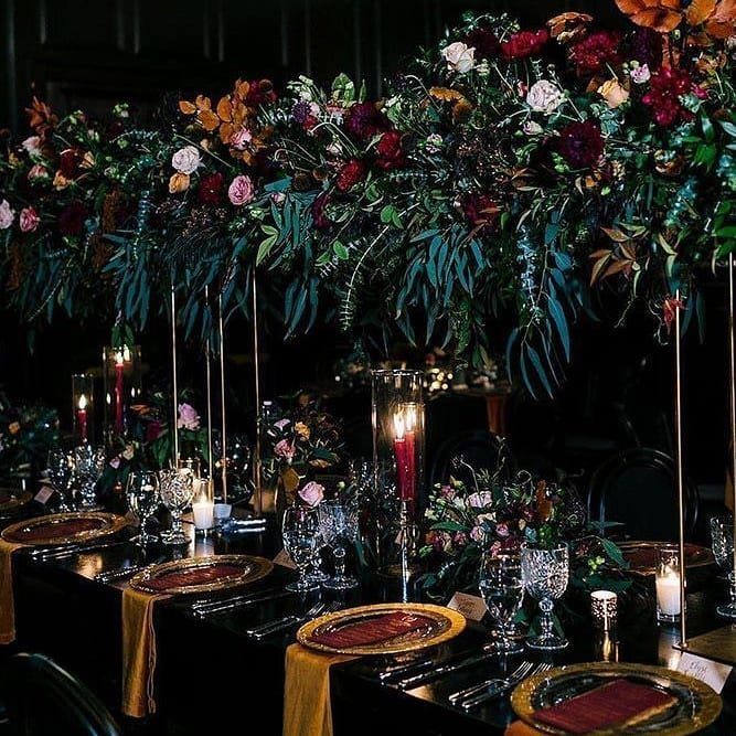
The range runs from a single emerald bow tie to a full lounge of velvet and beaded curtains, so both effort and budget scale with how far you take it.
Whatever you pick, one hero color, one neutral and one repeated metallic keep the rest from looking random.
1. Floral Arrangements
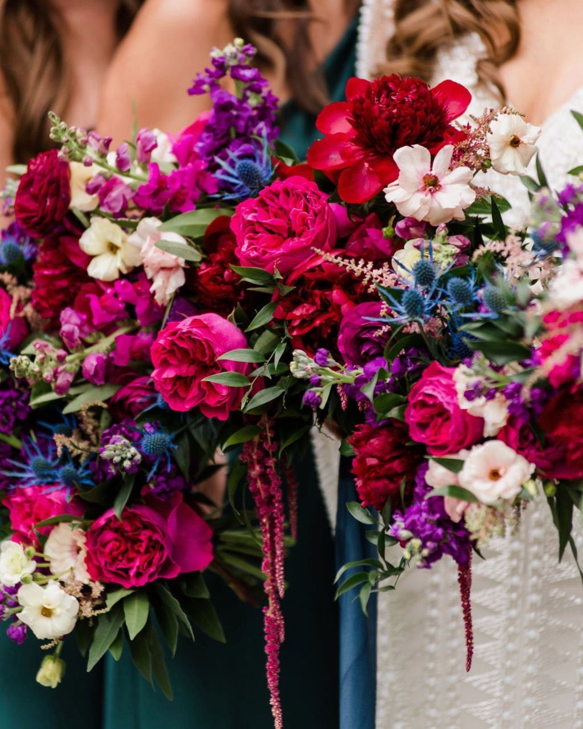
Magenta roses and blue thistles make a good pair because the thistle’s spiky texture keeps deep pink from going sweet.
Ask your florist for flowers in saturated reds, magentas and purples, then add one cool blue accent so the palette reads as jewels rather than a generic pink mix.
I would repeat the same blooms in the bouquets and the ceremony arrangements. That repetition makes the color feel planned, and it keeps you from paying for a different recipe at every spot.
“With a jewel-tone color palette, your floral options are endless: from soft purple lilac to luxurious deep red garden roses, you’re bound to create an intriguing arrangement,” suggests Liza Roeser Atwood of FiftyFlowers.com.
2. Wedding Invitations
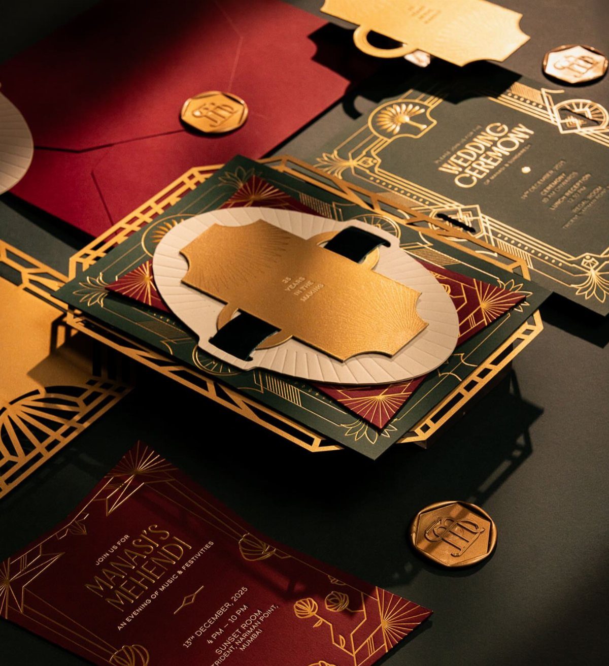
Emerald green and burgundy paper with gold foil gives guests their first look at the palette before they ever arrive. Foil reads best against a dark background, so keep the wording short and give the metal most of the work.
Foil costs more than flat ink, so I would save it for the main invitation and print the enclosure cards plainly in one jewel color.
If you have several events, matching the set across all of them makes it feel like one collection.
3. Wedding Cake
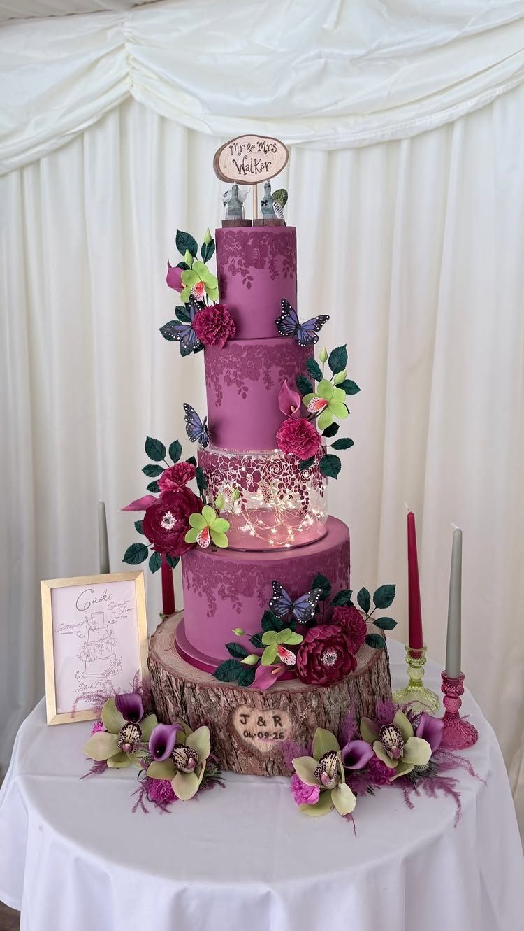
A magenta cake with sugar flowers and butterflies carries the whole palette in a single dessert. Tell your baker the exact shade you want and bring a fabric swatch or paint chip, because pink-purples drift easily when mixed into frosting.
Decoration adds cost, so I would put the flowers and butterflies on the tiers people see most and keep the rest smooth. A wooden base warms up the saturated color nicely.
4. Bridesmaid Dresses
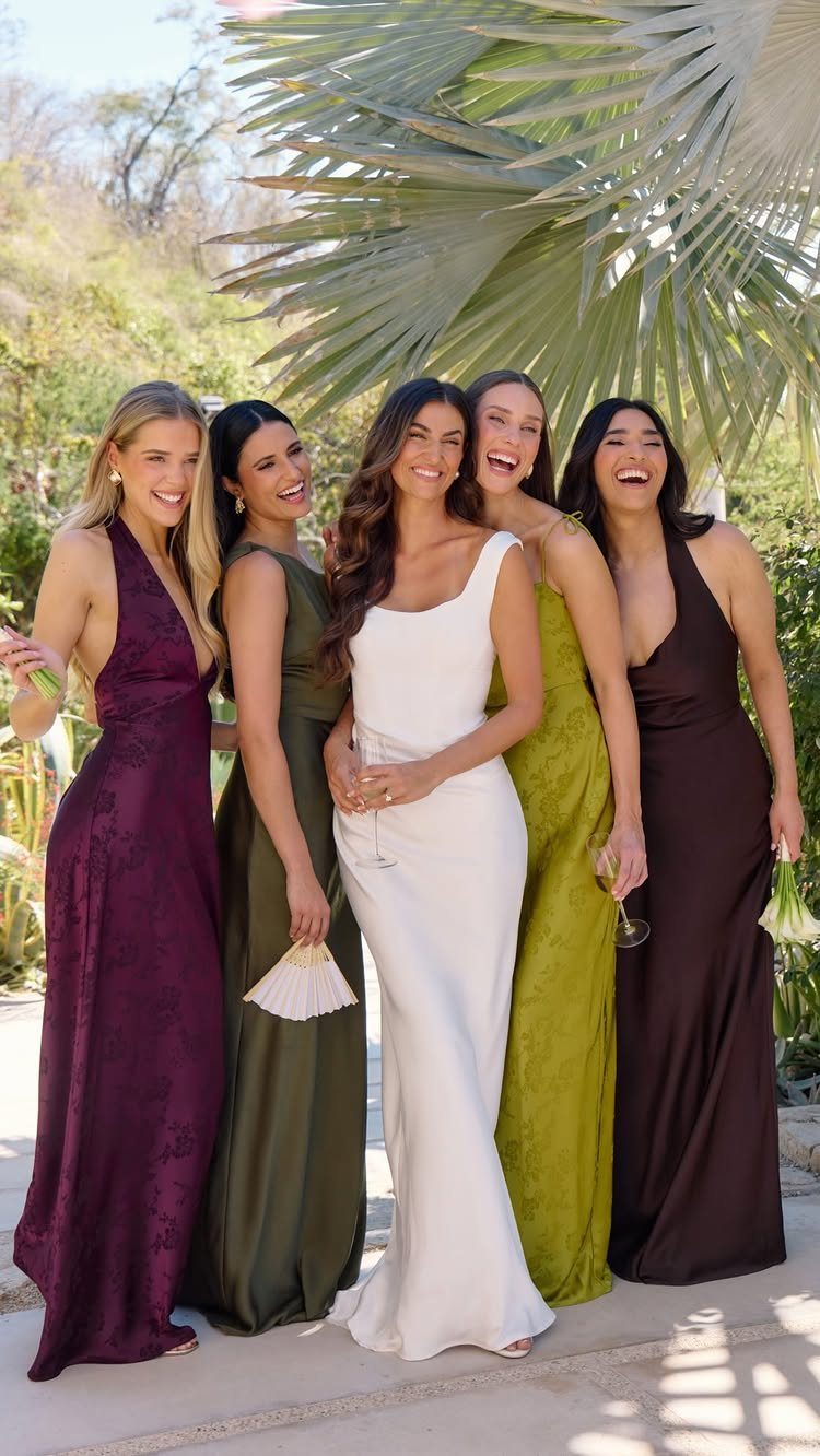
Mixing shades in one wedding party, such as plum, olive and chocolate brown, looks richer than matching dresses.
Choose colors from the same depth so none of them looks pastel next to the others, and keep the silhouette long and formal so the set feels cohesive.
Let each bridesmaid pick her own shade from a short approved list. Letting each person pick her own shade from a set palette saves arguments, and white stands out clearly against so much deep color.
5. Table Settings
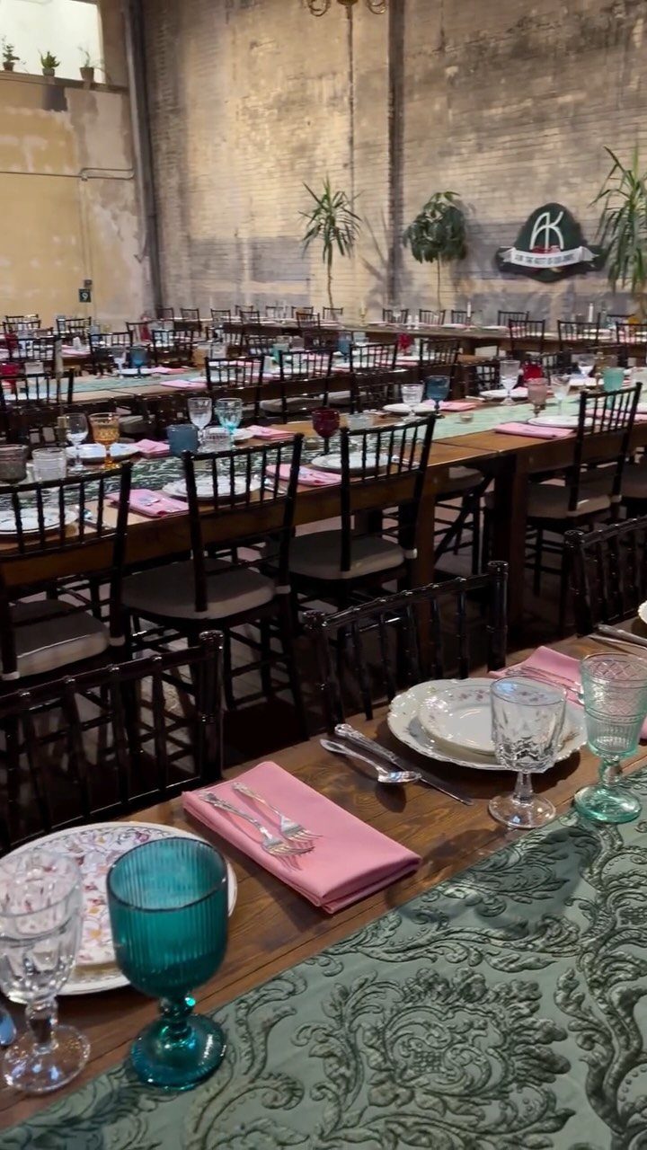
Teal glassware does a lot of work for little money, since a few colored glasses at each setting add jewel color without needing a single centerpiece.
Pair it with green runners and pink napkins to bring in a second and third jewel shade.
Napkins are the cheapest layer to change, so I would test one at a sample table before ordering for everyone. Wood tables suit this palette because the warm tone steadies the bright colors.
6. Jewel-toned Bow Tie
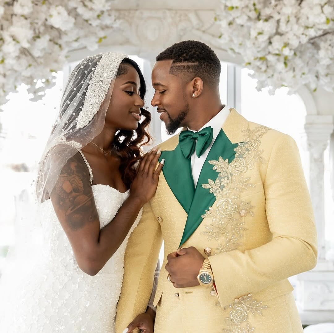
An emerald bow tie on a gold jacket is the smallest way to wear this palette, and it works because green and gold sit comfortably together.
Buy the tie after the jacket is settled, and hold the fabric against it in daylight to check that the green reads as a jewel and not as olive.
I would match the pocket square or boutonniere to the bride’s bouquet so the groom ties into the rest of the day.
7. Jewel-toned Lounge Area
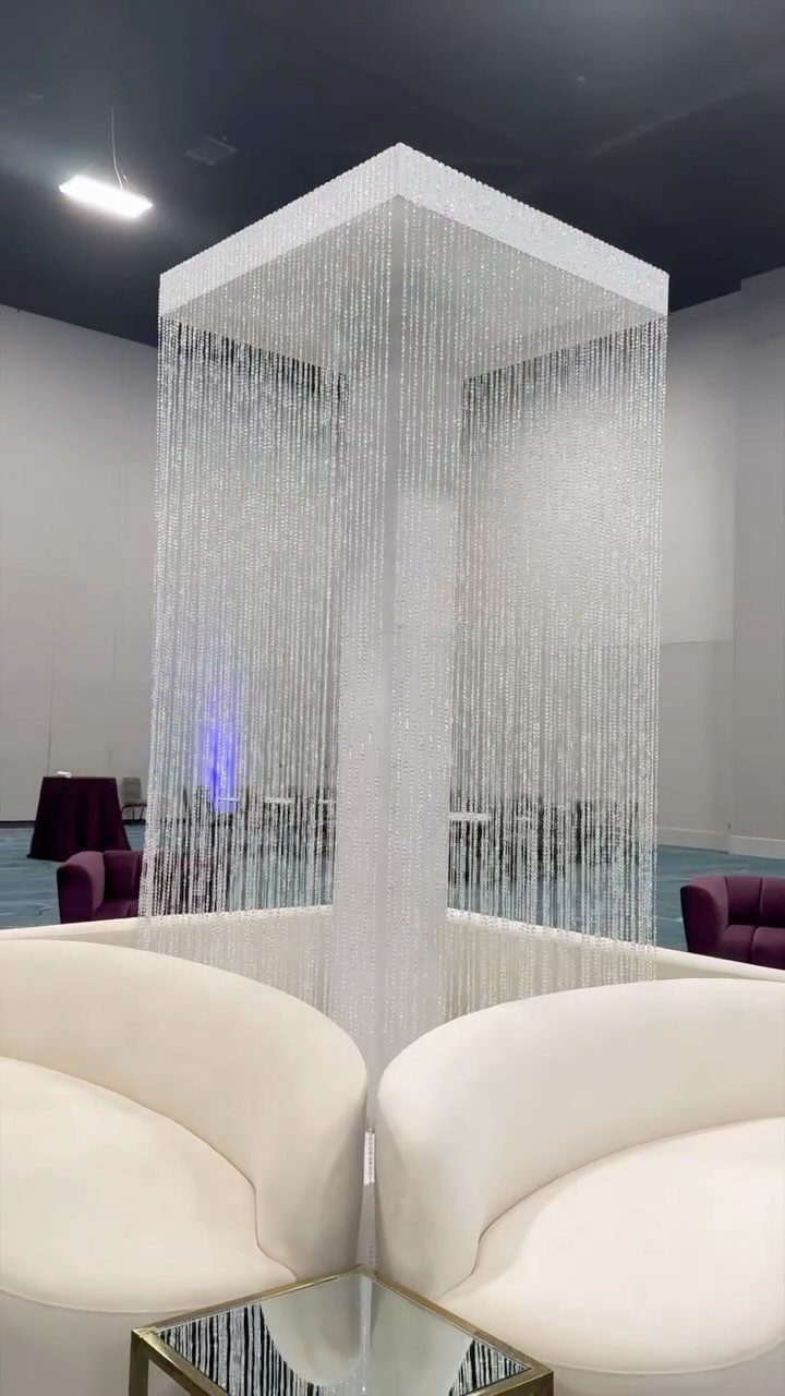
White curved sofas let purple velvet chairs and silver beaded curtains carry the color, so the lounge stays bright and the jewel tone shows up only where you want the eye to land.
Keep the seating neutral and spend your color budget on a few velvet chairs.
Beaded curtains catch light and move, so I would hang them behind the seating as a backdrop rather than scatter them around the room. Ask your venue what can be hung, and by whom, before you order any.
8. Floral Ice Bucket Display
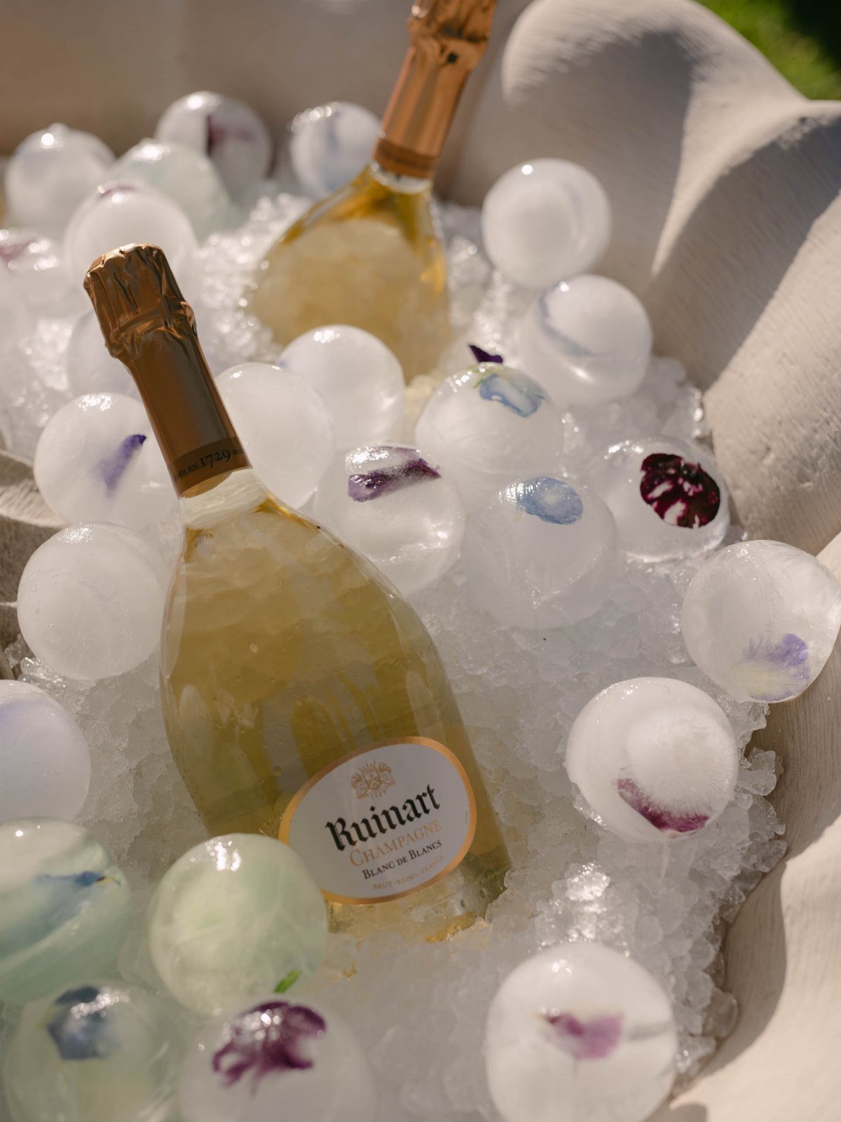
Ice balls with deep purple and blue petals frozen inside turn a champagne tub into decor, and the bottles stay chilled in the same tub.
Set them in crushed ice so the spheres sit on top where guests can see them.
Freeze the balls ahead of time in a round mold, with the petals arranged before the water goes in. Choose petals that are food-safe for contact with drinks, and have your florist confirm that first, ahead of placing any order.
Since some spheres will crack or melt before the toast, I would make 3–4 more than the count you need.
Best Seasons for Jewel Tones
Fall is the easiest season for this palette. Amber light flatters deep color, and autumn foliage backs it up, with ruby and garnet at their strongest in October.
For a December wedding, sapphire and amethyst look best next to silver or gold, and evergreen in the florals ties the palette to the season.
Spring needs a lighter hand. Keep amethyst or teal-topaz accents against cream and white, and choose ranunculus or peonies so the palette doesn’t read heavy.
Summer light favors topaz and emerald, and a deep sapphire holds its color well outdoors under a bright sky. I would pass on ruby and garnet for a July or August afternoon, because hard sun flattens them into something heavy.
Mixing Jewel Tones
Pick one hero jewel tone and let it run through your stationery, florals and linens. Once the lead color is set, bring in 1–2 supporting tones in small amounts: candles, ribbon, a few accent blooms.
You can use every jewel tone at once, but only if two things stay fixed: a single neutral such as black, white or cream, and one metallic repeated throughout to hold the colors together.
If you can’t decide on a base, start with emerald, ruby or deep purple and build outward from there.
Metallic Accents
Gold flatters every jewel tone I can think of, which makes it the metallic I reach for first when I am unsure. Bronze and copper suit ruby and garnet, while silver suits sapphire and amethyst.
Neutrals change the mood. Deep cream and ivory soften jewel tones without watering them down, and black pushes them toward high drama.
Texture helps the color glow. Pair deep blooms with velvet or silk, such as ruby roses on a silk runner, and add crystal vases or metallic pieces, because reflective surfaces bounce light and make saturated color look richer.
Frequently Asked Questions
What are jewel tones for a wedding?
Jewel tones are deep, saturated colors named for gemstones: emerald green, sapphire blue, ruby red, amethyst purple, garnet burgundy and topaz teal.
Their richness and depth set them apart from pastels. Gold or silver metallics are the usual finishing touch.
Are jewel tones in for 2026?
Yes, jewel tones are a leading wedding palette for 2026. Deep emerald, sapphire and ruby hold their color when the light turns amber, so they look rich in golden-hour portraits and under the warm glow of a ballroom chandelier.
Pair two or three jewel tones and each one makes the others look stronger, while pastels set together often fade into one another.





