
The palettes here start with a single quiet blush and build up to a layered mix of clay, coral and peach, and what you pay depends mostly on how many shades you have to buy in flowers and fabric.
A venue that already brings its own color, such as clay-toned stone or a greenhouse full of leaves, can serve as one shade of the palette, so Citrus & Clay or the Orange and Pink Greenhouse Setting lets me spend on flowers alone.
A plain room calls for a palette that cheap swaps can carry, and Blush, Yellow or Dusty Blue and Sea Glass do that well through linens, candles and string lights.
1. Blush
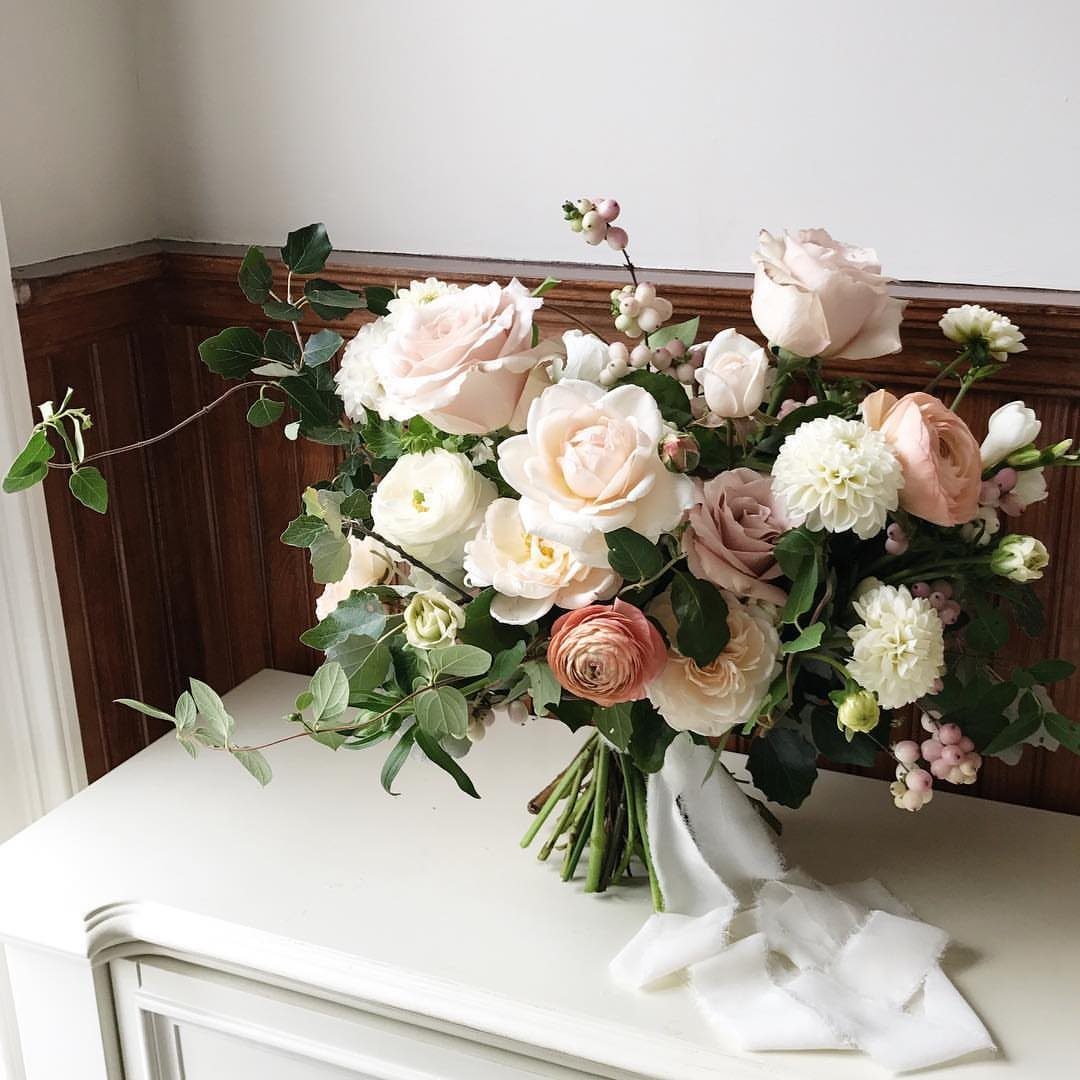
Blush reads romantic without trying hard, and a bouquet like this one proves it: the pink stays quiet because cream and white sit right beside it.
I would keep blush as the softest color in the palette and let a deeper partner do the anchoring.
Greenery and a plain white ribbon give the flowers some structure, so the pink never turns sugary. Skip a second pastel if you want the look to stay clean.
2. Yellow
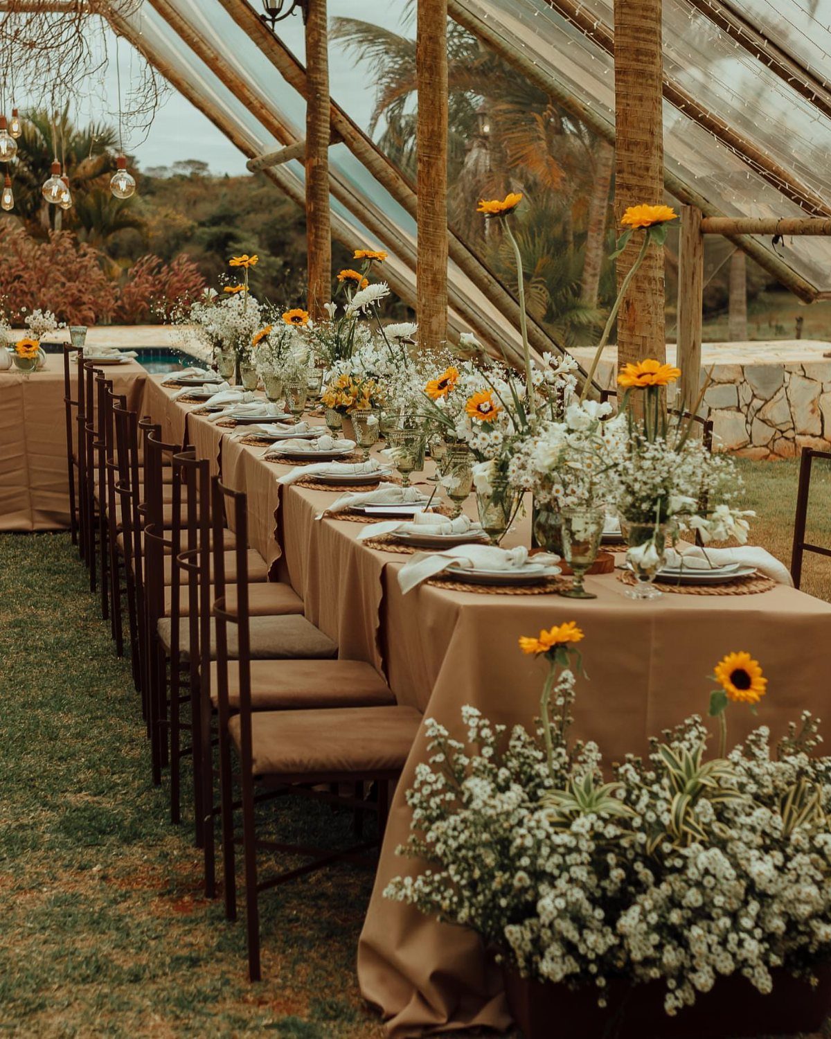
Yellow works best in sunflowers, and a tan or neutral tablecloth gives the bright blooms a calm ground. Pair yellow with white flowers so it feels sunny and not loud.
For a modest budget, I would put the color in the centerpieces alone and keep linens neutral. Tan or cream costs less to swap than a bold cloth, and the flowers do all the talking.
3. Dusty Blue and Sea Glass
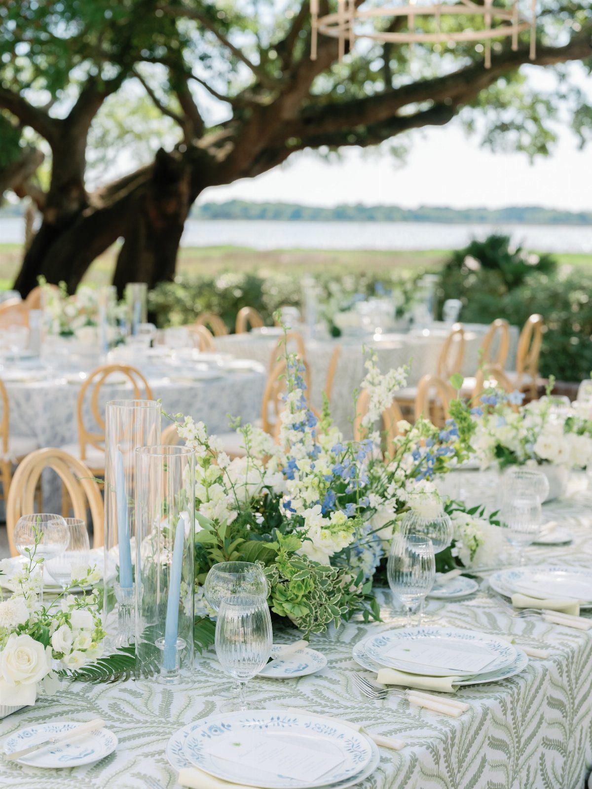
Dusty blue is the color to pick if you want a wedding that feels like a calm afternoon by the water. Sea glass adds the paler, slightly green-gray note that keeps the blue from looking flat.
A few shades of one cool family look layered, so stay inside that family and let white do the brightening.
4. Soft Coral and Deep Plum
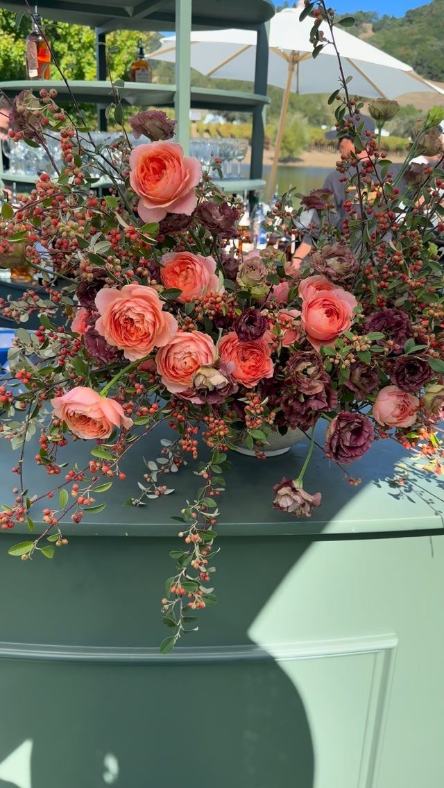
Soft coral against deep plum is a pairing I would pick for couples who want warmth without a loud color. Coral brings the glow, and plum gives it depth so the pastel never washes out.
Use roses for the coral and a darker bloom with berries for the plum.
Keep the plum to a smaller share, since the deep shade overpowers quickly. Roughly two parts coral to one part plum is a good starting ratio.
5. Citrus & Clay
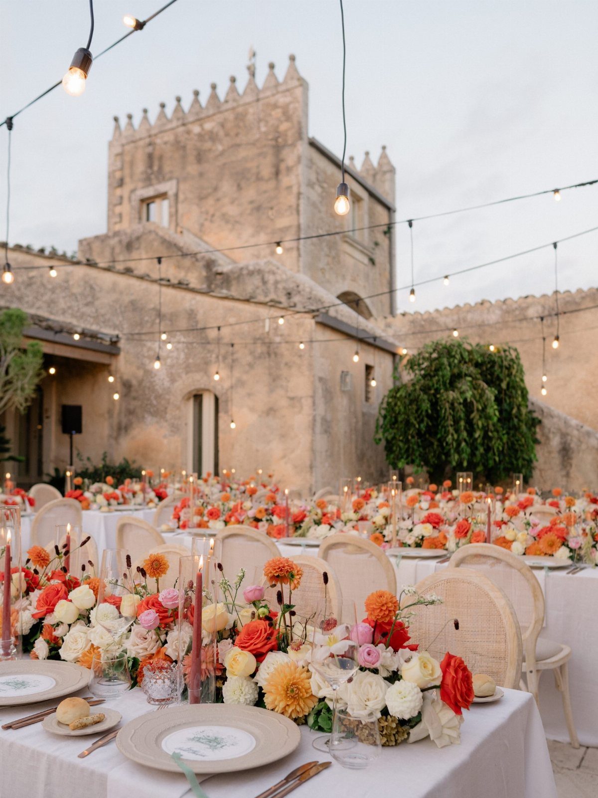
Orange and yellow florals set against clay-colored stone make a palette that feels sun-baked, and it asks little of you if the venue already supplies the clay. Let the building be the third color.
White linens and white chairs keep the warm tones from piling up.
String lights are an inexpensive way to carry the glow into the evening. If your venue is not stone, terracotta pots or napkins can stand in for the clay.
6. Orange and Pink Greenhouse Setting
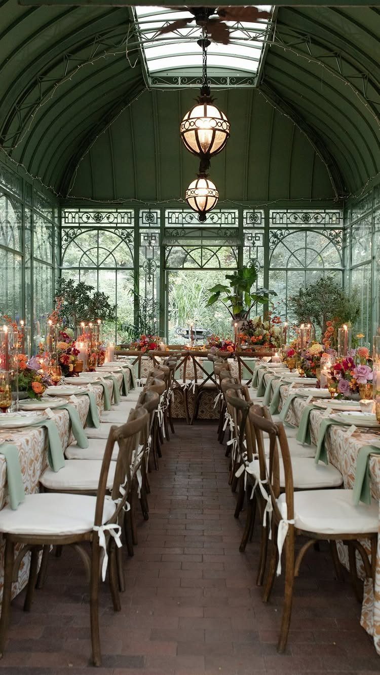
A greenhouse already hands you the green, so the flowers can be bold. Pink and orange sit well together here because glass, wood chairs and candles keep things grounded.
I would let one of the two colors lead and use the other as the accent.
Hanging globe lights give a warm glow that suits those hues as daylight fades. Keep the table decor simple: the flowers and the setting will carry it.
7. Orange and Blue Accents
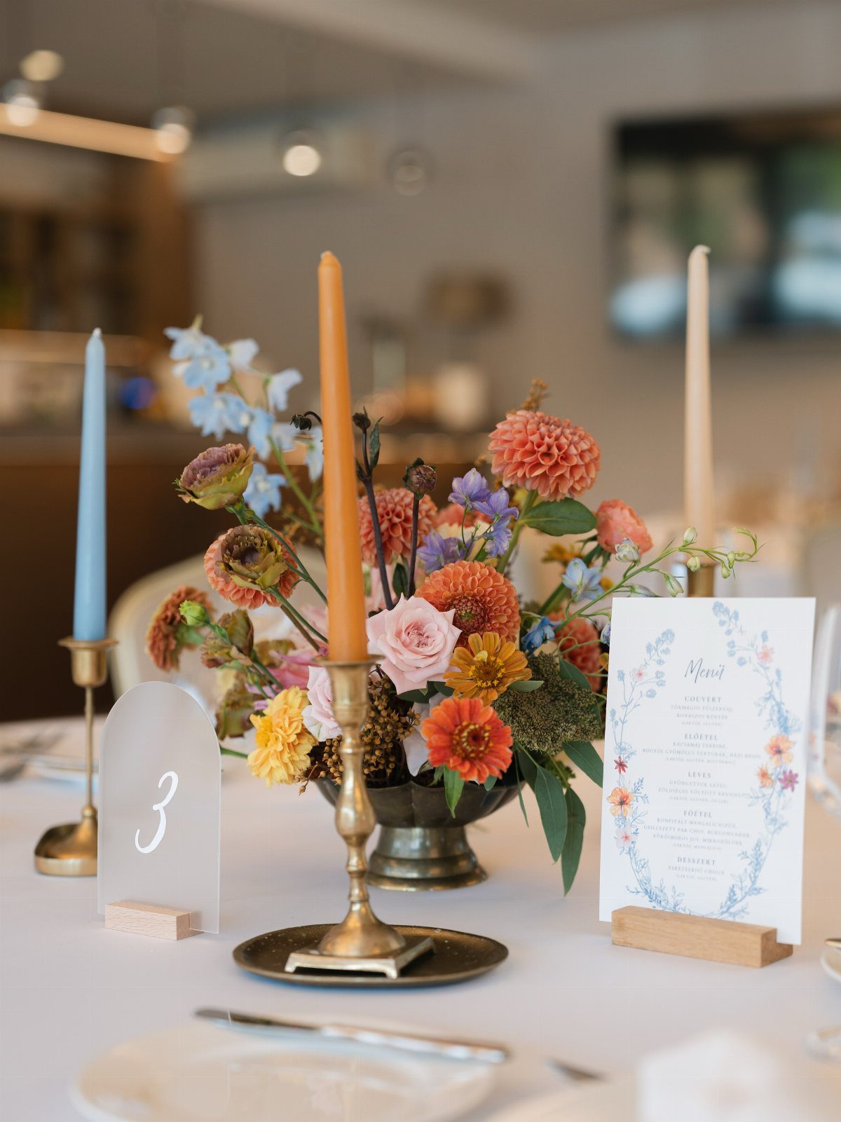
Orange against blue is a high-contrast pairing, and tapers are the cheapest way to repeat it. Candles in the same hues as the flowers tie the table together without adding another type of decor.
I would let orange lead and keep blue as the small surprise tucked into the arrangement. A plain white tablecloth lets the colors do all the work, so skip patterned linens.
8. Burgundy, Coral, and Peach
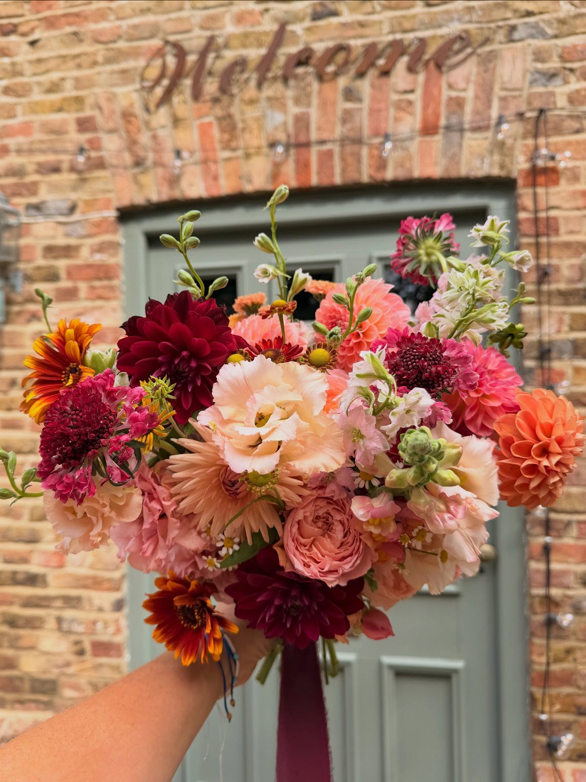
Deep burgundy, coral and peach read as late summer because they sit close to the colors of ripening fruit. Burgundy anchors the bouquet, coral warms it, and peach softens the edge between them.
I would limit burgundy to a few focal blooms, with the lighter coral and peach filling out the rest so the bouquet stays light. Match bridesmaid bouquets to the same 3 colors, with burgundy used even more sparingly.
9. Pink, Purple, and White
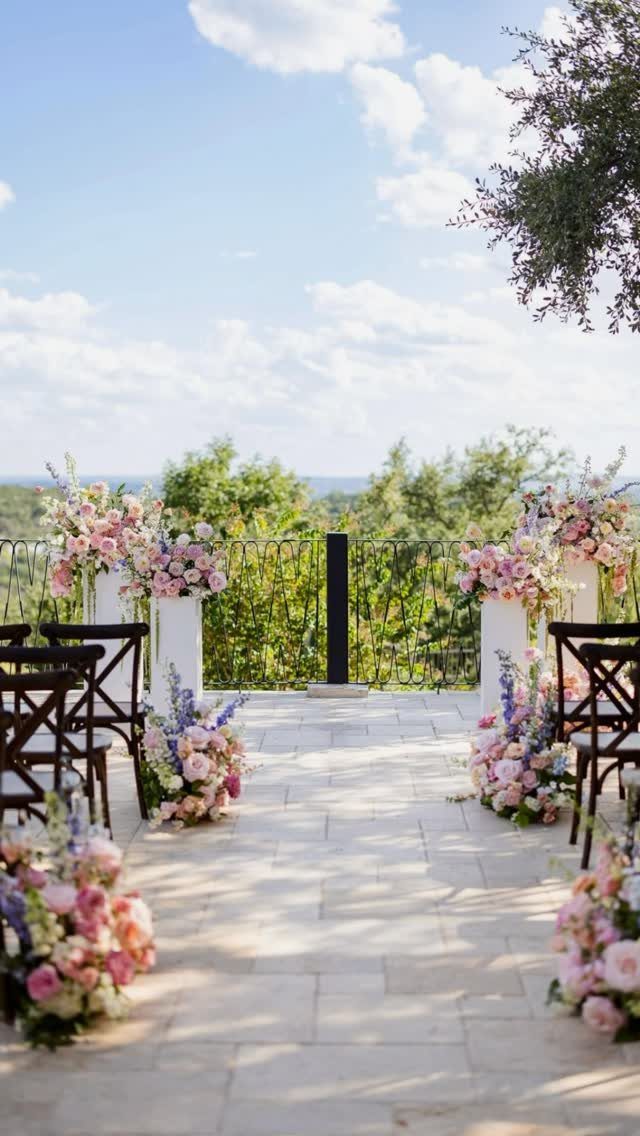
Pink, purple and white is an easy trio for an outdoor aisle because all three are soft, and white keeps the pink and purple from blurring together.
Set the arrangements in matched pairs down both sides so the colors repeat evenly.
Dark wood chairs and stone floors, like the ones here, make the flowers look brighter. If your venue is plainer, I would add more white to lift it.
10. Olive Green Bridesmaid Style
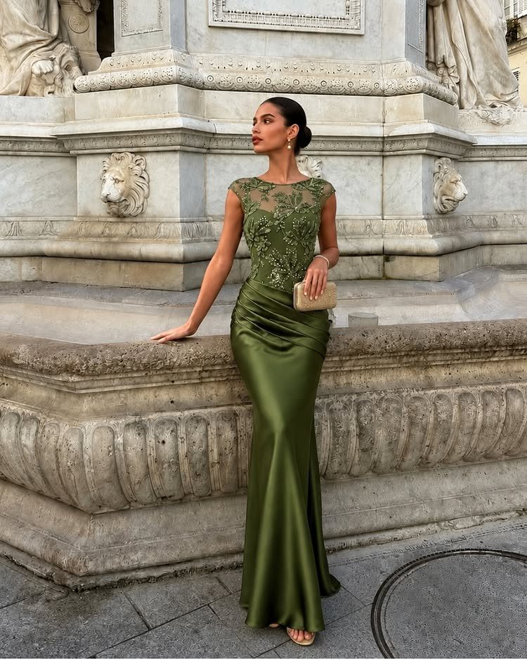
Olive green satin in a floor-length cut is a bridesmaid choice I would happily pick over the usual pastels. The color is rich but muted, so it flatters many skin tones and sits well beside burgundy, coral or peach flowers.
A lace bodice adds detail without a single extra accessory.
Keep jewelry simple, since the dress already carries the look. Satin shows every wrinkle, so plan on steaming before the day.
Incorporating Florals
Dahlias, gladiolas, zinnias and garden roses are all in season by late summer, and each one holds up in a classic palette or a bolder, less expected one.
Pick the flower first, then check that its color sits inside your scheme.
A palette also depends on texture, whether it’s something guests see, like ruffled petals, or something they feel, like a nubby linen runner. Put the flowers on tables dressed in a well-chosen neutral linen, and the palette comes through quietly.
Keep the napkins in line with the style of the day. A sleek, minimal look falls apart next to a rough, rustic napkin, so choose something smoother.
Choosing the Right Fabrics
Color gets the attention, but a bridal party that is too warm will not enjoy the day however good the palette looks. Choose fabric with the same care you give the shade.
Chiffon is my default fabric for a summer dress or bridesmaid gown: it’s light, it moves, and it lets heat escape instead of trapping it.
For a more structured dress, stretch crepe is a sleek option that moves easily and stays comfortable outdoors.
Order swatches before you commit. Seeing the color on the actual fabric you want is the safest way to avoid a surprise, since the same shade can look different on chiffon than on crepe.
Made-to-order dresses are worth a look too, since they cut down on waste from mass production and can be cut to fit each person.
Mixing Colors
Your palette does not have to be one pair of colors. A spectrum of several shades can read as one unified look, and it helps indoor and outdoor photos feel balanced.
Choose three or four colors that complement each other and let each bridesmaid pick the shade and style that makes her feel her best.
For a sunset gradient, terracotta, sunset and mai tai work together as the party moves through the venue.
Give the mix one point of unity. Use the same fabric, such as chiffon, or the same dress length, and the group looks cohesive without looking cookie cutter.
Frequently Asked Questions
Can I wear brown for a summer wedding?
Yes, as long as you pair it with livelier colors. Brown, latte and other earthy neutrals look stylish beside bright tones, and a warm clay or terracotta shade is an easy way in.
A tan or cream base lets bold blooms stand out, so brown works in summer as long as it stays light and warm instead of heavy and dark.
Which color is best for a daytime wedding?
Bright, cheerful colors like yellow and soft pastels suit daylight best.
Sunflowers on a tan or neutral tablecloth look sunny without getting loud, and blush stays pretty when cream and white sit beside it. Dusty blue with pale sea glass is another calm choice for an afternoon ceremony.
What is the in-color for weddings in 2026?
I can’t point to one official shade, and it’s better to build a palette that feels like you.
For late summer, the combinations I’d reach for are burgundy with coral and peach, soft coral with deep plum, and orange with blue accents.
Each one stays close to ripening fruit and warm light, so it should hold up beyond one season.





