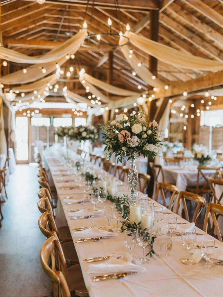
Where the color lives decides which palette fits: on the table, as with Ivory Linens with Gold Accents, on the people, as with Taupe Bridesmaid Dresses, or in the flowers, as with Mauve Floral Arrangements with Forest Green.
Swatches should be in your hands before anything gets ordered, since taupe can swing pink or gray and sage often reads gray under indoor light.
1. Soft Beige and Coral
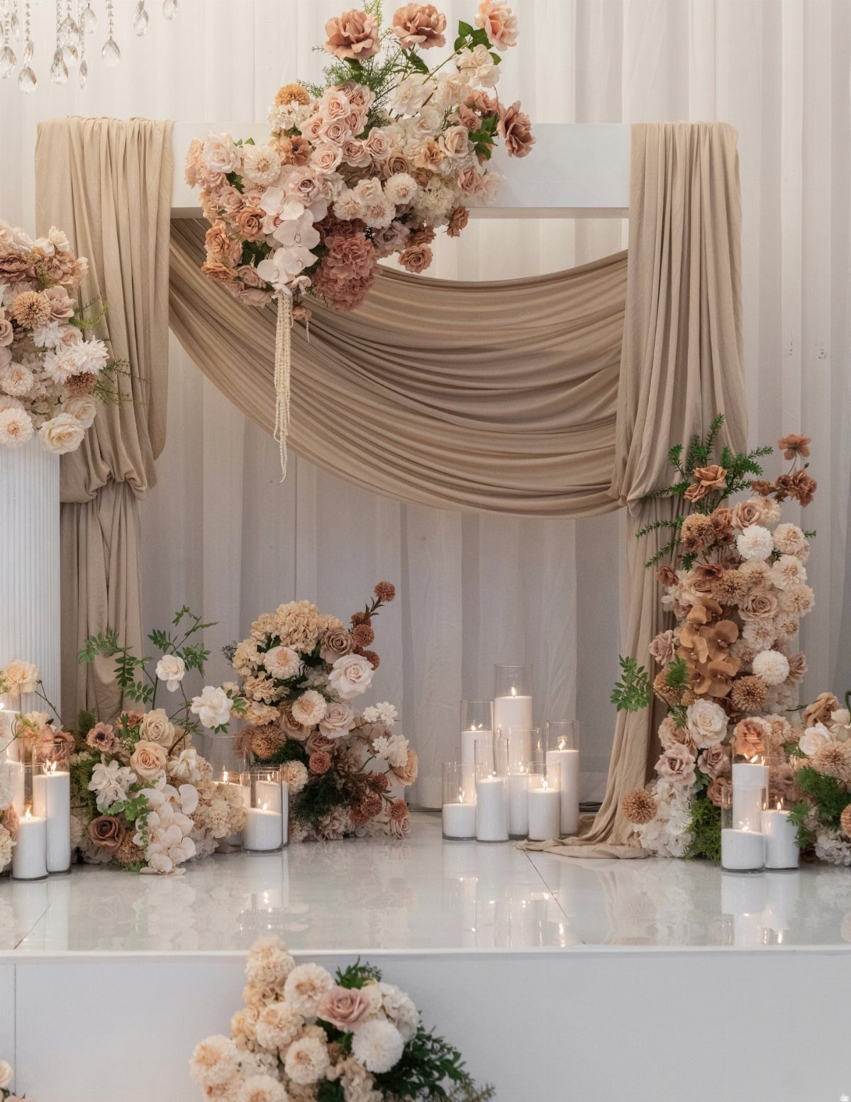
Coral works as the single warm note in a room of beige, and the draped fabric does the quiet work of keeping everything soft. Cream blooms between the coral ones stop the color from reading too loud.
Keep the coral to flowers and let the candles stay white. That way the palette has one accent, and you can cut the coral stems down if the budget tightens without losing the look.
2. Rust, Amber, Beige, Black, Brown
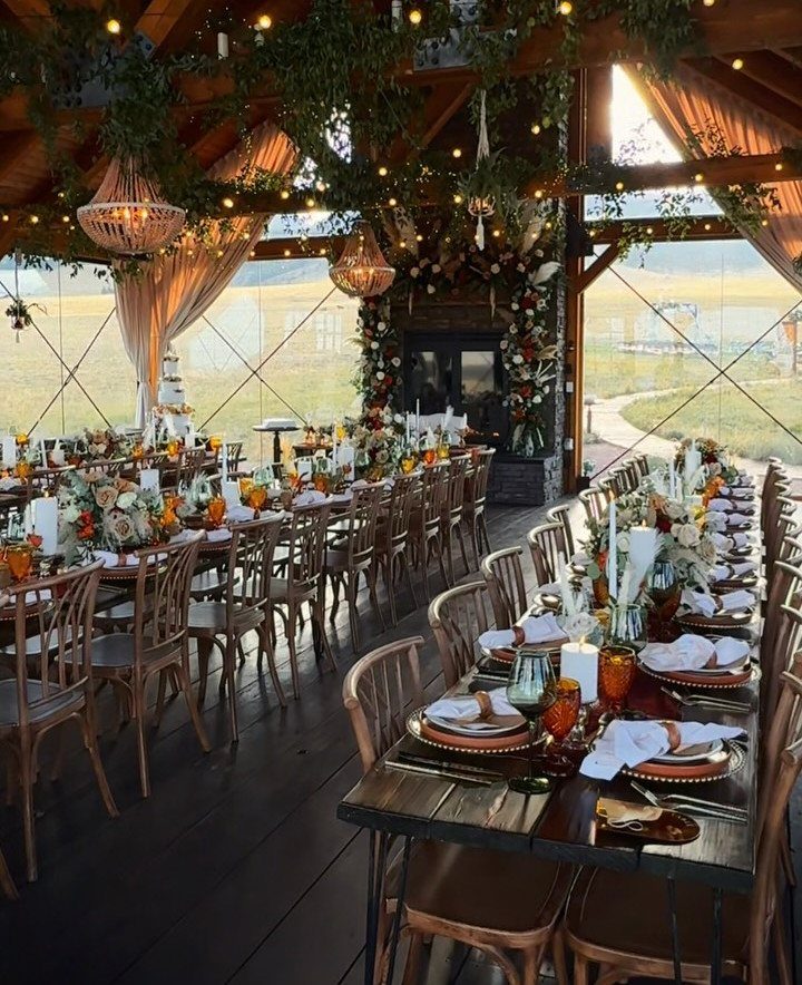
Amber glassware is the cheapest way to get this warmth onto a table, and it pairs well with rust florals and dark wood.
Black and brown give the palette its weight, so use them in small doses: menus, napkin rings, candle holders.
Hanging greenery overhead keeps all that depth from feeling heavy. Beige linens beat white here, since white next to rust can look stark.
3. Beige, Dusty Blue, White, Brown
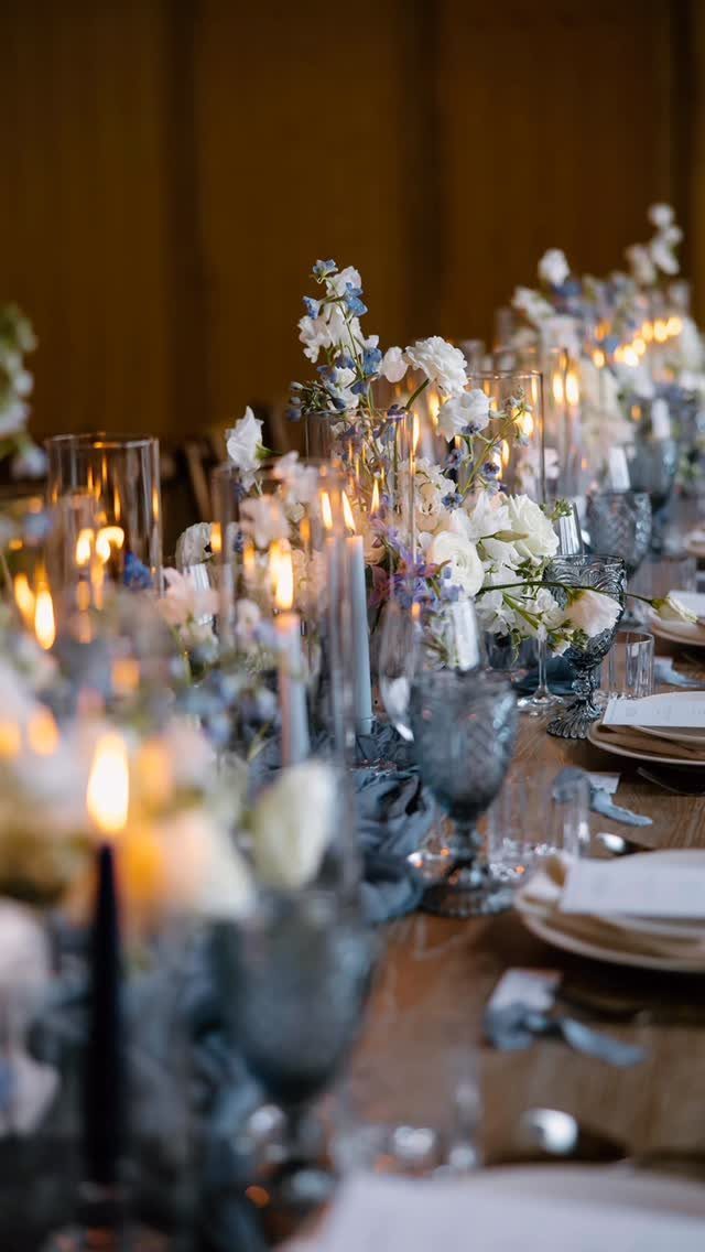
Dusty blue glassware carries this palette, and it costs far less than dyeing linens or renting blue tableware in bulk. Beige napkins on a brown wood table keep the blue from turning icy.
Keep the flowers to white and blue so the table reads calm, and let tall candles add height. I would skip a tablecloth entirely if the wood is good, since it does half the styling for you.
4. Ivory Blooms with Sage Greenery
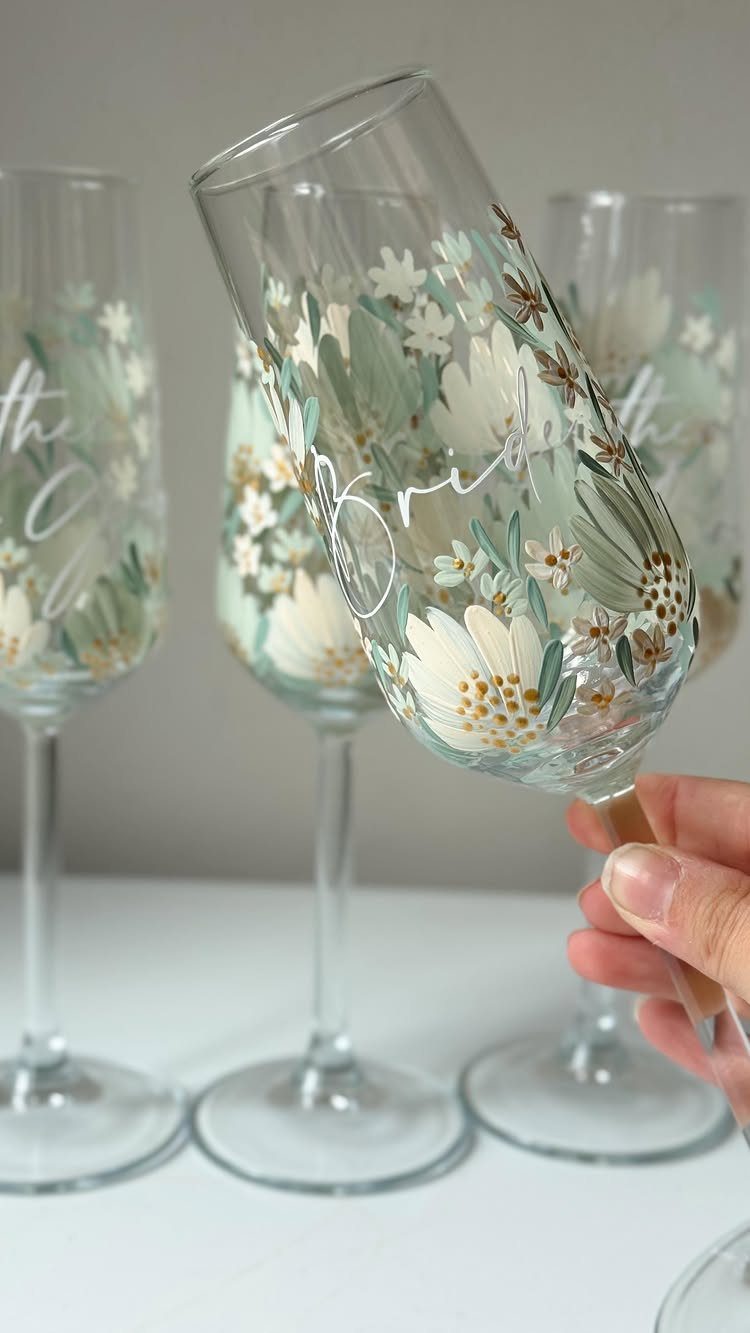
Ivory flowers against sage leaves are about as gentle as a color pairing gets, and a champagne flute is a small, low-cost place to try it.
Fresh blooms and greenery tucked around the stem take only a few minutes per glass.
Script lettering such as "Bride" turns a plain flute into a keepsake for the morning-of photos. Make the bride’s glass first, then decide whether the rest of the party gets one.
5. Sage and French Blue
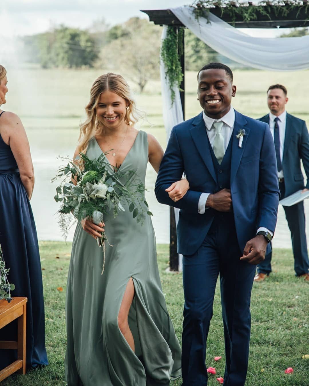
French blue and sage sit close enough on the color wheel to look related, yet different enough that nobody blends into the lawn.
The suit takes the blue, the dress takes the sage, and the pairing feels balanced rather than matched.
Outdoors, both shades pick up the greens and sky around them. Check swatches in daylight before ordering, because sage can look gray indoors.
6. Ivory Linens with Gold Accents
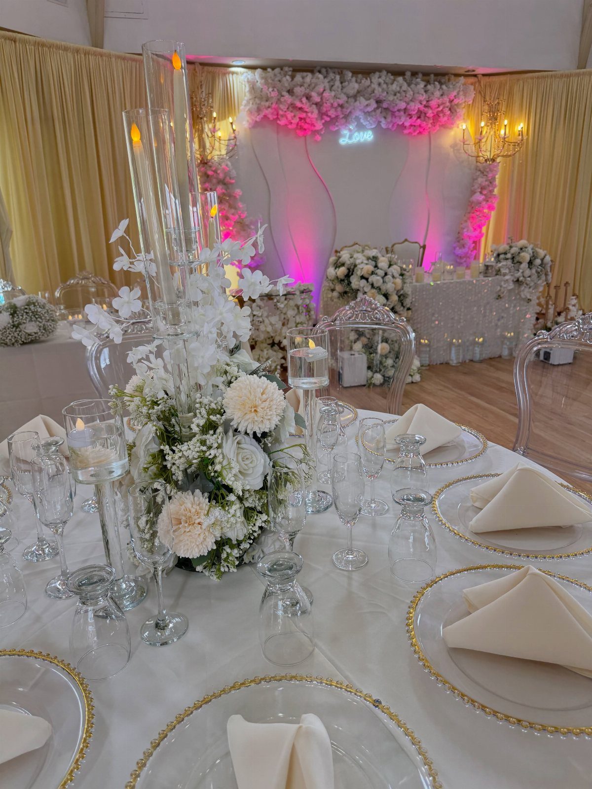
Gold-rimmed plates give ivory linens a glint without any extra decor, and they photograph well under warm light. White florals keep the table clean, so the gold stays the only metallic.
Rimmed plates are usually a rental line item, so ask about the per-plate price before committing. A neon sign like this one adds a modern twist and costs far less than a custom backdrop.
7. Mauve Floral Arrangements with Forest Green
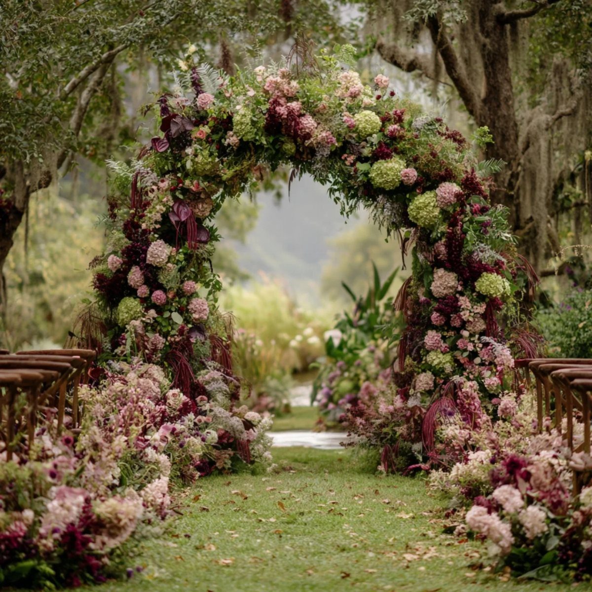
Forest green is what keeps mauve from going sugary. The dark green makes mauve and lavender look richer, less like a nursery and more like a garden that’s been around a while.
An arch is a good place to spend the flower budget, since it frames the ceremony and shows up in every photo.
If money is tight, I would keep the mauve to the arch and let the green carry the rest of the aisle.
8. Pewter and Plum
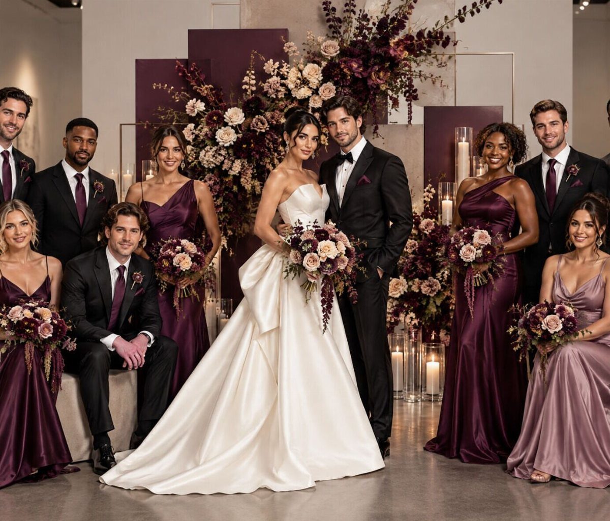
Plum and pewter make a quiet pairing: the plum brings richness, the gray steadies it. A white gown stands out cleanly against both, so the bride never gets lost in the group.
Put the bridesmaids in plum and the groomsmen in pewter, or mix the two within the party.
I like the mix, because it looks planned without making everyone match. Plum can read nearly black in dim rooms, so check fabric swatches under the venue’s lighting.
9. Black and White Decor
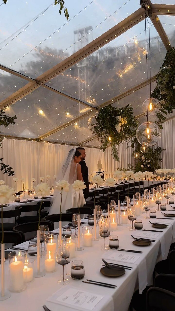
Black chairs against white linens give a room a graphic, tuxedo-crisp look with very little effort. White flowers and candles on the tables keep the contrast clean instead of busy.
Chairs are the lever here. I would keep the florals simple and all white, and let the black and white do the decorating.
10. Taupe Linens and Cream Accents
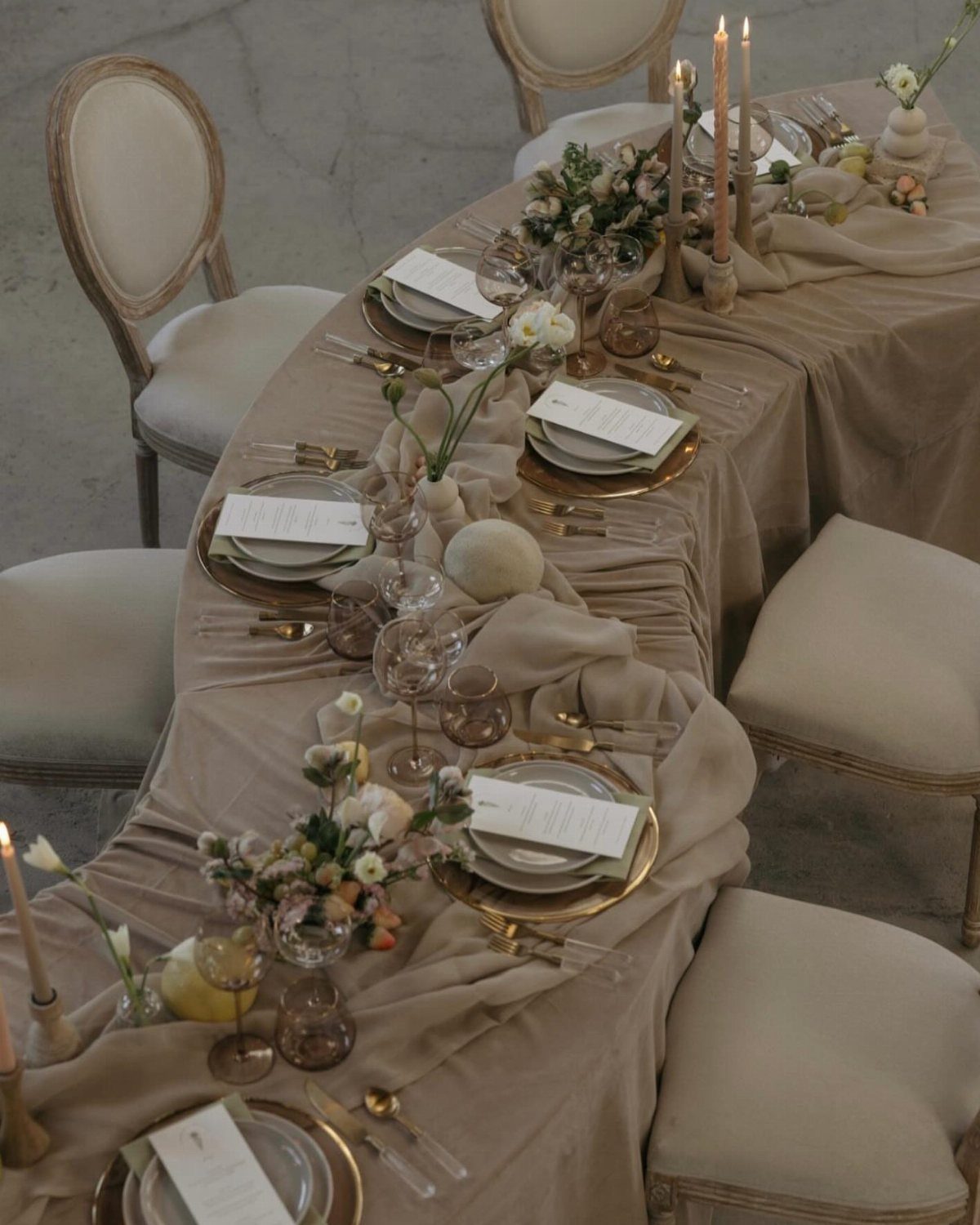
Taupe linens sit between beige and gray, which makes them an easy backdrop for gold cutlery and white flowers. Cream chairs soften the table further, so nothing in the room fights for attention.
Draped linens look richer than flat ones, so ask whether the rental covers floor-length drops.
Gold flatware gives you shine without covering the whole table in it, which keeps things quiet if that’s the look you’re after. Candles in white or cream finish the table without adding another color.
11. Taupe Bridesmaid Dresses
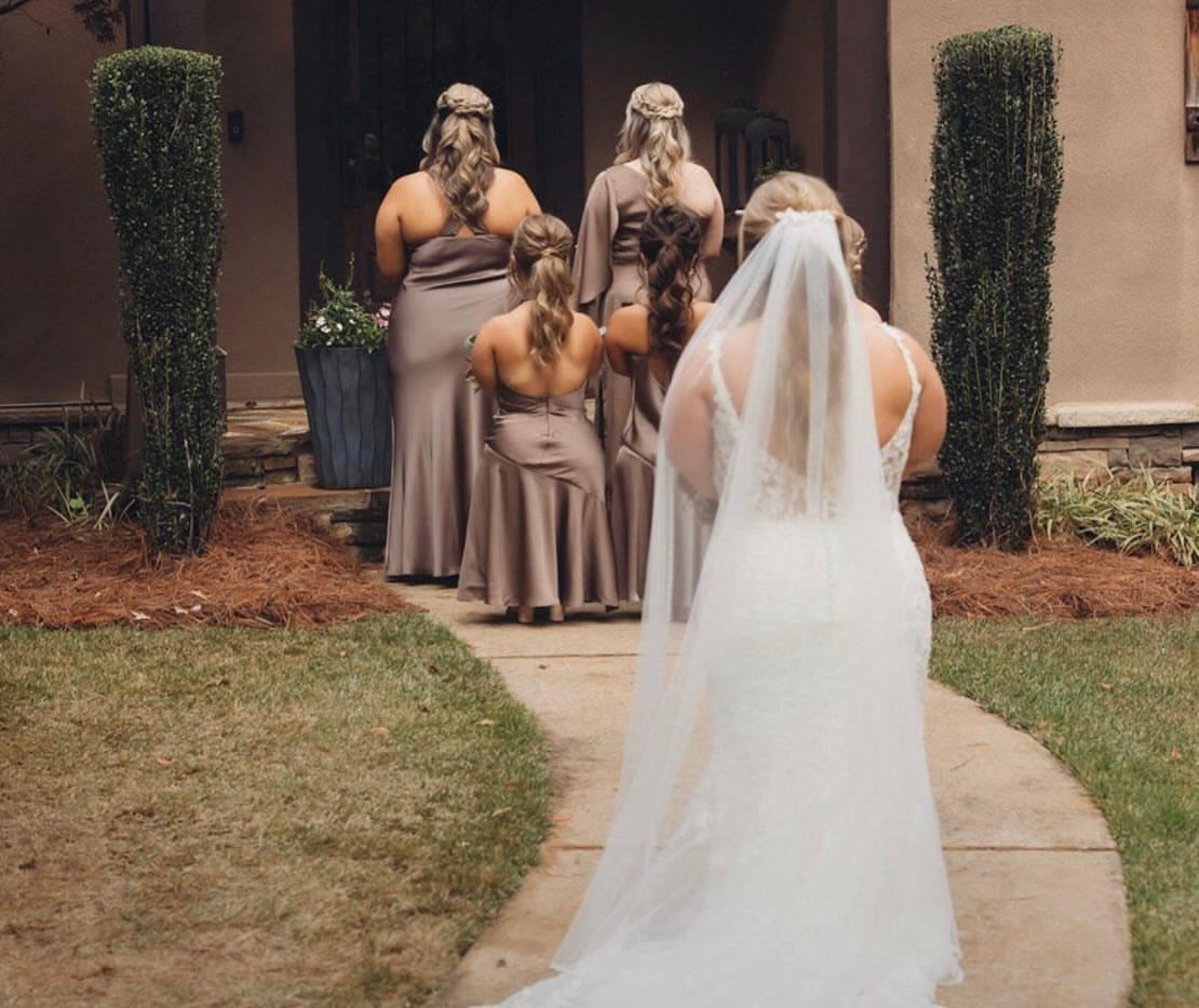
Floor-length taupe dresses look good on nearly everyone in a bridal party, because the shade is soft enough to flatter different skin tones. Against a white gown, it frames the bride without competing.
I would let bridesmaids choose their own taupe silhouettes in the same fabric and shade, which saves arguments about fit. Order swatches first, since taupe can lean pink or gray depending on the dye lot and the light.
12. All-White and Silver Reception
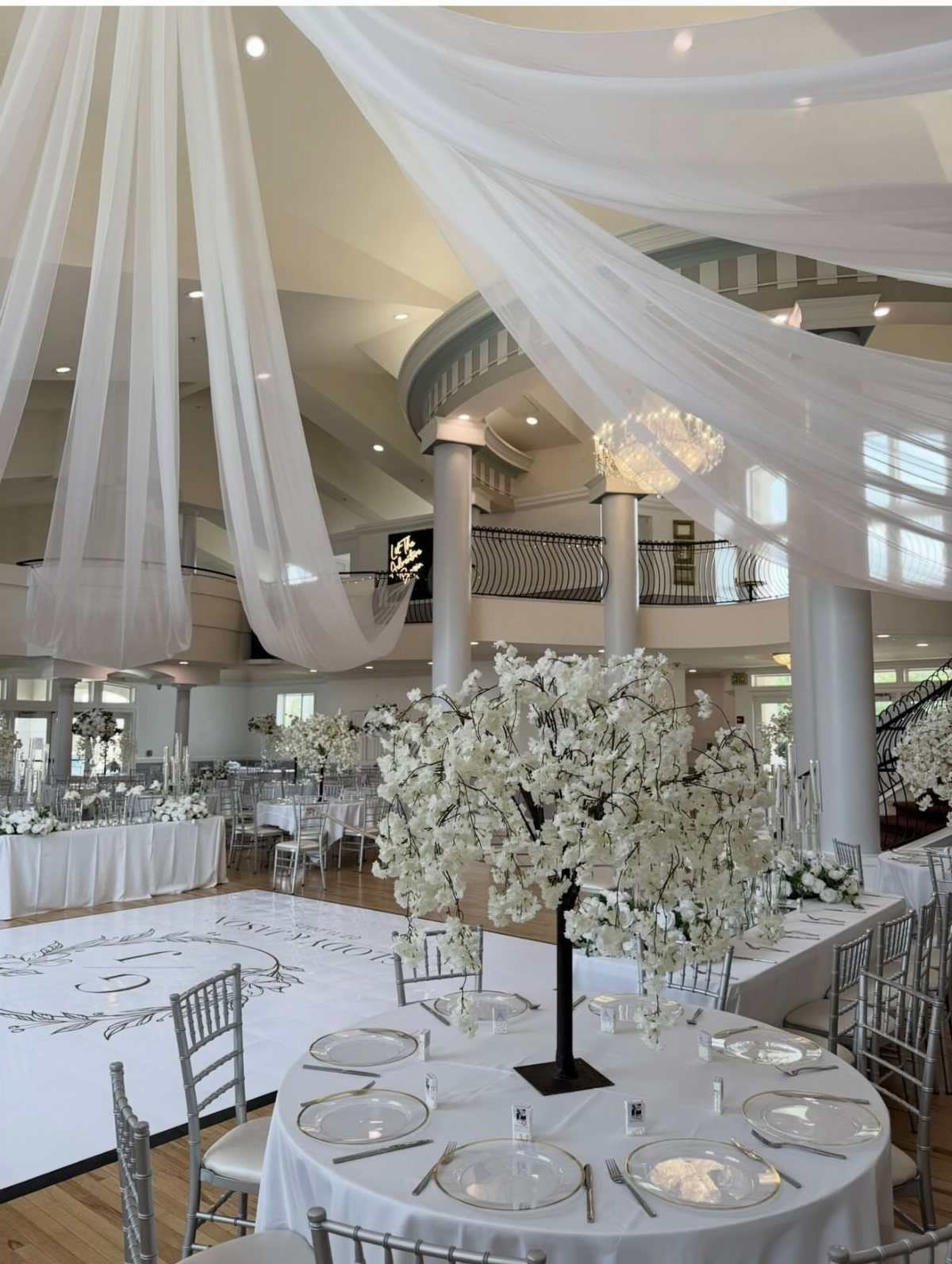
White drapery overhead, white linens and tall white florals make the room feel like one continuous surface, and silver chairs add a cool shimmer without breaking the palette. A monogrammed dance floor gives the room its single personal detail.
All-white is unforgiving: any stain or off-white shade shows.
Ask your rental company to match the whites exactly. If the budget is tight, I would skip the draped ceiling and put the money into the tall centerpieces.
Choosing the Right Fabrics
Fabric changes how a color lands in the room.
Chiffon reads light and airy, and it moves when people walk. Satin holds a more structured shape, and its shine can make a plain sand or champagne look dressier.
Tulle and mesh are the choice for the softest, most ethereal look. They catch light, float when draped, and fill space without pulling a centerpiece over.
Order swatches before you commit to anything.
Screens misreport color, so look at the fabric at home, in the light you will actually be in. Handle it too, because swatches also show you texture and how the fabric reacts to light.
Mixing Textures
A neutral palette goes flat in photos when every surface has the same finish and the same shade. Mix fabrics to fix that: satin on some dresses and chiffon on others gives the camera contrast to work with.
Florals can help as well. A shade or two darker in the greenery or roses gives the pale dress fabrics something to sit against.
Keep the shade shifts small. The goal is variation you can see in a photo, not a new color.
Seasonal Adaptability
Neutrals and pastels are not tied to one season, which makes them easy to adapt if your date moves. Bright colors tend to pin a wedding to a time of year; these don’t.
For spring and summer, soft florals and greenery keep the room airy. Cold-weather versions pull in candles, taupe and ivory table linens, roses with beige or mauve edges, and throws guests can actually use.
Outdoors, a neutral palette sits well with whatever colors the setting has in any season. It also looks modern and timeless whatever your theme.
One of the best places to look for your neutral wedding color palette is in nature! Rust and amber provide just a little bit of color while still remaining firmly in neutral territory, and especially pop against shades of beige, brown, and black.
Frequently Asked Questions
What are considered neutral colors for a wedding?
White, ivory, beige, taupe, gray, and earthy shades like brown and rust all count.
Champagne and sand fit too. Their quiet tone lets flowers, candles, and tableware carry the look instead of competing with it.
What are the trendy colors for weddings in 2026?
Soft grays, ivory, and pastels remain the safe, popular picks, and warm neutrals like taupe, sand, and champagne sit right alongside them.
Neutrals also fit any season, so they hold up if your date moves. They also look modern without tying the day to one trend.
What colors are frowned upon at weddings?
Guests usually skip white so the bride’s gown is the only one in the room. Beyond that, no color is truly off limits.
Within a neutral palette, the real risk is a shade that clashes with your setting or reads differently in the room’s light, such as sage turning gray indoors or plum looking nearly black in a dim venue.
Hold swatches up in the actual lighting of your venue, and do it ahead of placing any order.





