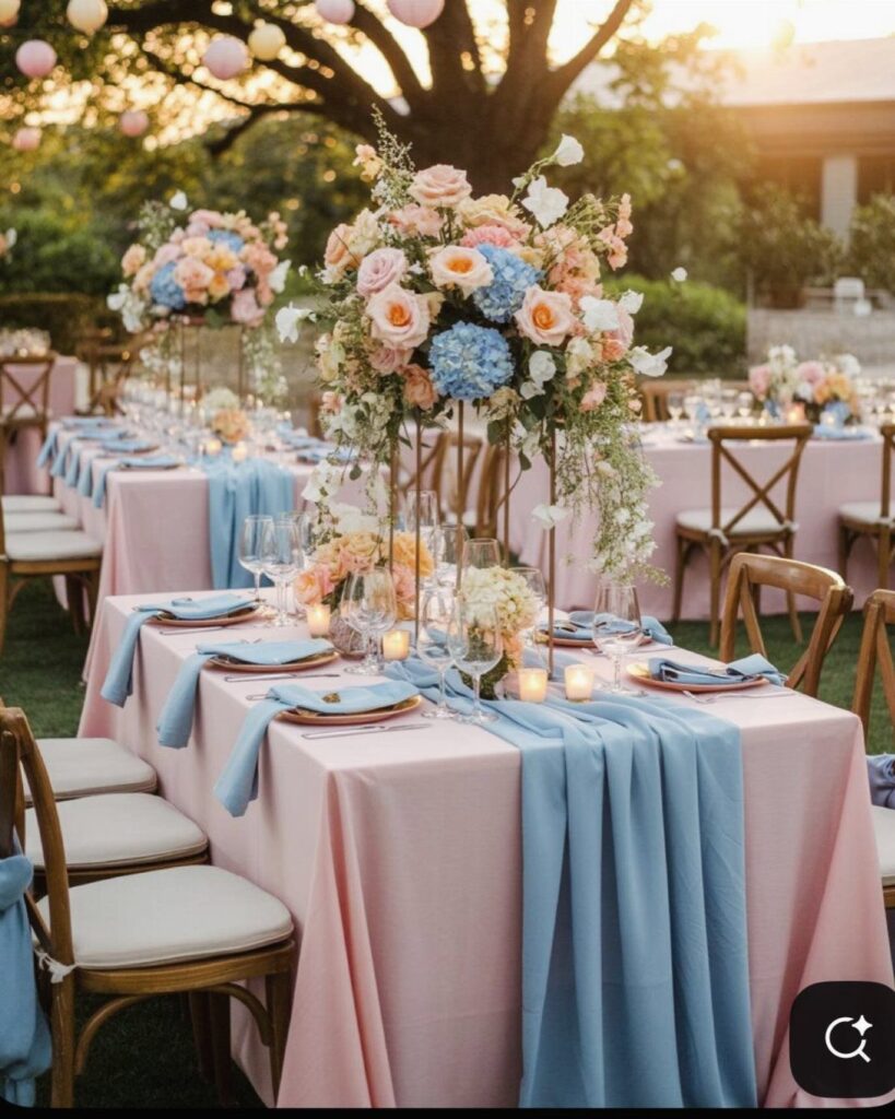
The ideas below run from small swaps, like pink napkins on chairs you already own, to bigger pieces such as the pink roses and blue hydrangeas centerpieces.
1. Pastel Pink and Blue Theme
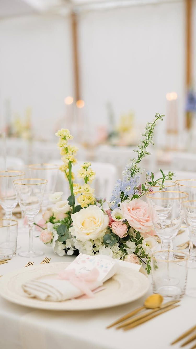
Soft pink and soft blue read as romantic because neither color shouts. Pale yellow, as in this table’s flowers, works as a third note that keeps the pair from feeling like a nursery.
White linens keep the table quiet, so the flowers can supply all the color. White cloths and gold cutlery give the pastels room, and they cost less than dyed linens or custom rentals.
Pick one shade of each color and repeat it everywhere, so the palette looks planned rather than scattered.
2. Wedding Cake Design
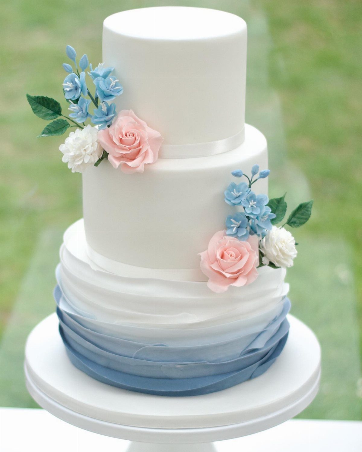
Sugar flowers in pink and blue on a white cake give you the color without tinting the whole thing. Blue ombre ruffles add a second texture, fading from light to deep down the tiers.
Ask your baker which parts are handmade, since sugar flowers and ruffles usually cost more than plain buttercream. A white base with a few colored accents is the budget-friendly way to get this look.
Share your exact pink and blue swatches with the baker so the cake matches the rest of the day.
3. Table Settings Using Pink and Blue
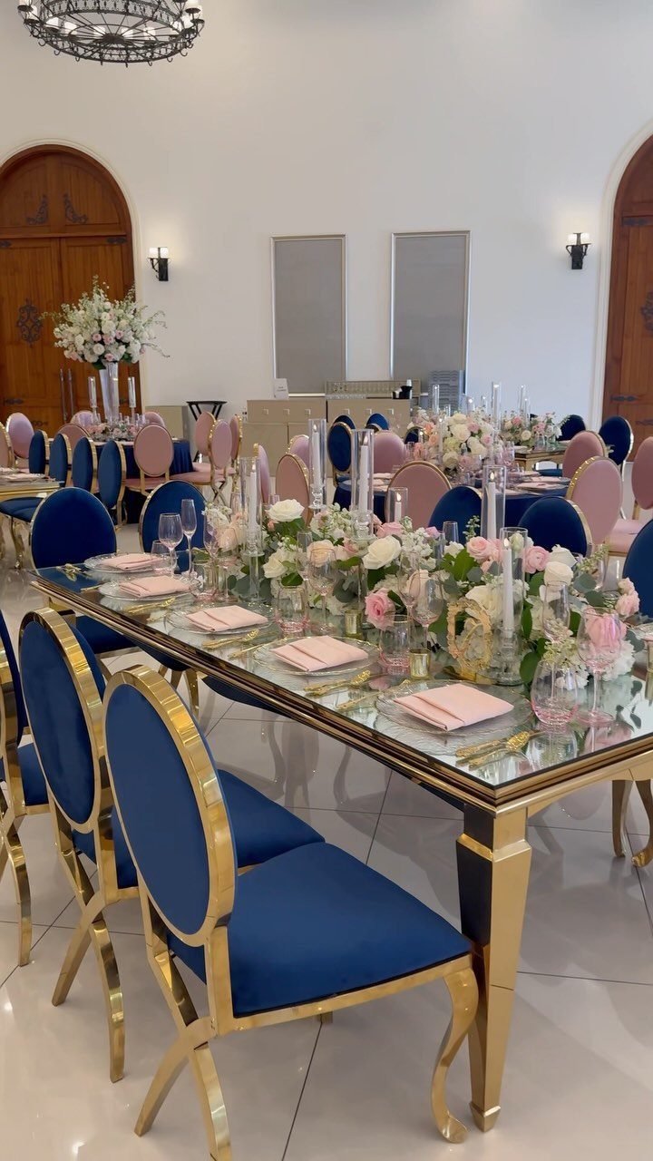
Navy velvet chairs against pink napkins is a pairing I would copy: the dark blue grounds the table, and the pink stays soft.
A mirrored table adds shine, though it is a rental piece, so check its cost before you fall for it.
If the budget is tight, keep your existing chairs and spend on napkins and centerpieces. Pink napkins are the cheapest way to bring the color to every seat.
Keep the arrangements low, under about 12 inches, so guests can see the people seated opposite them.
4. Wedding Invitations

A blue ribbon tied around the suite and a pink envelope make the pairing obvious before anyone reads a word. Floral details tie the paper to your centerpieces and bouquets.
Print the invitation in the lighter shade, then bring in the darker one through the envelope liner or a ribbon.
That keeps printing simpler and the text easy to read. Put the venue name and the reply line in the darker shade.
Order a sample before the full run to check that the pink and blue print as you expect.
5. Bridesmaid Dresses
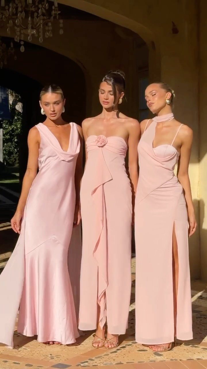
Light pink gowns in different cuts let each bridesmaid choose what flatters her while the color stays unified. Matching the shade matters more than matching the silhouette.
Choose one pink and send everyone the same fabric swatch, since pinks vary a lot between dye lots and brands. Mixed styles also help the budget, because each person can shop within her own price range.
If you want blue in the lineup, add it through bouquets or ribbon rather than a second dress color.
6. Ceremony Aisle Decor
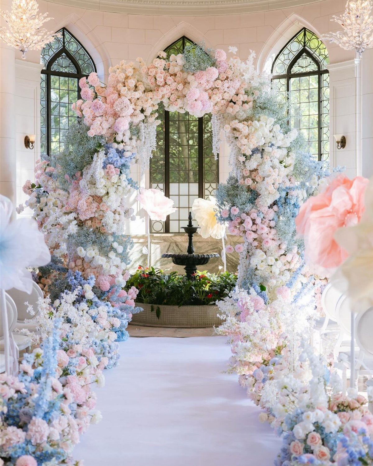
A white runner is the best backdrop for this aisle, because it lets pink, blue, and white blooms stand out instead of competing with the floor. A floral arch at the end pulls the eye forward to the couple.
Put most of your flowers into the arch, where every guest can see them, and keep the aisle itself simpler. Smaller arrangements along the sides can repeat the same 3 colors.
Test the runner for wrinkles before the ceremony, since a flat, smooth one looks cleaner in photos.
7. Pink Roses and Blue Hydrangeas Centerpieces
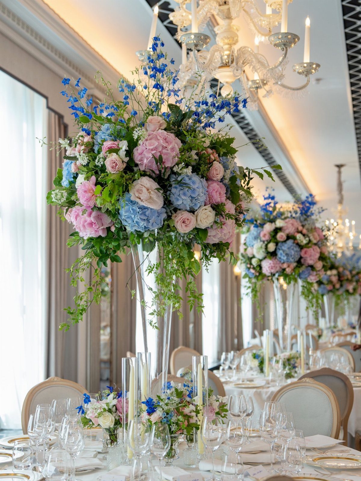
Tall glass vases lift pink roses and blue hydrangeas above eye level, so the flowers read from across the room and the white tablecloth stays clean beneath them.
I like this version for a formal room, where the height suits a chandelier.
Hydrangeas are full, wide blooms, so a few stems fill a lot of vase.
That makes them a smart way to add bulk and blue without buying more roses. Ask your florist to price the arrangement with more hydrangea and fewer roses.
Tall pieces cost more and block sightlines, so mix them with a few low ones.
Entry 3 on this page makes the case for keeping low arrangements short enough that guests can see across the table, and the same rule suits the other tables here.
Choosing Wedding Colors
Season and venue should settle your pink and blue before any swatch does. Daylight in a garden or a room with big windows makes soft shades look pale, while a dim ballroom can turn the same shades muddy.
Visit the venue at the hour your reception starts, and hold your fabric and ribbon samples against its walls, carpet, and wood. Colors that clash with a fixed surface are the ones you will fight all night.
Season tells you which shades are easy to source. Ask your florist what is in bloom on your date, because a flower that is out of season costs more and may not match your swatch.
Mixing Colors
Mixing the 2 colors works best when you vary depth, not just hue.
Pair a light shade of one with a deeper shade of the other, such as blush with a dusty or navy blue, and the combination reads as layered rather than loud.
Keep one color dominant. A rough 60/40 split between them looks intentional, while an even split tends to compete.
Add a neutral, such as white, cream, or greenery, to rest the eye between the two. Lay every item together on a table before you order, and cut anything that looks off next to the rest.
Budget-Friendly Ideas
DIY flowers can save real money, but only when the project is sized to your skill and your free time.
Start with something forgiving, such as simple bud vases or loose bunches of a single flower, and skip anything that needs wiring or a structure.
Buy blooms in bulk from a wholesale source, and order a little extra to cover any stems that arrive bruised or snapped. Do a full practice arrangement a few weeks ahead so you know how long each one takes.
Simple decor carries elegance better than a crowded table. A few well-chosen pieces repeated evenly look more polished than many small ones.
Frequently Asked Questions
What color do you get when you mix blue and pink?
Purple is the usual result when blue and pink are blended as paint or dye. On a wedding table, though, the 2 colors sit side by side instead of merging.
What are some cute wedding colors?
Blush pink, baby blue, and lavender are popular picks, and soft pink with soft blue is an easy pair to start from.
What colors make pink pop?
Navy or deep blue makes soft pink stand out, because the dark shade grounds the table while the pink stays gentle. Greenery, cream, or white give the eye a place to rest between colors.
How do I know what my wedding theme is?
Start with your colors, then check them against your venue and season.





