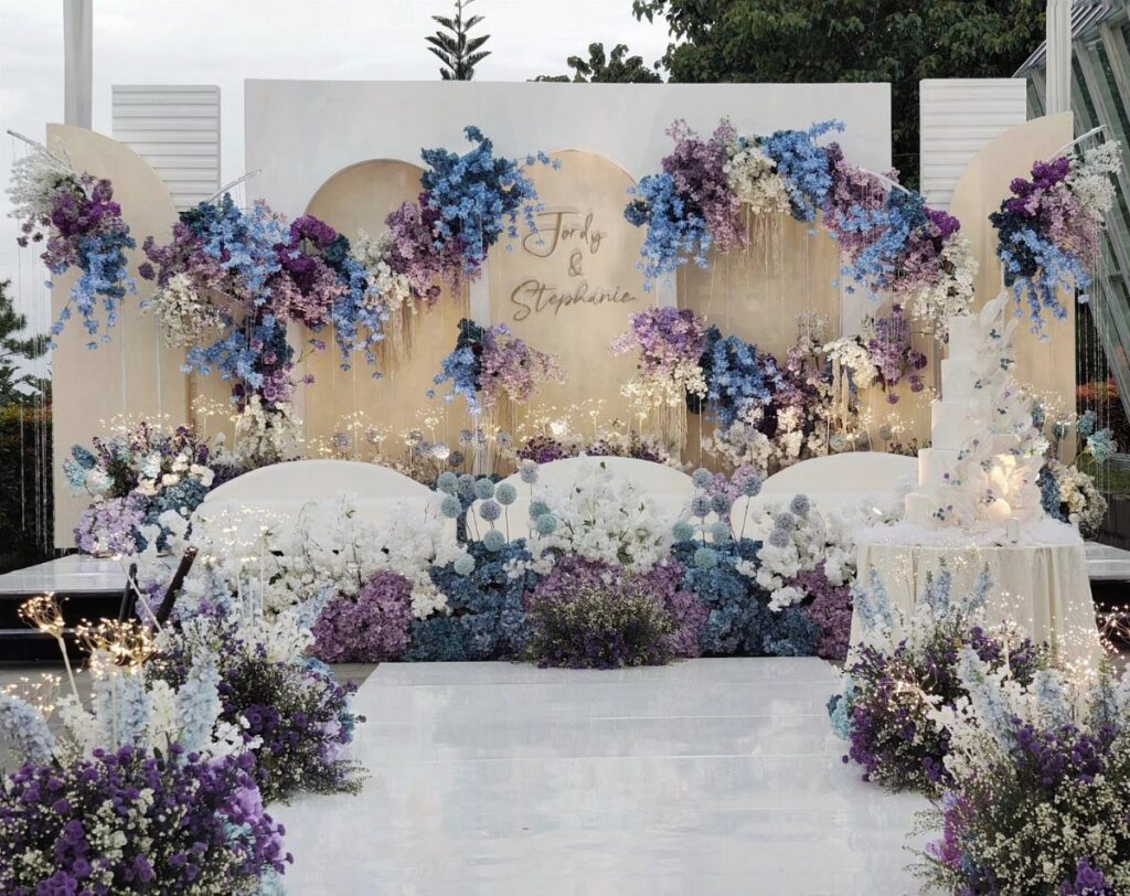
The ideas here run from printed invitations to bridesmaid dresses, flowers and centerpieces, lighting that washes the room in color, table settings, aisle decor, photo backdrops and favors, and the spend climbs with how many of them you use.
Which one is yours depends on how much of the day you want to carry the palette: if it’s a little, start with invitations and flowers; if it’s most of the room, lighting and fabric color more square footage for less money than individual pieces do.
Whatever you pick, decide on shades like lavender and dusty blue first, because vague color names clash between vendors.
1. Blue and Purple Invitations
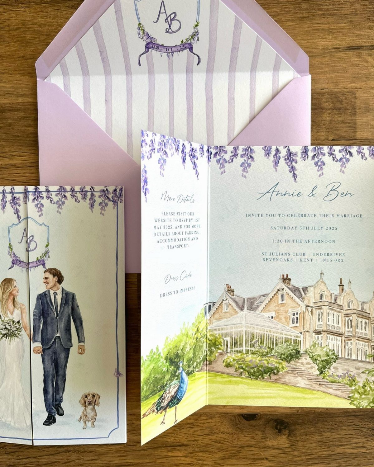
A suite that carries purple and blue only as accents leaves room for the illustration to do the talking.
Keep the 2 colors to a few touches, like a ribbon, a border or the date line, so the watercolor art stays the focus.
Order the whole suite from one designer so the shades match across pieces. Purple and blue drift apart fast between print shops, so ask for a printed proof before you commit to the full run.
2. Purple and Blue Bridesmaid Dresses
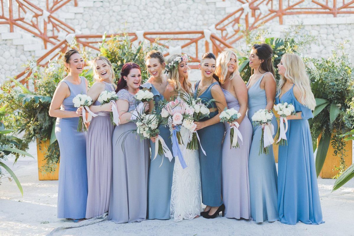
Mixed shades of blue and purple in one bridal party read as a palette instead of a uniform, and they forgive the differences in skin tone and build that a single dress color can’t.
Pick a narrow range, say periwinkle through plum, and let each bridesmaid choose her own cut within it.
I would send swatches before anyone orders, since screens misreport both colors. White stone or wood as a backdrop keeps the group from looking busy.
3. Purple and Blue Flowers
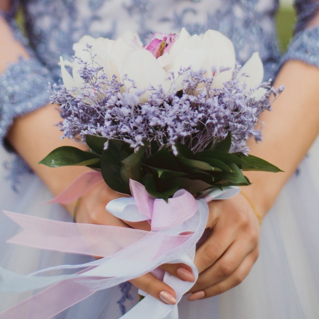
White does quiet work in a purple bouquet: it separates the shades so the purple looks deliberate. Tying the stems with light purple and white ribbon, as here, finishes the handle without adding another color.
If you want blue in the flowers themselves, ask your florist what is in season for your date, because true blue blooms are scarce and often dyed.
A blue dress or ribbon can carry that color instead, and it costs less.
4. Centerpieces
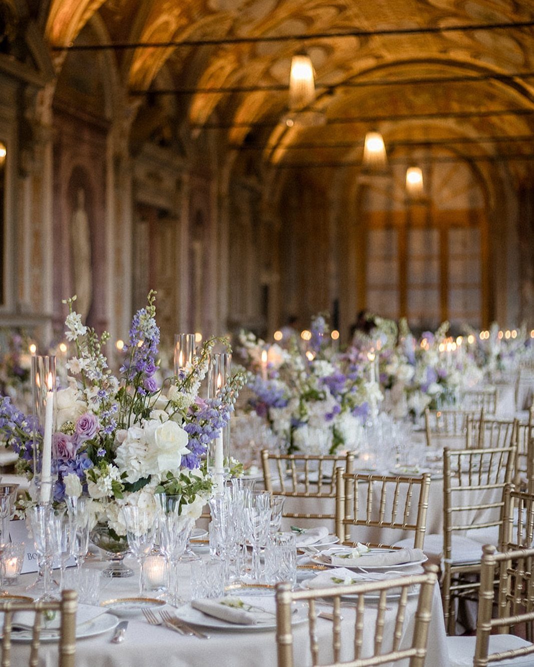
Mixing flowers is what keeps a long table from looking like a row of copies. Combine white, purple and blue blooms in arrangements that differ slightly, and set tall white candles among them for height.
On a long banquet table, I would keep the arrangements low enough to talk over, and let the candles supply the vertical lines.
Gold chairs and white linens already give you a warm base, so the flowers can carry all the color.
5. Blue and Purple Lighting
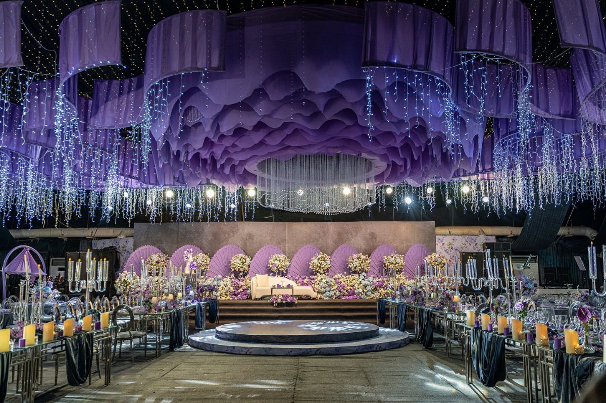
Purple fabric draped across the ceiling and blue fairy lights below it split the color job neatly: purple overhead, blue as a glow. That is a cheaper way to color a room than dyeing every surface.
Test the lights in the actual space after dark if you can, because blue tends to look cooler and darker on a ceiling than in a product photo. Purple candles on the tables tie the lower level to the draping.
6. Blue and Purple Wedding Favors
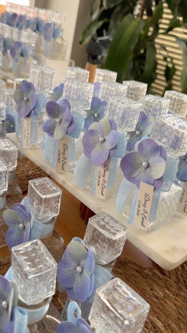
Light blue ribbon and a pressed purple petal or two carry the palette, and a tag with your names and the date turns a small favor into a keepsake.
Hydrangea is the item to plan around, since fresh petals wilt.
Dried ones hold their shade better if you assemble the bottles ahead. Make a test batch before you commit to all of them, so you can check how the ribbon, tag and stopper hold up together.
7. Purple and Blue Table Settings
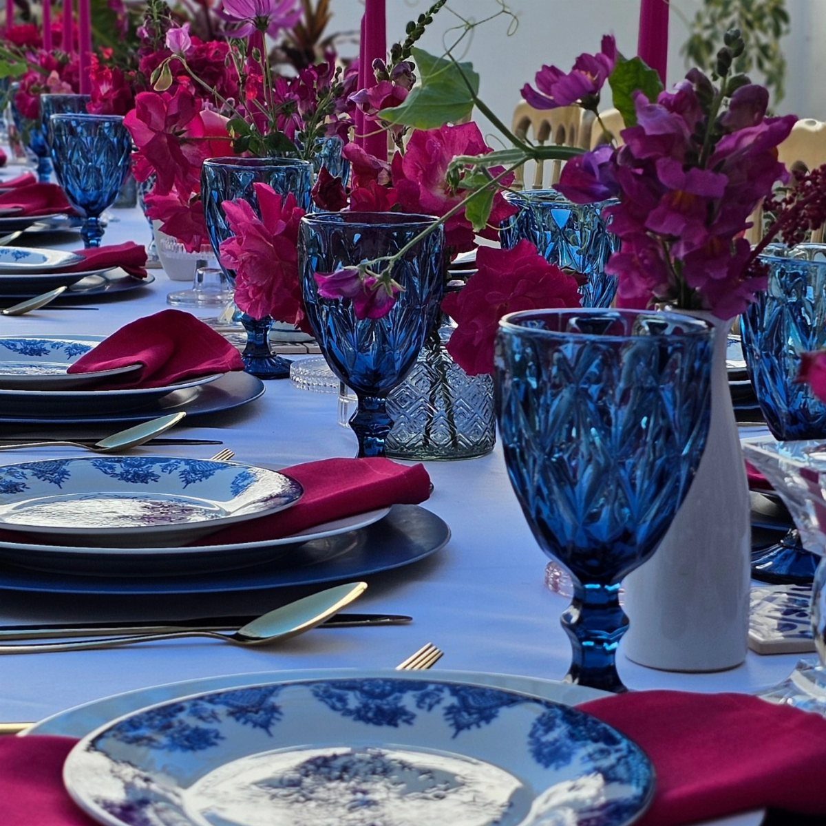
Magenta napkins against blue patterned plates make the purple side of the palette louder than a pale lavender would. Blue glassware repeats the plate color up high, so the table reads as a set instead of 2 separate colors.
A white tablecloth keeps that much pattern from crowding the eye. I would keep the vases low and the flowers in one magenta family, and let the plates be the only busy thing on the table.
8. Purple and Blue Wedding Ceremony Aisle
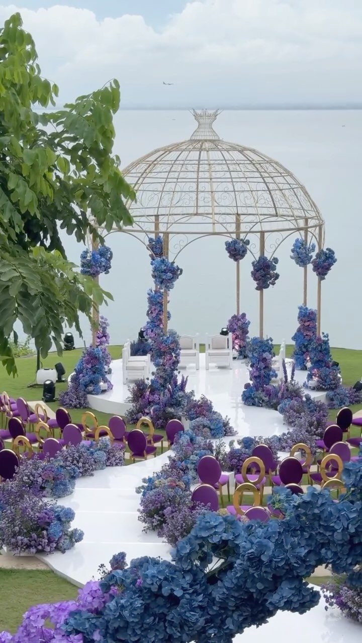
Purple and blue flowers lining a white aisle point the eye straight to the gazebo, so the florals do the guiding and the structure at the end does the framing.
Gold is a good neutral for a purple and blue aisle: gold chairs or a gold arch add warmth that keeps the 2 cool colors from feeling icy.
Repeat the same two colors down both sides of the aisle so the line reads as one run. With water behind the gazebo, I would keep the arrangements low enough that guests still see it from their seats.
9. Purple and Blue Photo Backdrop
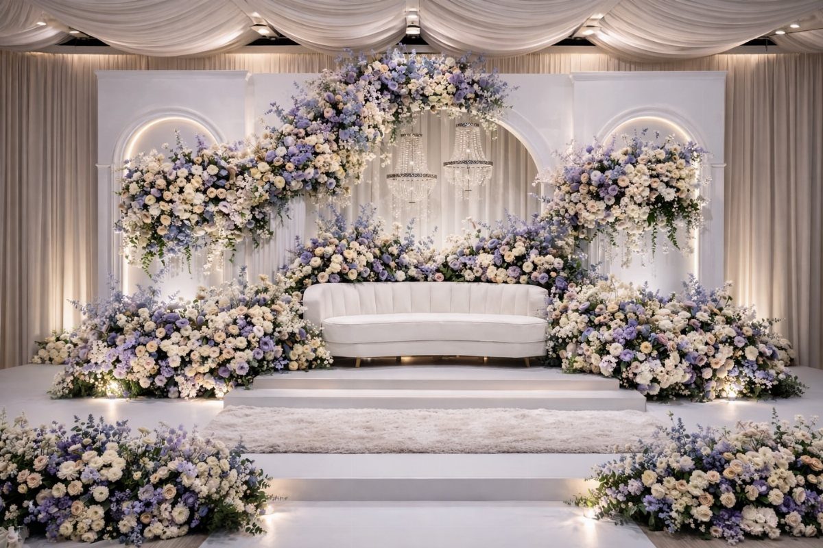
A white sofa on a platform gives guests a place to sit for portraits and keeps the flowers as the only color.
White arches around it frame the shot, and purple, blue and white arrangements fill the sides so the sofa looks surrounded rather than parked.
Draped fabric and crystal chandeliers behind it add depth without competing. I would set the arrangements at different heights, since a flat row of blooms looks like a wall instead of a garden.
Importance of Color Palette
A palette is a set of decisions you make once, so every later choice can be checked against it.
Purple and blue hold up well here because they sit close together on the color wheel, which makes them easy to mix without clashing.
Pick one color to lead and one to support. If purple is the lead, blue becomes the accent, and a vendor can tell at a glance what to match.
Add one metal.
Gold or silver both work with this pair; gold reads warmer, silver cooler and crisper. Choose one and stick with it so the metal doesn’t become a third color.
Settle the palette before you book anyone or order anything, since every shade you buy later has to match it.
Creating a Cohesive Look
Write your palette down as a short list: two main colors, one metal, one neutral. Give it to every vendor, your florist, your stationer and your bridal party, so everyone works from the same words.
Pick actual shades before you order anything: say lavender and dusty blue, or plum and navy, because two vague "purples" and "blues" from different vendors will clash on the table.
Lavender, plum and navy are far easier to match than the bare color names.
Collect small samples of each item in one place before the wedding: a ribbon, a napkin, a fabric swatch, a printed card.
Lay them side by side in daylight and again under lamplight. Anything that looks off next to the others is cheaper to swap now than on the day.
Keep a limit on the number of shades. Two or three per color is plenty, and the repetition is what makes the whole day look planned.





