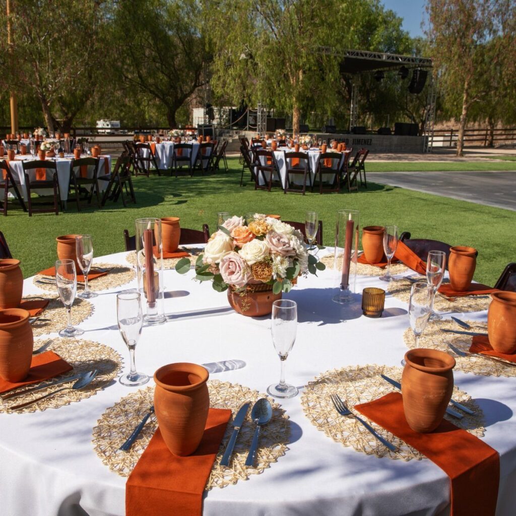
Each palette here comes down to how much of the table the color covers: Terracotta Table Linens and Peach Bouquets keep the terracotta in the linens and the peach in the flowers, while Aubergine and Antique Wine take over the cloth, florals and candles.
Your venue’s light should pick the winner, and the Photography Tips for September section shows how each palette reads once the sun drops.
A bright outdoor afternoon favors dusty blue and peach, and a reception that runs into candlelight favors the deep tones, where pastels can disappear.
Pick the palette that suits the hour when most of your guests will see the room, and use the Choosing a Color Palette section to test it against your own timeline.
1. Terracotta Table Linens and Peach Bouquets
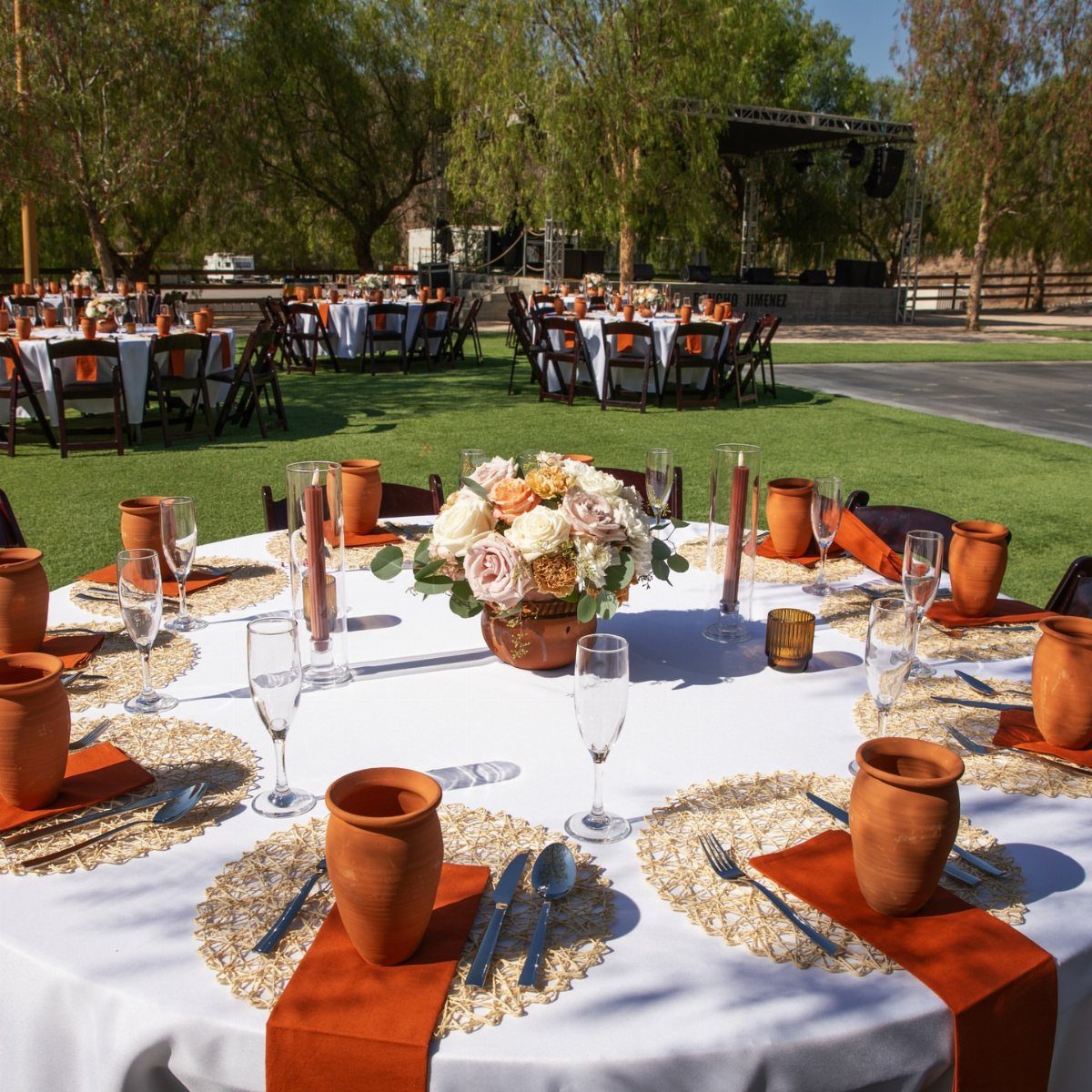
The color sits almost entirely in the napkins, which makes this approach cheap to pull off. Rent plain white cloths, then add the clay-toned napkins as the one rented or bought accent.
Peach florals sit softly against that earthy orange, so keep the centerpieces low enough to talk over. Clay cups, if you want them, repeat the napkin color without adding another shade.
2. Navy Suits and Burnt Orange Florals
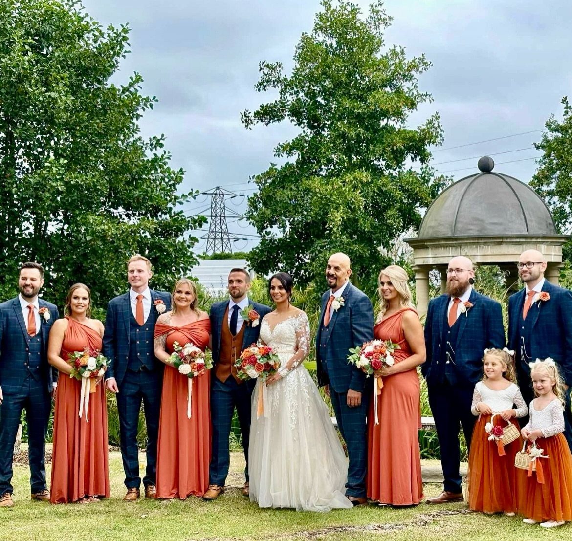
Navy suits against burnt orange dresses is a high-contrast pairing, and it photographs well outdoors among stone and trees. Let the orange carry the bouquets too, so the florals and bridesmaid dresses read as one color.
I would keep the groomsmen in plain navy with no extra accent color. The dresses and flowers already supply the warmth, and one more shade would crowd the group.
3. Aubergine and Antique Wine
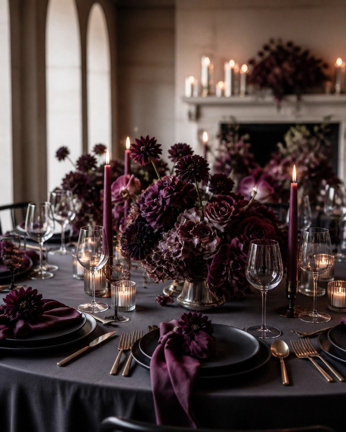
Aubergine #4A1E33 and wine #7B2C3B sit close enough on the color wheel to feel layered, not matched. Add ivory #EFE3D6 so the table has a light note to rest on.
Use the aubergine for the cloth or large florals, and the wine for napkins and candles. Candlelight suits this palette better than any bright overhead light, since dark tones go flat without a glow.
4. Vineyard Romance
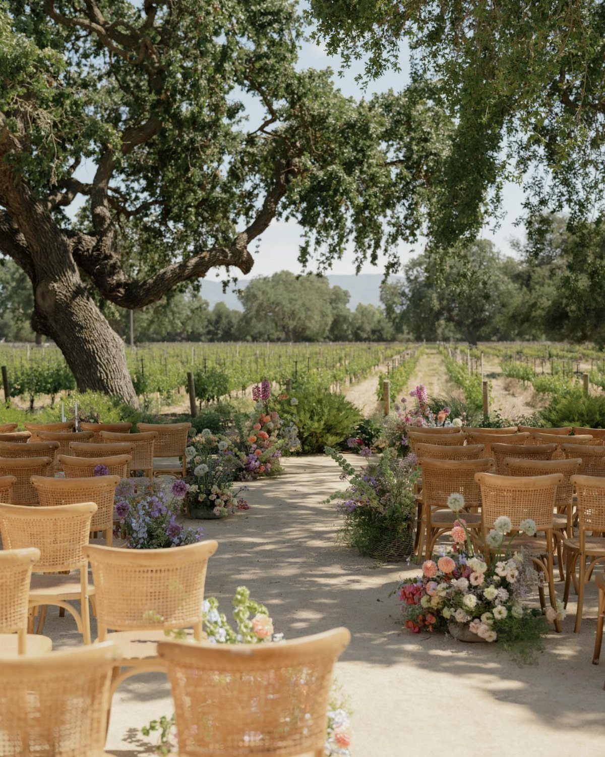
Rows of vines, a big shade tree and an aisle lined with woven wicker chairs already give you a finished setting, so spend on flowers instead of backdrops.
The vines are full and the light stays warm into evening, which is exactly when a vineyard setting works best.
Choose arrangements in warm, saturated colors that can hold their own against all that green.
5. Jewel Tones with Gold Accents
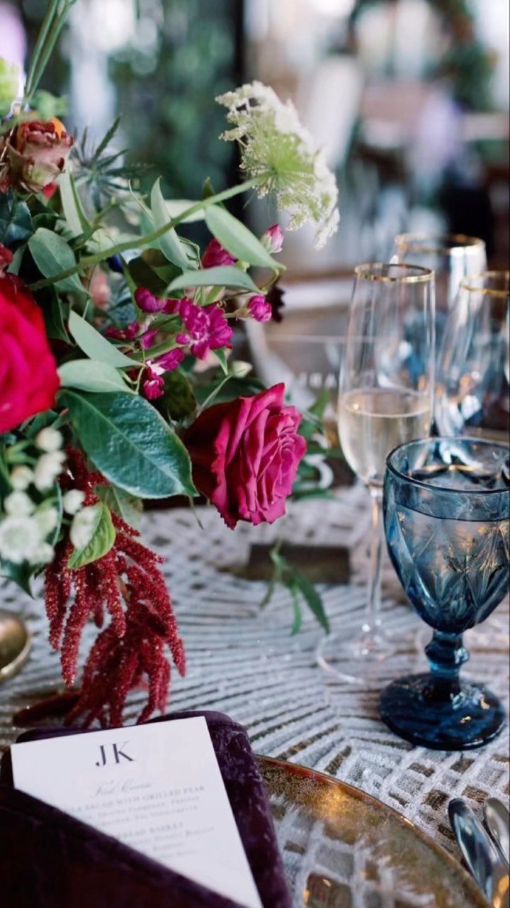
Deep red roses, blue glassware and gold-rimmed glasses make a bold, luxurious table without much clutter. I would let gold appear in small doses: a charger plate, a glass rim, nothing more.
White lace underneath keeps the saturated colors from feeling heavy. Pick one jewel tone as the lead, here the red, and let the blue glass play support.
6. Peach and Dusty Blue
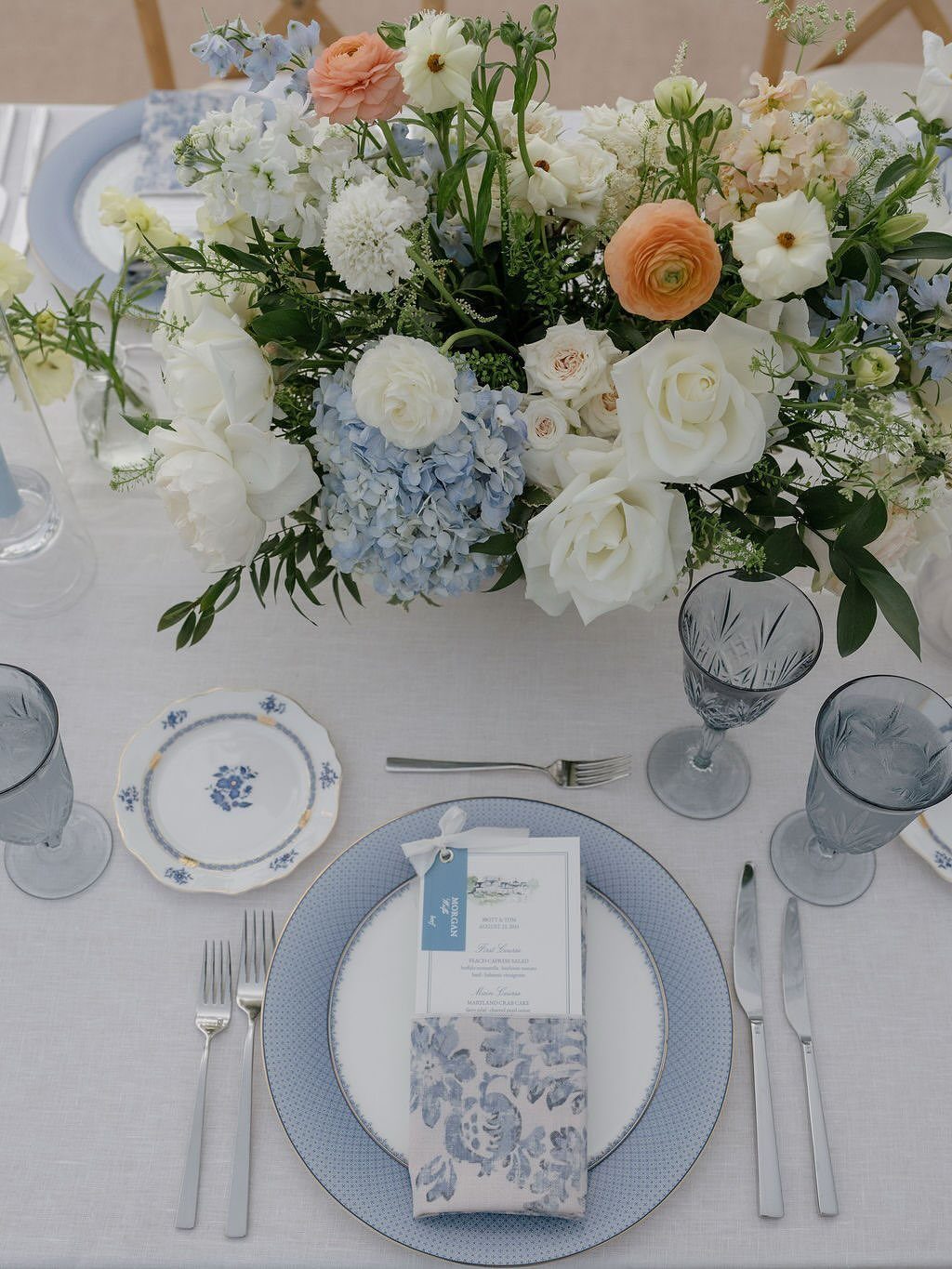
Peach ranunculus, white roses and light blue hydrangeas make a centerpiece that works with blue patterned plates and light blue glassware. The two colors share a soft tone, so neither one fights the other.
The plates carry a lot of pattern, so keep the linens plain. A menu card resting on each plate is a simple way to finish the setting without adding another color.
7. Burgundy and Blush
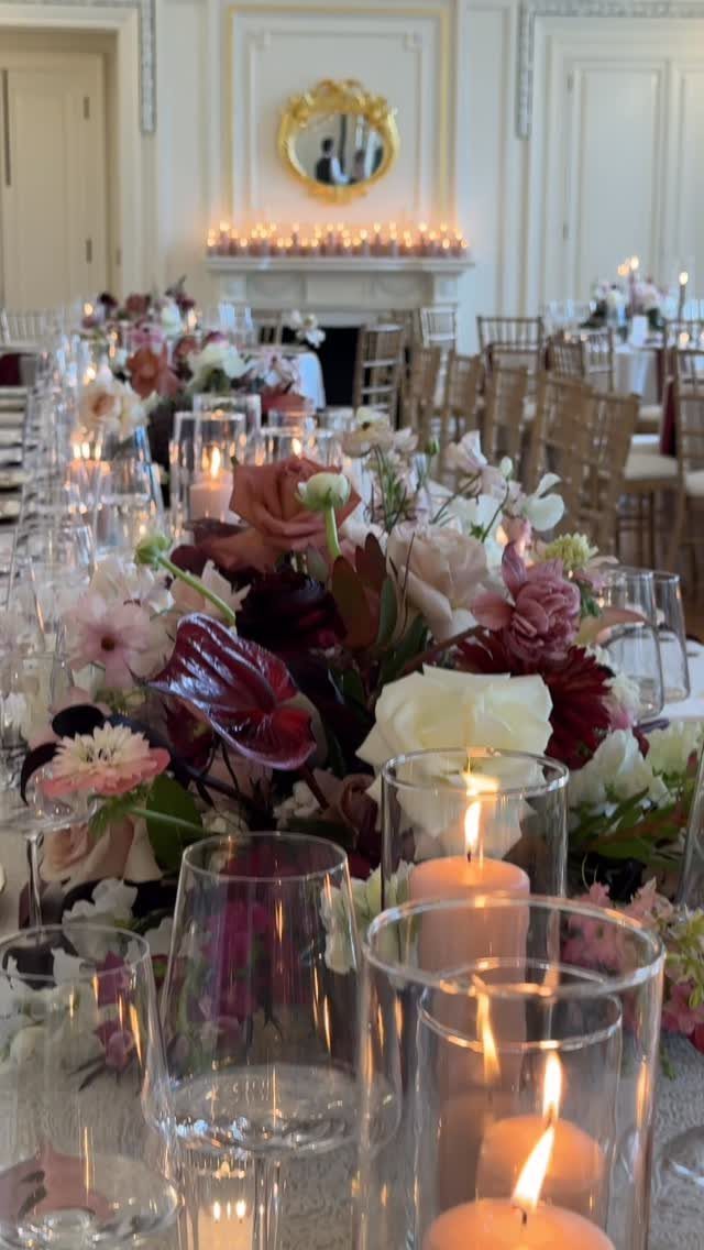
Blush linens, burgundy napkins and arrangements that mix both colors give a long table a clear light-and-dark rhythm. Because the blush covers the largest surface, the napkins can stay the deeper color and still feel balanced.
Repeat the mix in the florals so the table reads as one palette, not two. Candles in the middle of the table suit these tones, since burgundy looks richest in warm light.
I would keep the glassware clear and let the flowers do the coloring.
8. Sage Green and White
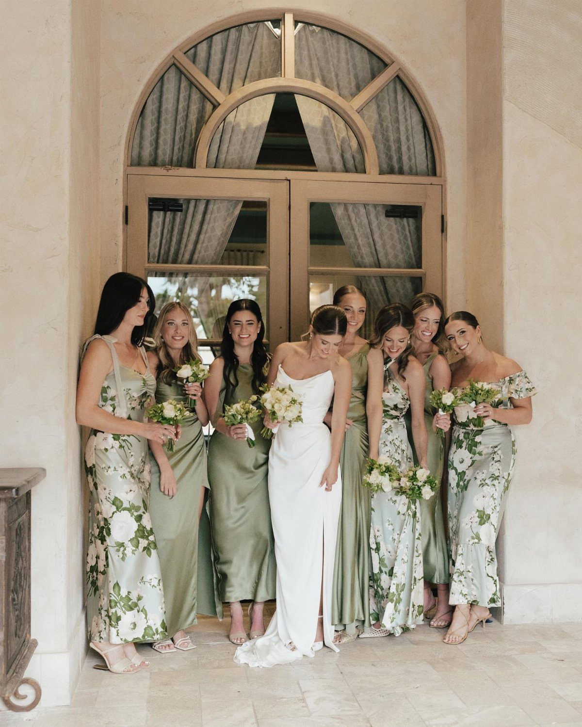
Sage green looks best in September when it is allowed to vary: some bridesmaids in solid dresses, others in floral prints, all sharing the same soft green.
A mixed group looks relaxed and gives each person more room to choose a cut that suits her.
Keep the bouquets crisp, white flowers with green foliage, so they echo the dresses without matching them exactly. I prefer that to a bouquet in a third color, which would crowd a bride in white.
Send swatches before anyone orders, since sage shifts a lot between brands.
9. Blush and Classic Ivory
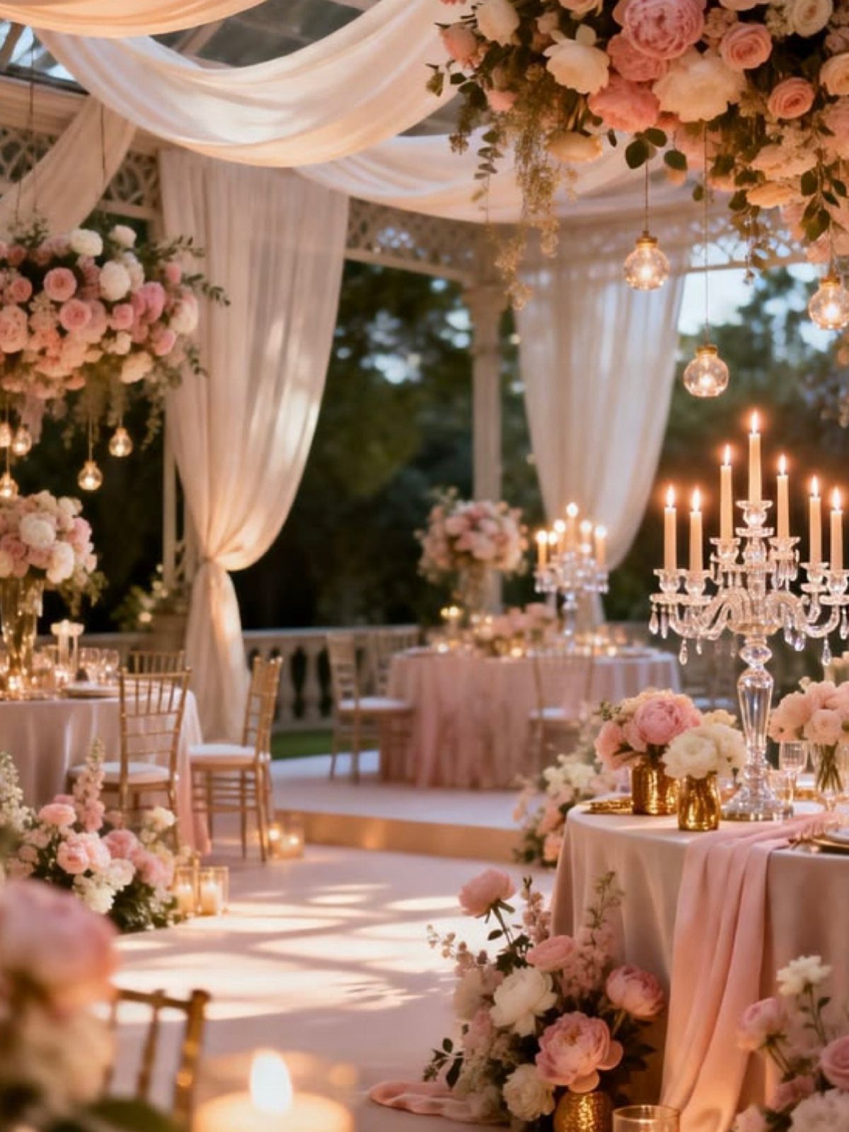
Blush and ivory are close enough in tone that the table feels calm, so give the room one sparkle: crystal candelabras. They add height and shine without introducing another color.
Pink and white florals sit well on blush linens, though I would keep the ivory as the lighter layer underneath so the pink has something to stand against.
Under a white draped canopy, the whole setup stays soft and pale. Skip any dark accent here, or it will pull the eye away from the flowers.
Choosing a Color Palette
Pick three slots and stop: one anchor, one mid-tone, one neutral or metal. Five colors will fight each other in photos, and I would rather you cut two now than regret them later.
Build the other 2 colors around it.
Then check the light. September afternoons run bright and golden, so a palette that looks soft on a screen can wash out or blow out.
Under strong September sun, stark white tends to blow out in photos, but dusty blue keeps its depth and peach puts a warm glow on faces.
Evening is a different test. Receptions that run into candlelight favor deep colors, and pastels can disappear.
Make sure a light neutral is in the mix.
Incorporating Seasonal Décor
Seasonal touches work best when they are textured and few. Weave autumn leaves into floral arrangements or scatter them along pathways, and the venue picks up the season without a big rental bill.
A few wooden crates, an old barrel, or a hand-painted sign give a room a grounded, rustic weight. Pick one or two of these, not all three, so the room doesn’t turn into a barn sale.
For the table, figs, grapes, golden pears, and textured foliage bring richness and depth. Soft linens and handwritten menus alongside them make the tables feel personal and good to touch.
Finish with candlelight. It suits indoor and outdoor spaces alike, and it is the cheapest way I know to make a room feel warm.
Photography Tips for September
Book your portraits for golden hour, that stretch of late afternoon just before sunset, and tell your photographer ahead of time.
Light at that hour is soft on skin and deepens the reds, golds, and oranges of early fall leaves. Lavender also reads deeper and richer in that low light than it does in the flat glare of noon.
Build the timeline around it. If the ceremony runs late, a short portrait break just before sunset beats trying to fit everything in earlier.
Choose an outdoor spot with trees and leaves behind you, since the foliage works as a free backdrop and saves you from paying for extra styling.
A few props can make portraits feel playful or intimate: scarves, blankets, or a floral arrangement. Ask for candid shots of the bridal party and family too, since those often become the images people keep.
Frequently Asked Questions
What are the best colors for a wedding in September?
Warm mid-tones that bridge summer and fall work best: peach with dusty blue, sage green with white, terracotta napkins on white linens, or blush with burgundy.
September afternoon light is bright and golden, so soft shades like dusty blue keep their depth and peach warms faces. Deep jewel tones also work, especially for evening receptions lit by candles.
Is September or October better for a wedding?
It depends on how autumnal you want the day to feel. September blends the last of summer with the first of fall, so peach, dusty blue and sage all look right, while October leans fully into fall.
Early September also lets you skip the heavy, dark autumn shades if they feel like too much, too soon.
What seasonal foods and drinks are perfect for a September wedding?
Apples, squash and roasted vegetables fit the month well, along with warm drinks like mulled cider or spiced tea. Apple tarts or cinnamon-spiced desserts finish the menu in the same spirit.
Fresh figs, Concord grapes and Bartlett pears can double as table decor, since their deep purples and warm golds fit a September palette and cost less than most flowers.





