The palettes here run from icy white and pale blue, where the flowers carry the only color, to deep red with heavy gold embroidery, where the fabric does all the work.
In a dim room, Warm Golden Glow and candlelight do the most work, while in a pale room Deep Red & Gold lets the metallic show best.
1. White & Ice Blue
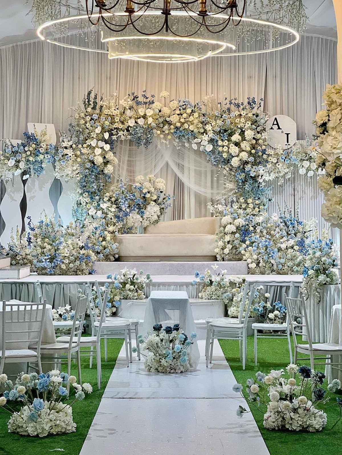
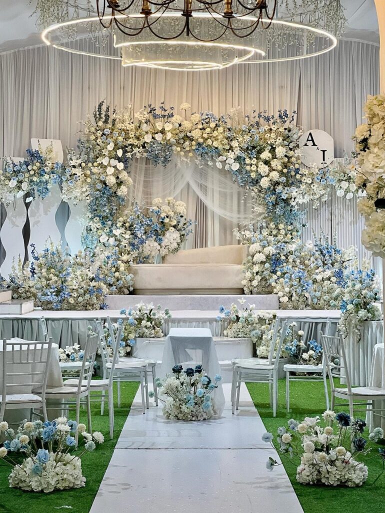
White with ice blue works best when the blue stays in the flowers and the white carries everything else: chairs, aisle runner, curtains. That keeps the palette quiet and cool.
A circular chandelier overhead adds a bit of sparkle without adding another color. Green turf underfoot gives the pale tones a clean base, so I would not fight it with a third shade.
For a winter ceremony, this is the palette I would choose when I want calm over drama.
2. Lavender & Silver
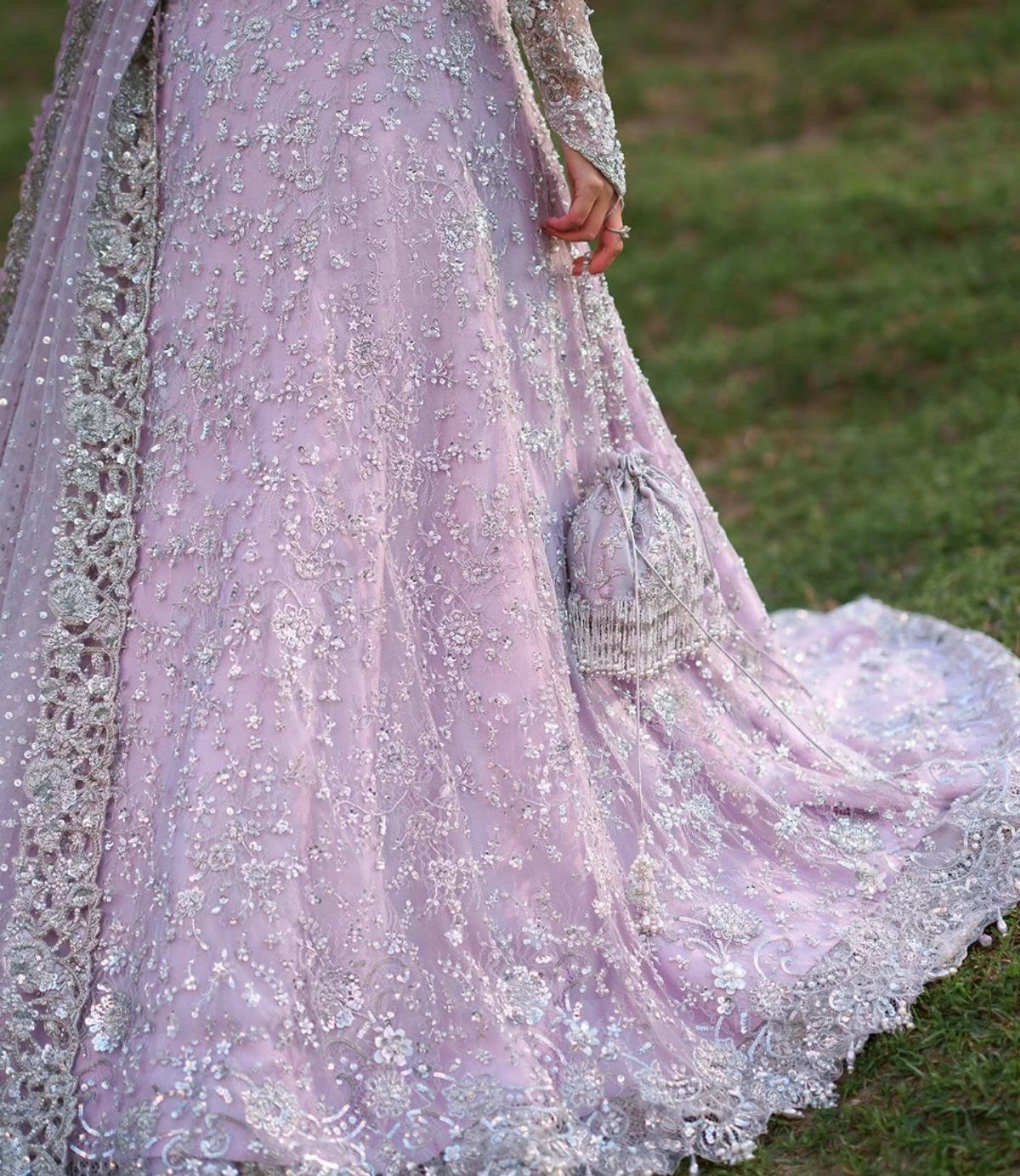
Lavender and silver sit close enough in tone that they read as one soft shimmer, which is why a gown in this pairing looks so delicate. Sequins and embroidery do the work that a bolder color would do elsewhere.
If the dress already carries the silver, keep the rest of the palette simple. A matching pouch is an easy way to repeat the lavender without spending much.
I would let the gown be the statement and keep decor in plain, pale tones.
3. Forest Green & Black
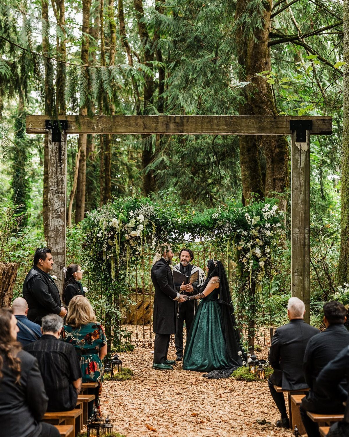
Dark green against black looks formal fast, and woodland settings make it feel natural rather than stiff. White flowers on a wooden arch give the eye somewhere to rest.
This palette is deep, so it needs that white. Without it, a forest ceremony can go heavy and hard to photograph.
I like green on the bride and black on the groom and guests: the couple stands out while the crowd stays a quiet frame.
4. Dusty Blue & Blush
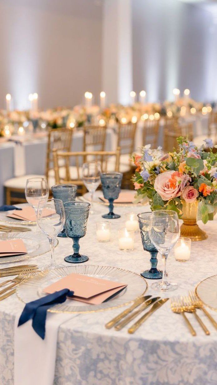
Light blue damask linens with a blush floral centerpiece make a table that feels gentle without going sugary. Blue glassware repeats the color in a different texture, which costs little and adds depth.
Gold chairs and cutlery warm the blue so it doesn’t turn icy. Candles finish the setting and soften an indoor room.
I would keep blush to the flowers only. Let the blue take the linens and glass, and the table stays balanced.
5. Emerald & Champagne
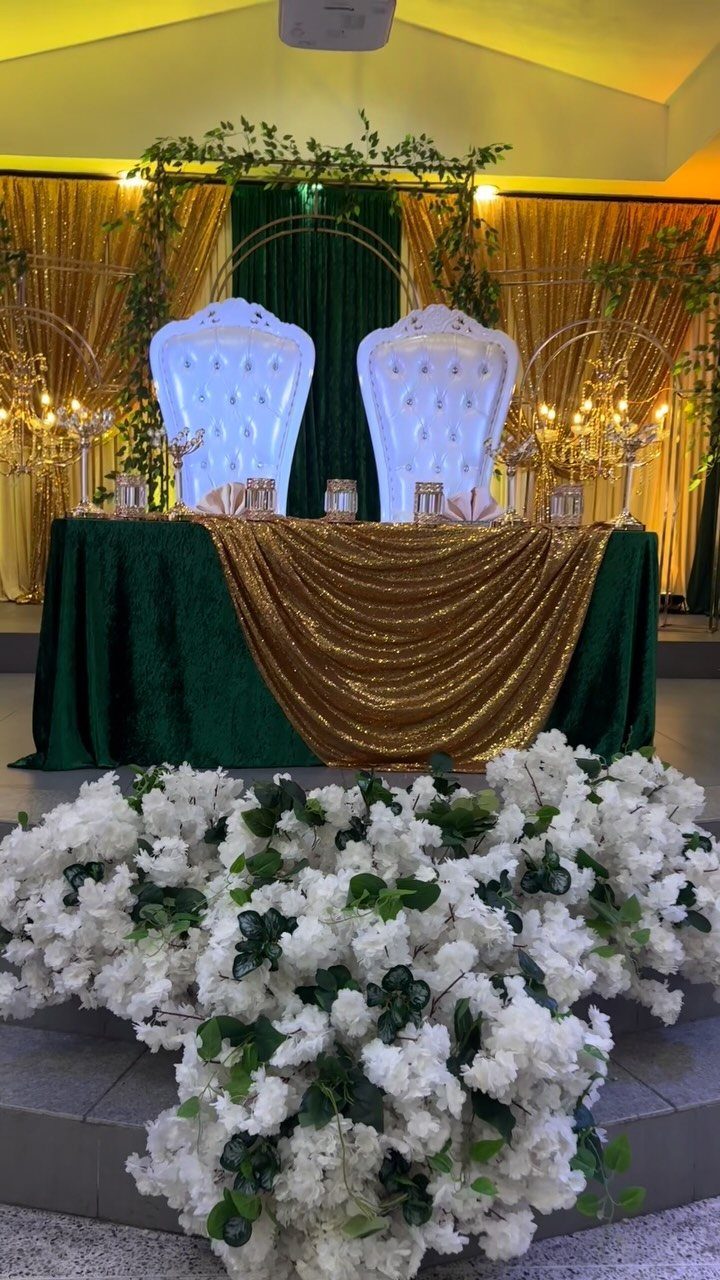
Emerald brings the winter depth, and champagne gold lifts it toward something lighter. Together they feel rich but not heavy.
A head table is the best place to spend on this pairing.
Layer emerald and champagne linens, add gold candelabras, and set one large white floral arrangement in front. White keeps the 2 main colors crisp.
On a tighter budget, I would put the full palette on the head table and keep guest tables simpler.
6. Dusty Plum
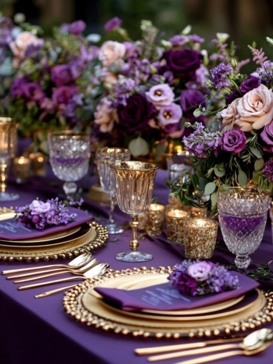
Plum is the winter color I reach for when I want a room to feel moody and warm at once. A purple tablecloth sets the tone, and purple and cream roses stop it from going dark.
Gold plates and cutlery add glow against the deeper shade. Crystal glasses catch candlelight and keep the table from feeling flat.
Choose a dusty plum rather than a bright purple. It sits more comfortably next to cream flowers and gold.
7. Warm Golden Glow
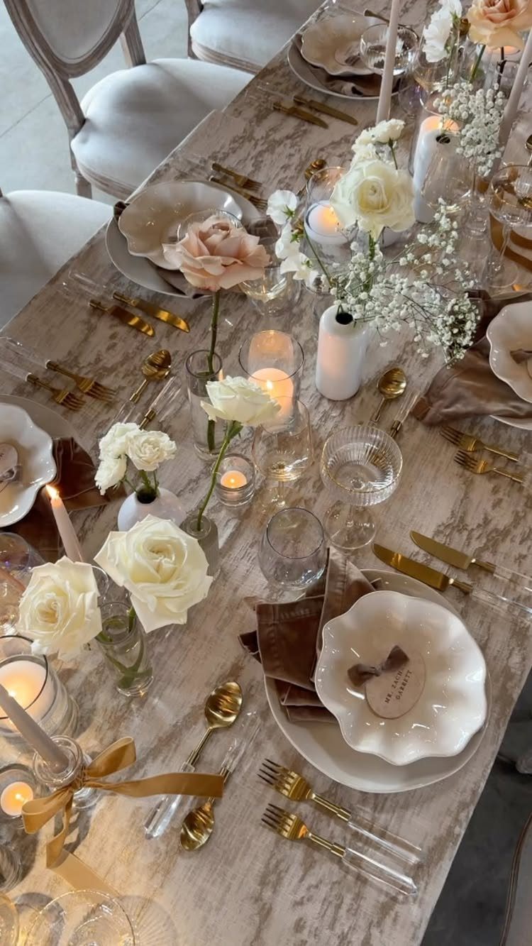
Caramel tones turn winter candlelight into something that looks expensive.
Keep the plates and flowers pale so the gold and candles can glow. White roses mixed with peach cost no more than a single color, and they soften the metal.
I would pick this over deep jewel tones if the room already feels dim.
8. Icy Cool
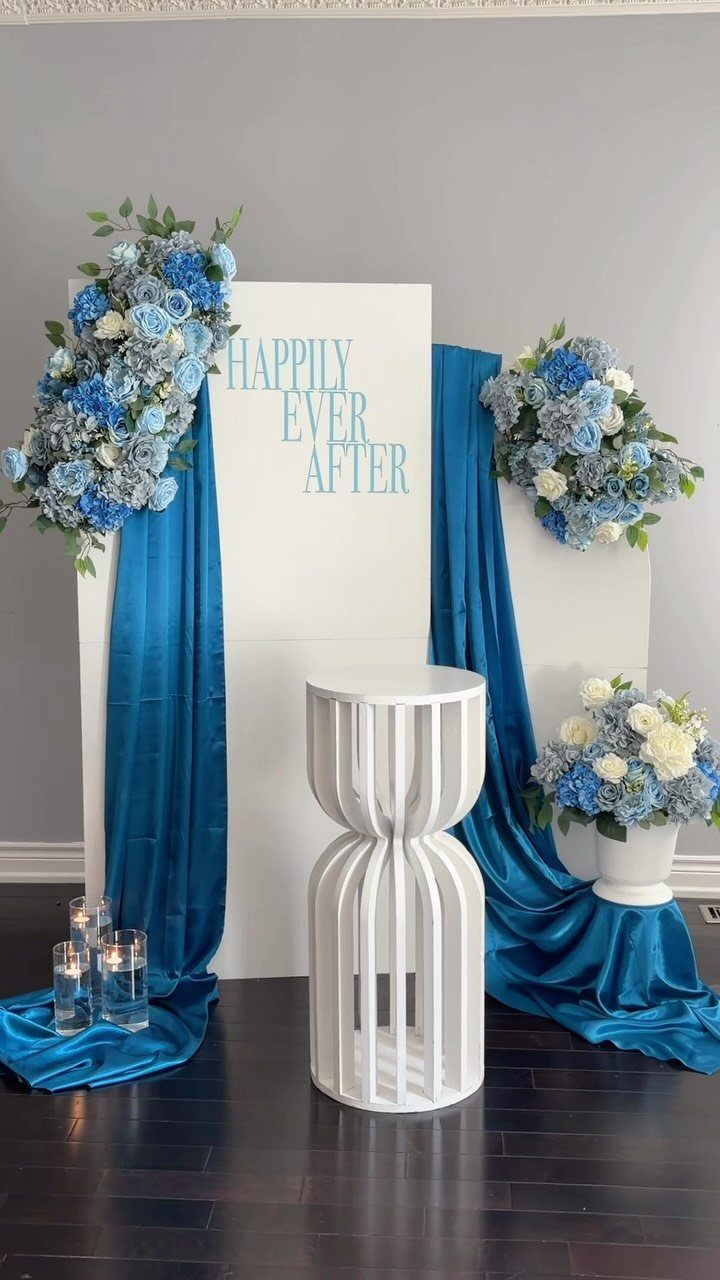
Blue satin drapes behind a white backdrop give a cool palette its shape, and a few blue and white arrangements keep it from reading as flat. Pale flowers on a white pedestal table repeat the idea at a smaller scale.
Candles on the floor add a warm point of light, which cool shades need in a winter room. Without them, all that blue can feel like a cold office.
9. Forest Green & Gold
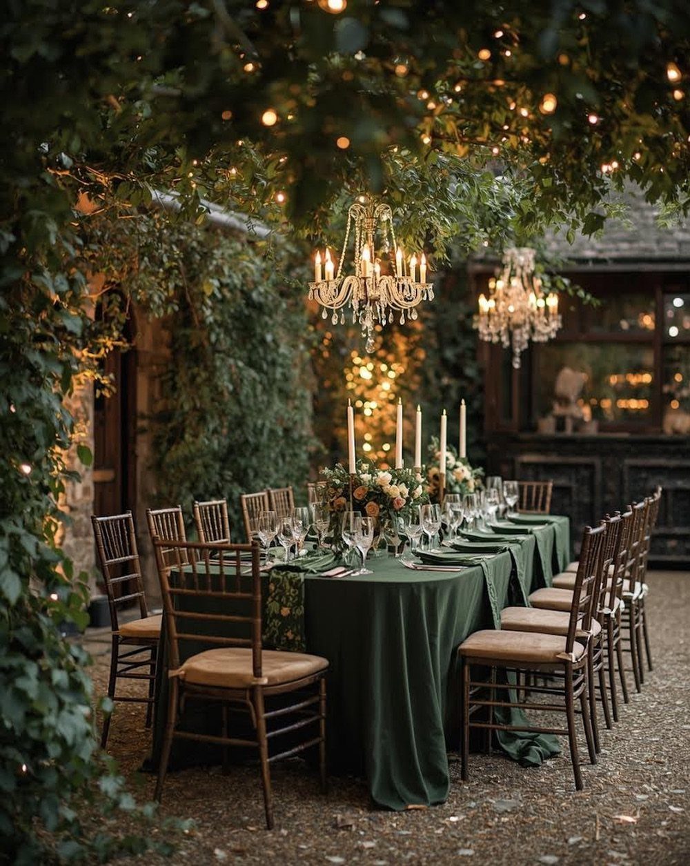
Forest green linens lay down a dark, even base, and gold chairs lift it right away.
Hang crystal chandeliers overhead and set white candles on the tables, so the green never turns murky after dark; deep green absorbs light, and you want a source above and at eye level.
If chairs are too much to rent in gold, I would spend on gold votives instead. They carry the same warmth in a smaller package.
Keep the flowers candlelit and mostly white or soft, and let green and gold do the rest.
10. Deep Red & Gold
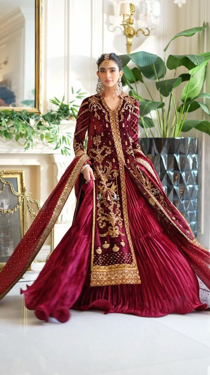
Deep red with heavy gold embroidery is a pairing that needs nothing added. The fabric carries the richness, so the room around it can stay plain and bright.
For a winter wedding, I would borrow the palette for decor in small doses: red flowers, gold frames or accents, and nothing busy competing with the outfit.
Gold shows best against red when the surroundings are light, so a pale room is a smart match.
11. Dusky Pink & Taupe Satin Fabric
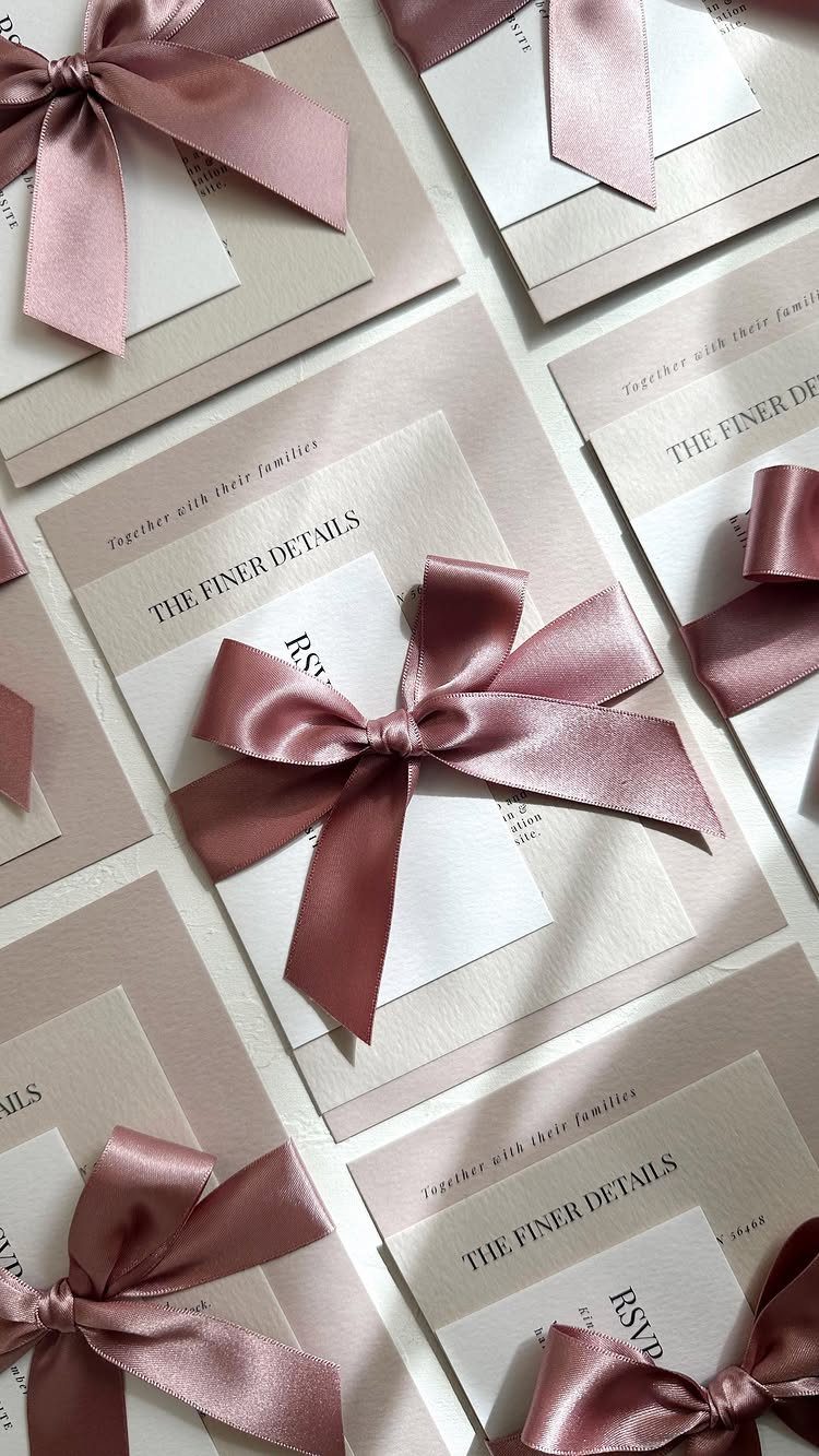
Satin ribbon is a cheap way to get a slightly shiny finish on paper. Dusky pink bows on taupe cardstock with white inserts look soft and warm, and the taupe has the pale glow of champagne.
Tie each suite by hand, and buy one ribbon width for the whole batch so the bows match. Test a single suite first to check the knot sits flat in the mail.
I would carry the same ribbon to the menus and place cards.
Choosing the Right Colors
Start with the room, not the Pinterest board. Look at what is already fixed in your venue: carpet, wood tone, wall color, and the light that comes through the windows at your ceremony time.
A palette that fights those will cost you more to correct than any flower order.
Season gives you 2 safe routes.
Classic burgundy and forest green read as Christmas-adjacent and formal. One deep winter color paired with neutrals feels more modern and less holiday.
Then check the palette against your own taste.
If you would not wear the main color, you will tire of it by the second hour of the reception. Pick two main colors and one neutral, and stop there.
Using Metallic Accents
Pick one metal and let it lead.
Gold warms a palette; silver cools it. Mixing both is possible, but on a budget it looks accidental unless one clearly dominates.
Gold pairs well with red and blush.
The red adds richness, the blush softens it, and the gold adds glamour. This combination also steers clear of the red-and-green holiday look, which matters if you want a winter wedding that does not feel like a Christmas party.
Silver and gray suit a sleek, modern palette. Icy blues and silvers pick up the glint of a frosty day, and you can carry them through a metallic charger, a bridesmaid dress, or the table linens.
Spread the metal in small doses across several places rather than one big gesture.
Lighting Effects
Light changes color more than any linen order will. The same dusty plum can look moody and romantic under warm light or flat and gray under harsh overheads, so decide on your lighting before you finalize shades.
Ask your venue what it can dim, and whether you can bring your own sources.
Warm bulbs, candles, and string lights set a cozy mood. Cooler light can make the room feel otherworldly, which suits icy palettes.
If you can, view your fabric swatches in the room at the time of day your event will happen.
Frequently Asked Questions
What are the trendy colors for winter weddings?
Deep jewel tones such as emerald, forest green, plum and deep red lead, with soft pastels like ice blue, lavender and dusty blue close behind.
Pair one deep winter color with neutrals for a modern look, or burgundy with forest green for a formal one that leans toward Christmas. Add one metal, gold to warm the palette or silver to cool it.
Can you wear black to a winter wedding?
Yes, black is a classic, elegant choice for winter.
Dark green against black looks formal fast, and I like green on the bride with black on the groom and guests, so the couple stands out while the crowd forms a quiet frame.
Add white flowers, because black and deep green alone can feel heavy and photograph poorly.





