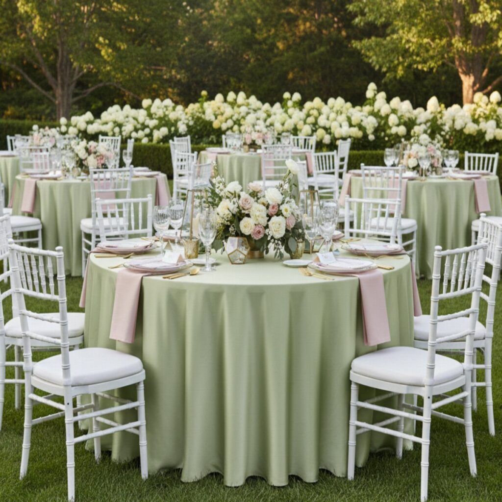
The ideas here run from a single sage sash tied to a white chair to a full pink-and-green table, and the deciding factor is which color leads your day.
Lead with pink and the day feels sweet and festive; lead with green and it feels calm, like a garden, so settle that first and let the other color play backup.
1. Pink and Green Floral Arrangements
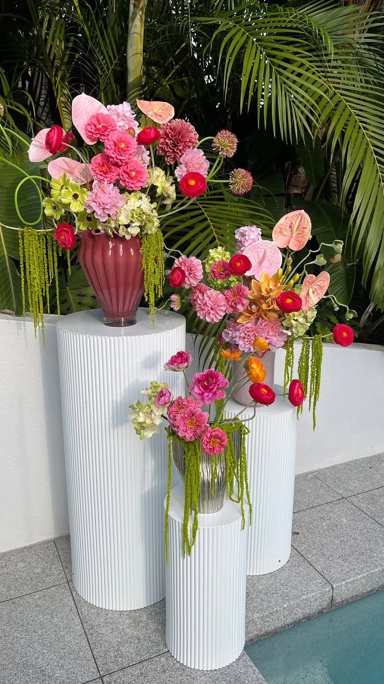
Pink blooms against green foliage look best when the vases stay simple, and the white fluted pedestals here do the lifting. Raising arrangements to different heights gives a few stems the presence of a full installation.
Three vases in one shape, and the flowers can vary from there. Mixing pink shades with plenty of leafy green keeps the palette from turning sugary, which suits a summer day outdoors.
"Pink and lime green felt like the perfect expression of summer: fresh, playful, and full of life," she smiles.
2. Sage Green Linens
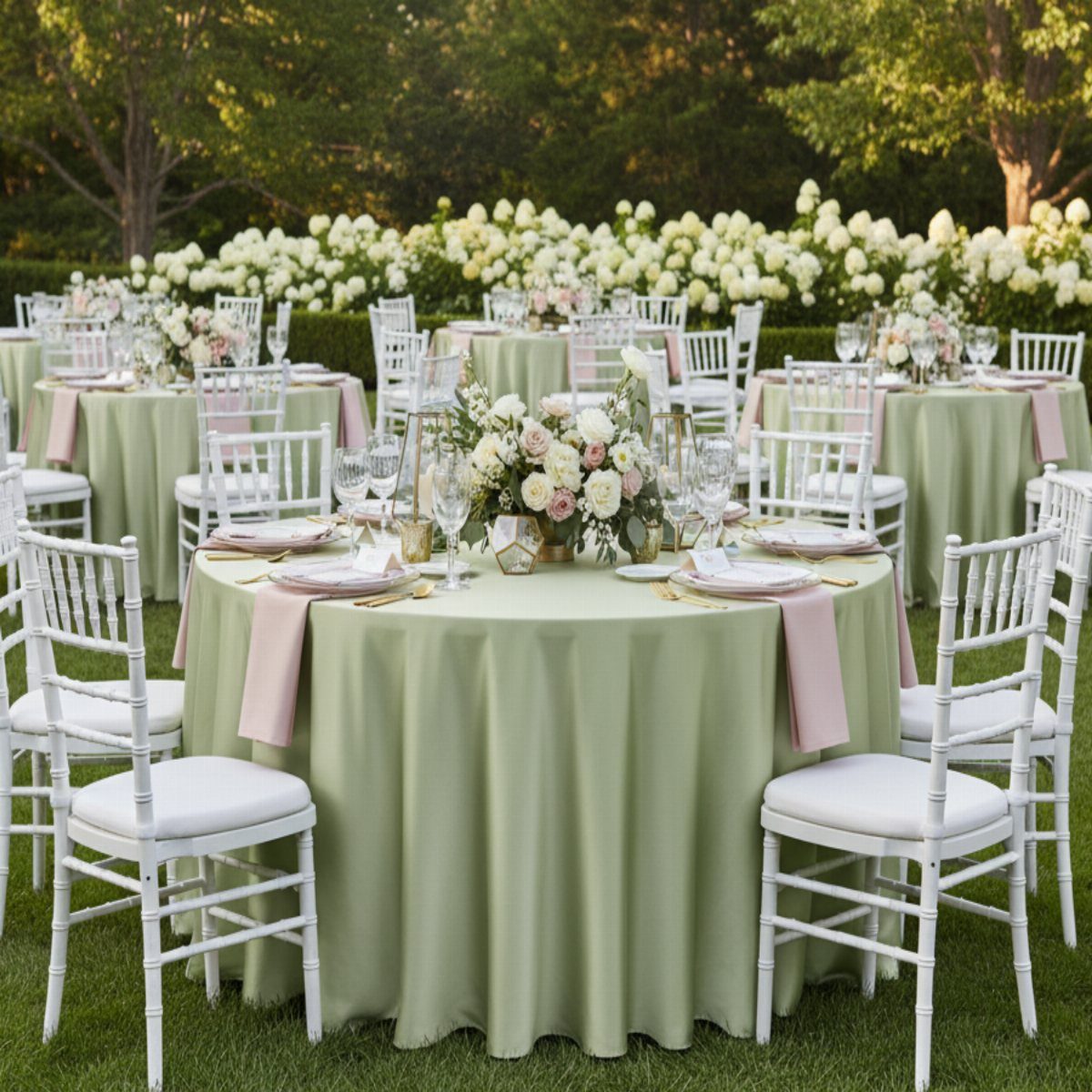
Sage green on the tables does the quiet work, so the pink can show up in small hits like napkins. That split keeps the palette soft instead of loud.
Against white chairs and a green lawn, sage tablecloths read as part of the garden rather than a separate color.
I would keep the napkins pink and let the centerpiece flowers repeat it, so the eye lands on the table without anything competing.
3. Pink and Green Wedding Stationery
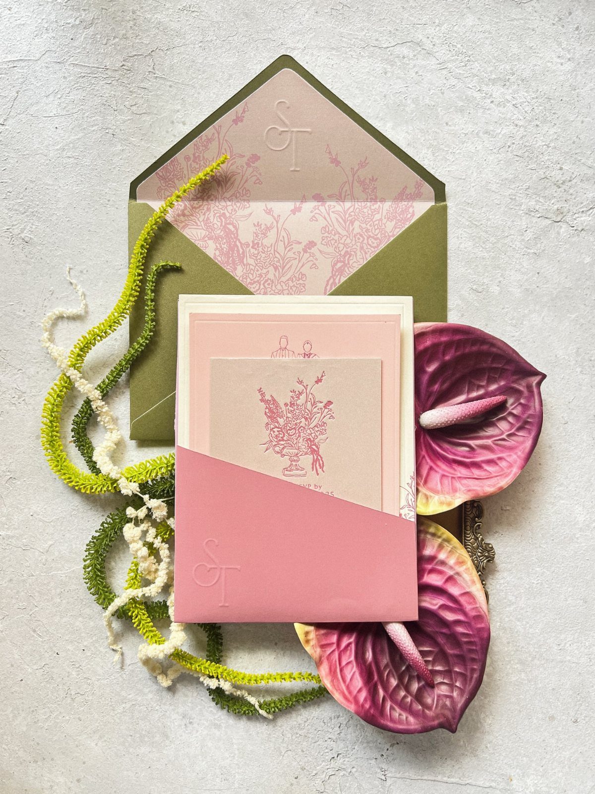
A pink invitation with a green envelope tells guests the palette before they arrive. The floral illustration ties the paper to the flowers on the day.
Order the envelope in green and the card in pink, not the reverse; the envelope is the first thing anyone sees.
If you want a styled flat lay for photos, a few stems of amaranthus beside the suite adds texture. Matching the menu or place cards to the same 2 shades finishes the set.
4. Pink and Green Table Runners
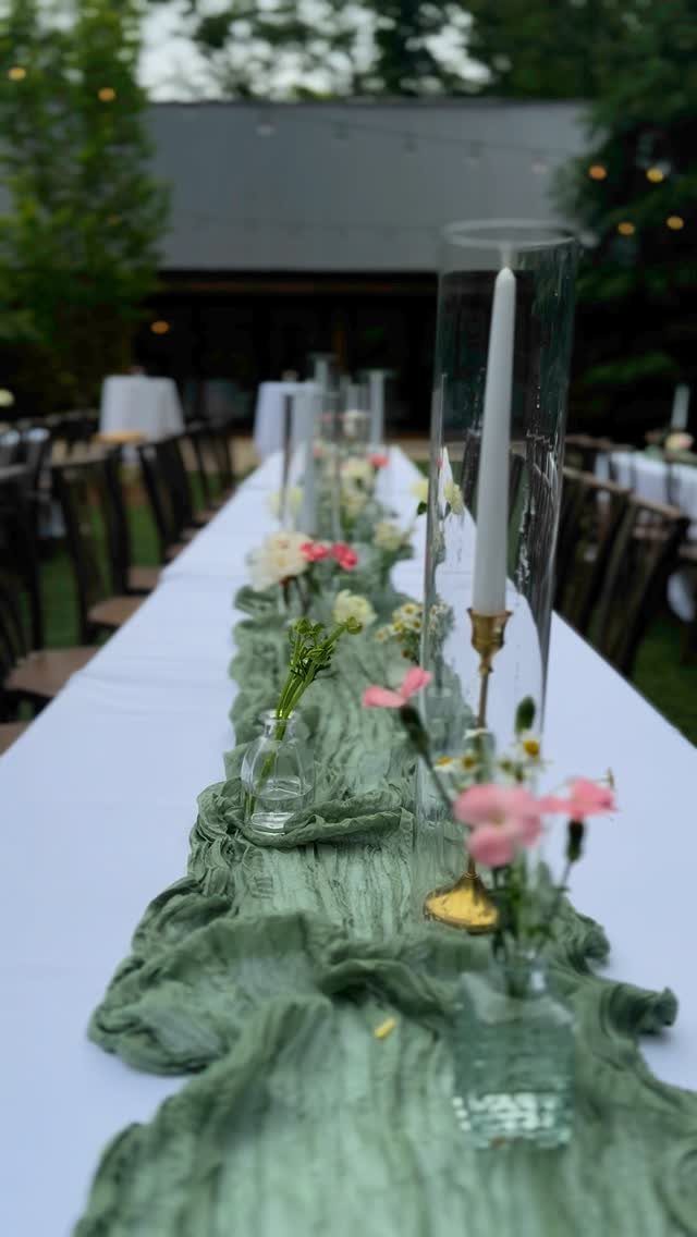
A gauzy green runner softens a long white table in a way a flat cloth cannot. Its texture catches light and gives the vases and candles something to sit on.
Keep the runner the star and the rest restrained: small vases of pink and white flowers, spaced evenly, with tall glass cylinders for candles between them.
I like leaving the table itself bare white, since it lets the sage color read clearly. Skip anything bulky that would crowd the runner.
5. Gold Chargers and Cutlery
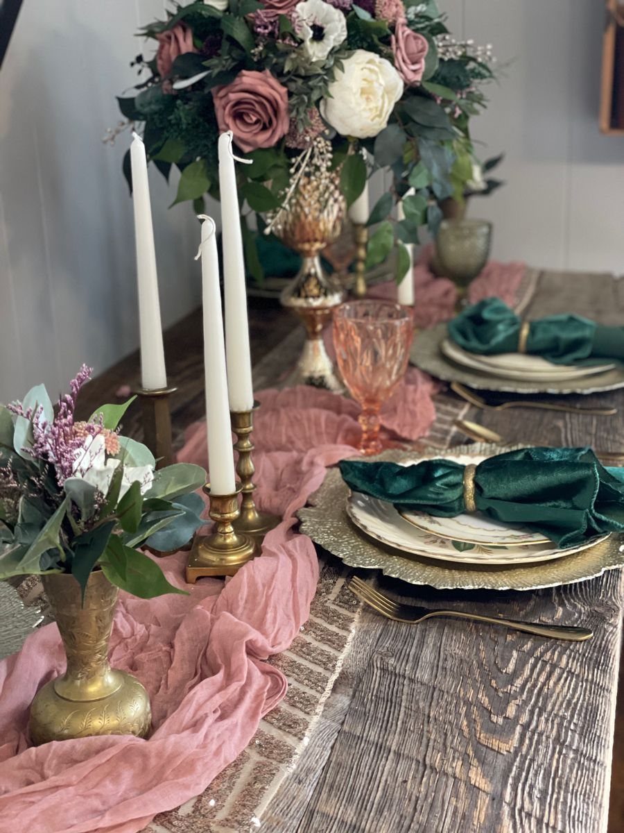
Gold chargers and cutlery warm up a pink and green table, and they do it without adding another color to manage. Metal sits neutral beside sage napkins and pink glassware.
Keep the gold to the place setting and let a pink runner and white and pink florals carry the rest.
On a wooden table, the gold looks rich against the grain. Choosing glassware in pink is the small touch I would spend on first.
6. Pink and White Taper Candles
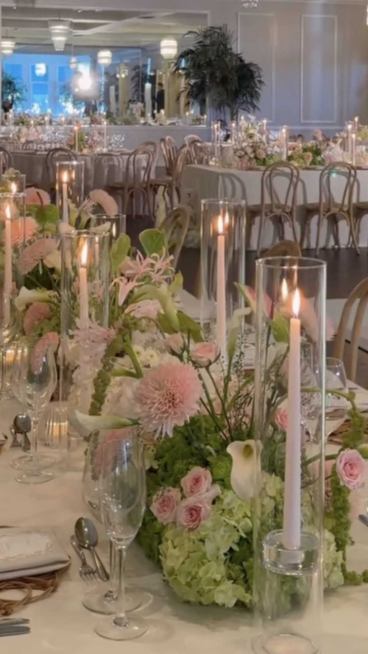
Taper candles in pink and white, set inside glass cylinders, bring height to a table without hiding the flowers around them. Mixing the 2 colors keeps the pink from overpowering the greenery.
I would cluster them low among the floral centerpieces, so the flames sit at the same level as the blooms. The glass cylinders hold the tapers upright, which matters on an outdoor reception table where a breeze can find them.
7. Blush Pink Satin Bridesmaid Dresses
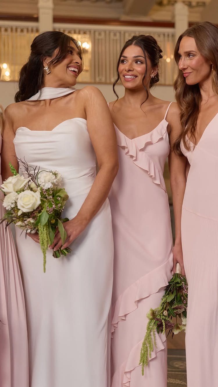
Blush satin photographs soft and reads romantic, which fits a pink and green summer palette without competing with the bride. Matching gowns in one shade keep the group tidy.
White bouquets are the right call here. I would let the greenery in the stems carry the green, so the dresses stay the single pink note.
8. White Wedding Cake with Pink Roses
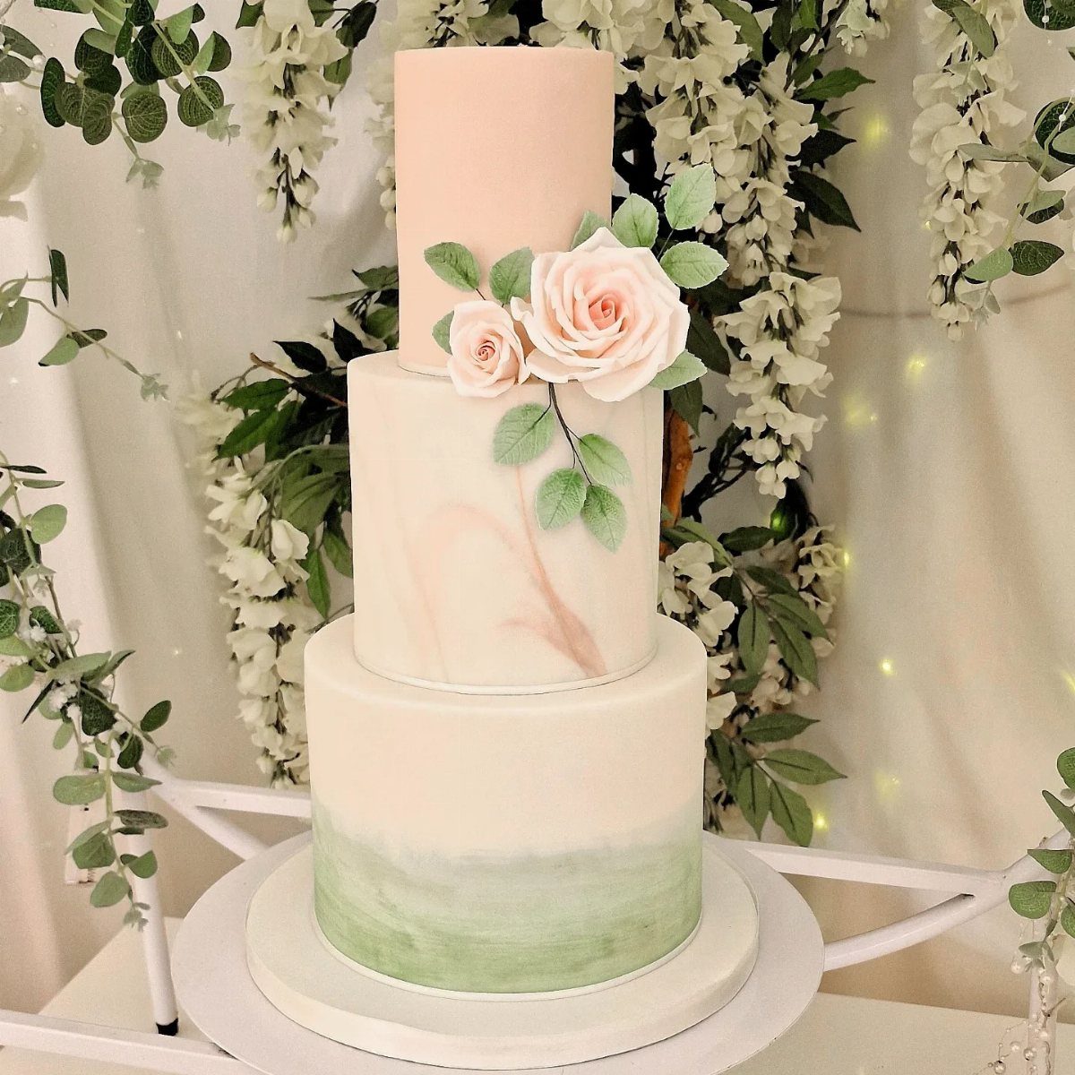
A cake can repeat the palette in 3 places: the frosting, the sugar flowers and the base. Here the pink roses sit on white tiers, and a green ombre at the bottom ties it to the foliage nearby.
Ask your baker to match the green to your linens or leaves, and keep the roses in the same pink as your bouquets. I would keep the rest of the tiers plain so the roses stand out.
9. White Chairs with Sage Green Streamers
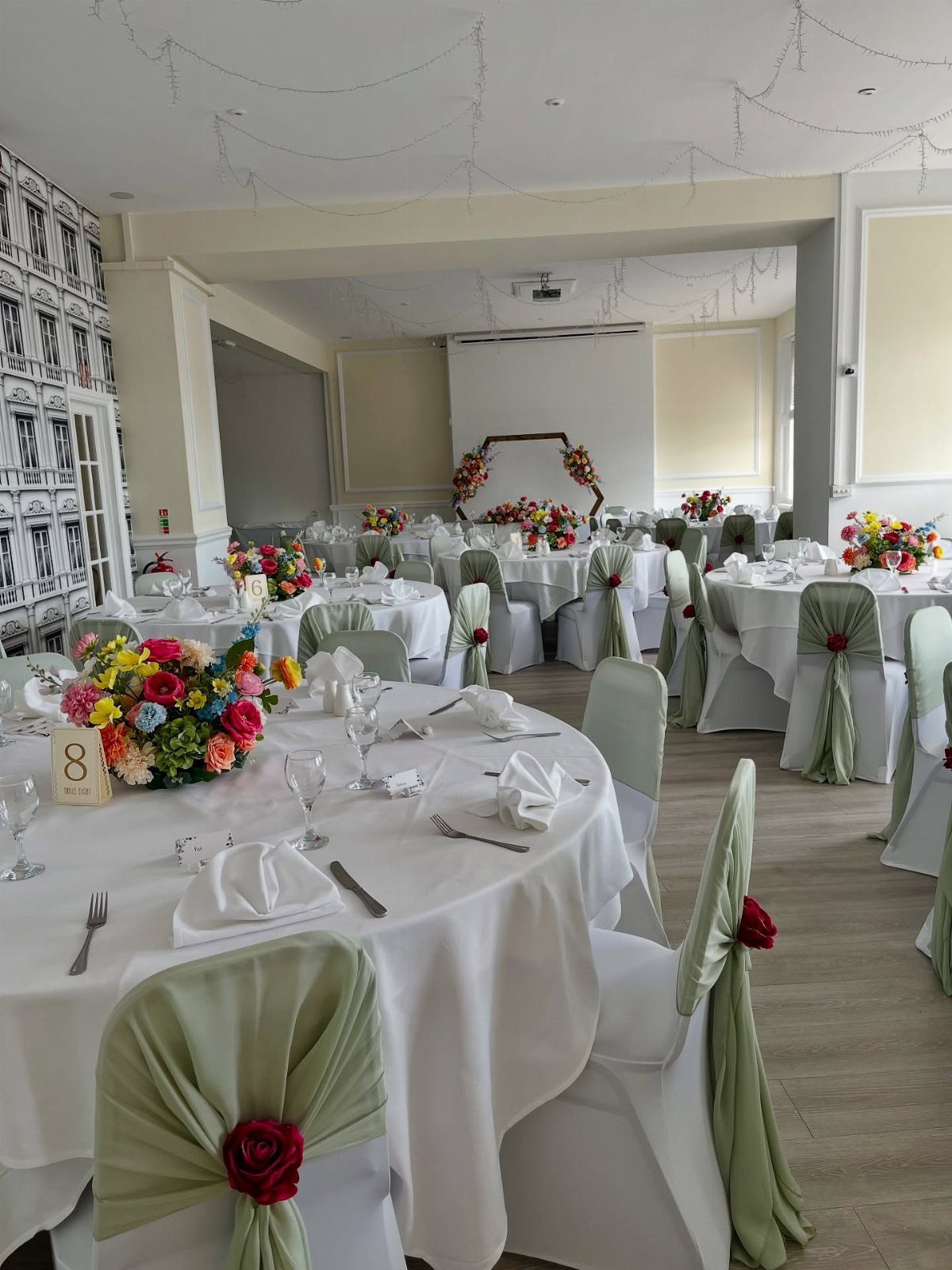
Fabric ties turn plain white chairs into part of the color scheme for very little work. Sage green sashes tied at the back, with a rose tucked into the knot, repeat the table palette at eye level.
Red roses pop against the sage here. For this pink and green theme, I would swap in pink roses, which keeps the chairs matched to the centerpieces.
10. Olive Green, Light Olive, Dusty Pink, Pale Pink, and Ivory Color Scheme
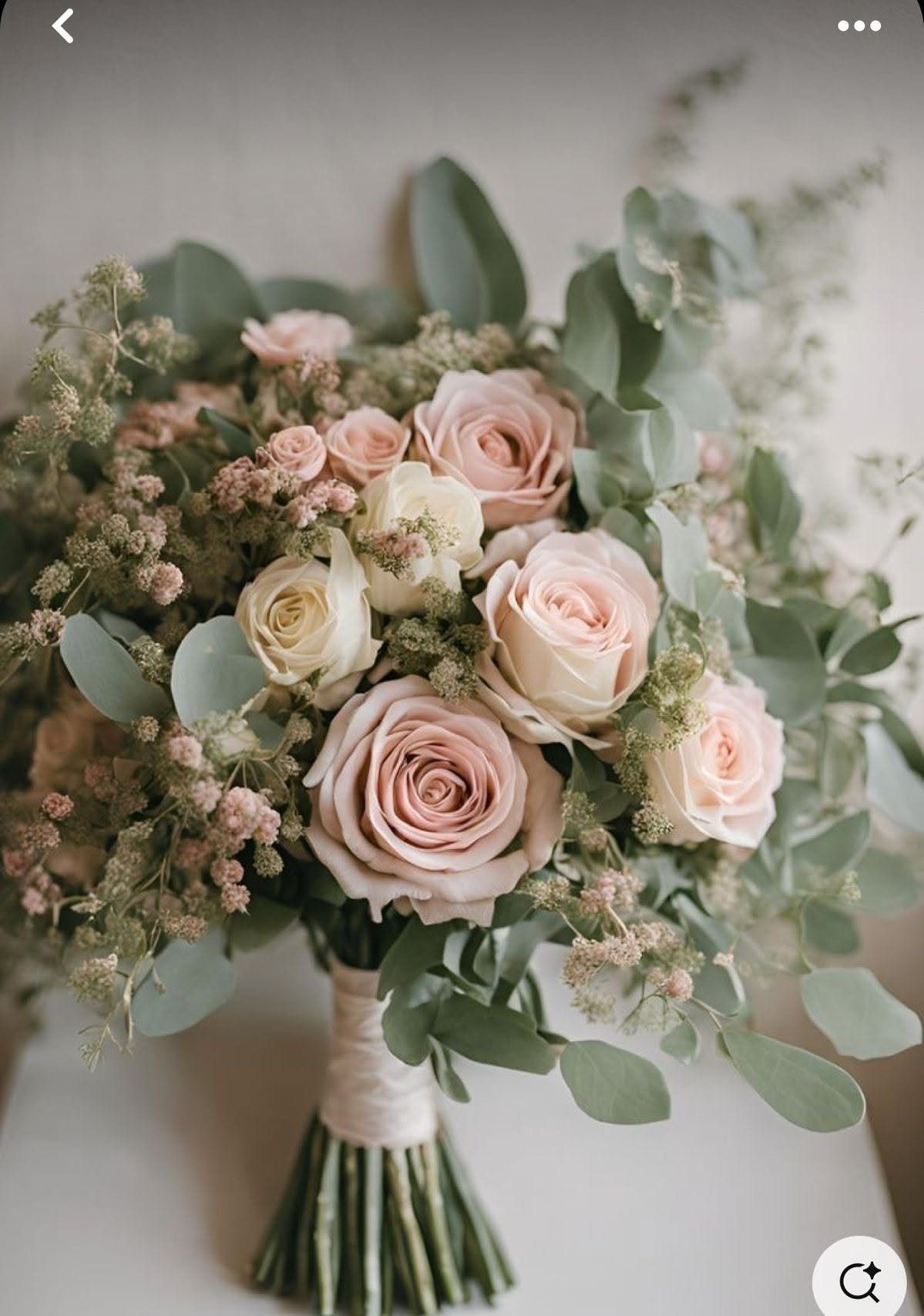
Olive, dusty pink and ivory make a muted, garden-style palette that is easy to carry from one item to the next.
To build this palette into a bouquet, I’d use roses in 3 soft shades (dusty pink, pale pink, ivory), add eucalyptus for the olive tones, and wrap the stems in cream ribbon so the greens and pinks stay quiet.
Pick one olive for greenery and one dusty pink for the roses, then repeat both on your paper goods and flowers. I would use ivory as the neutral and keep pale pink for small accents.
11. Pink and Green Flowers Lining a Path
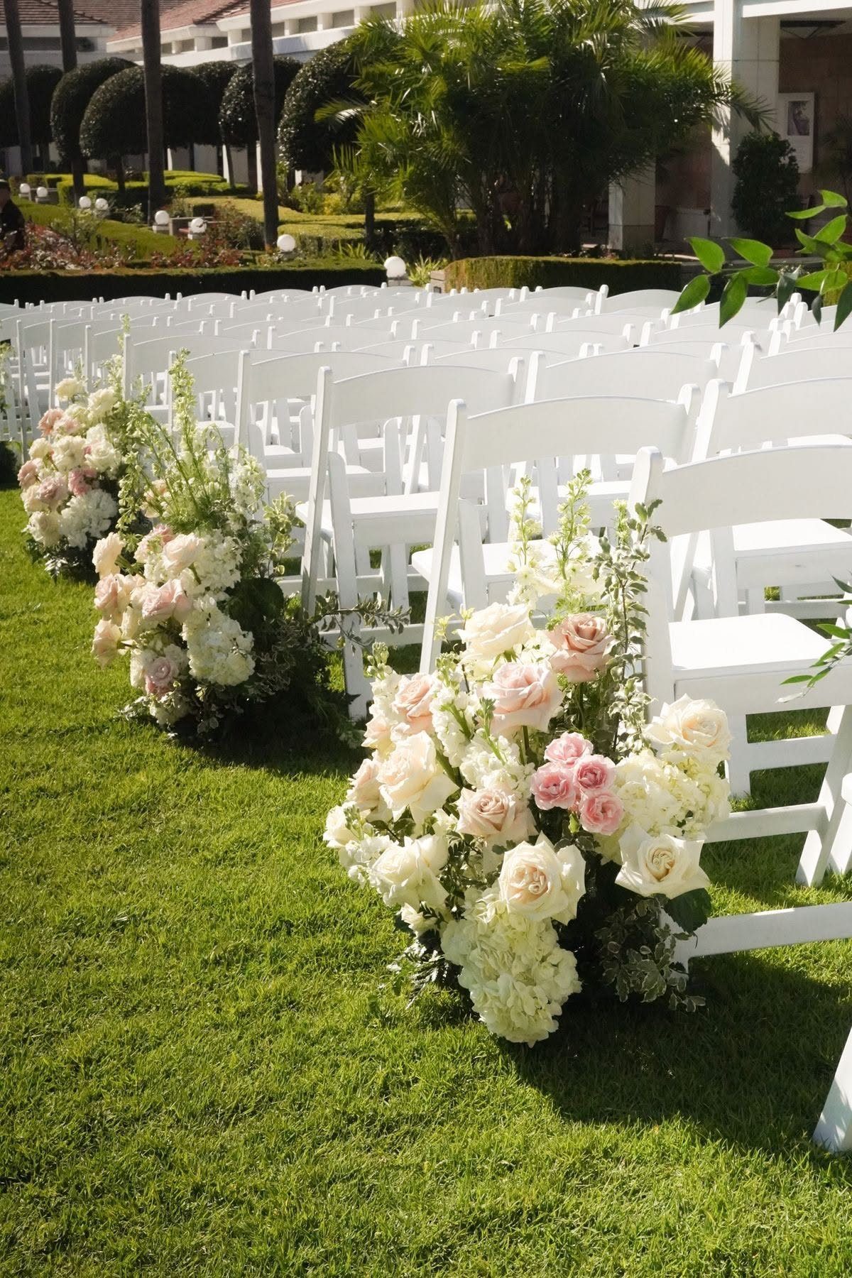
Flowers lining the aisle set the tone before the ceremony starts, and they cost less than a full arch. Pink and white roses in low arrangements, spaced evenly down both sides, frame the walk across the lawn.
Keep them low so guests in white folding chairs can see the couple. Green grass supplies the green, so the flowers only need pink and white.
Color Palette Significance
Pink stands for love and romance, and green for growth and harmony. Together they say something a wedding wants to say, which is why the pairing feels right even to guests who never think about color meaning.
Decide which of the 2 leads.
Pink as the main color reads sweet and festive; green as the main color reads calm and garden-like. Pick a dominant shade first, then let the other support it.
Shade matters more than the pairing itself. Mixing the two moods in one room tends to look accidental, so choose one.
Seasonal Suitability
The brighter, livelier version of the pairing fits those months best.
If your date falls outside summer, move the shades rather than drop the idea.
Check your flower choices against the date before you commit to a color. A bloom you want in a certain pink may not be in season, and a florist can suggest the closest shade that is.
Frequently Asked Questions
What color is green and pink together?
Pink and green together read as romantic and garden-like. Whichever color takes the lead sets the tone: lead with pink and the day feels playful and celebratory, lead with green and it settles into something quieter.
Choose the main color before anything else, then use the second as the accent.
What are some cute wedding colors?
Pink and green is a cute, lively pairing, especially in soft shades like sage green with blush or dusty pink.
A muted palette of olive, dusty pink and ivory is easy to repeat across flowers and paper goods. Keep one neutral, such as white or ivory, so the two colors don’t compete.
What does pink mean at a wedding?
Pink traditionally reads as romance and affection, while green suggests new growth and balance.





