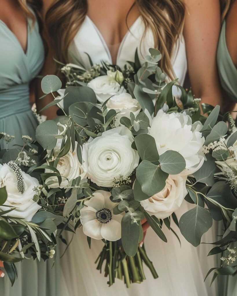
Sage green pairs quietly with blush, dusty blue, white, or peach, and more boldly with navy, Venetian red, or gold, and the undertone of the sage you buy decides which of those will work.
Hold fabric swatches against your flowers, linens, and venue walls in the light you will have on the day, because that check tells you which partner color works.
1. Blush & Sage
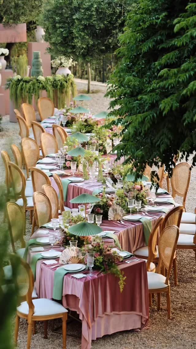
Blush velvet against sage napkins and runners gives a table a soft, romantic feel without tipping into sugary. Both colors are muted, so neither shouts over the other.
Keep the flowers in the same quiet range and let the greenery do some of the work. If budget is tight, linens are where I would spend: the velvet tablecloth carries the whole look.
2. Navy & Sage
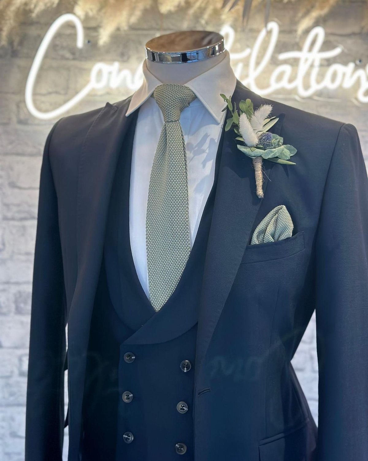
A navy three-piece suit with sage accents is a grown-up take on groomsmen styling.
Navy beats black for this palette, since sage looks muddy next to black.
3. Sage Green and Dusty Blue
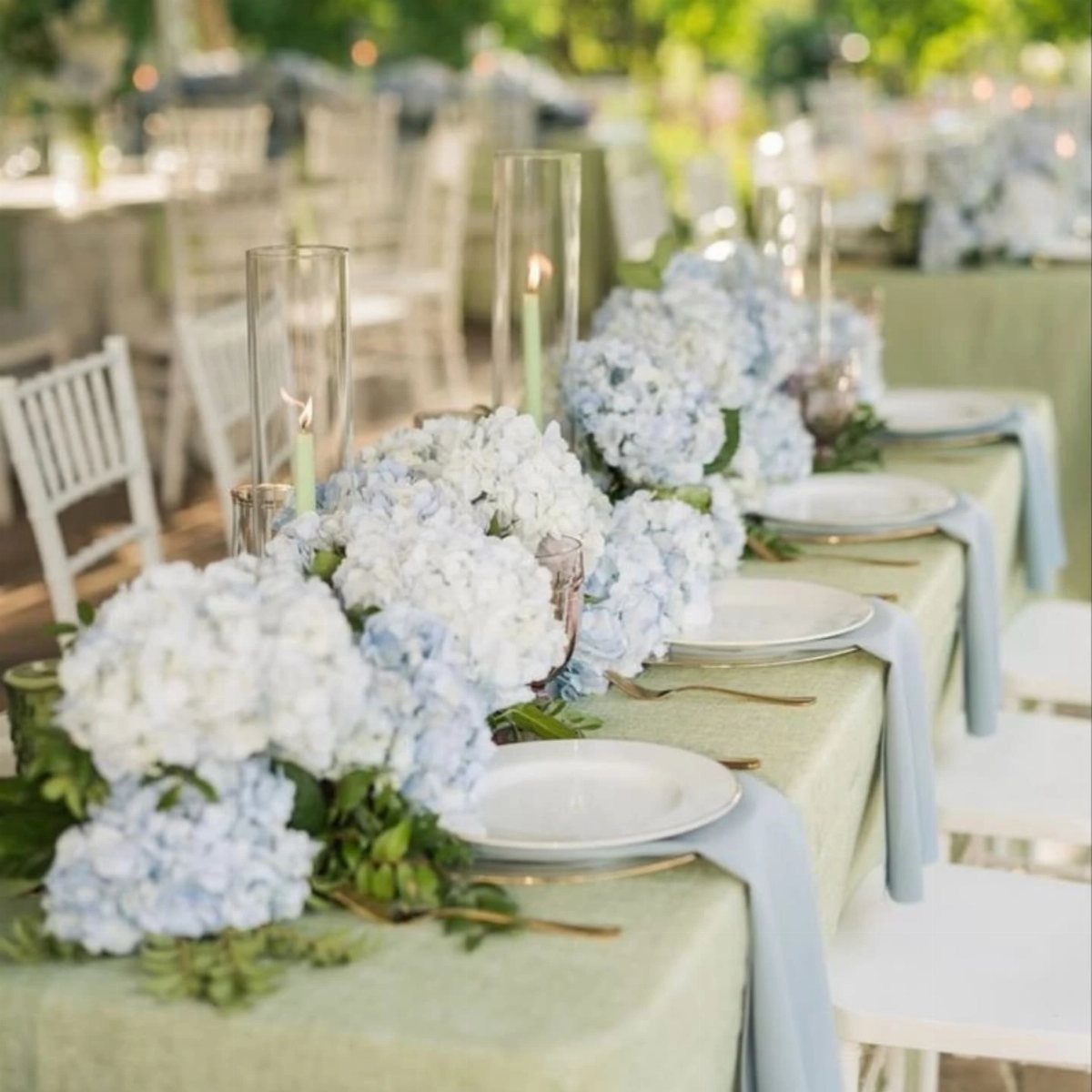
Hydrangeas tie sage linens to dusty blue napkins in one move. Tall glass candle holders keep the long table from looking flat.
Choose a sage cloth with a dusty blue that leans gray rather than bright, or the napkins will clash. For me, this pairing is the most restful of the lot.
4. Sage Green and Lavender
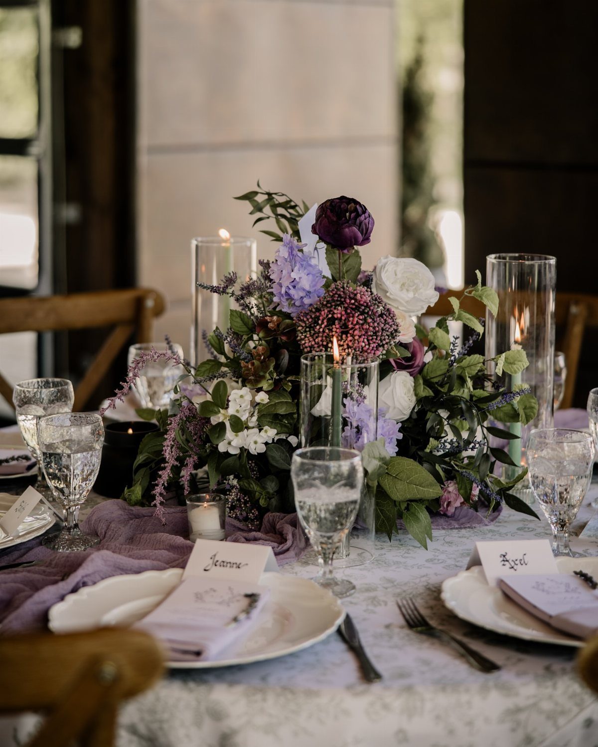
Lavender and white blooms with sage foliage read as playful and slightly wild, more garden party than ballroom. Let the leaves carry the sage, then add lavender napkins for a second hit of color.
Small touches like handwritten place cards suit the mood well.
5. Sage Green and Gold
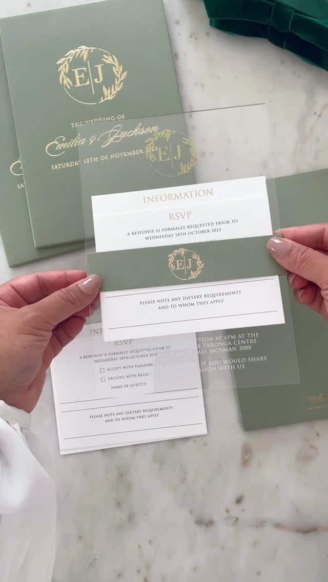
Gold foil on sage paper is the easiest way to make this palette feel luxe, and stationery is where it pays off. Lettering catches the light, while the sage stays calm.
Limit gold to the details: invitation text, RSVP cards, maybe a few table accents.
Used sparingly, it looks expensive; spread everywhere, it starts to feel heavy. Foil printing costs more than flat ink, so ask for a quote before you commit.
6. Sage Green and Venetian Red
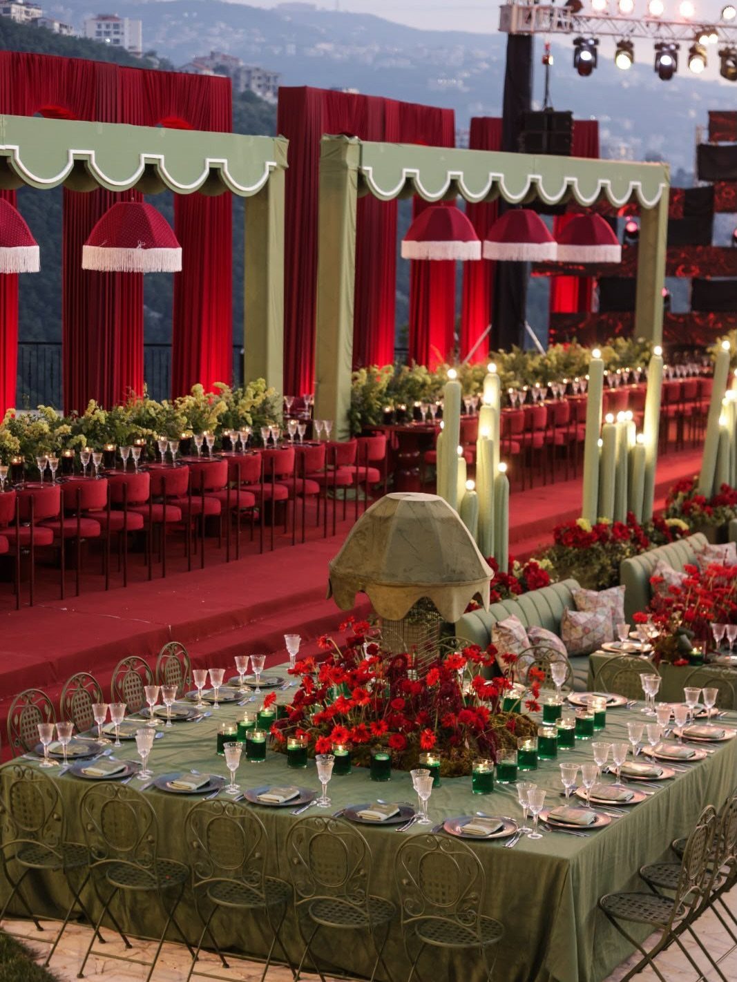
Deep red against sage is bolder than most sage palettes, and warmer. Red curtains, chairs, and florals make a sage-draped space feel rich and a little dramatic.
Use sage as the base, covering linens and canopies, and let red act as the accent so the room does not turn heavy.
I would choose a red with brown in it over a bright one, which keeps the whole look earthy.
7. Pale Yellow and Sage Green
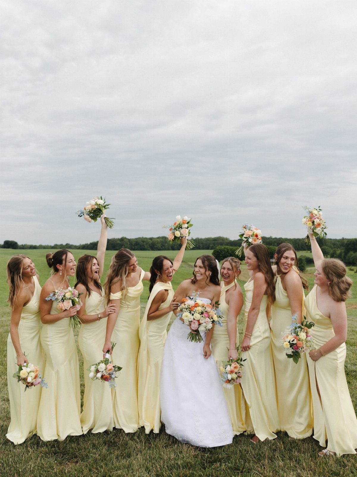
Pale yellow next to sage is soft and sunny, closer to spring butter than lemon.
Bridesmaids in yellow dresses with green foliage in their bouquets let the greens do the sage work, so the dresses never have to match it exactly.
Keep the yellow pale and slightly creamy against a white gown, or the bride gets lost in the group. Outdoors on grass, the green does the rest.
8. Sage Green and White
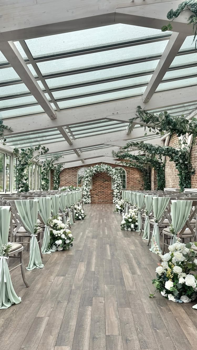
White flowers on sage chair drapes give a ceremony a clean, calm look, and the aisle reads as fresh rather than fussy. A floral arch in all white keeps the focus in one spot.
Chair sashes are a cheap way to bring in sage, since the color repeats down every row. Skip a third color and let the setting supply the rest.
9. Sage Green and Peach
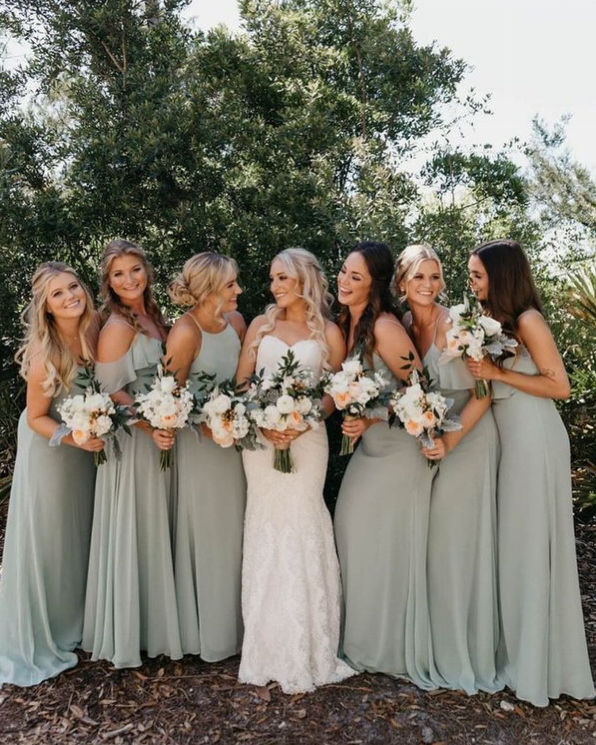
Peach warms sage without shouting, so the pair works when you want something gentler than red or gold. Sage dresses paired with soft peach and white blooms in the bouquets are the easiest way to try this palette.
I would keep the peach in the flowers only and let sage cover the dresses. A pale, slightly pink peach sits better against sage than a bright orange one.
Sage Green Variants
Every sage has an undertone, and it decides how the color behaves in a room. Cool sages tilt gray or blue-gray, and #848B79 or #8FA887 shows you roughly where they land.
A neutral sage, around #98A869, sits between the 2 and shifts with whatever surrounds it.
Check which undertone a bridesmaid dress has before you place the order. Without that check, you have no way of guessing how the flowers, linens, or venue walls will push the color.
Ask for fabric swatches and hold them against the other materials in the room, in the same light you will have on the day.
Best Pairings for Sage Green
Sage is low in saturation, and that is why it looks elegant beside other muted tones.
Soft blush, creamy ivory, and dusty rose all sit comfortably in that quiet range. Gold and brass metals sit well beside it too.
A vivid burgundy swamps sage entirely.
I hold to one rule: whatever you set next to sage should be less saturated than your first instinct. If a swatch feels slightly too soft on its own, it is probably right next to sage.
Avoiding Mismatched Colors
Highly saturated colors cause most of the trouble.
Pure crisp white, with no warm buffer, exposes sage’s gray undertone and makes it look dingy.
Soften it to ivory. On a phone screen the gap looks slight, but across a full room it is easy to see.
Olive and khaki are the sneakier problem.
Their hue is close to sage but their value is not, so the pair merges into one muddled shade. For olive, I would bring it in through real greenery instead of making it part of the palette.
Frequently Asked Questions
What colors go best with sage green for a wedding?
Soft, muted tones sit best beside sage: blush, ivory, dusty rose, and gold or brass metals.
Navy, dusty blue, and white also work. Sage is low in saturation, so partners that are quieter than your first instinct tend to look right next to it.
What colors make sage green look bad?
Loud, saturated shades are the usual culprit; a vivid burgundy next to sage drowns the green and pulls all the attention to itself.
Bright, stark white can make sage look gray and a little tired, so I switch to ivory or cream, which gives the green a warm cushion.
Olive and khaki sit so close to sage in both hue and depth that the three run together, and the palette loses its definition.
Is sage green out of style?
No.
Sage stays a dependable wedding color because it is calm and muted, and it pairs with so many partners, from blush and navy to gold and peach. Its soft saturation keeps it from looking loud or dated.





