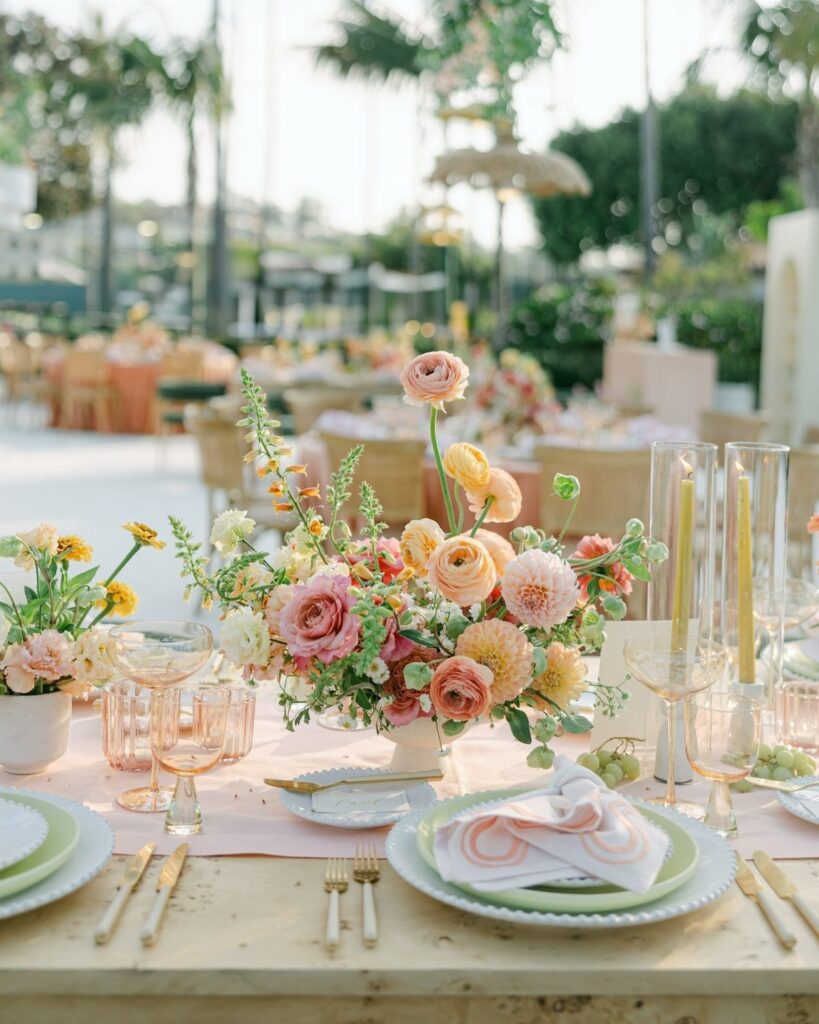
The palettes here run from a single accent, like napkins in olive green or tall lavender tapers, to full installations such as a burgundy and peach arch or white and gold backdrop.
If the venue already carries pattern or strong color, pull back to the simpler versions here and let one or two shades do the work.
1. Blush and Sage Floral Arrangements
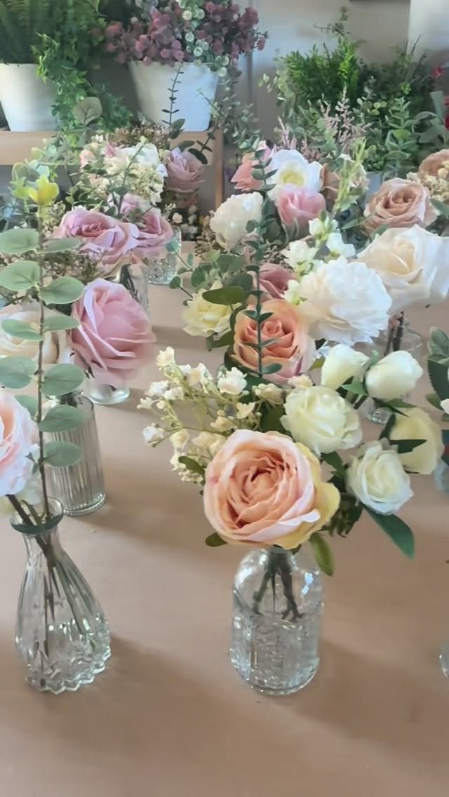
Bud vases do the heavy lifting here. Small glass vases, each holding just a few stems, cost less than a handful of large arrangements and fill a long table more evenly.
Blush, cream and peach roses with sage eucalyptus keep the palette soft. Artificial flowers in champagne, sage, blush pink and ivory are what I would pick on a tight budget, since you can assemble them weeks ahead.
Repeat the same three colors in every vase so the table reads as one.
2. Peach and Sage Table Decor
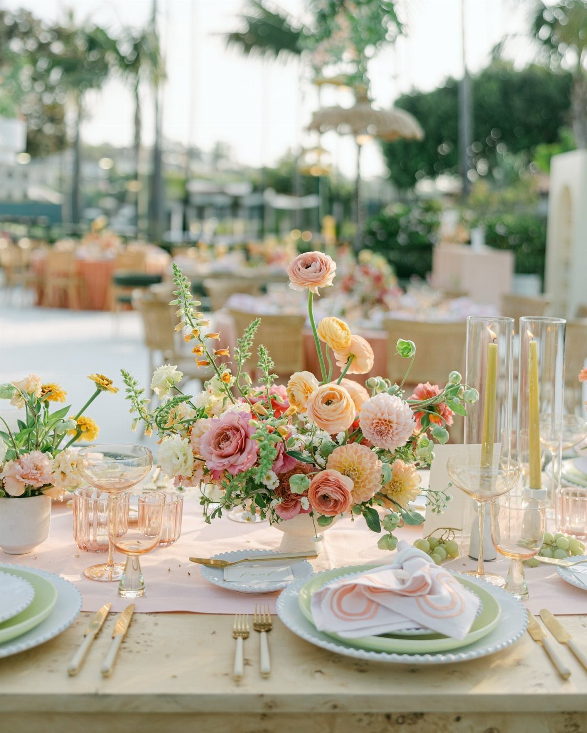
Sage plates against pink linens is the move that makes this table. Most couples put color only in the flowers, but a green charger or plate carries the palette right to each guest’s seat.
Peach blooms sit well against that green, and gold cutlery warms the whole setting. I would keep the centerpiece low so guests can see each other and talk over it.
3. Navy and Blush
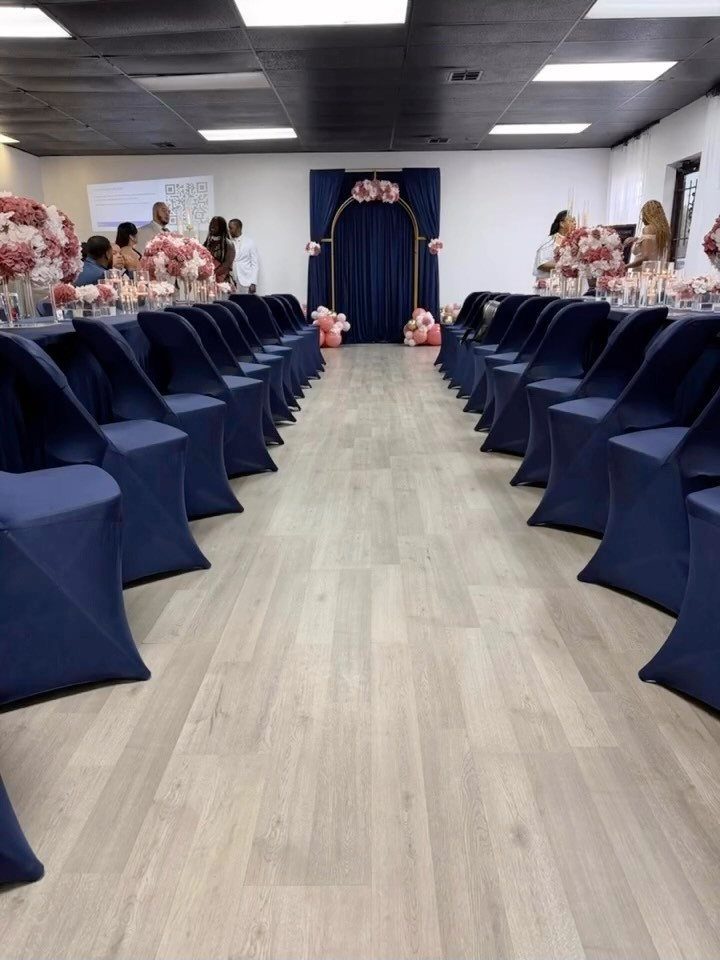
Navy gives a room weight, and blush keeps it from feeling heavy.
A navy backdrop with a gold arch makes the ceremony end of the room the focal point. I would add gold in small doses only, so the navy stays the star.
4. Orange and Pink
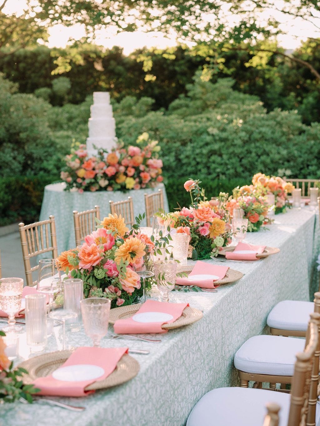
Orange and pink look like a gamble until a cool color sits between them.
Gold chairs keep it from turning too sweet. If the combination feels risky, put the orange only in the centerpieces and let the linens stay calm.
5. White, Green, and Gold
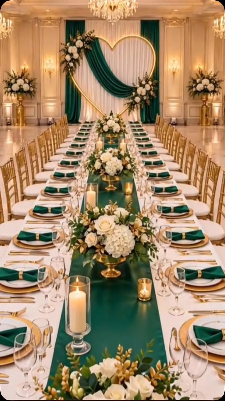
3 colors, no clutter. A green runner down a long banquet table, white flowers on top and gold in the details is a palette that suits a ballroom, where a busier scheme would get lost.
Because the flowers are white, the green does the work, so choose a runner in a shade you love. I would spend on the backdrop and keep the table simple.
6. Lilac and Champagne
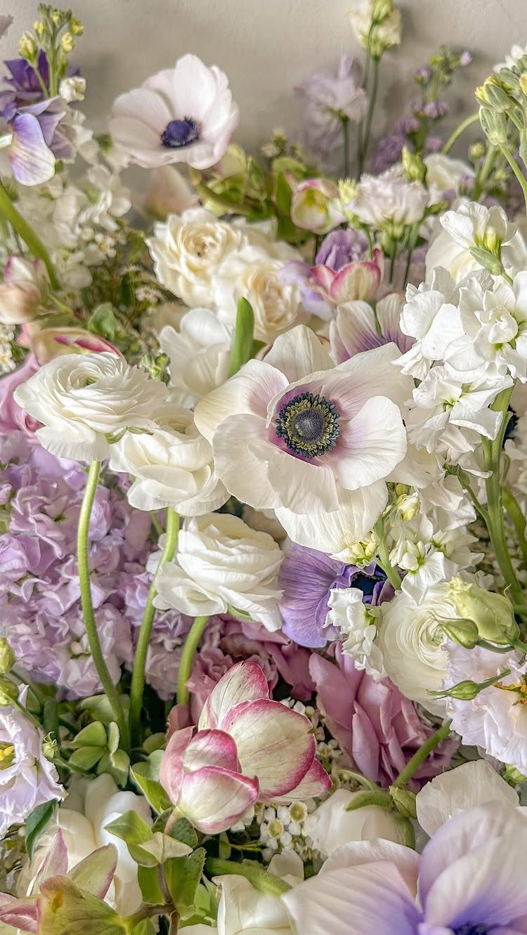
Lilac next to champagne reads as pale and warm at once. White anemones, cream roses and a few lilac blooms with green leaves make a bouquet that photographs softly in evening light.
Keep the lilac as the accent, a few stems rather than half the bouquet, so the cream and white stay in front. For the rest of the day, champagne in bridesmaid dresses or linens carries the same warmth.
7. Burnt Orange and Ivory
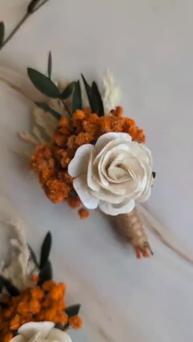
A single white rose among burnt orange blooms and green leaves is enough to carry this palette on a boutonniere. Ivory calms the orange, so the pair reads bold without shouting.
Use the orange as filler flowers and let one white rose be the big shape, so the ivory leads and the orange supports. Repeat that same small mix in the bouquet, and the rest of the day can stay ivory.
8. Peach, White, and Green
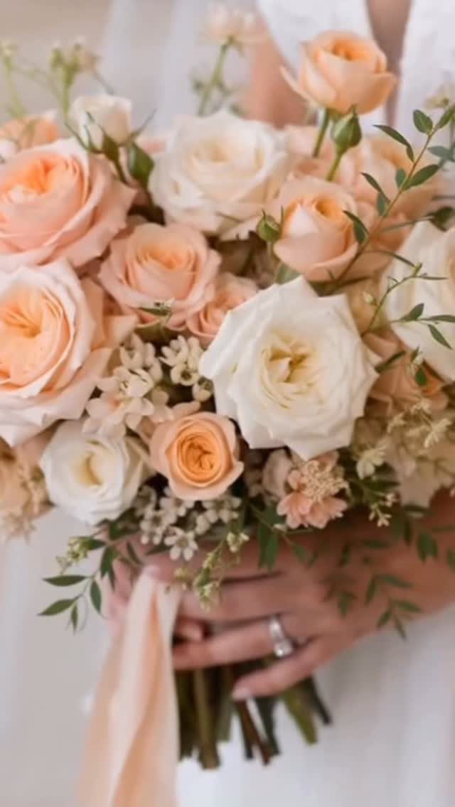
Peach and white roses with a little greenery make a bouquet that suits nearly any spring dress. The 2 colors sit close in tone, so the green leaves are what keep the shapes from blurring together.
Ask your florist to mix the peach and white roses evenly rather than in clumps. A matching peach, white and green palette then carries easily to the rest of the day.
9. Burgundy and Peach Arch
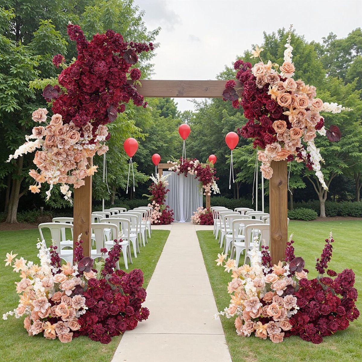
Raw wood asks for deep color, and burgundy is the one that holds up against it. Peach roses mixed in soften the dark red so the arch looks lush, not heavy.
I would put the heaviest cluster of burgundy at one corner and let peach trail along the top and down the other side.
10. Light Blue and Colorful Pastels
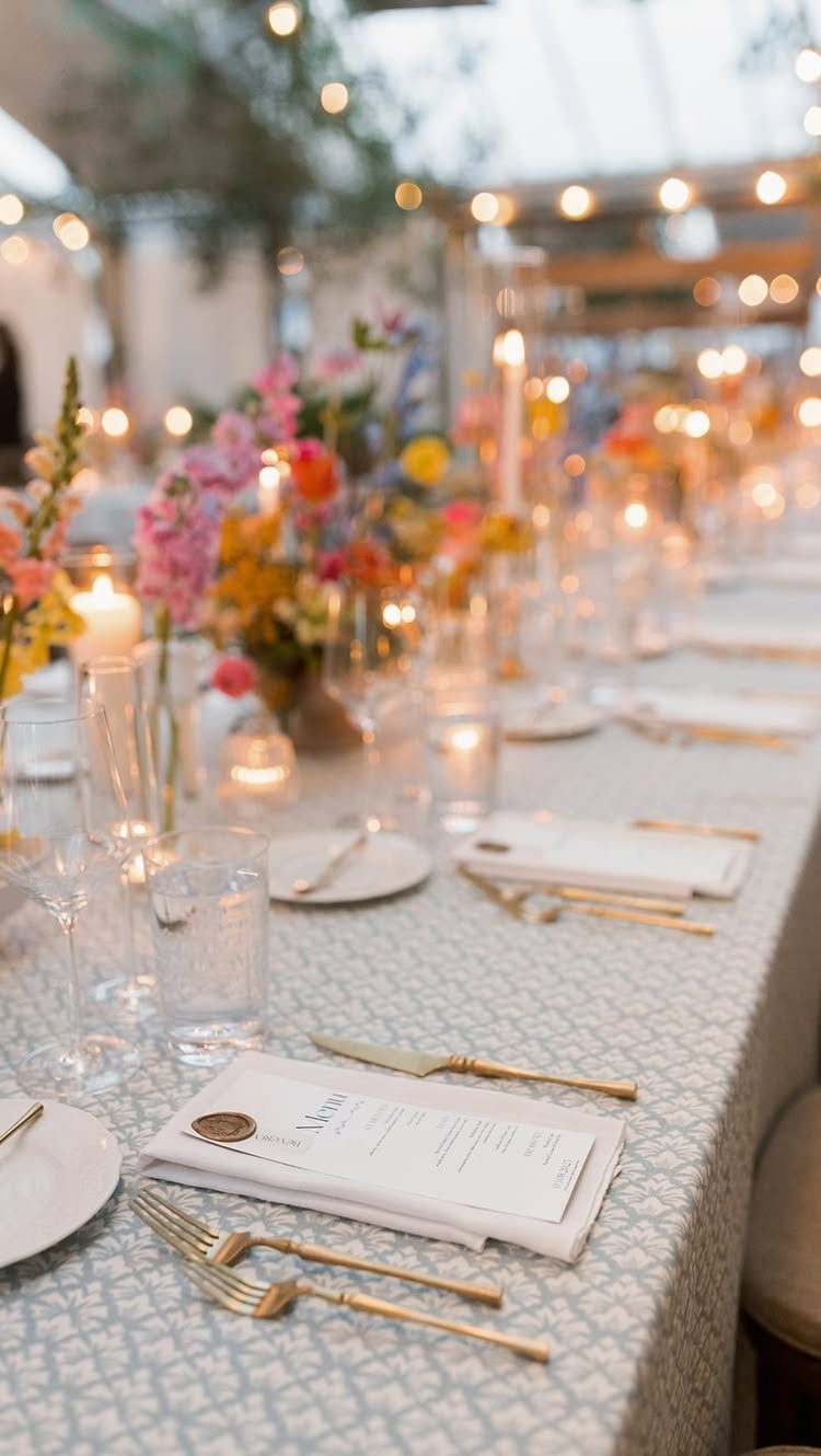
Light blue linens do something most tablecloths cannot: they make pink, yellow and orange flowers look soft instead of loud. Pattern in the cloth adds interest, so the flowers can stay loose and mixed.
With a patterned cloth and several flower colors already on the table, extra decor just crowds it.
11. Olive Green and White
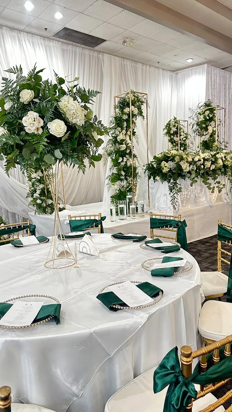
Dark green napkins on a white cloth give a table structure, and olive reads richer than a bright green would. Large white centerpieces then have a calm base to stand out against.
Gold chairs warm the scheme without adding another color. If budget is tight, spend on the big white arrangements and let the napkins do the green, since napkins cost far less than greenery.
12. Lavender and Purple Table Accents
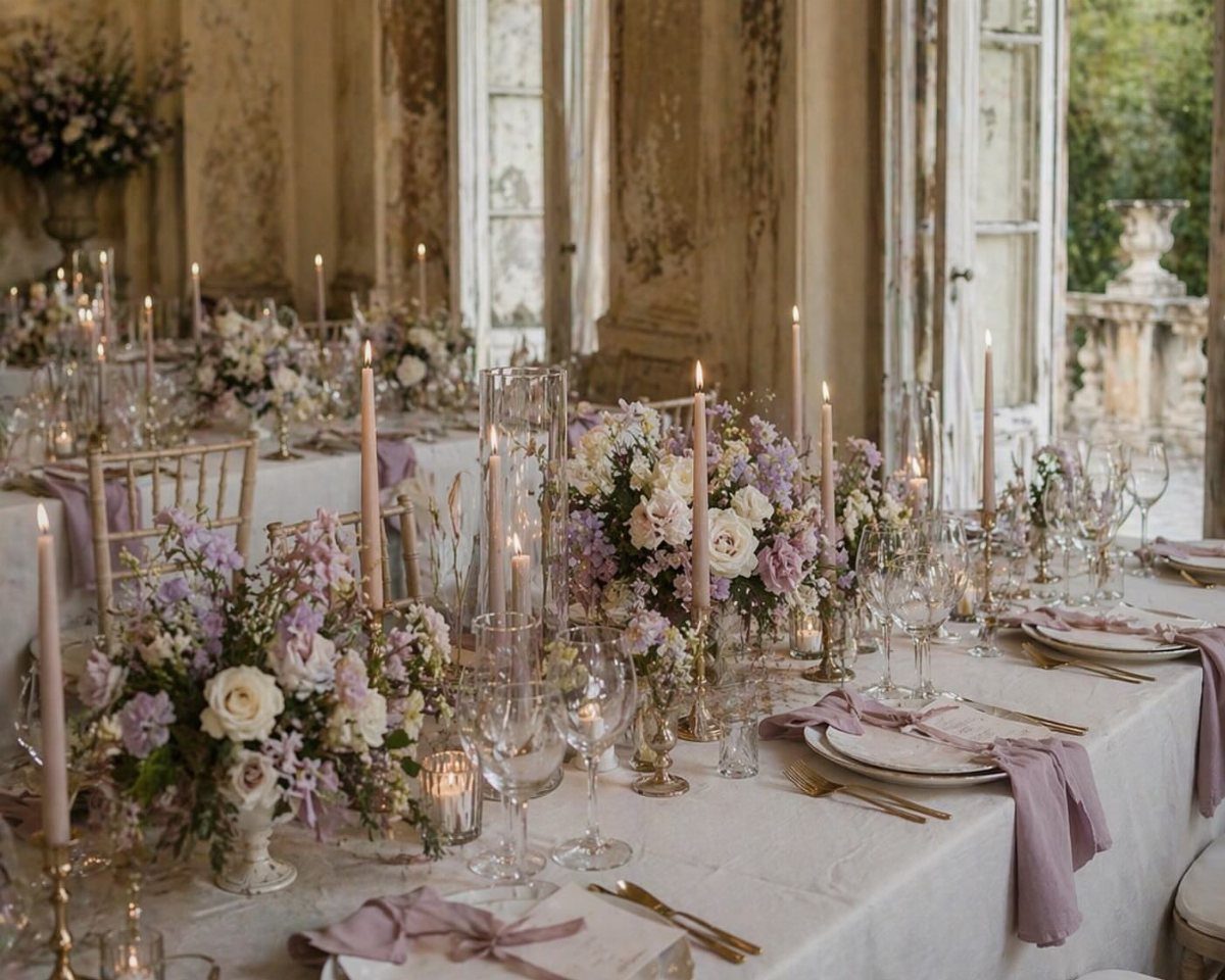
Candles are the cheapest way to get purple onto a formal table. Tall purple tapers beside lavender napkins give height and color without a single extra flower.
White and purple blooms keep the florals light, so the candles stay the deeper note. I would pick lavender napkins first, then match the taper shade to them, so the 2 purples look planned rather than close but off.
Choosing the Right Color Palette
Start with the venue, not the Pinterest board. A room with neutral walls, white linens and big windows takes almost any spring palette, while a room with strong carpet, wood or stone already has colors you have to work with.
Look at your venue’s fixed colors first, then pick two or three shades that sit comfortably beside them. Seasonal flowers can then fill in whatever the room lacks.
Your palette also reaches past the tables. It shows up in invitations, signage, the aisle and even the cocktails, so choose colors you will still like on a sign at 8 p.m. as much as in a bouquet.
Incorporating Colors Into Decor
Ask your venue what linens it already provides. White overlays let you add color through napkins alone, which costs less than renting colored cloths for every table.
Ask your florist about tulips, ranunculus, peonies and garden roses, since spring is when all four are in season and priced for it.
Choose a florist who has worked in your venue, since they know how the room handles the light and the scale.
A few small pieces, like ribbon sashes on the chairs or a hand-lettered welcome sign, carry the palette through the room without cluttering it.
If you hire lighting, ask about pinspotting, which puts a focused beam on each centerpiece so the colors read clearly.
Mixing Pastels with Bold Colors
Pastels give a wedding a soft, romantic base, and one bold color gives it a modern edge.
Keep the ratio lopsided: mostly pastel, with the strong shade in a few places, so it reads as a choice and not a clash.
Crisp white tableware helps both sides. It keeps pastel florals from washing out and gives the bold color a clean place to land.
Soft, draped fabric and loose, just-cut-looking flowers sit best in a garden setup, especially once the lighting turns warm and low.
Dress the wedding party in coordinated pastels, then let the bold shade show up in one repeating detail, like a flower or a stationery accent.
Frequently Asked Questions
What are the best spring wedding colors?
Soft pastels like blush, lavender, lilac, peach and light blue lead the list, paired with sage or olive green and ivory or champagne.
Brighter choices like coral, orange and burgundy also work if you keep them as accents. Spring flowers come in all of these shades, so the palette matches what the florist can supply.
How do you mix pastels with bold colors at a spring wedding?
Let one color anchor most of the look and bring the stronger shade in once or twice. White plates and linens keep pastels from looking washed out and give bold colors something clean to sit against.
How do I carry my wedding colors through the decor without overspending?
Check what tablecloths your venue includes, because a white base means you only need to rent or buy napkins in your colors.
Napkins cost a fraction of what you’d spend on colored linens for 10 or 15 tables. A length of ribbon on each chair or one hand-painted sign at the entrance adds the palette without filling every surface.





