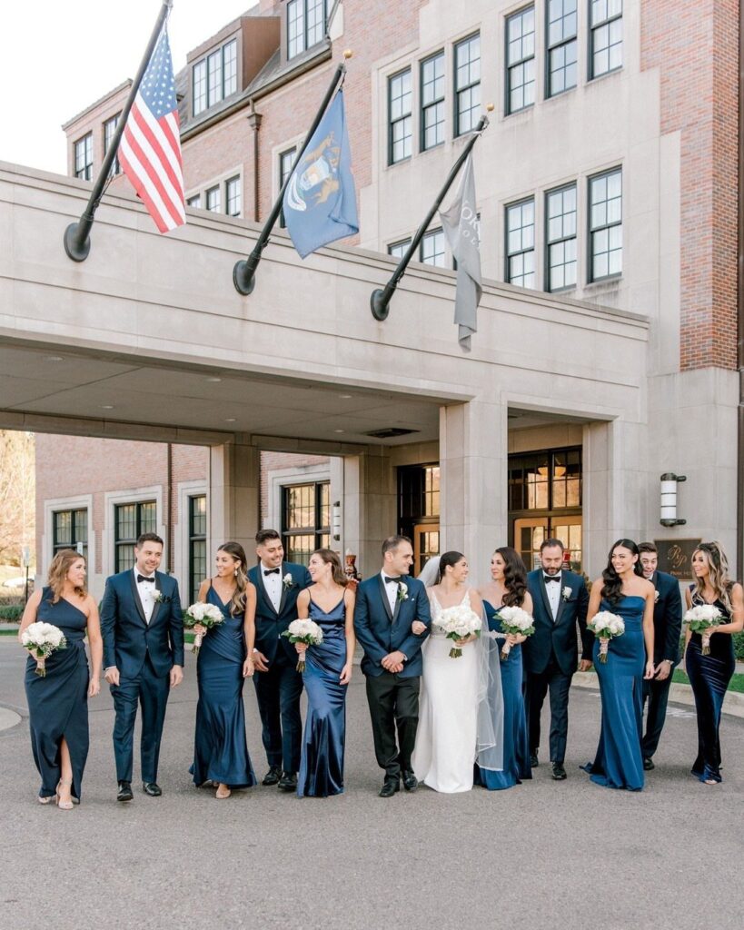
Navy changes mood with its partner: blush or champagne keeps it soft, while gold, copper or rust orange pushes it toward formal and a little theatrical.
Where navy goes decides the partner. A suit can take a yellow or sage green tie, a table can take copper, and a bare wall can take navy with purple flowers.
Some of these ideas cost almost nothing, like a tie swap, so pick the one spot where you most want the color and start there.
1. Navy + Gold
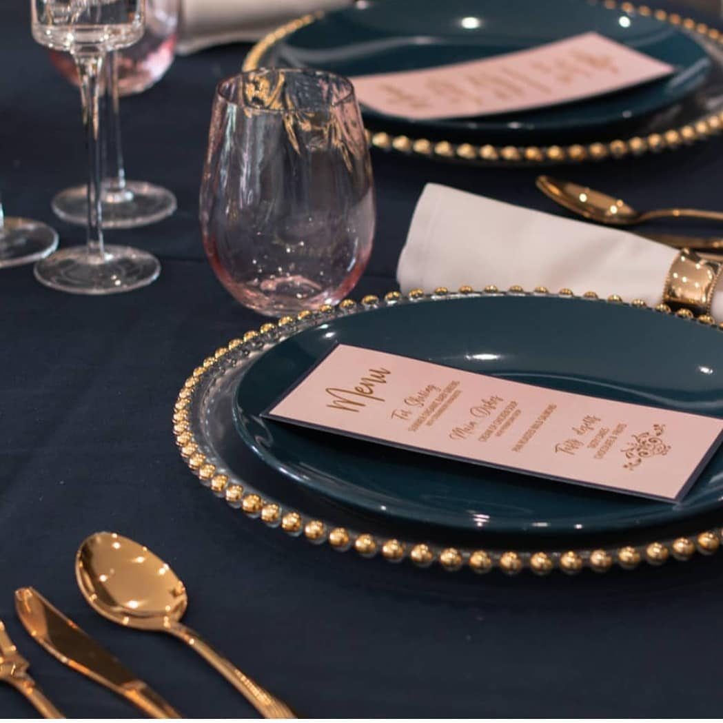
Gold chargers do the heavy lifting here. Set under navy plates, they frame each place in metal, and gold cutlery picks up the same note so the table reads as one decision rather than three.
Blush pink menu cards soften the look, which I like: navy and gold alone can feel stiff, and one pale card keeps it warm.
If budget is tight, spend on the gold you can see most, the chargers and the flatware, and let everything else stay simple.
2. Navy + Dusty Rose
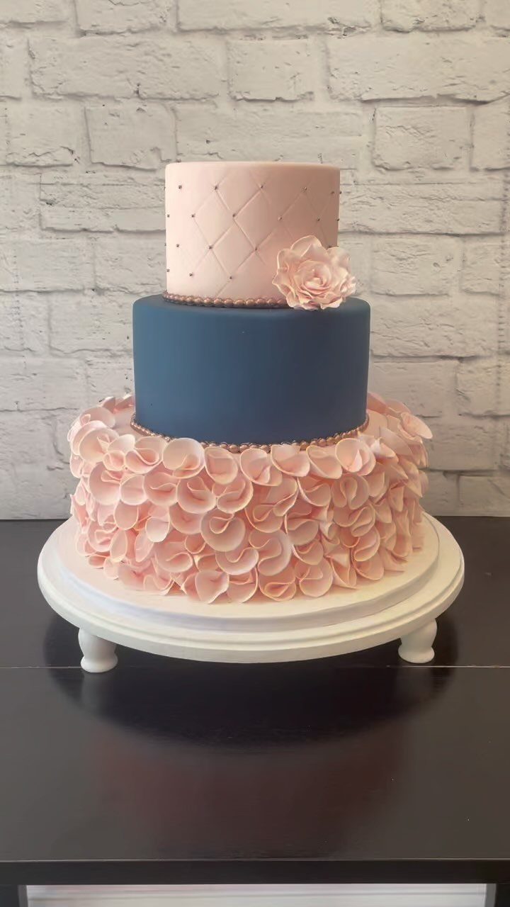
Dusty rose against navy has a quiet, old-fashioned romance, and a cake is a smart place to try it.
A tiered cake in 2 tones, rose on the quilted top and ruffled bottom with navy between, shows the pairing at full strength, so you can judge it before settling on it for anything else.
I would keep the stand white, as it is here. A white brick wall or plain backdrop lets the 2 colors carry the display without competing.
Ask your baker for a swatch or a photo of your actual dusty rose so the frosting matches your flowers and linens.
3. Navy Table Settings with Copper Accents
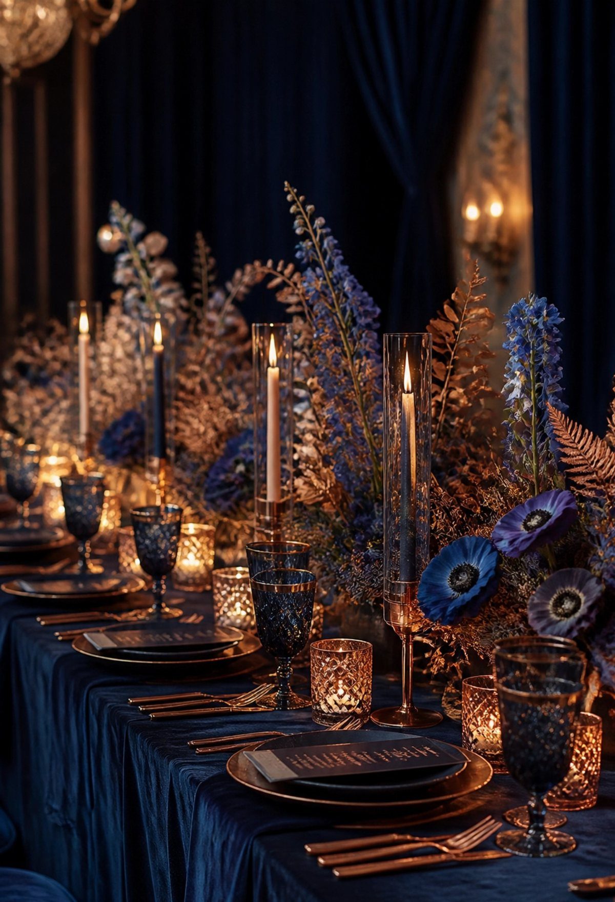
Copper is the warmer cousin of gold, and on navy it glows. Copper plates and cutlery over a navy cloth, with navy glassware, give a table that feels moody and rich without extra ornament.
Blue flowers in the centerpiece keep the palette tight, while copper candle holders add height and a flicker of light after dark.
Matching metal across plates, flatware and candle holders matters more than any single piece. Rentals are usually the cheaper route than buying a full copper set you will use once.
4. Navy and Coral
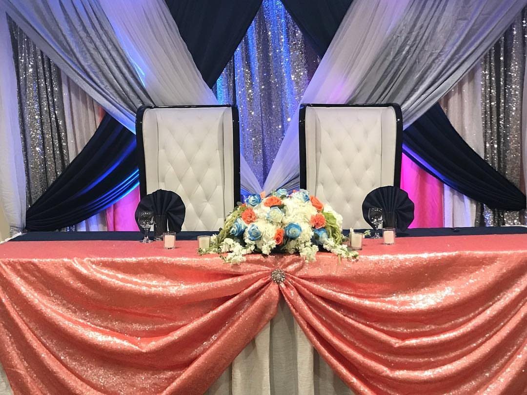
Few pairings wake up a head table like coral sequins on navy.
A sweetheart table gets the full treatment: a coral sequin cloth, a navy runner down the center and navy drapery behind, so the couple sits inside the color scheme.
Keep the centerpiece white and floral, as it is here, so the 2 strong colors do not fight a third.
Sequins are loud, so save them for one table. Using them on every guest table would cost more and flatten the effect.
5. Navy and Champagne
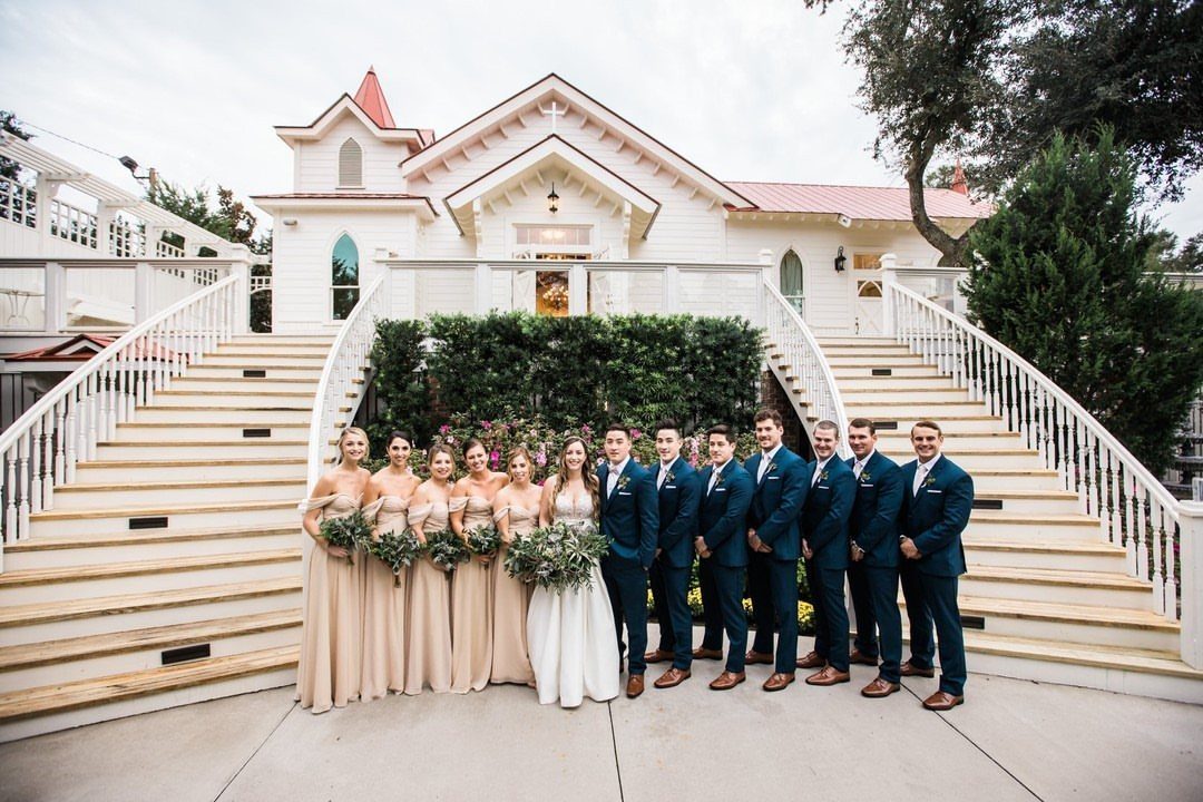
Champagne dresses beside navy suits make a wedding party look related without looking matched. The warm, pale neutral of the bridesmaids pairs with the deep, cool groomsmen to give a photo real contrast.
I like this combination for outdoor portraits, where a white house or stone steps lets both colors read clearly.
Order fabric swatches before choosing, since champagne can lean pink, gold or gray under different light. Check them next to the actual suits.
6. Navy and Yellow
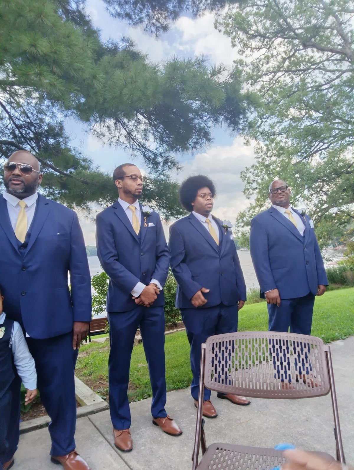
Yellow ties are the cheapest way I know to put a bold color on a navy suit. Groomsmen in matching navy with bright yellow look cheerful and sharp, especially outdoors near trees and water.
The tie is the only yellow on the men, so repeat it somewhere else: a bouquet, a boutonniere or a table accent. Otherwise it floats.
Pick one exact shade for all ties and order them together so the dye lots match.
7. Navy and Classic White
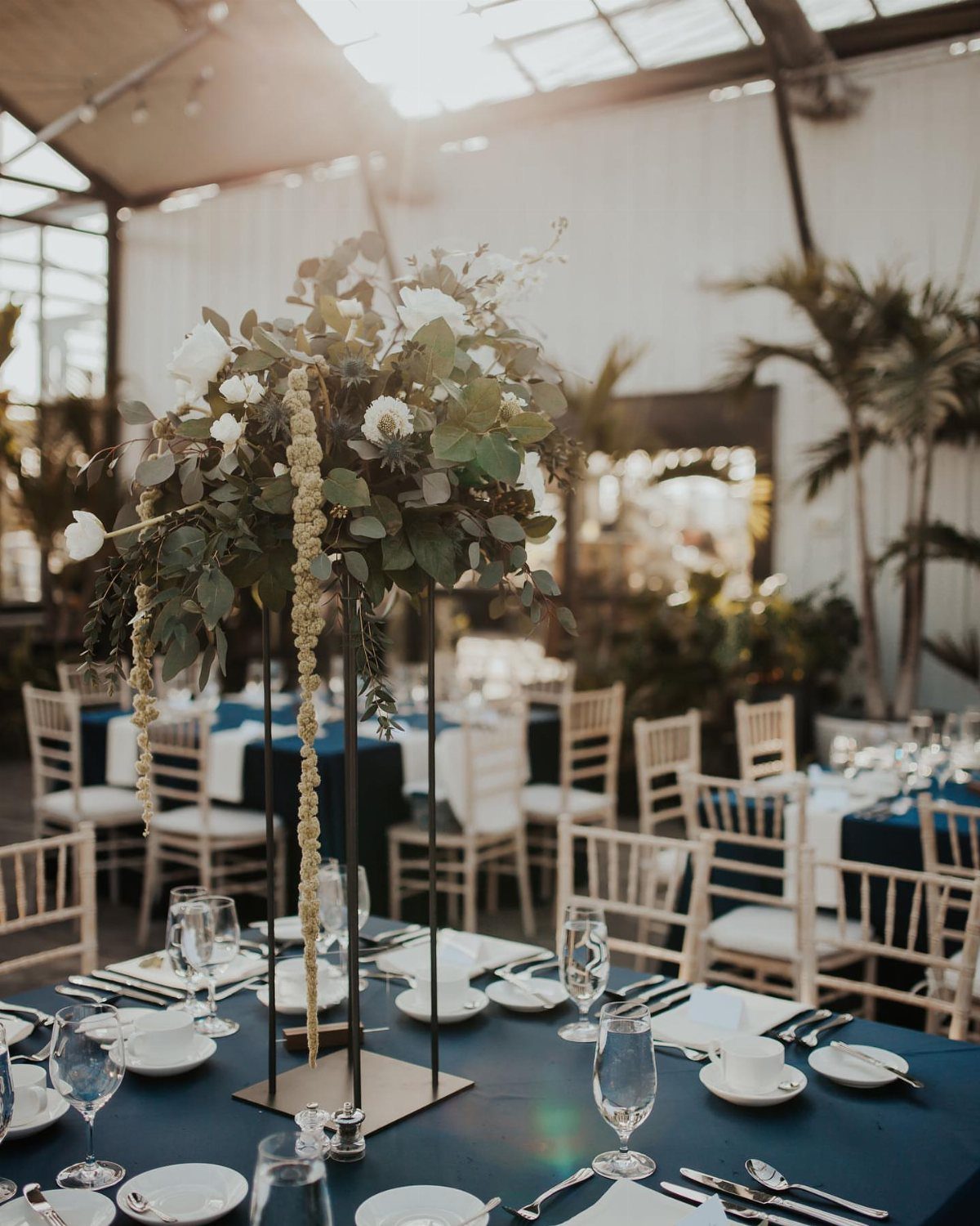
Navy cloths under white chairs give a reception its sharpest contrast, and a greenhouse supplies the daylight that keeps all that navy from feeling heavy.
The dark tables ground the room while the white chairs and white florals stay crisp against the glass.
I would put the flowers on tall stands, as here, so the blooms sit above the sightline and guests can still see each other while they talk. White on navy needs no third color to look finished.
If budget is tight, rent the white chairs and linens in navy rather than buying either. Both are standard rental items.
8. Navy and Sage Green
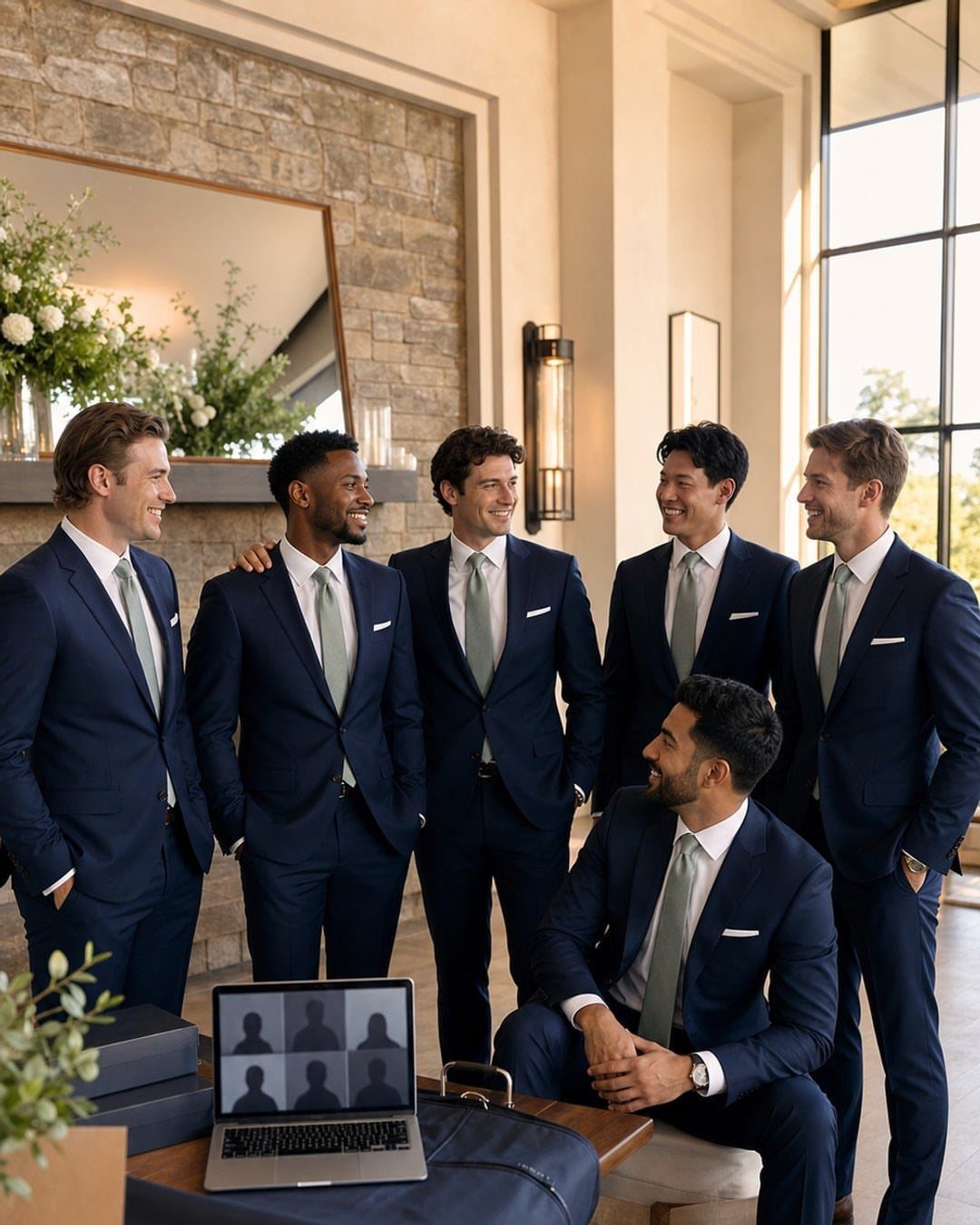
Sage green ties soften a navy suit without turning it into a costume.
The green is pale and a little gray, so it reads as a quiet accent next to the dark fabric, and six men in the same pairing look unified rather than loud.
Match the tie to a color you already use, such as bouquet greenery, so it connects to the rest of the day. I prefer a matte fabric over a shiny one, which can make sage look minty and cheap.
Order all the ties at once, and hold one against the suit before you place the full order.
9. Navy and Purple
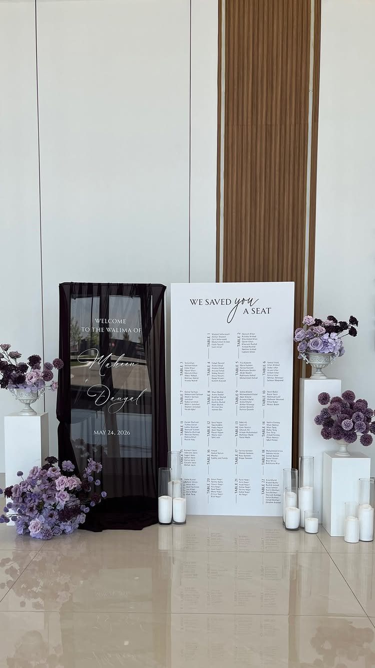
A navy fabric backdrop turns a plain white wall into an entrance with a clear color story. Purple flowers pick up the blue in the cloth, and white candles keep the arrangement from getting heavy.
I would keep the seating chart white, as it is here, so the names stay easy to read against the navy.
Pick one purple and stay with it, since mixed shades of purple can drift toward pink or gray beside navy.
Use real candles only where guests will not brush past them. Battery ones are safer near fabric.
10. Navy and Rust Orange
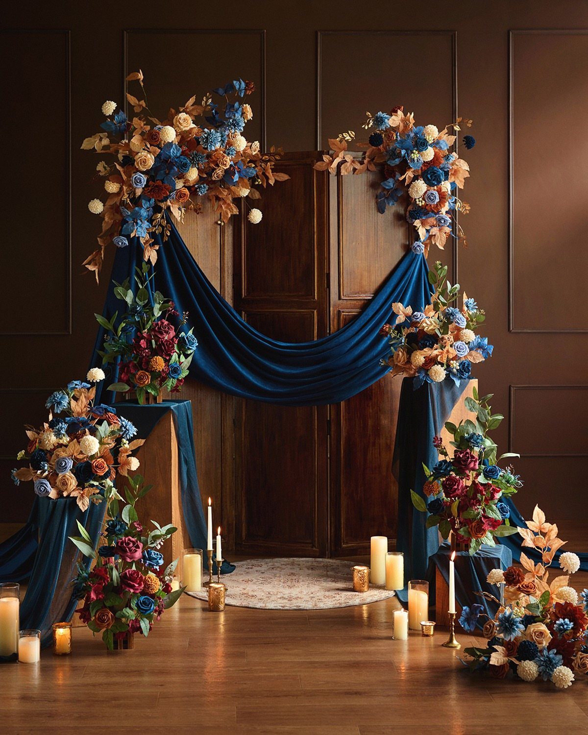
Draped navy velvet gives a backdrop real depth, and rust orange is the right partner for it: warm against cool, with both colors dark enough to feel moody.
Orange and blue flowers repeat the palette in softer form, so the fabric does not have to do all the work.
Let the velvet fall in loose folds rather than pulling it flat, because the folds catch candlelight. Set the candles low, on the floor or a stand, so the glow rises up the cloth.
Keep flames well clear of the fabric, or use battery candles instead.
Psychology of Blue
Blue carries a set of meanings that suit a wedding: trust, loyalty, calm and confidence. Navy is the deepest version of that, so it sets a steady, serious mood before anyone says a word.
The meaning is only half the decision, though. Because navy shifts from easy and romantic to sharp and dramatic depending on its neighbors, I’d settle the mood you want first, then choose the supporting colors to push it that way.
Pale partners make navy feel easy and soft. Metallics and rich darks push it toward formal and theatrical.
Say the mood out loud in one word to your partner before you buy anything. If you both pick the same word, the palette is probably right.
Incorporating Navy Blue
Use navy in a few places and give it a job in each: bridesmaid dresses, table settings, floral arrangements and invitations. Repeating it across those 4 is what makes the day look planned rather than assembled.
Balance matters more than quantity. Navy should be a star, not a scene-stealer, so if it covers the dresses and the linens, let the flowers and paper carry lighter shades.
Invitations are the cheapest place to start, since they set the color before guests arrive. Match the navy on paper to your fabric as closely as you can, because navy shifts between dye lots and printers.
Hold a printed sample next to a dress swatch in daylight before you order either.
Frequently Asked Questions
What colors go with navy blue for a wedding?
Gold, dusty rose, copper, coral, champagne, yellow, white, sage green, purple and rust orange all work with navy.
Blush, champagne and white keep navy light and approachable, but gold, copper or a deep burgundy push the same suits and sashes toward black-tie drama. Choose the mood first, then pick the supporting colors.
What colors should you avoid with navy blue?
Avoid mixing several shades of one color, since purples can drift toward pink or gray beside navy.
Also keep strong colors from piling up: with loud coral sequins, for example, a white centerpiece keeps a third color from fighting. A single exact shade for each accent, checked against the navy, keeps the palette from clashing.
What are some good fall colors for a wedding in October?
Navy pairs well with warm, dark tones that suit the season, and rust orange is a strong choice.
Draped navy velvet with rust orange and orange and blue flowers looks moody, and candlelight low on the fabric adds glow. Open flame and fabric don’t mix, so set candles on bare wood or glass, or buy flickering battery ones.
How do I choose the right navy shade?
Order swatches and check them next to your actual suits, dresses and flowers in daylight.
Dye lots and printers don’t agree on navy, so I’d hold a printed invitation sample against a dress swatch before placing any order. Buy items like ties all at once so the dye lots match.





