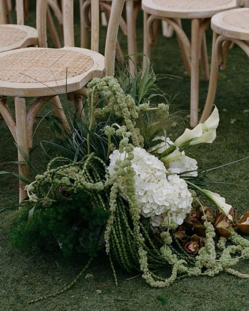
Green in this list runs from a sage invitation suite to emerald paired with gold or navy, and where you put the color matters more than which shade you pick.
If your budget is tight, start with green on the invitations, as in the emerald and navy suite, and save the full-room commitment for the one pairing you are sure of.
1. Emerald Green & Blush Pink
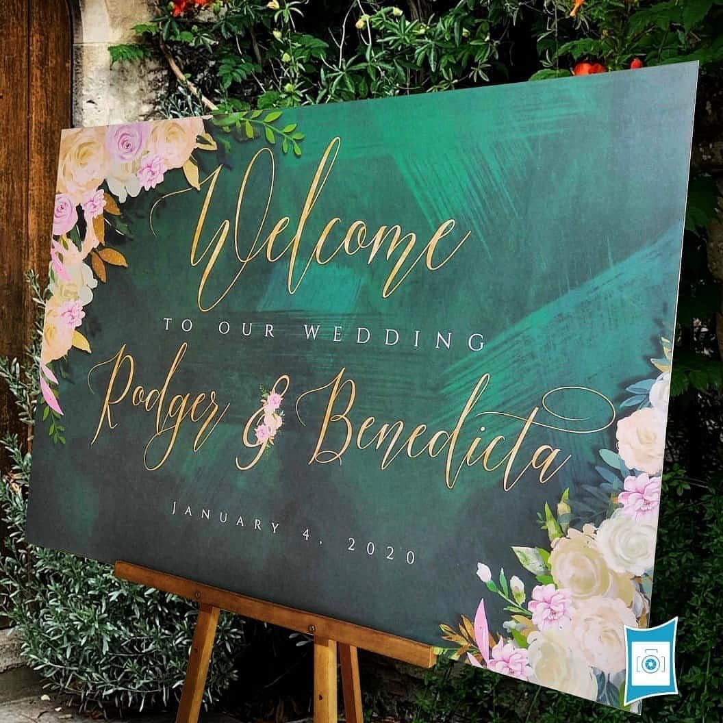
Deep emerald against blush pink works because the two sit nearly opposite on the color wheel, so the pink reads soft without turning sugary.
Keep the green as the base and let blush appear in the flowers, the way a welcome sign does with gold lettering on top.
I would use pink sparingly: a ratio of mostly green with blush as the accent keeps the mood romantic rather than sweet.
Gold lettering ties both colors together, so pick one metallic and stay with it.
2. Emerald Green & Gold
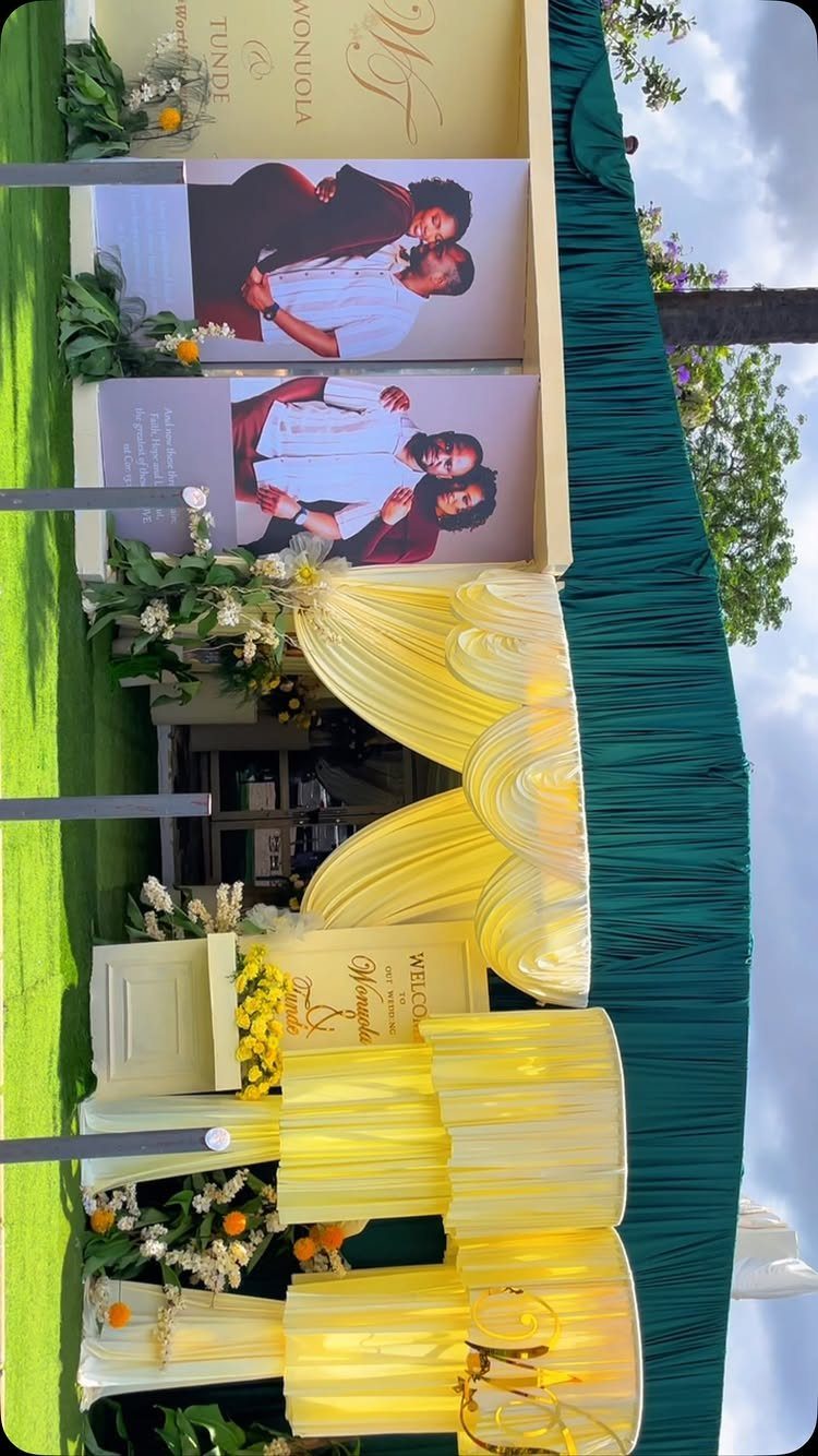
Emerald fabric with gold draping is the dramatic end of green, and it asks for a bold backdrop.
Rented chair covers and draping cost less than custom builds, but price them early, since the yardage adds up fast.
I would keep the florals simple and let the green and gold carry the room.
3. Sage Green & Soft Ivory
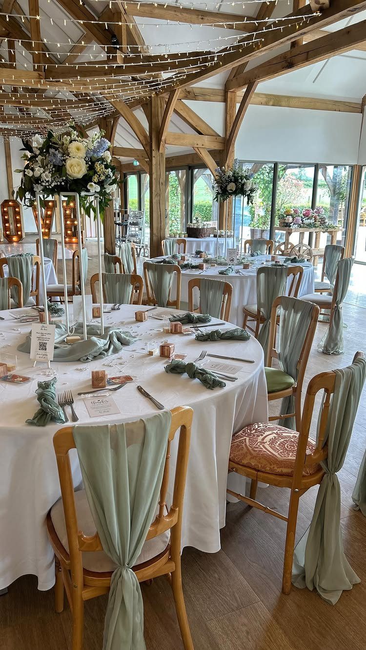
Sage sashes on ivory linens are an easy way to bring green into a room without making it loud. Because the tablecloths stay white, the green lives in the small pieces: chair sashes, napkins and the foliage in the centerpieces.
That makes it forgiving on a tight budget, since sashes and napkins are the only items you need to source in color.
A wooden barn suits the soft palette well, as the warm wood keeps the pale tones from feeling flat.
4. Dusty Blue Linens with Sage Greenery
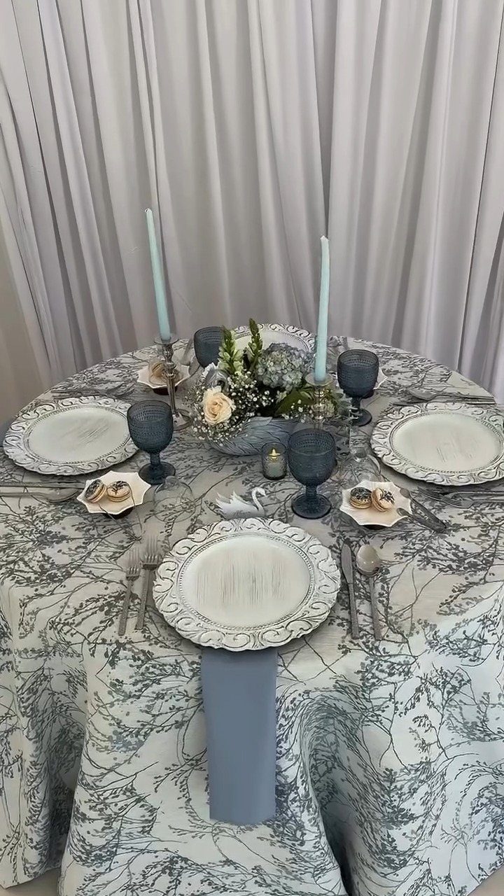
Dusty blue and sage sit close enough in tone that they blend, and that is the appeal.
Start with blue on the table in napkins and glassware, then let sage greenery and white roses in the centerpiece bring in the green.
Neutral linens, like a grey pattern, keep both colors quiet and let the glass stand out.
I would keep the plates white so the blue has room to show.
5. Sage Green with Gold Accents
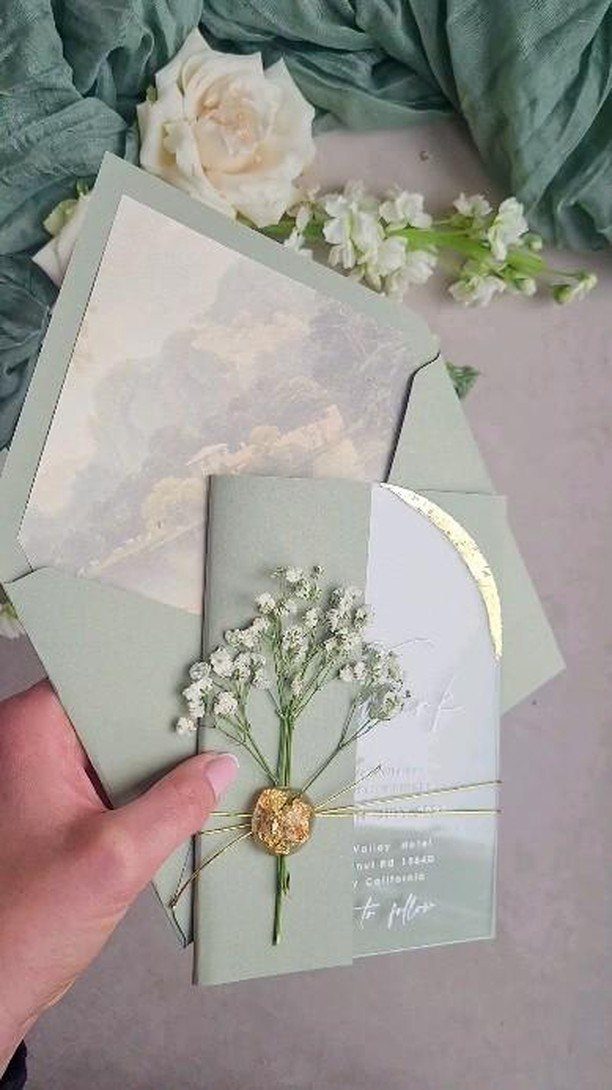
A sage invitation with a gold seal sets the palette before anyone arrives, and foil is where gold earns its cost.
A little goes a long way: a seal and fine foil detail look finished, while full foil printing on every piece will push up your stationery bill.
Carry that same gold into the day through small details so the invitation feels like the start of one look.
6. Emerald Green and Navy Blue Wedding Invitations
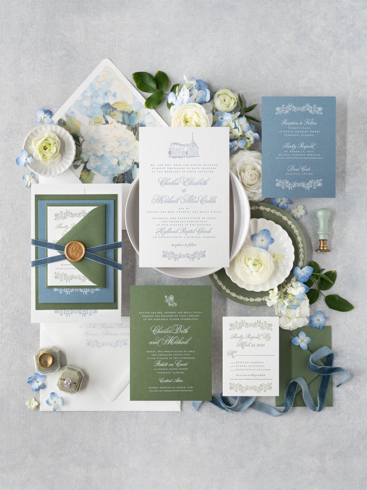
Navy gives emerald a grounded partner, and on paper the pair feels formal without much effort.
Stationery is the cheapest place to try it: a suite in emerald and navy lets you test the combination at low cost, then scale up to linens or bridesmaid dresses if you like it.
White and blue flowers photograph well against both colors, and a grey backdrop keeps the flat lay calm.
Order a sample before the full run, because deep greens and navies can print darker than they look on screen.
7. Mint Green & Lavender
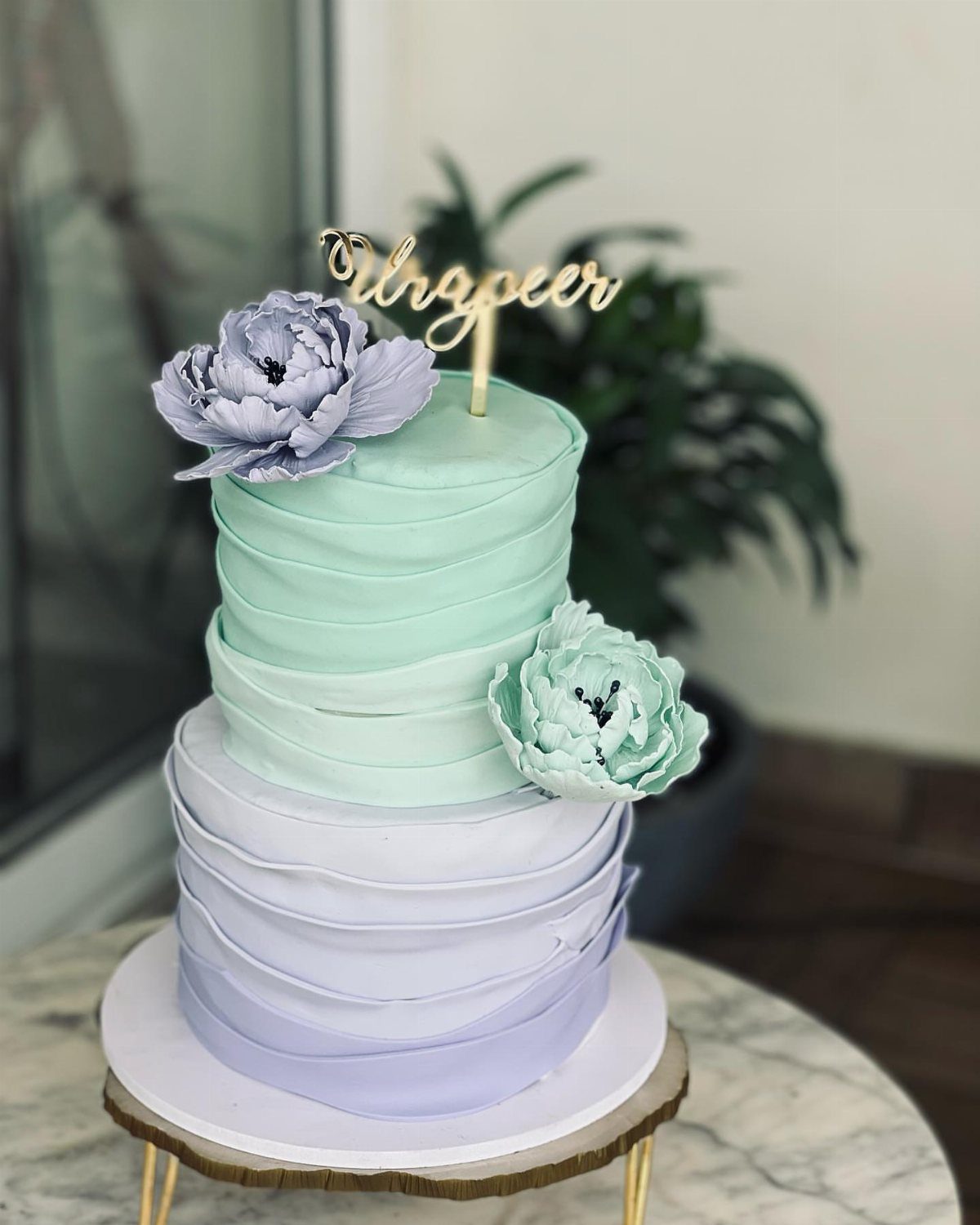
Mint and lavender are both pale and cool, so they sit together like sorbet flavors.
A tiered cake lets each color claim its own level, which makes sense when you want the 2 shades to sit side by side without blending.
Sugar flowers carry the colors upward, and a gold topper gives the pastels something firm to rest against. I would keep the stand white and let the cake be the only strong color on the table.
Pastels look fresher with plenty of white around them.
8. Olive Green and Navy Blue
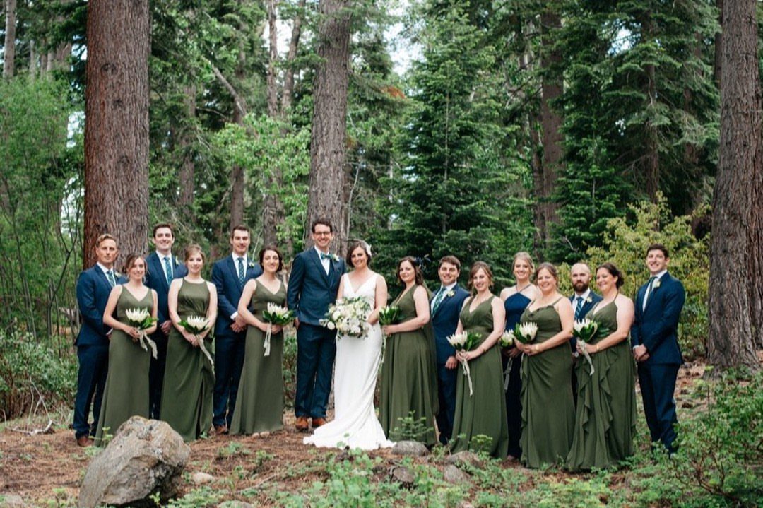
Olive bridesmaid dresses next to navy suits give a wedding party two deep, muted colors that hold their own among trees.
The bride in white stands apart without any effort, which is why I like this split: the party carries the color and the gown stays clean.
If dresses and suits come from different shops, compare them in daylight, because olive can lean yellow or grey. Order fabric swatches first.
9. Olive Green and White
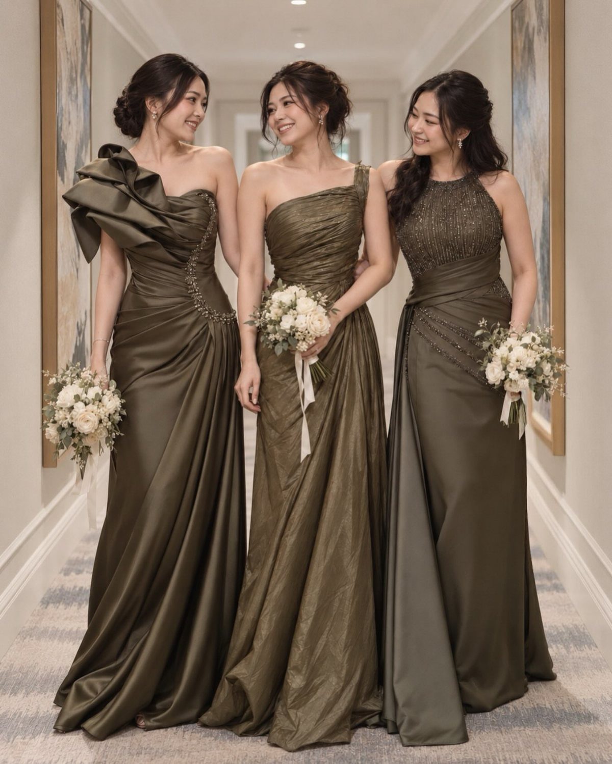
Olive satin with white bouquets is a simple pairing, and the contrast does the work. Satin has a sheen, so the dress color looks richer than a matte fabric would, and white blooms look crisp against it.
I would keep the bouquets all white and loosely shaped, with no second color, so the dresses stay the focus.
Check swatches under the lighting of your venue, since satin shifts shade as it catches light.
Why Green Works in Weddings
Green can carry a palette as the lead color or sit quietly behind other shades like a neutral, so it pairs with almost anything you pick.
It pairs naturally with florals, wood textures and outdoor settings, and it photographs well, giving the whole day a rich but balanced backdrop.
Its range across seasons makes planning easier. Pair it with soft neutrals for spring and summer, or with deep, rich tones for fall and winter.
It also suits both an elegant ballroom and a small outdoor ceremony, so you can keep your palette even if the venue changes.
Green also carries a sense of renewal and calm. If sustainability matters to you, it is the easiest color to tie to that value, since so much of it can come from plants.
Incorporating Greenery in Decor
Greenery can replace some of the florals entirely. Eucalyptus, ivy, ferns and succulents all make full designs, and a hanging backdrop, a lush arch or cascading centerpieces add dimension and texture.
Potted plants and small trees work as decor and as a sustainable choice, since they last beyond the night.
Moss napkins and a velvet runner in deep green look especially good next to dinnerware with a gold rim. For centerpieces, rosemary sprigs, potted succulents or tall greenery arrangements look refined and organic.
Other swaps keep the look consistent: wooden signage, biodegradable confetti and natural fiber textiles. A live plant as a favor is one I like, because guests take home something they can keep growing.
Frequently Asked Questions
What are some good green color combinations for a wedding?
Emerald with blush pink, emerald with gold, sage with soft ivory, and dusty blue with sage greenery are the ones I’d start with.
Emerald with navy and olive with white also work well. Pick one partner color and one metallic at most, so the green stays the lead.
Is sage green a popular wedding color?
Sage is a popular pick for good reason: it reads as green without shouting, so it sits easily in a ballroom, a barn, or a backyard.
It works with garden and rustic settings, and it suits a tight budget: with white tablecloths, only sashes, napkins and centerpiece foliage need to be sourced in color.
What are the 2026 wedding color trends?
I can’t point to a verified 2026 trend list, but green is a dependable bet because it works in every season.
For a spring or summer date, sage looks best beside cream, ivory, or blush; for fall or winter, I’d set it against burgundy, plum, or deep navy.
It also holds up if your venue changes, from a ballroom to a small outdoor ceremony.





