Pastels shift between suppliers, under indoor lights and in morning versus late-afternoon sun, so Choosing the Right Colors matters less than seeing how each shade looks in the room where it will sit.
This list runs from Soft-Colored Candles on a single table to a whole Pastel Wedding Venue, and the venue and season you already have should decide which ideas fit.
Using Pastels in Different Seasons matters here: spring takes soft pink and peach easily, while a fall date calls for dustier mauve with a metallic accent.
1. Soft-Colored Candles
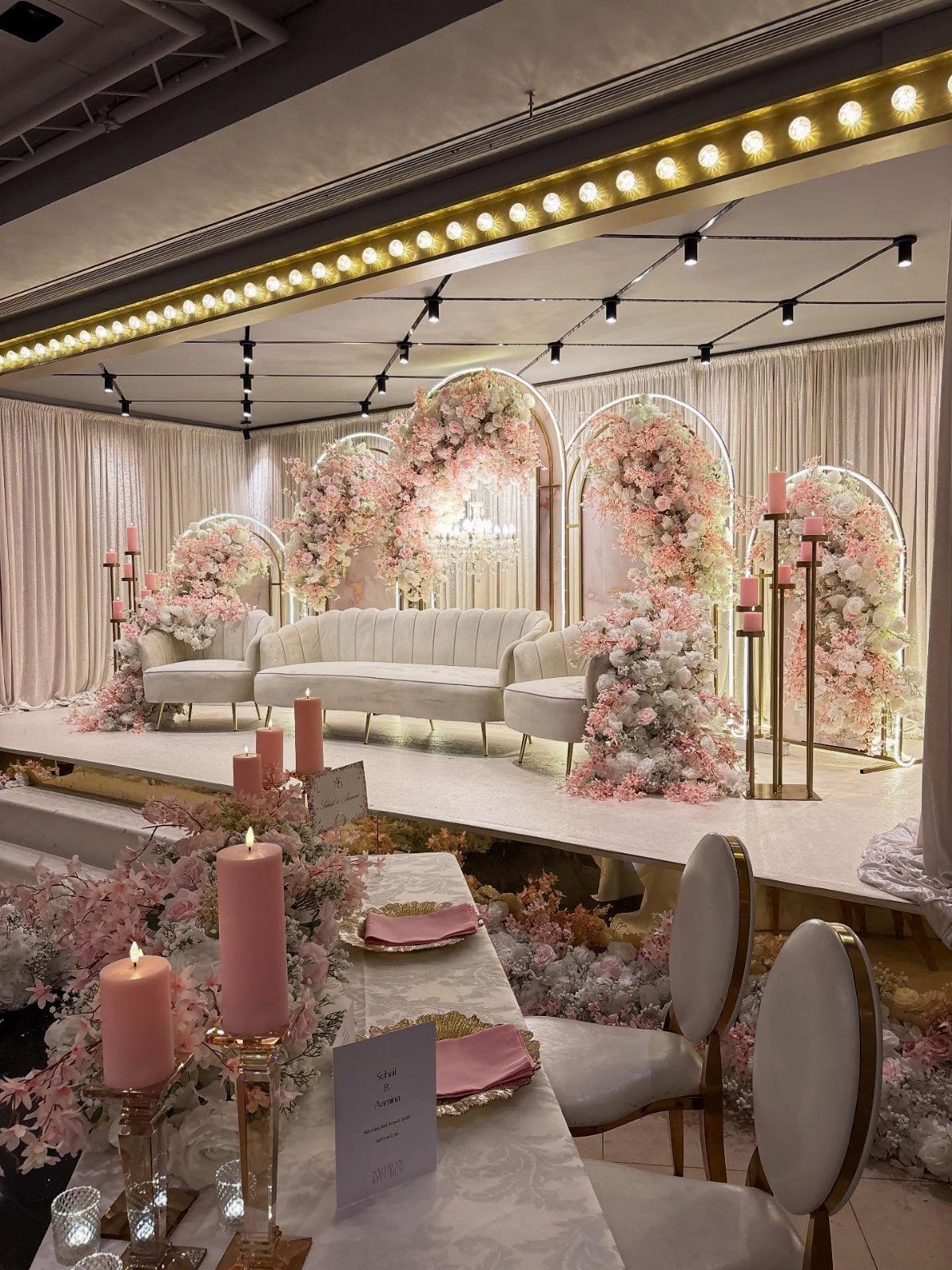
Pink pillar candles in a few heights do quiet work around a lounge: they warm up white sofas without competing with the flowers.
Group them in odd numbers on low tables and keep the tones close, blush to rose, so they read as one color.
Candles are cheap next to florals, which makes them a good place to spend a little extra on the shade you actually want. Match them to your palette before you buy in bulk.
2. Wedding Florals
Pastel flowers carry a palette better than almost any other piece of decor, because the color sits at eye level on every table and at the altar.
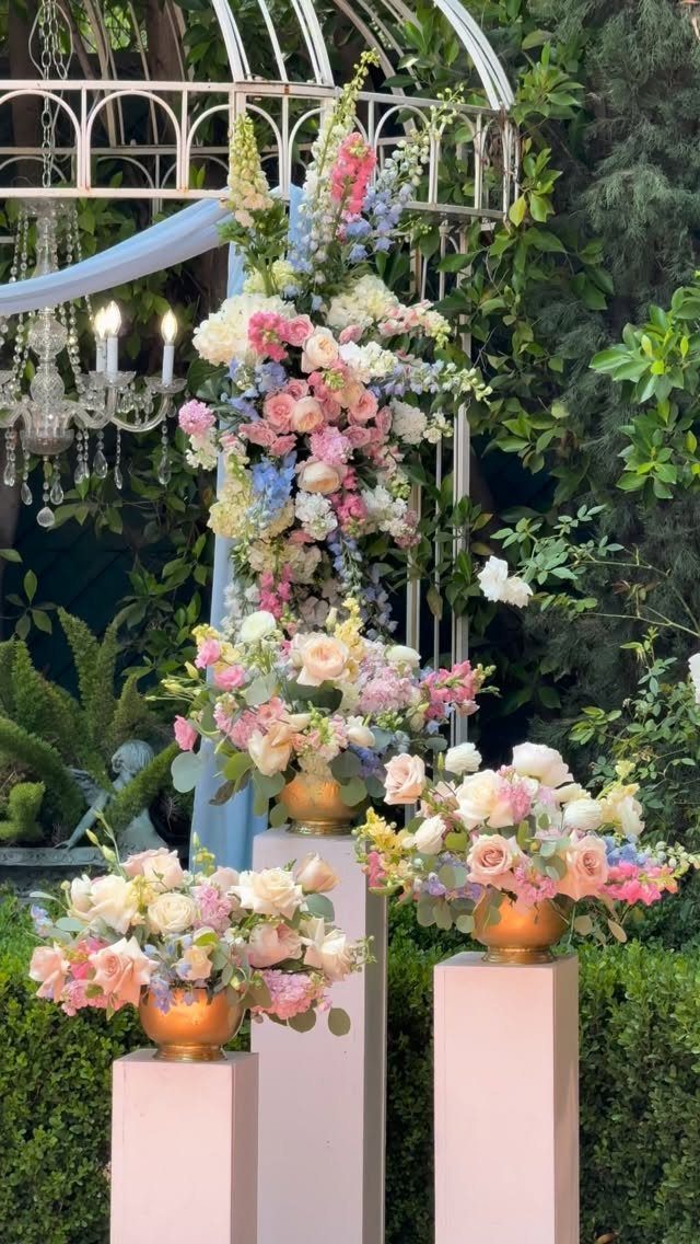
Pink, blue and white together stay soft when you keep one white bloom in every arrangement.
Gold vases lift the pale tones, and pedestals at different heights make 3 arrangements look like a deliberate set. Ask your florist to build from your color swatches, since pastels shift a lot between suppliers.
3. Dreamy Bridesmaid Dresses
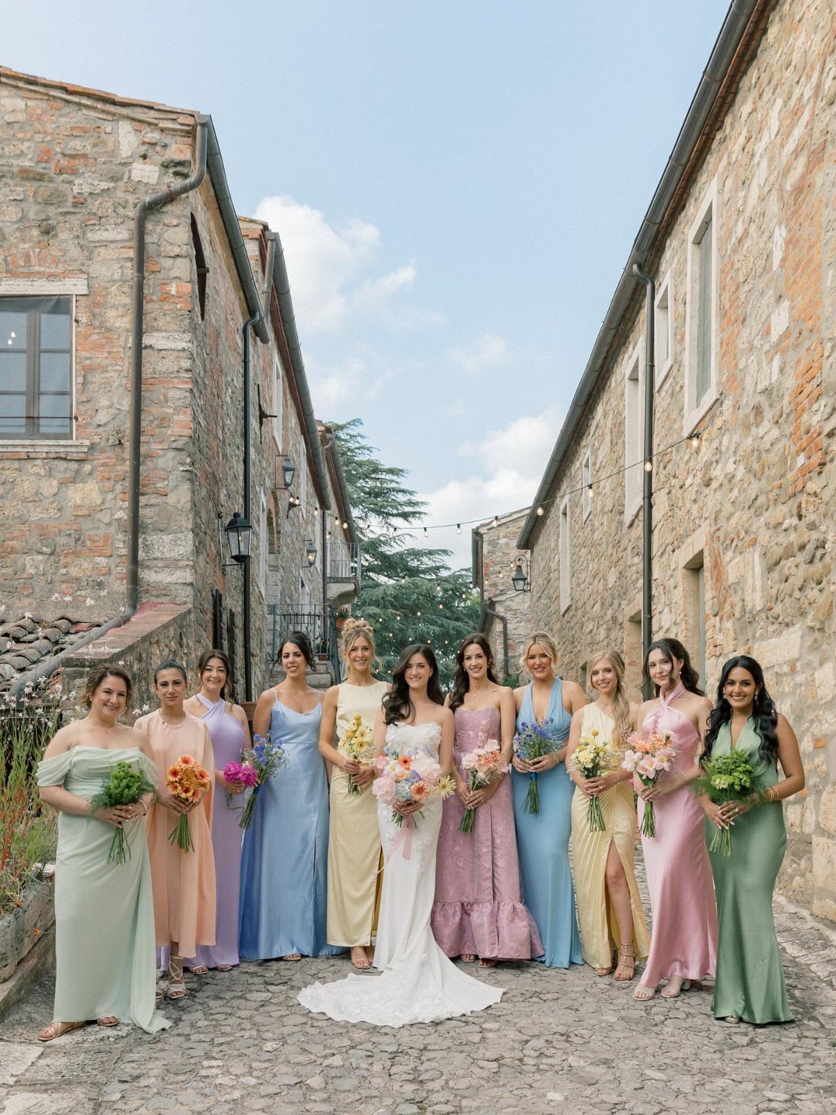
Mixed pastel gowns let bridesmaids pick the shade that flatters them while the group still reads as one palette.
Soft pink, blue, lilac and mint all sit pale enough that a bride in white or ivory still reads clearly in the middle of the group; keep the dresses in the same light range and skip any shade that approaches true white.
I would keep the fabric the same across all of them, such as chiffon, so the colors vary and the texture doesn’t. Choose shades with a similar softness; one saturated dress breaks the effect.
Send a swatch card to everyone before ordering.
Of course, if you’re going for pastels, you don’t have to dress your maids all in the same shade. Pastels are easy to mix and match up – you could go for a sort of faded rainbow look if you wanted.
4. Pastel Table Settings
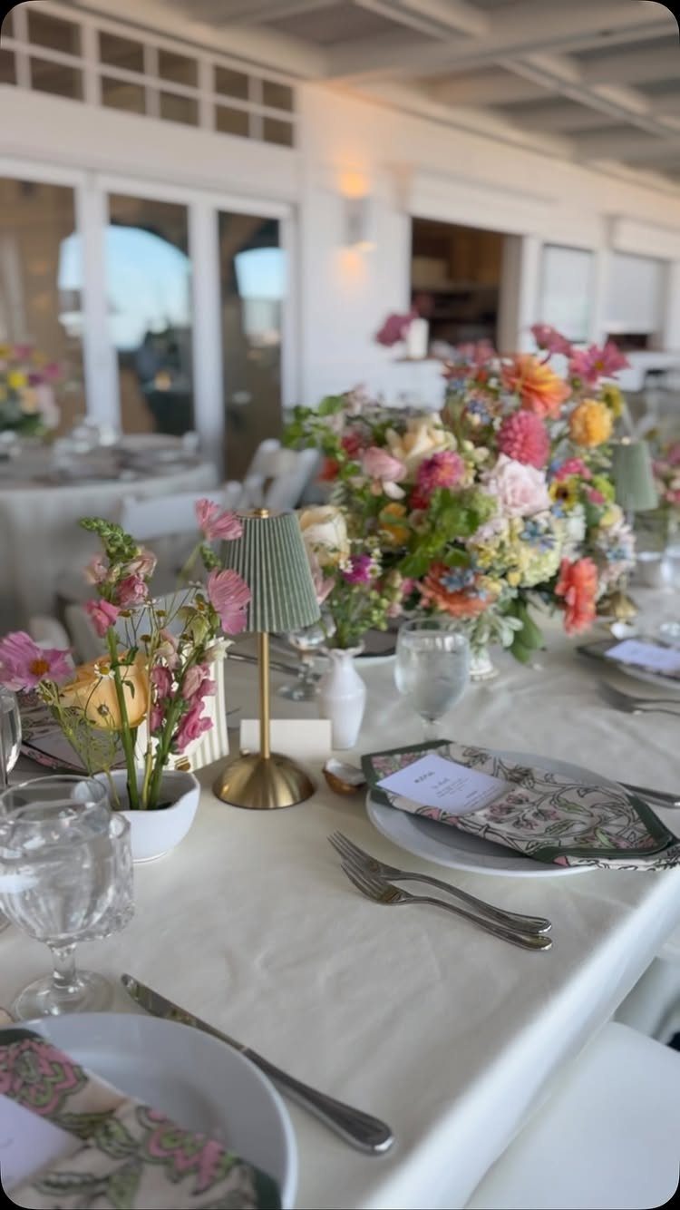
White linens give pastel centerpieces room to breathe, and that is the cheapest way to make a table look styled.
Let the flowers hold the color, then repeat one of their shades in a napkin or a small accent like a lamp.
2 pastel tones on the table is plenty. Clear glassware keeps the look light, and anything tinted should match the florals, not fight them.
5. Wedding Favors
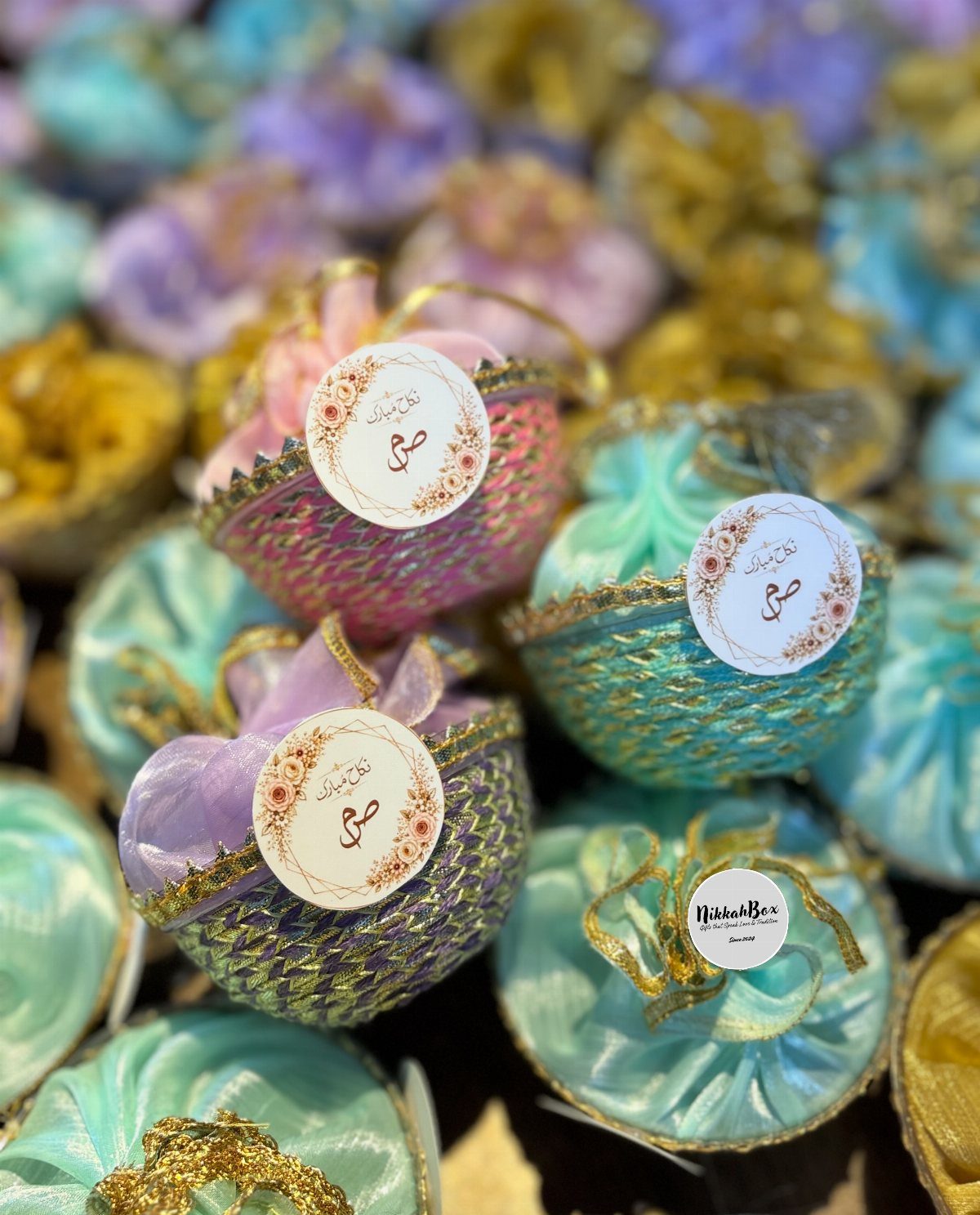
A tag with a name or a short line in calligraphy turns a generic pouch into something personal.
Fabric favors cost more per piece than candy boxes, so decide your count early and keep the filling simple. Guests keep a bag they can reuse, which is why I prefer them to paper.
6. Pastel Wedding Attire
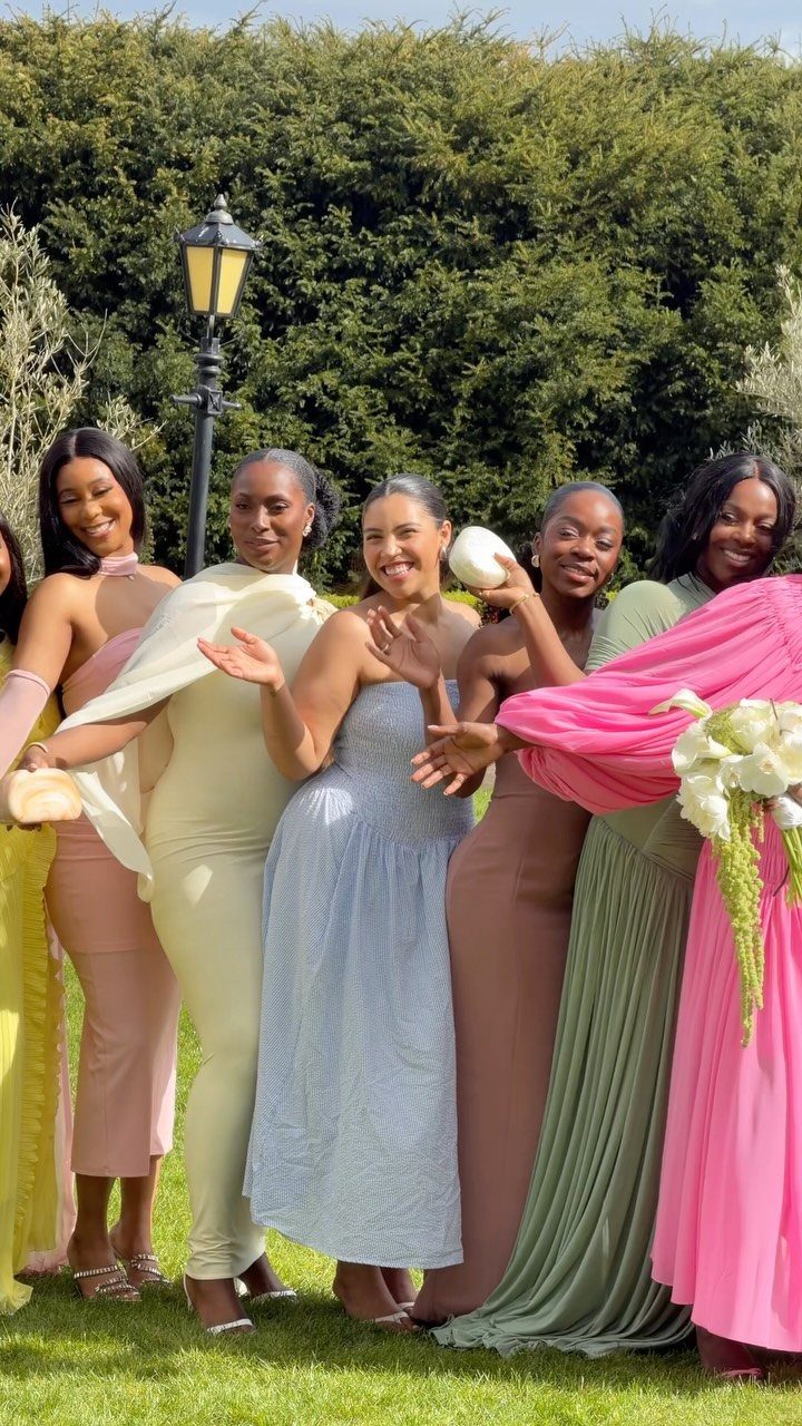
Dressing the whole wedding party in pastels works best when every person gets a different shade from one family: pink, yellow, blue, green. A lawn and green hedges suit that softness, since the greenery calms the color.
Watch the muted shades, like the brown-leaning ones, which can look dull in photos next to brighter pastels. Compare every fabric together in daylight before you commit, because pastels shift under indoor lights.
7. Pastel Wedding Themes
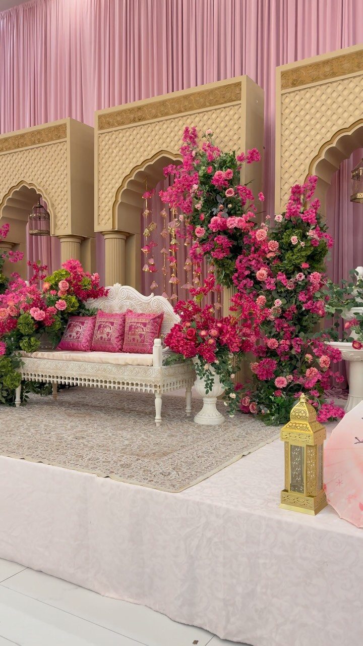
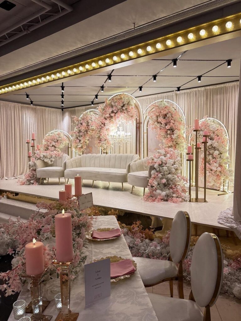
A pastel theme works best when one color leads. Keep a pastel room in one color family: pink cushions, florals and curtains together, then break it up with white furniture and gold accents so it reads polished instead of sugary.
Pick the lead shade first, then let everything else support it. Gold framing gives the pink a finish that looks planned, so I would choose it over adding a second pastel.
8. Pastel Color Pairing
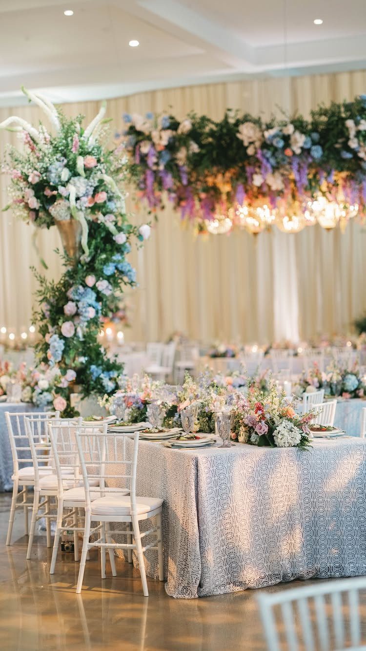
A metallic like silver sequin linen under pastel flowers catches light and makes the blooms look brighter without adding another hue. White chairs keep the neutral side quiet.
Use one metallic per table.
A gold vase against a silver cloth works in this setup, but I would pick one metal for your own tables and repeat it. Pastels need a calm base, so keep the patterned piece to the tablecloth.
9. Dusty Rose Shades, Mauve, and Metallic
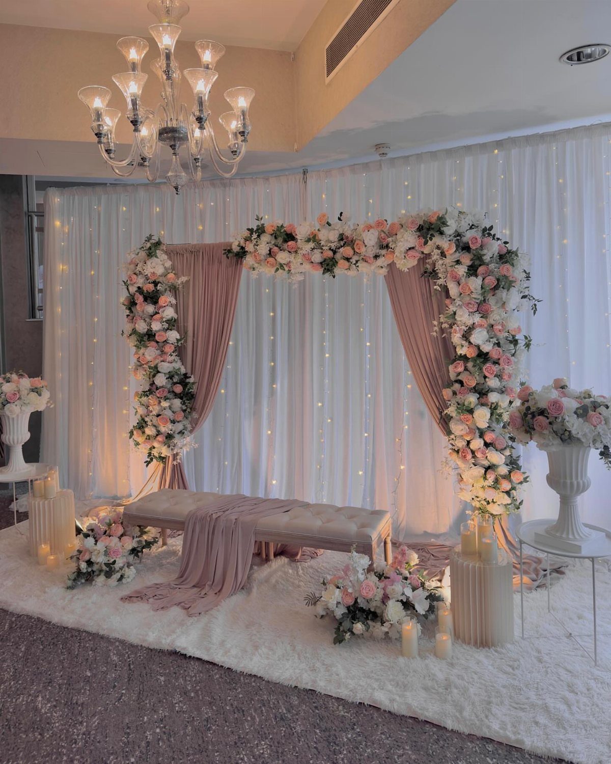
Dusty rose is the pastel with some depth to it. It reads softer than true pink but warmer than gray, and it pairs easily with mauve and anything that glints, like crystal or gold.
A fabric arch in dusty rose, dressed with pink and white flowers, gives you a focal point that photographs as romantic rather than sweet.
I like it for couples who find baby pink too young. Keep the flowers lighter than the fabric so they stand out.
10. Peach Blossom & Lavender
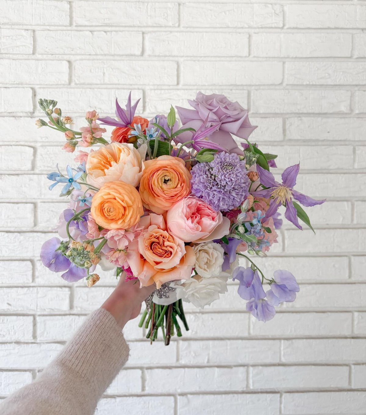
Peach and lavender sit opposite each other in tone, one warm and one cool, so a bouquet that holds both looks lively without leaving the pastel range. Add pink between them and the shift feels gradual.
Choose flowers in all three shades at similar softness, since one deeper bloom pulls the eye.
Ask your florist for a sample bunch before you commit. Pastels vary by supplier, and peach in particular can turn orange.
11. Pastel Wedding Cake
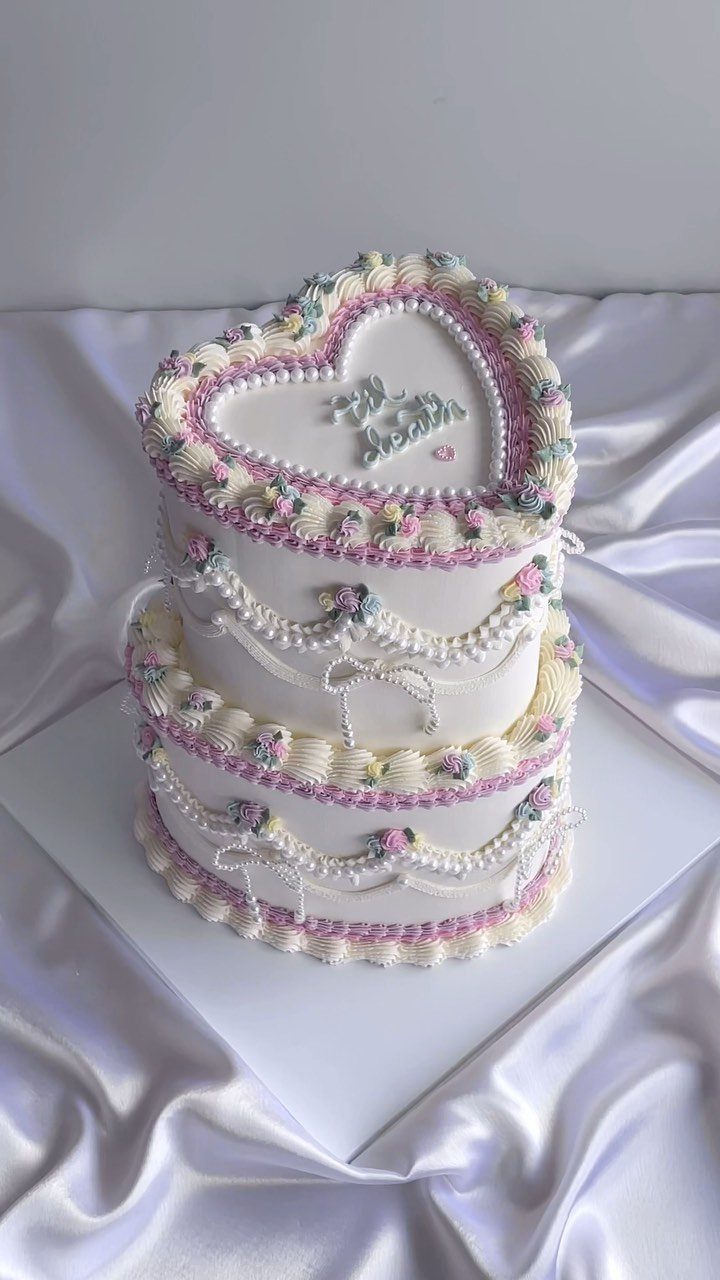
Painting your wedding cake in soft pastel frosting, sugar flowers, or watercolor washes makes it a styled piece of your palette rather than just dessert.
A heart shape with 2 tiers gives you a strong outline, and the lettering on top can say whatever suits your humor. Bring your swatches to the baker so the frosting matches your florals.
12. Pastel Wedding Invitations
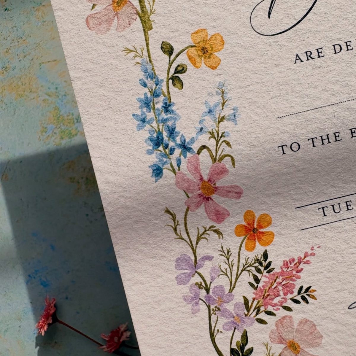
The invitation is the first place your colors appear, so use it to preview them.
I would pair the soft art with dark, simple lettering.
Black type keeps the names readable, and pale text on pale paper is the usual mistake. Order a printed sample first, because pastels often print duller than they look on screen.
13. Pastel Wedding Venue
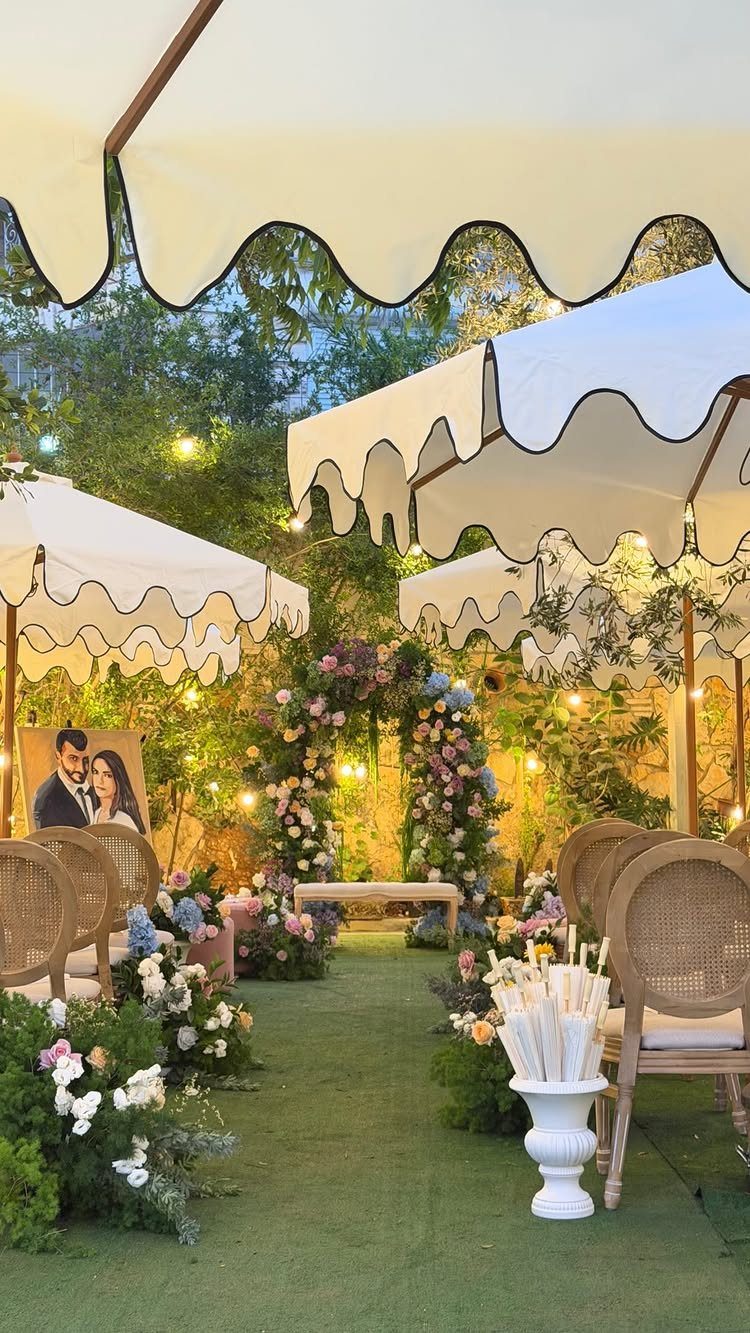
Scalloped white tents give a pastel palette a clean frame, so the flowers and the arch carry all the color.
Choose a venue where the structure stays neutral: white canopies, natural cane or wicker seating, and open sky behind the florals.
A pastel arch looks best against a plain backdrop, which is why I would skip a venue with strong built-in color, like dark wood paneling or busy wallpaper.
Visit at the hour your ceremony will happen, since pastels read differently in morning light than in late afternoon.
Ask what the venue already provides, such as chairs and tents, before you spend on rentals.
Choosing the Right Colors
Start with the season and the venue, since both change how pale colors read. A palette that looks right in a photo can wash out or clash once it sits next to your actual room, lawn or ballroom.
Pastels are made by lightening a color with white, which is why they feel soft and calm. That also makes them easy to mix, so you can use a few shades from different families and still get one cohesive look.
Pick the shades that match what the venue already has, then check the florals and attire against them.
If you feel stuck, a planner can narrow the options faster than another night of scrolling.
Pastel Wedding Trends
Spring and summer are where pastels look their best, since soft color against fresh greenery and long daylight feels romantic instead of washed out. Because they are softer than bold colors, they still make an impression without shouting.
Light blues, soft greens, muted pinks and mauves are the shades that pair best in this style. A quiet scheme like that tends to leave guests feeling calm, so it suits a day built around relaxed, easy moments.
Using Pastels in Different Seasons
Pastels can carry into fall or winter, but only after I push them darker and dustier than the spring versions.
Mauve, dusty blue, or a heavier metallic like antique gold or bronze keeps the palette from looking like it wandered in from April.
For spring, these combinations work well:
Keep everything light and airy with loose florals, sheer fabrics and plenty of soft daylight.
Frequently Asked Questions
What are some nice wedding colors?
Blush with white is a pretty, safe place to start, and a little greenery in the florals keeps it from feeling flat.
Soft blue, mint, lavender and peach also work well. Choose a single dominant shade before anything else, then treat the rest as supporting players; that hierarchy is what makes a palette look deliberate.
What colors are pastel colors?
A pastel is any hue cut with plenty of white, which gives you blush pink, powder blue, lilac, mint, butter yellow and peach.
That lightening is why they feel calm and why shades from different families mix easily. Muted versions like mauve and dusty rose sit at the deeper, dustier end.
Is champagne a pastel color for a wedding?
Yes, champagne is usually treated as a soft, neutral pastel, and it sits easily next to blush, peach, lilac and mint.
It works well as the calm base that pastels need. If you want contrast, add one metallic such as gold and repeat it.
How do I keep a pastel wedding from looking too sugary?
Let one pastel lead instead of using several equally. White tables, chairs and linens give the eye somewhere to rest, and a single metallic like brushed gold finishes the look so it feels polished instead of candy-sweet.
Keep to 2 pastel tones on each table, and stay with the same fabric across bridesmaid dresses so only the color varies.
Can you use pastels for a fall or winter wedding?
Cold-weather pastels work, but pick versions with more gray and depth than the airy spring ones.
Mauve and dusty blue hold up well in colder months, and pairing them with antique gold or bronze adds the weight that keeps them from reading as springtime.





