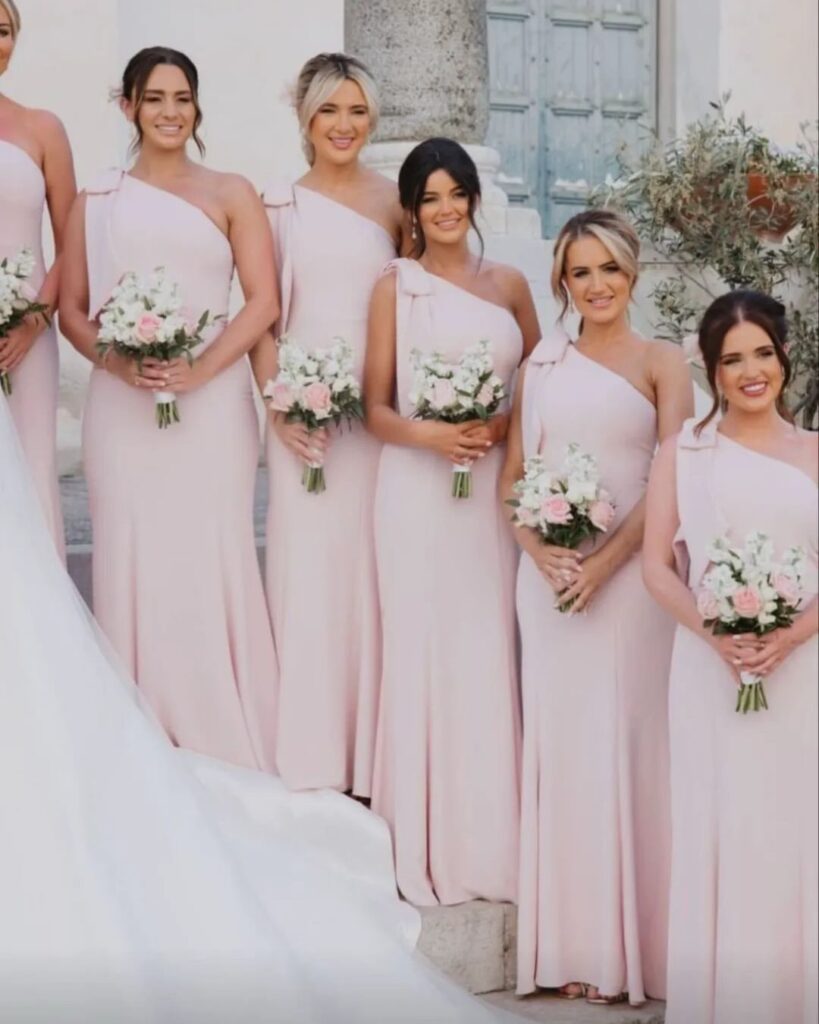
The pink you pick matters less than what stands next to it: these palettes run from dusty rose with cream, a pairing so quiet that texture has to do the work, to fuchsia with gold, which gets loud fast.
Pick the partner color by the mood you want guests to feel walking in, then match the shade of pink to it, because a fuchsia and a dusky rose behave very differently beside the same navy.
1. Dusty Rose & Mauve
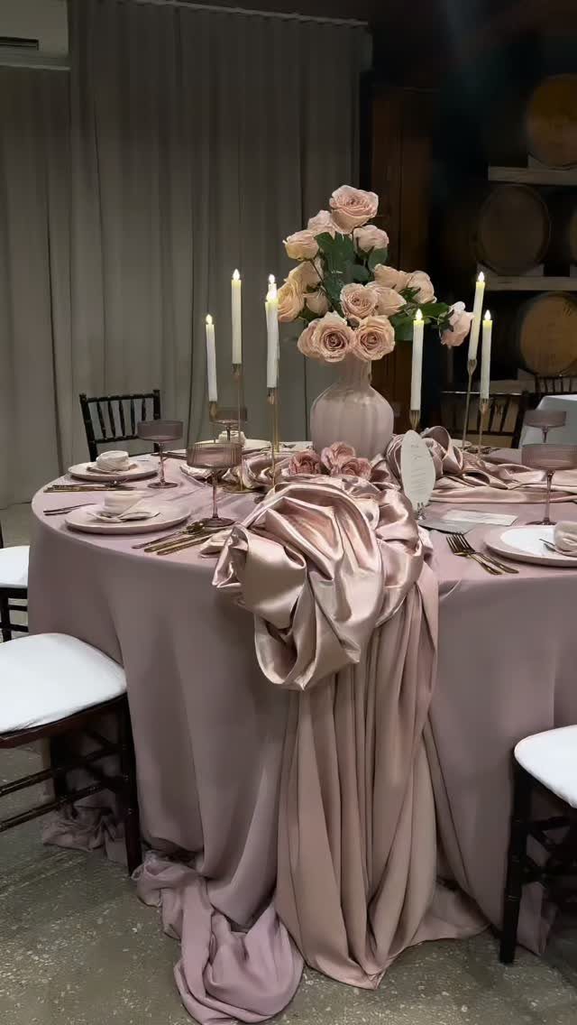
Mauve and dusty rose sit close enough on the color wheel that the pairing reads as one soft, slightly faded color rather than two. That is the vintage pull.
Gold candlesticks and white tapers keep it from going muddy, so I would add them before anything else. Pink glassware is a cheap way to deepen the rose without adding a third color.
Put the mauve on the biggest surface, the tablecloth, and let the rose live in the flowers.
2. Dusty Rose & Navy
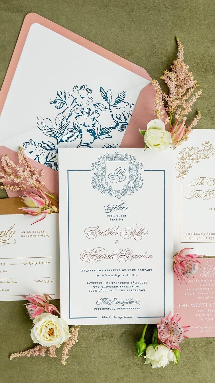
Navy gives dusty rose something to push against, which is why this pairing looks formal without feeling stiff. Stationery is where I would start: navy text on white, with a dusty rose envelope.
Rose gold foil on letterpress, which the maker of this suite recommends, adds shine without pulling attention from the navy. It also costs more than flat printing, so ask for a quote on both.
Keep the rose in the envelope and flowers, and let navy do the reading.
3. Dusty Rose & Cream
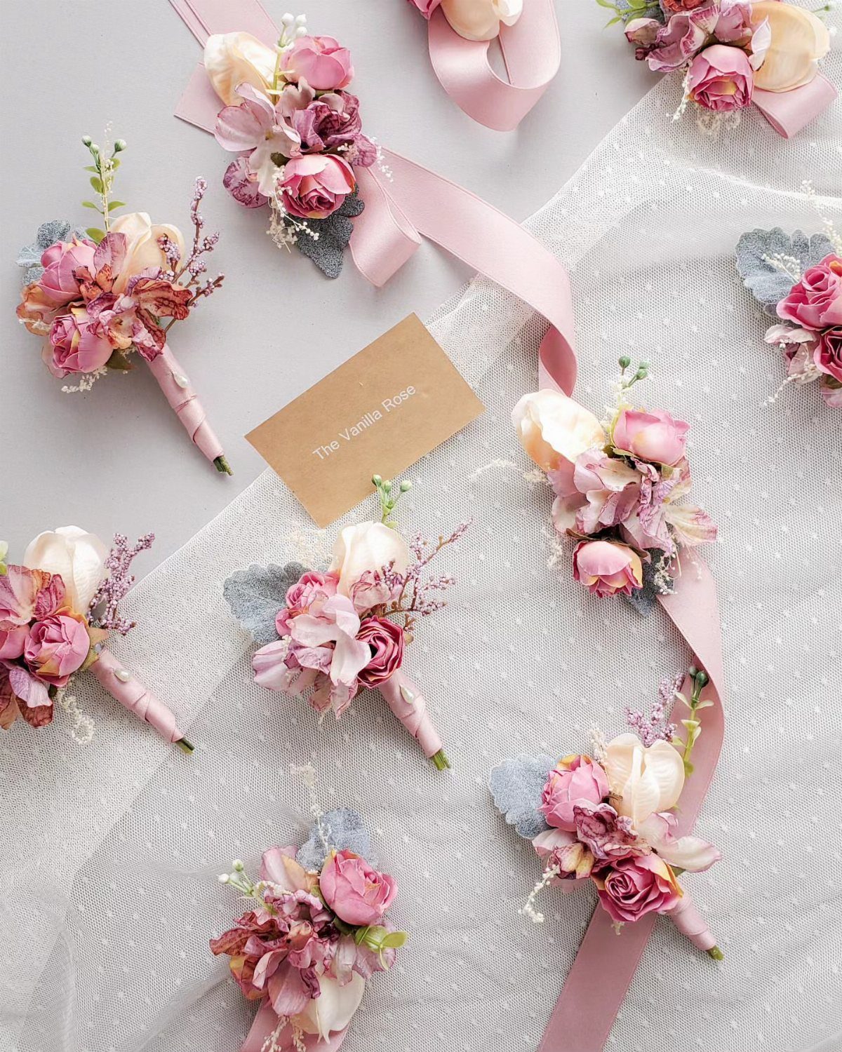
Cream is the quietest partner dusty rose can have, and boutonnieres show why. Blooms in both tones, tied with pink ribbon, look soft without needing a third color.
I like this best in small pieces: boutonnieres, corsages, a bouquet wrap.
Cream next to dusty rose has little contrast, so texture does the work. Mix ruffled petals with smoother ones, or the arrangement can go flat.
If you want one pop of depth, pick a single darker rose and repeat it sparingly.
4. Pink, Burgundy, Navy, and Gold
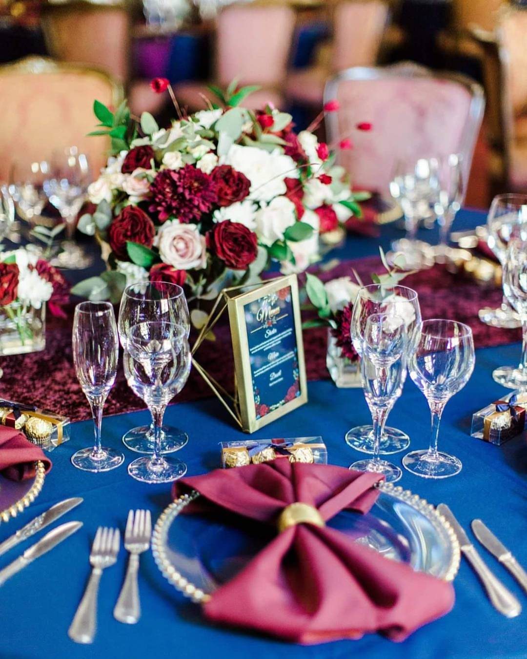
A palette with this many colors can feel like a lot, but here each one has a job.
Navy covers the big surface, the tablecloth. Burgundy shows up in the napkins, pink and white soften the flowers, and gold finishes the details.
Gold rings and a framed menu card keep it looking rich. I would hold the burgundy to small items so the table stays navy-led.
Pink is the easiest to lose, so check that the centerpiece has enough of it.
5. Dusky Rose & Silver
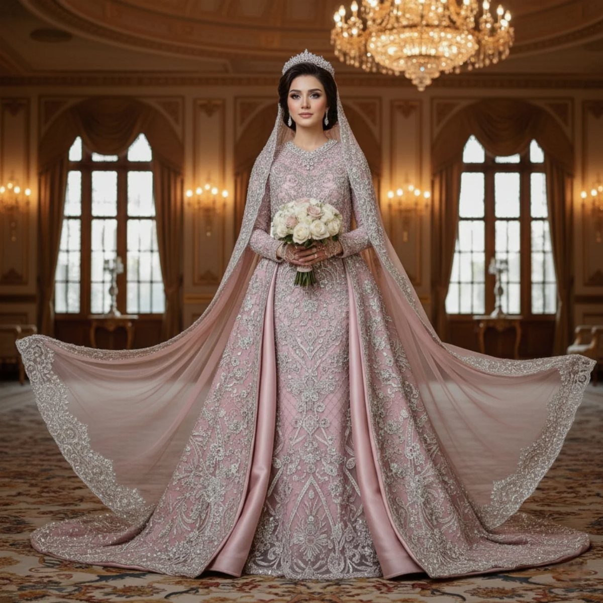
Dusty rose with silver feels like candlelight on a cold evening: warm color, cool metal.
Silver works best in small doses: a little metallic thread or a few accents goes a long way against dusky rose. A tiara or a few beaded details can carry it.
Silver is less common than gold, so it can look more distinctive. I would use it in thin accents like thread, flatware or frames, not as a large surface.
White roses in the bouquet keep the palette light and let the pink read as dusty rather than dull.
6. Blush Meets Fuchsia
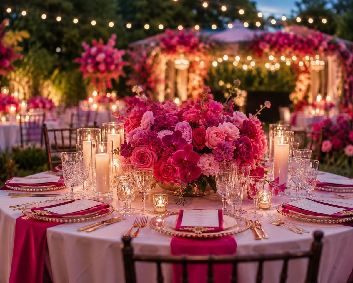
Fuchsia napkins on a white cloth are the simplest way to get this palette without overwhelming a room. White gives the bright pink a clean edge, and gold plates warm it up.
For the flowers, blend blush and fuchsia in one centerpiece so the two colors link up. I would keep fuchsia to napkins and a few blooms, with blush filling the volume.
Bold color photographs well outdoors under string lights, so consider an evening setup.
7. Pink and Green
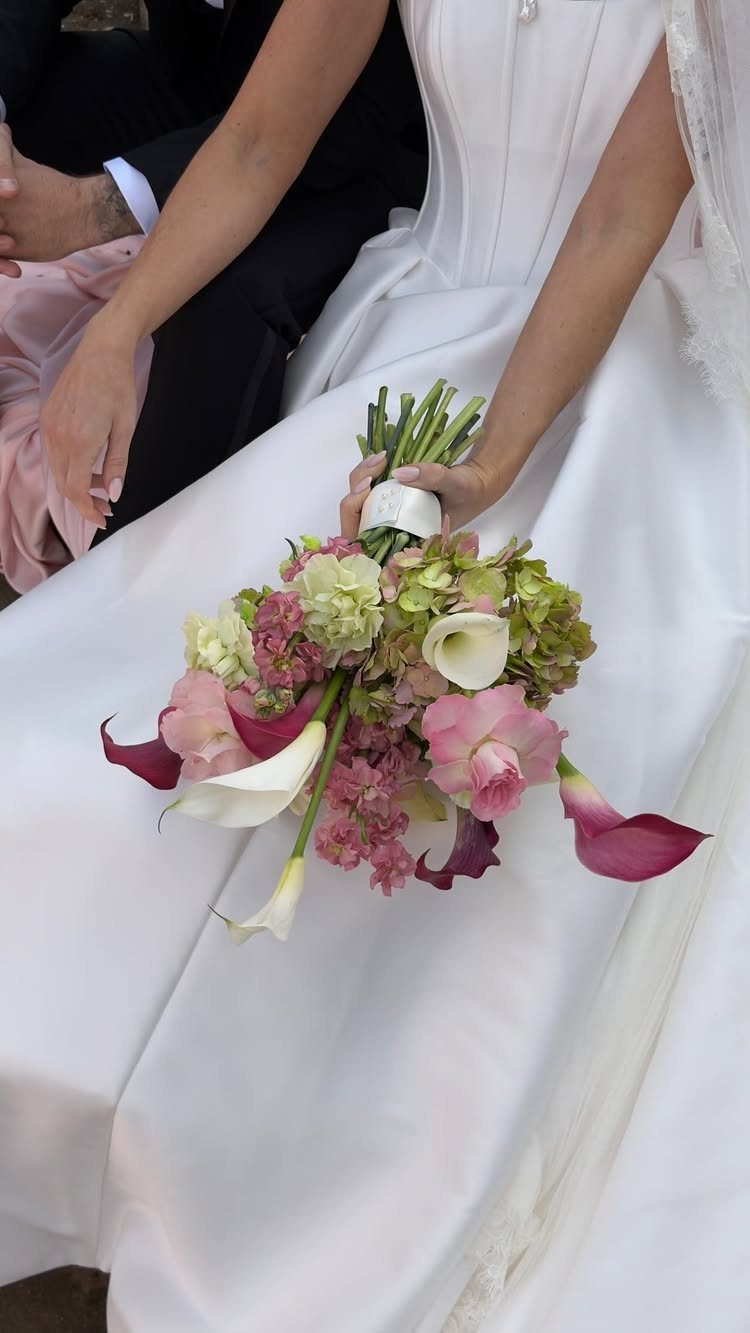
Green does for pink what a good frame does for a painting: it makes the color look deliberate.
I would let the greenery be a full second color, not filler. Pink roses against hydrangea stay soft against a white dress, and the same flowers repeat easily in centerpieces and boutonnieres.
Pick one pink and stick with it, so the green stays the contrast.
8. Pink, White, and Beige
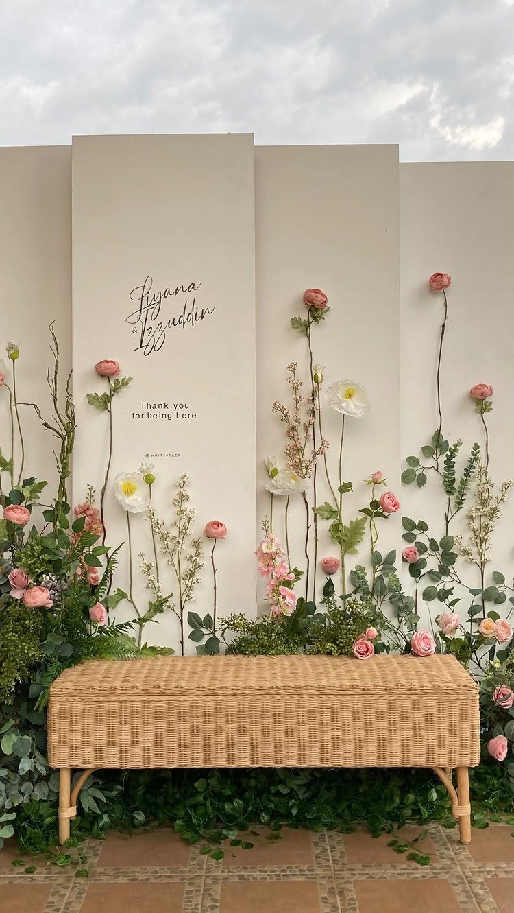
Beige is the calmest backdrop pink can have, and arched panels turn it into a ceremony frame. Soft pink and white flowers against the neutral look quiet and warm, not sweet.
Keep the flowers clustered at the base and along the arch edge so the beige still reads as a color. A woven bench adds a natural texture that suits all 3 tones.
If your photos will be outdoors, a personalized sign gives guests a spot to gather for pictures.
9. Fuchsia and Gold
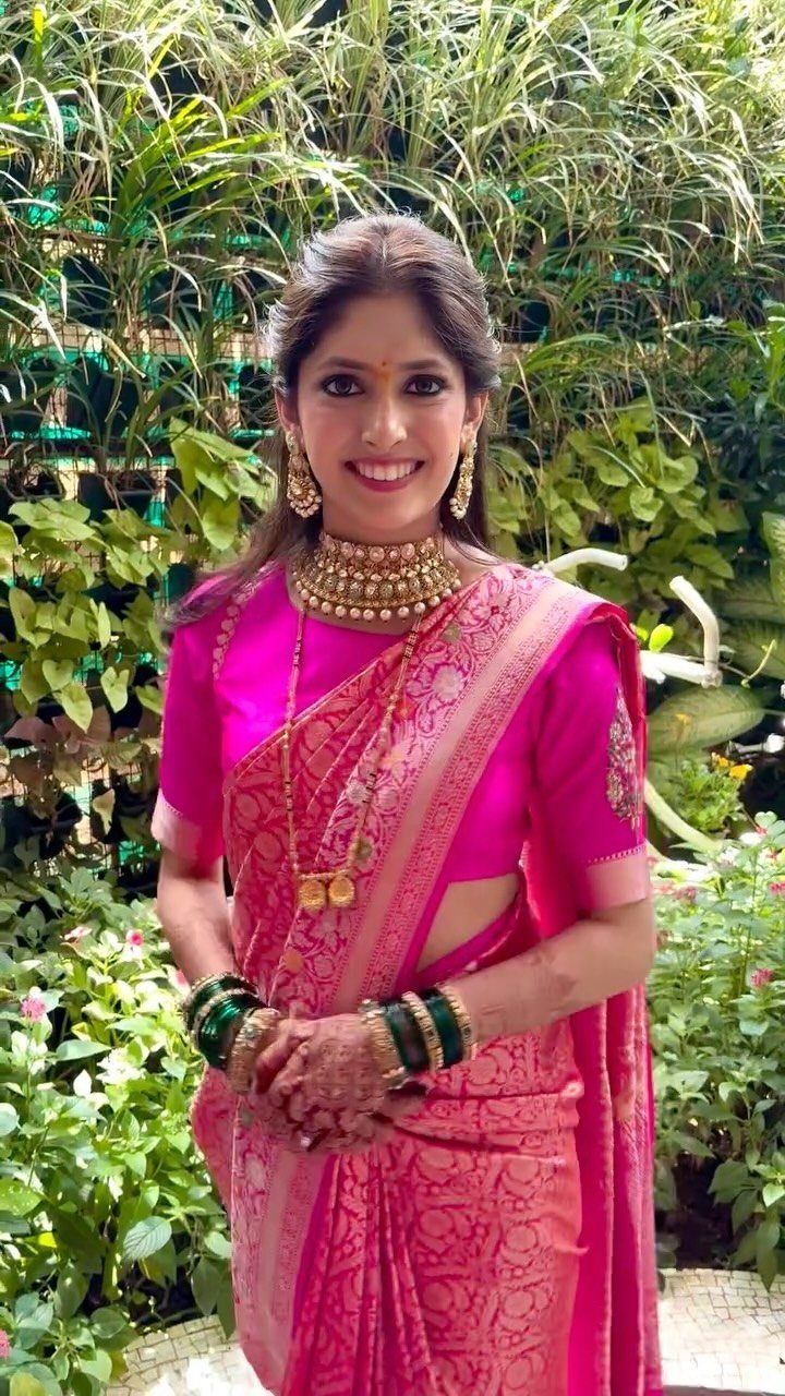
Fuchsia silk with gold embroidery is a palette that already comes finished: the fabric supplies the color and the metal supplies the shine. A saree like this does most of the decorating on its own.
I would echo it sparingly. Gold jewelry and metallic thread are enough on the bride, and green foliage around the ceremony space lets the pink stand out, as it does here.
Choose either heavy jewelry or heavy embroidery as the star, not both at full volume.
10. Pink, Orange, and Purple
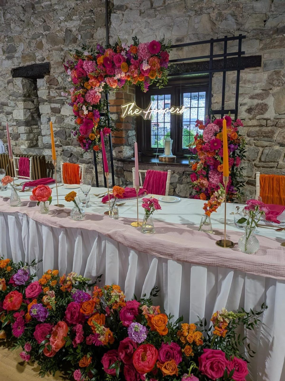
Pink sits between orange and purple on the color wheel, so a bouquet that moves through all three can read like a sunset instead of a clash. Against white linens, the palette gets enough room to glow.
The head table gets the most attention all night, so that’s where saturated florals pay off. Mix all three colors in one arrangement, and let a neon sign add one more punch of pink.
Neutral walls let the palette take center stage. I would keep the guest tables simpler, with one of the three colors each.
11. All-Pink Monochrome
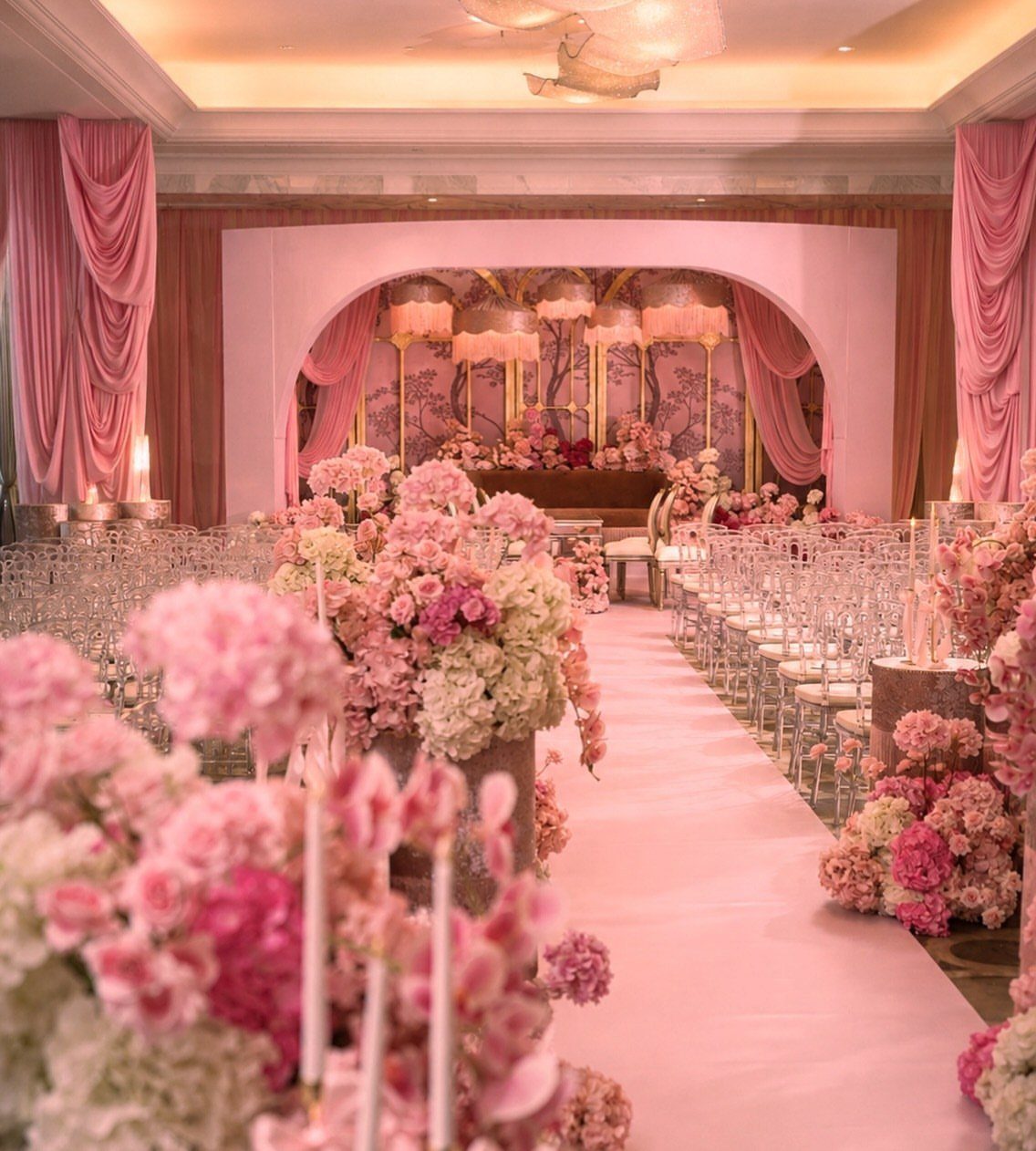
Going fully pink works when the shades vary, because one flat tone looks like a theme party while a range looks designed. Drapery, aisle runner, and florals can each take a different depth, from pale blush to deeper rose.
Clear chairs are a smart choice here, since they add no competing color and let the pink read cleanly. Repeat the color at different heights: draping overhead, flowers at the sides, the runner underfoot.
Hold your lightest shade for the largest surface, and save the deepest for small spots.
Complementary Colors for Pink
Navy, cream, mauve, and green are the four partners that make pink easiest to plan around, and each one pushes the pink in a different direction.
Navy makes it formal, cream makes it soft, mauve makes it moody, and green makes it fresh.
Silver also works as a small accent, so you have a metal option beyond gold.
Pick the partner by the mood you want first, then choose the shade of pink to match. A hot pink and a dusky rose will behave very differently next to the same navy.
Swatches look different under a venue’s real lighting, so hold them up there first, ideally at the hour your ceremony will start. Pink shifts more than most colors between daylight and warm bulbs.
Meaning of Pink in Weddings
Pink carries a lot of meaning, and most of it is gentle: love, romance, femininity, sweetness, tenderness, and affection. It is also tied to calm and positivity, which is where the phrase "feeling rosy" comes from.
That gives you a way to choose a shade. Soft blush leans toward young love and vulnerability, while brighter pinks read as playful romance.
The popular pink choices are blush, fuchsia, rose, coral, and magenta. Choose by the feeling you want guests to have walking in, because the traditional meaning of pink counts for less than the mood it sets.
Seasonal Considerations for Palettes
Season and venue should narrow your palette before Pinterest does. A color you love can look different once it sits next to your venue’s carpet, wood, or stone, so check the room first.
Don’t limit yourself to one or two colors. A palette with several works well when you choose them as partners for the colors you already love.
For spring or summer, pink, peach, coral, and green is a strong combination.
Soft pink with peach gives you a gentle foundation, and a few touches of coral or leafy green bring in some contrast. It suits floral and garden details and a romantic, whimsical wedding.





