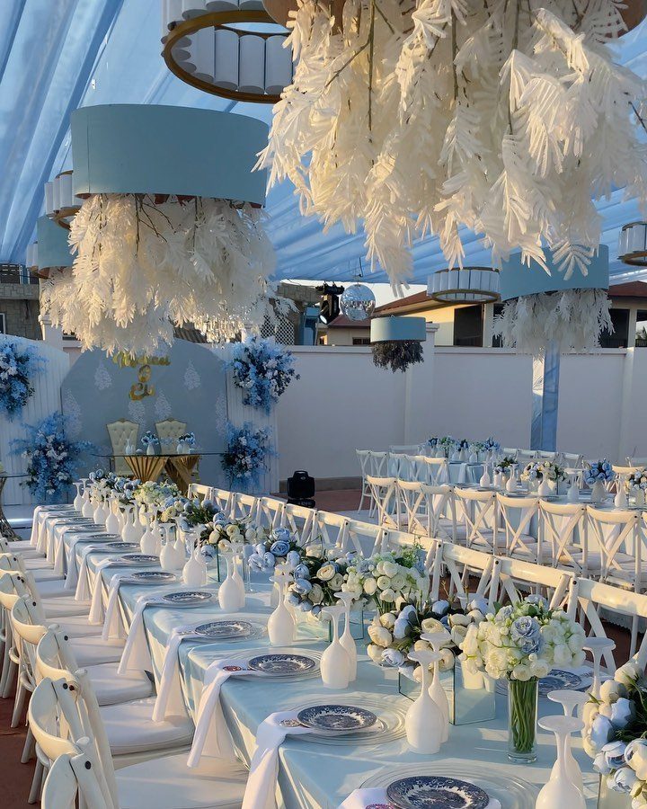
Blue runs from barely-there baby blue and ivory to royal blue and white, cobalt tile accents, and deep blue lighting washed across a ceiling.
Which one is yours depends on how much of the room you control: a venue that is already mostly blue needs almost nothing added, while a plain hall needs linens, flowers or ambient lighting to carry the color.
Pale blues like baby blue and light blue spread cheaply across invitations and flowers, but the saturated ones, like cobalt and deep blue lighting, ask for rentals and quotes before you commit.
1. Navy Blue and Blush
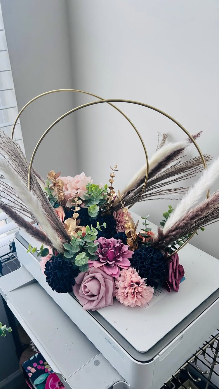
Navy gives blush something to push against. Alone, soft pink can drift toward sugary; next to deep blue, it reads grown-up and a little formal.
Green foliage and pampas grass sit between navy and blush, which stops the pairing from reading flat. I would add gold in small doses, like the hoops here, and stop there.
Navy is the anchor, so put it in the big areas and let blush carry the flowers.
2. Dusty Blue
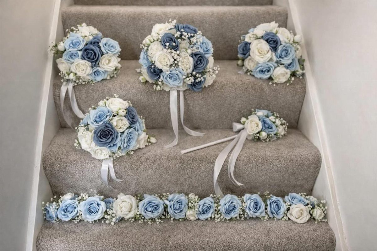
Dusty blue is blue with the volume turned down, a grayed shade that sits quietly beside white roses and baby’s breath. Because it is so soft, it works best when the flowers around it are simple.
White blooms should carry most of the arrangement, with blue used as an accent in bouquets and a long garland. A garland is a nice way to repeat the color across a staircase, an arch or a head table.
Settle on a single blue and match it across ribbon, stationery and flowers, because near-misses show up fast in a grayed shade.
3. Light Blue Wedding Palette
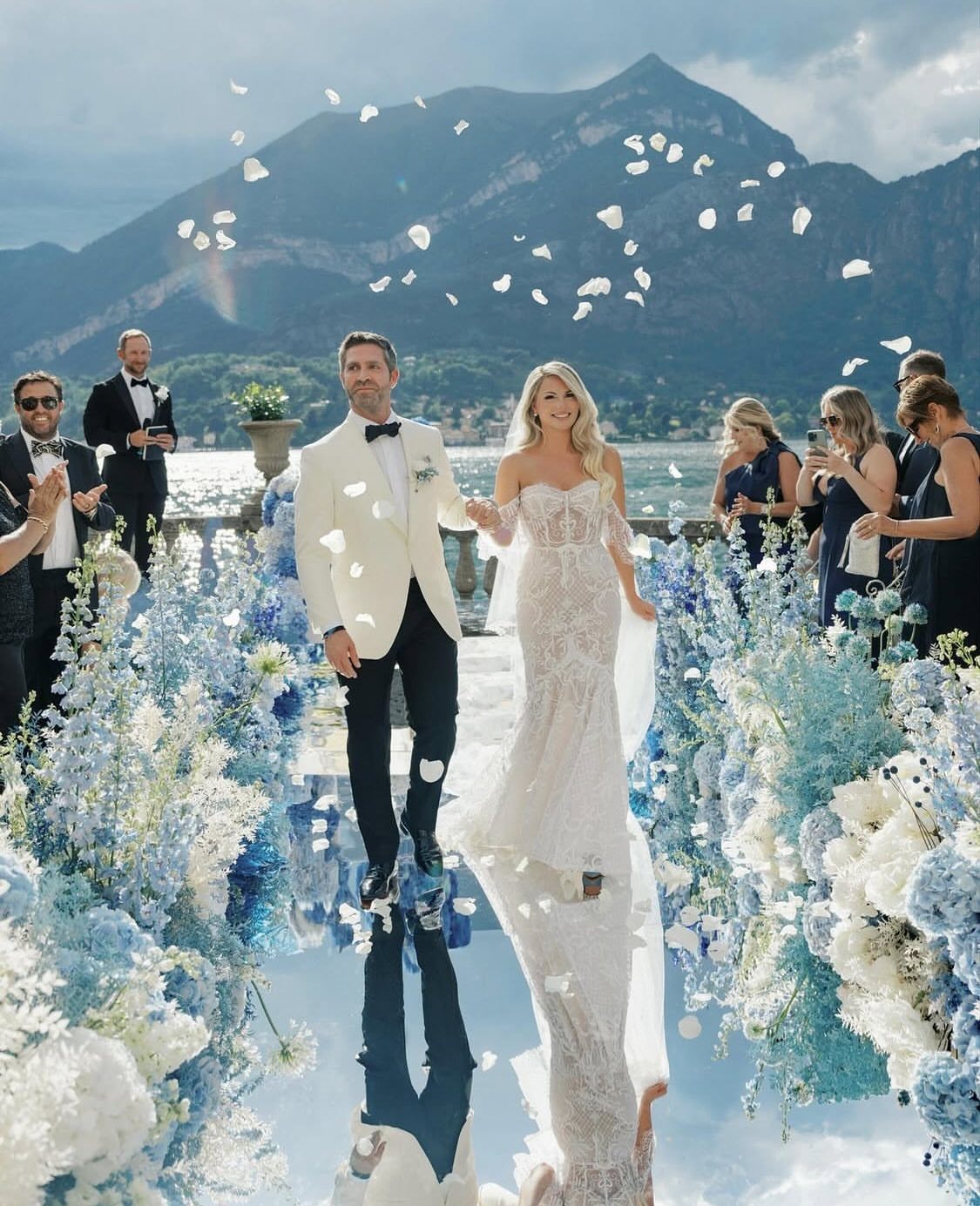
Light blue is the easiest color here to spread around. It can sit in flowers, linens, ribbon, stationery or bridesmaid dresses without any one piece having to do all the work.
Outdoors, against water and mountains, it blends into the sky and the setting, so you barely have to add anything. White works best beside it, with loose, unstructured flowers.
My advice is to choose two or three places for it rather than all of them. Used everywhere, light blue goes flat.
4. Teal Blue and Coral
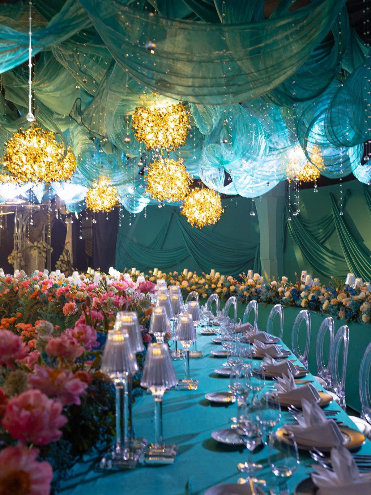
Teal and coral together feel warm and a bit tropical, and they hold their own in a big room. Teal fabric draping and a teal tablecloth make a strong base, and coral flowers pop against it.
Gold chandeliers add glow that suits both colors. I would keep the coral in the centerpieces only and let teal cover the large surfaces, so the room stays balanced.
Fabric draping can cost real money, so price it before you commit to a whole room of it.
5. Baby Blue and Ivory
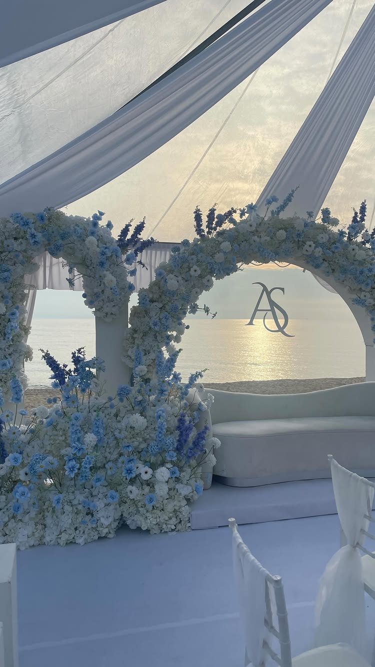
Baby blue and ivory is the gentlest pairing on this list, and it suits open, bright spaces like a beach at sunset. Pale color holds up well in that light because nothing competes with the sky.
Florals in baby blue and white, a white canopy and a gold monogram keep it clean. I like that a single metallic detail, like initials, gives the soft palette a focal point.
Skip heavy dark accents here; they would fight the softness.
6. Classic Blue and Green
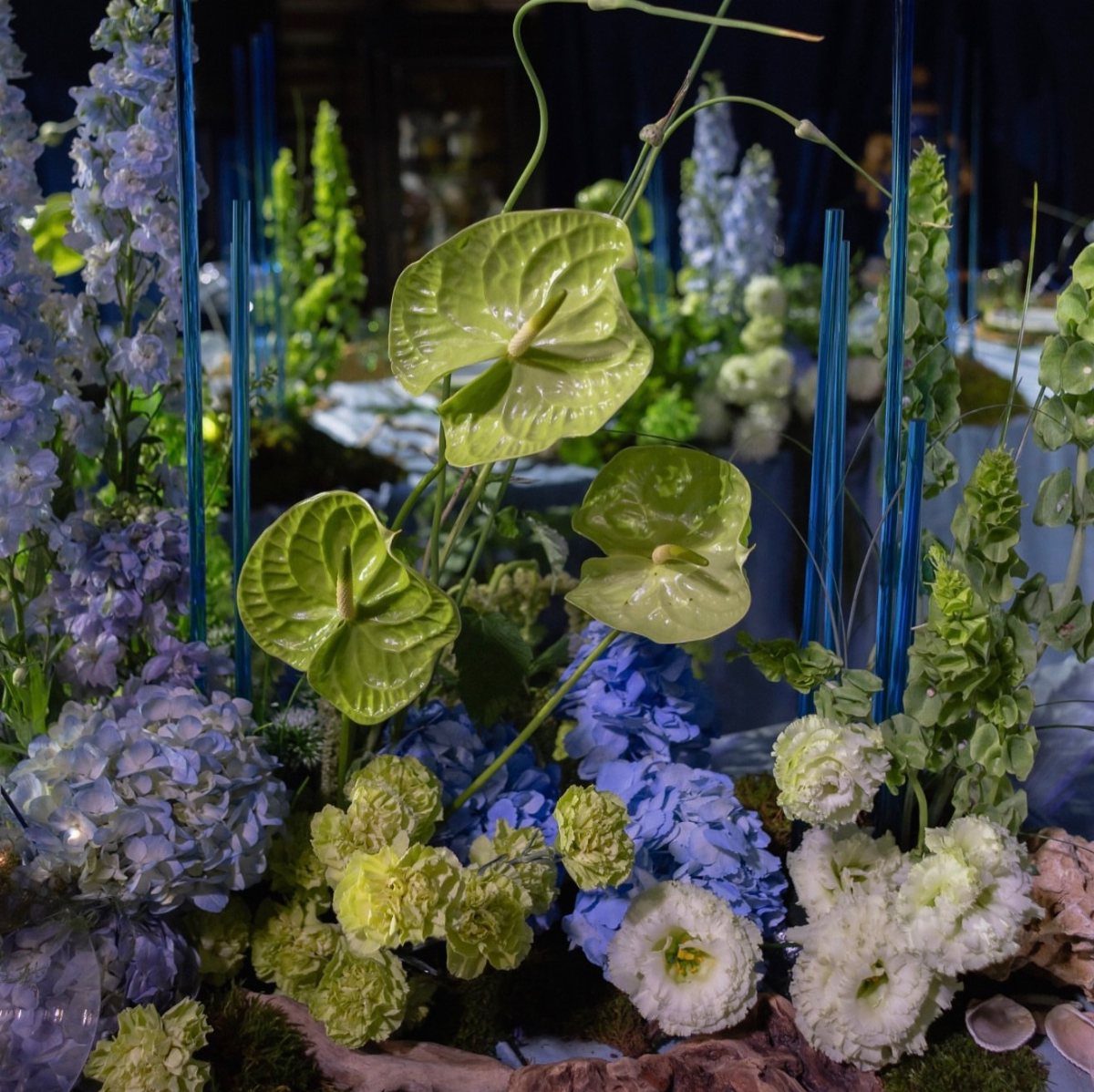
Blue hydrangeas and green anthuriums make an arrangement that looks like it came from a garden, with a cool, natural blue against waxy, glossy green.
Delphiniums add height, and blue glass tubes and blue candles repeat the color at table level.
A dark background makes both colors glow, so I would use this on tables with dark linens or in a dim room.
Let green do the filling and blue do the accenting, so the centerpiece never turns into a solid block of one color.
Match the candles to the blue of the flowers, because a mismatched pair will stand out against all that foliage.
7. Royal Blue and White
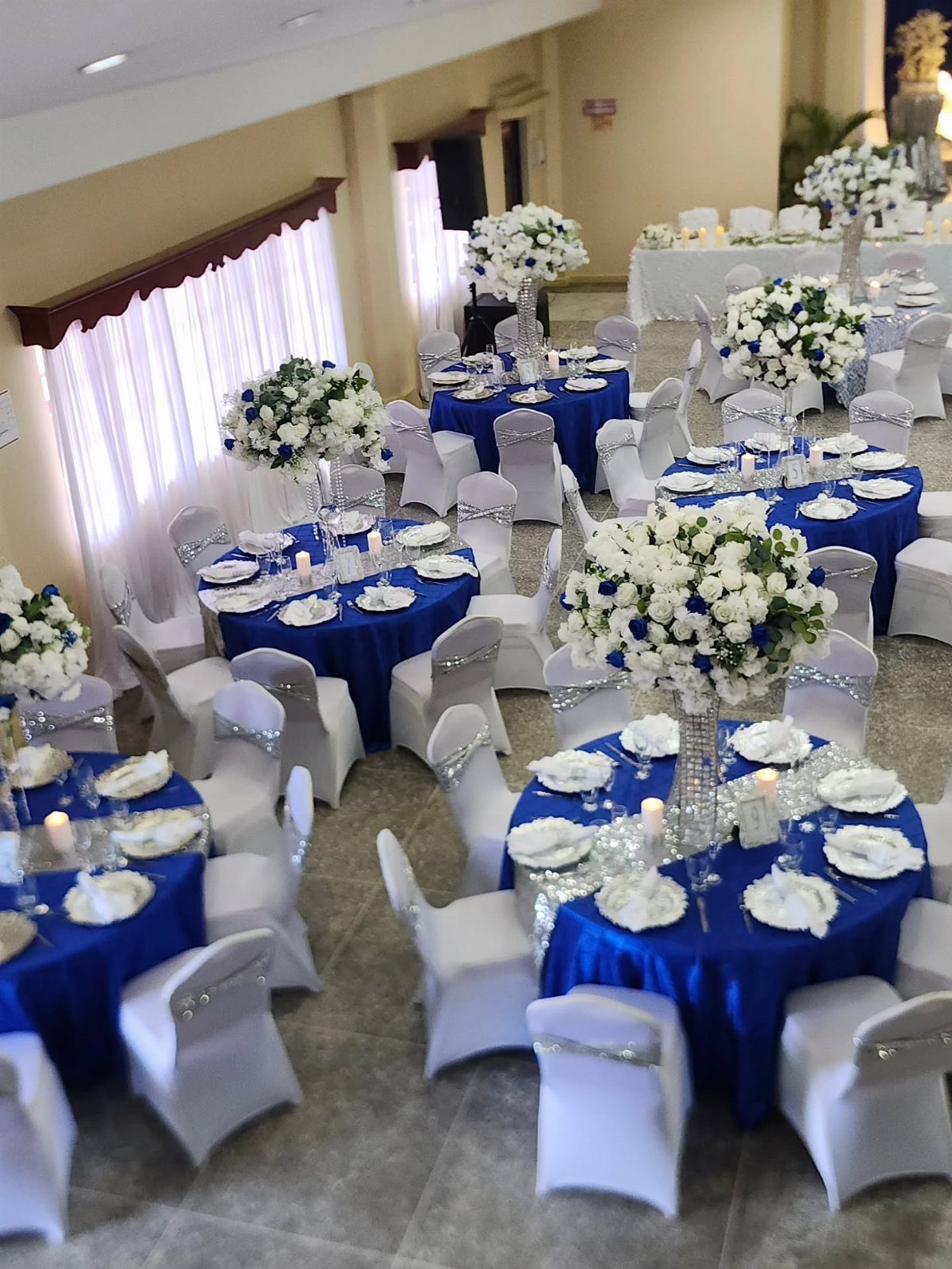
Royal blue is the loudest blue you can pick for a wedding, and white is what keeps it from shouting. Blue cloths on the round tables, white chairs and white flowers in tall vases make a clean, bright split.
I would keep every flower white and let the linens carry all the color. Tall vases lift the arrangements above the blue, so they read clearly from across the room.
Pick one royal blue and match it across every cloth, since a second shade will look like a mistake.
8. Monochromatic Shades of Blue
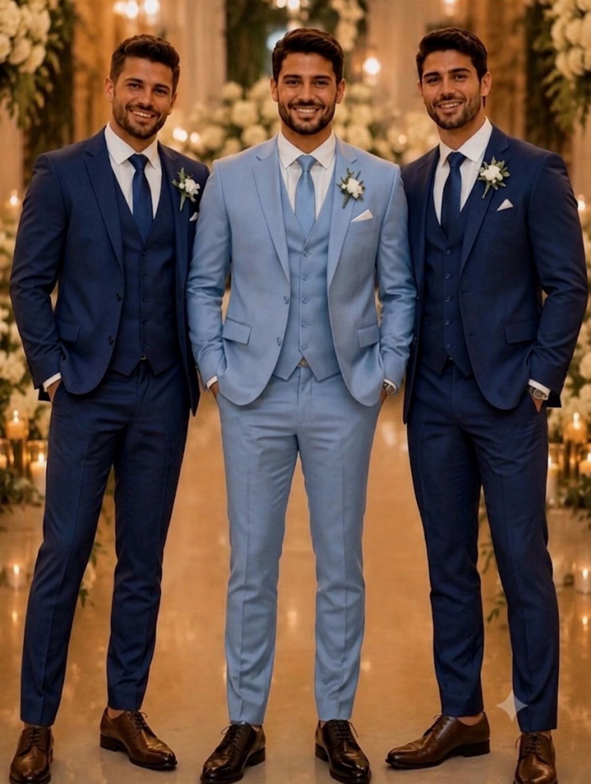
Two blues on one wedding party look planned when one is clearly darker. Navy and light blue three-piece suits give the group depth without adding a single new color.
I would put the groom in the darker navy and the groomsmen in light blue, or reverse it, so one person stands apart. Matching vests and jackets within each shade keeps the layers tidy.
Check the fabric swatches side by side in daylight before ordering. 2 blues that look right on a screen can clash in person.
9. Blue and Gold Lounge Setting
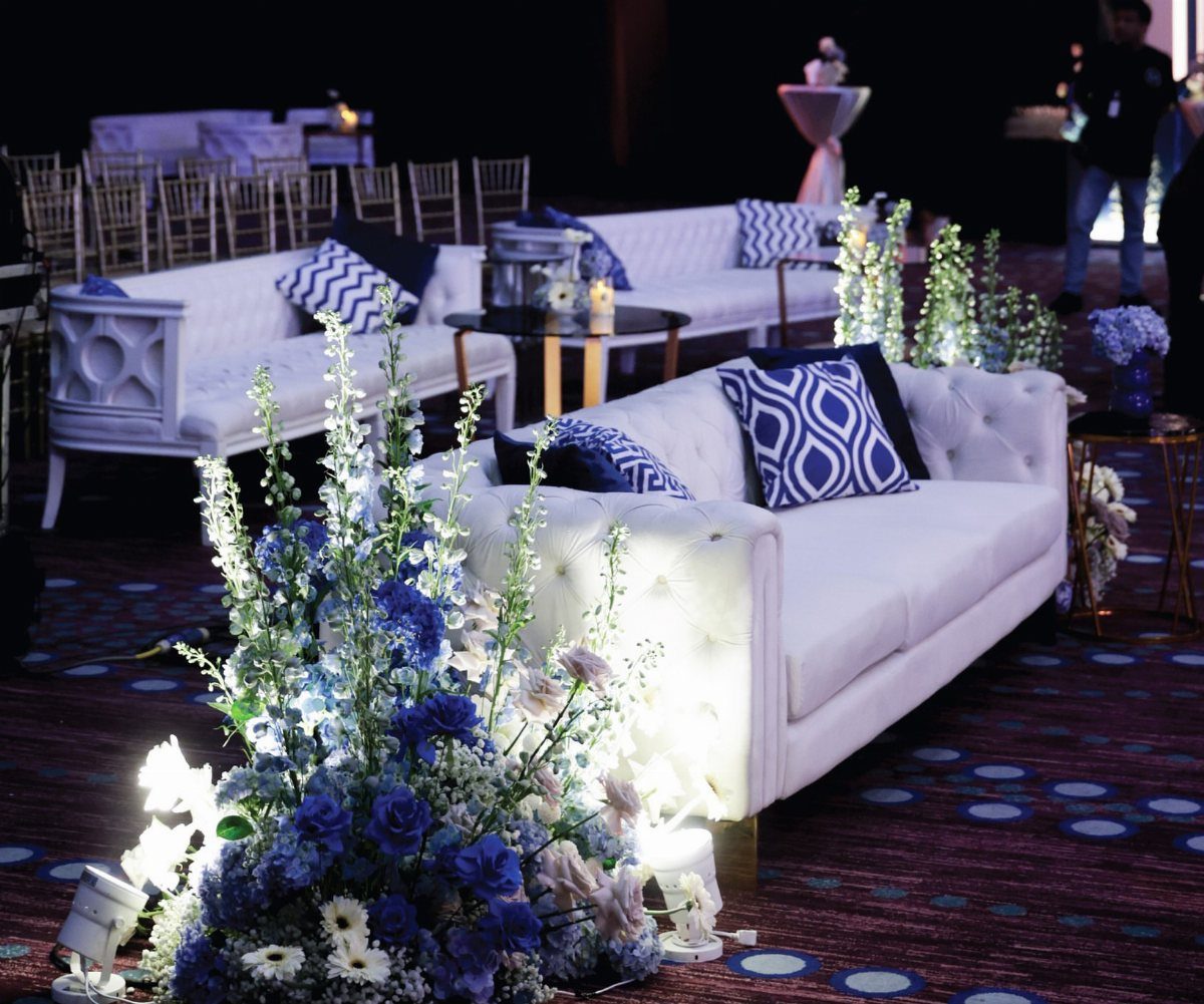
A lounge corner gives guests somewhere to sit and gives you a spot for photos. White tufted sofas are the base, and blue and white patterned pillows tie them to the rest of the palette.
Blue floral arrangements beside the sofas repeat the color, while gold chairs behind them add a warm, formal note. I like keeping the big furniture white so the blue stays in the small pieces.
Pillows are the cheap part to change, so spend there before buying anything larger.
10. Deep Blue and Silver
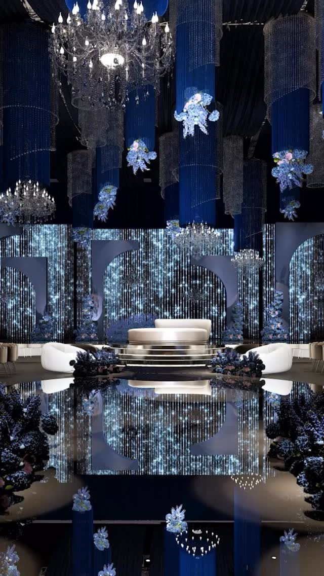
Deep blue drapes against a shimmering silver backdrop is a cool, glossy pairing, and crystal chandeliers push it toward black-tie. A white curved sofa gives the eye a place to rest.
Silver reflects light, so it needs the blue behind it to stay rich rather than icy. I would let the drapes cover the walls and keep silver to the backdrop.
Rented fabric and chandeliers add up quickly, so get a quote for both before you fall for this look.
11. Cobalt Blue and Tile Accents
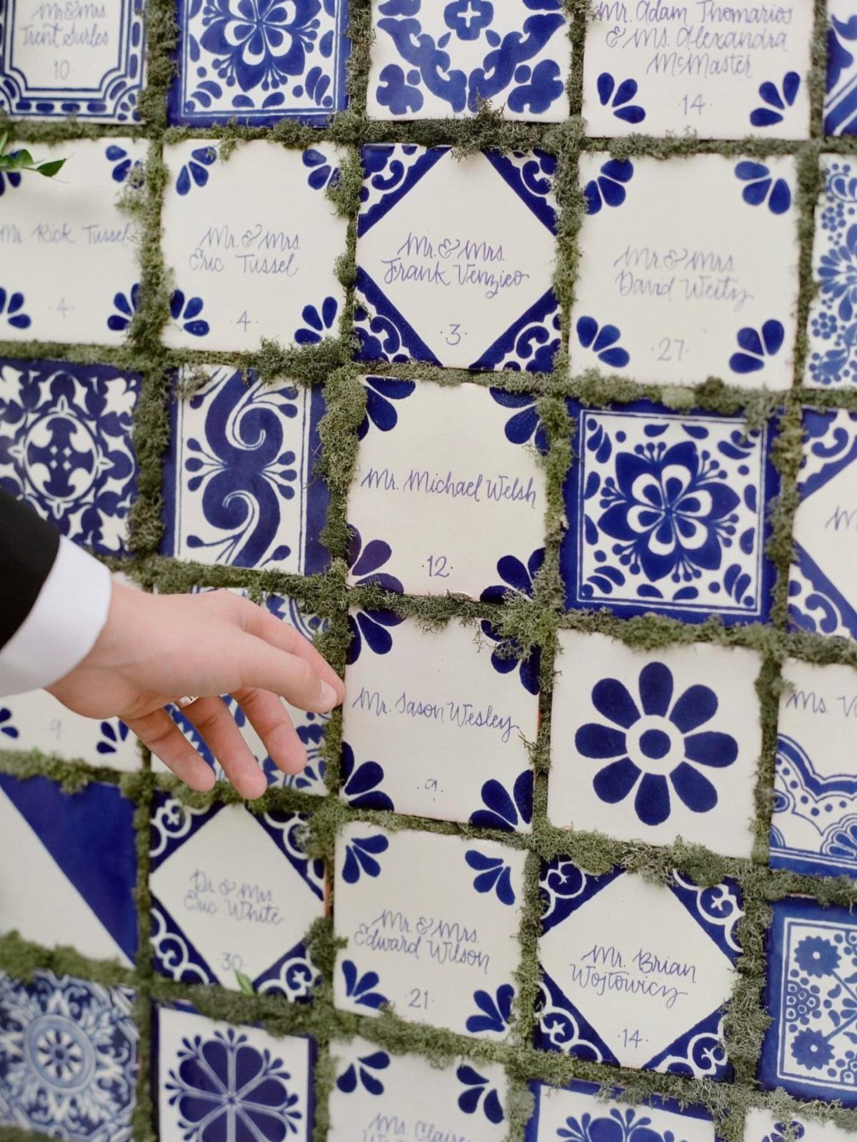
A seating chart made from blue and white patterned tiles is a decoration guests will actually stop and read. Cobalt works well here because its saturation holds up on small surfaces.
Green moss between the tiles frames each name and softens all that hard ceramic. I would write names on the tiles in a single clear hand so they stay legible from a step back.
Order a few spare tiles in case a name is misspelled or a guest drops out.
12. Deep Blue Ambient Lighting
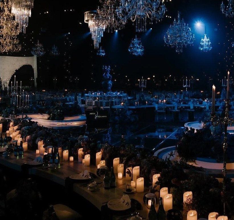
Light changes blue faster than any linen or flower can. Deep blue washed across the ceiling turns long tables and crystal chandeliers into one moody scene, with candles supplying the warm points.
I would keep the tabletops simple: candles and little else, since the lighting does the decorating. Warm candle flames against cool blue give the room contrast without extra color.
Ask your venue what lighting it allows, and ask about the cost, before you plan the room around it.
Blue Wedding Venues
Indoor rooms can carry blue without a blue venue. Wash the walls with blue lighting, set tea lights in blue glass, or hang blue string lights over the tables.
A venue with a mostly blue interior saves the most work, since the room does the decorating for you.
Light blue in particular tends to make a space feel open and airy, so it suits a smaller room that needs to feel larger.
Outdoors, blue decor and blue lighting at dusk can deepen the mood once the sky fades.
Blue Wedding Flowers
Hydrangeas and irises bloom in true blue tones and hold up well in bouquets. Blue petals are scarce in nature, which is why florists dye roses, calla lilies and carnations to reach baby blue or powder blue shades.
For greenery, silvery eucalyptus and sage sit well beside blue. Baby’s breath reads softer and lighter, good for pairing with a single blue focal flower.
Blue glass vases, bottles or jars on the tables give a monochrome look without extra flowers. Ask your florist which blues are real and which are dyed before you commit to a shade.
Blue Wedding Invitations
Invitations are the first look guests get at your color scheme, so they should match the palette you have chosen. Sky blue card stock with white or black type sets a formal tone from the first piece of mail.
White lettering gives a softer look; black reads crisper and is easier to read in low light. Whichever you pick, order a printed sample before the full run and check that the blue you see matches your ribbon and flowers.
Frequently Asked Questions
What does the color blue symbolize at a wedding?
Blue is tied to stability, tranquility and peace, which is why it suits a calm, romantic mood. The symbolism also leaves room for different looks: deep blue reads formal, light blue reads open and airy, and royal blue reads bold.
What are some nice wedding colors?
Navy and blush is a dependable pairing, because deep blue keeps soft pink from turning sugary.
Teal and coral is warmer and a bit tropical, and baby blue with ivory is the gentlest choice for a bright, open space. Pick one main color for the big surfaces and let the second one carry the flowers.
What are shades of blue?
Common wedding blues run from navy, royal blue and cobalt on the deep, saturated end to dusty blue, light blue and baby blue on the soft end.
Teal sits between blue and green, and deep blue paired with silver leans black-tie. Whichever you choose, match that one shade across flowers, ribbon and stationery, since near-misses show quickly.
What is the in-color for weddings in 2026?
I can’t point to a single color that rules 2026, but blue stays a classic choice because it bends to so many styles. A palette you love in your own venue will outlast any trend.





