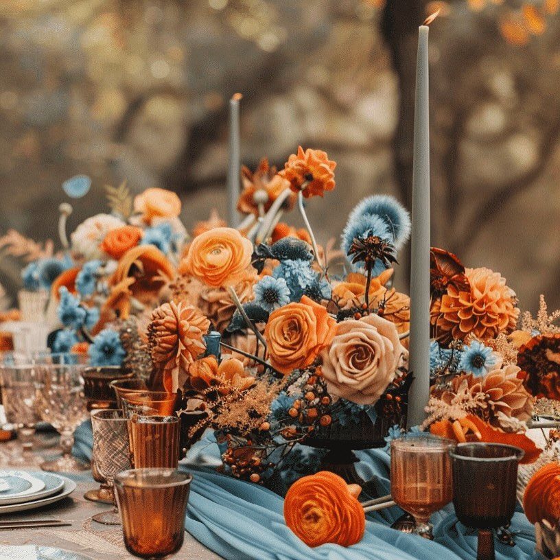
The palettes below range from two-color pairs like navy and terracotta to a neutral scheme built on beige, cream, and soft metallics.
If your wedding party’s outfits are already chosen, build around those colors; if nothing is set yet, start with a palette that works across different depths, like the dark purple and lavender combination further down.
Whichever you pick, a palette that appears in only one of decor, florals, or attire looks accidental.
1. Navy Blue and Terracotta
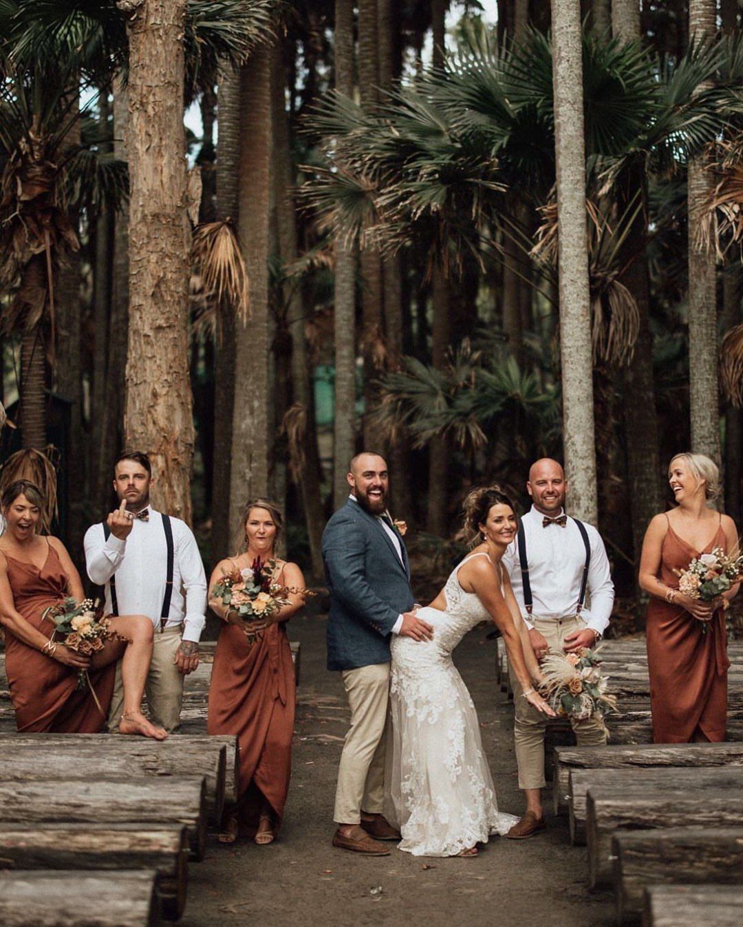
Navy and terracotta work because one color is cool and deep while the other is warm and clay-like, so neither fights the other.
Put the navy on the groom and groomsmen and the terracotta on the bridesmaids, and the bride’s white stays the brightest thing in the group.
For me, this is the easiest fall pairing to carry from attire into the rest of the day. Repeat terracotta in the flowers and navy in the stationery, and the palette holds together without much effort.
2. Emerald and Ivory
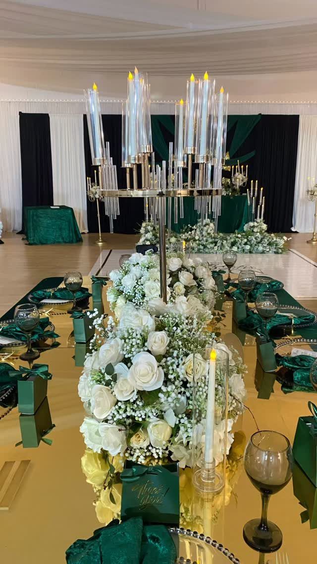
Deep emerald napkins against a gold tabletop and ivory roses make a table that feels formal without trying hard. The green is saturated enough that ivory flowers read as crisp rather than washed out.
Simple flowers let the napkins do the color work. Tall candle holders add height, but pick one metal for the whole table, whether gold or brass, so the finishes don’t compete.
3. Gold, Yellow, and Ivory
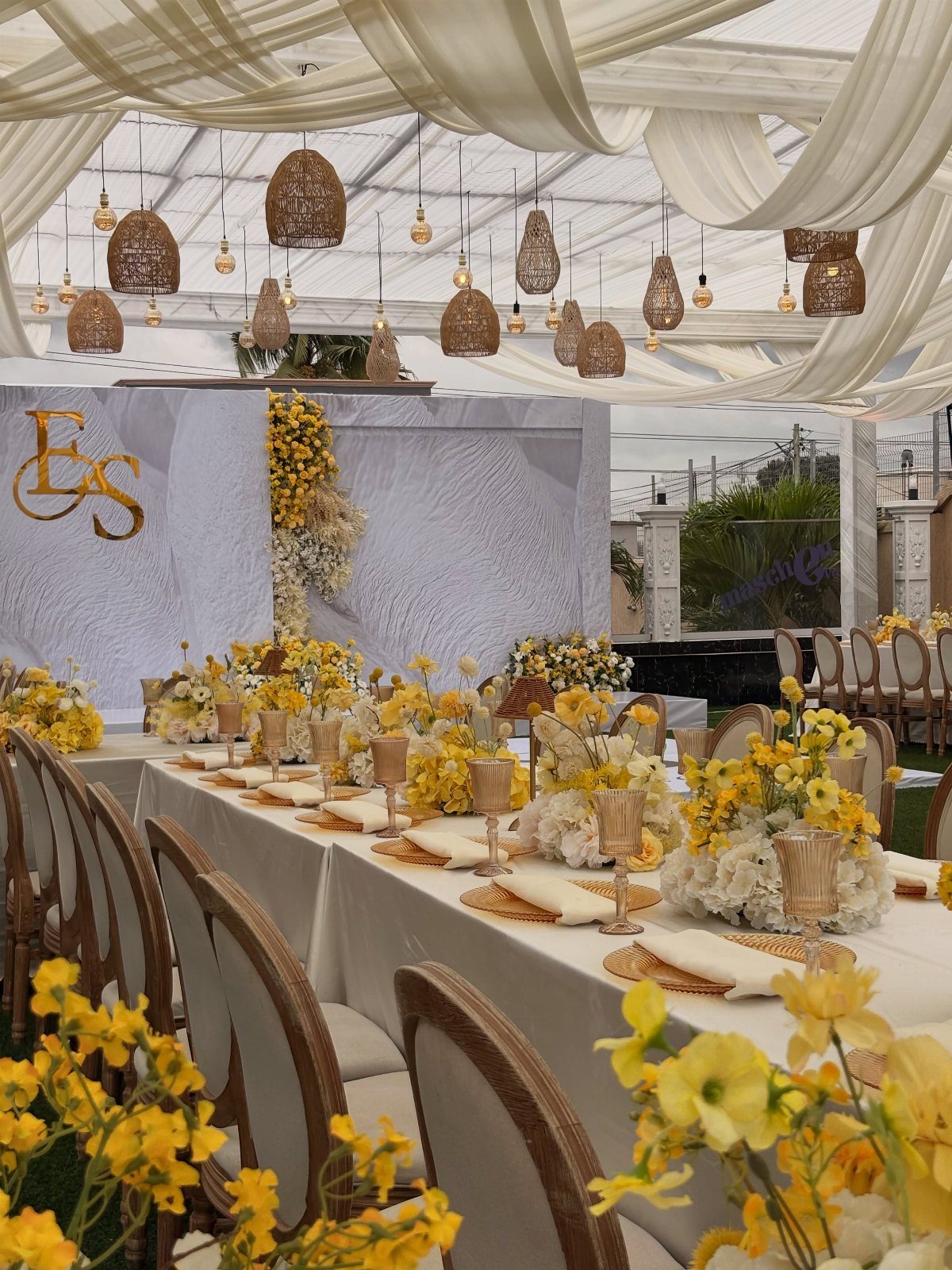
Yellow is the risky color here, and ivory linens are what keep it from looking loud. Gold in small doses, like the initials on the backdrop, ties the two together.
My advice is to let the yellow live in the flowers and nowhere else. Linens stay ivory, metallics stay gold, and the palette stays warm and a little rustic without tipping into a sunflower field.
4. Peach and Green
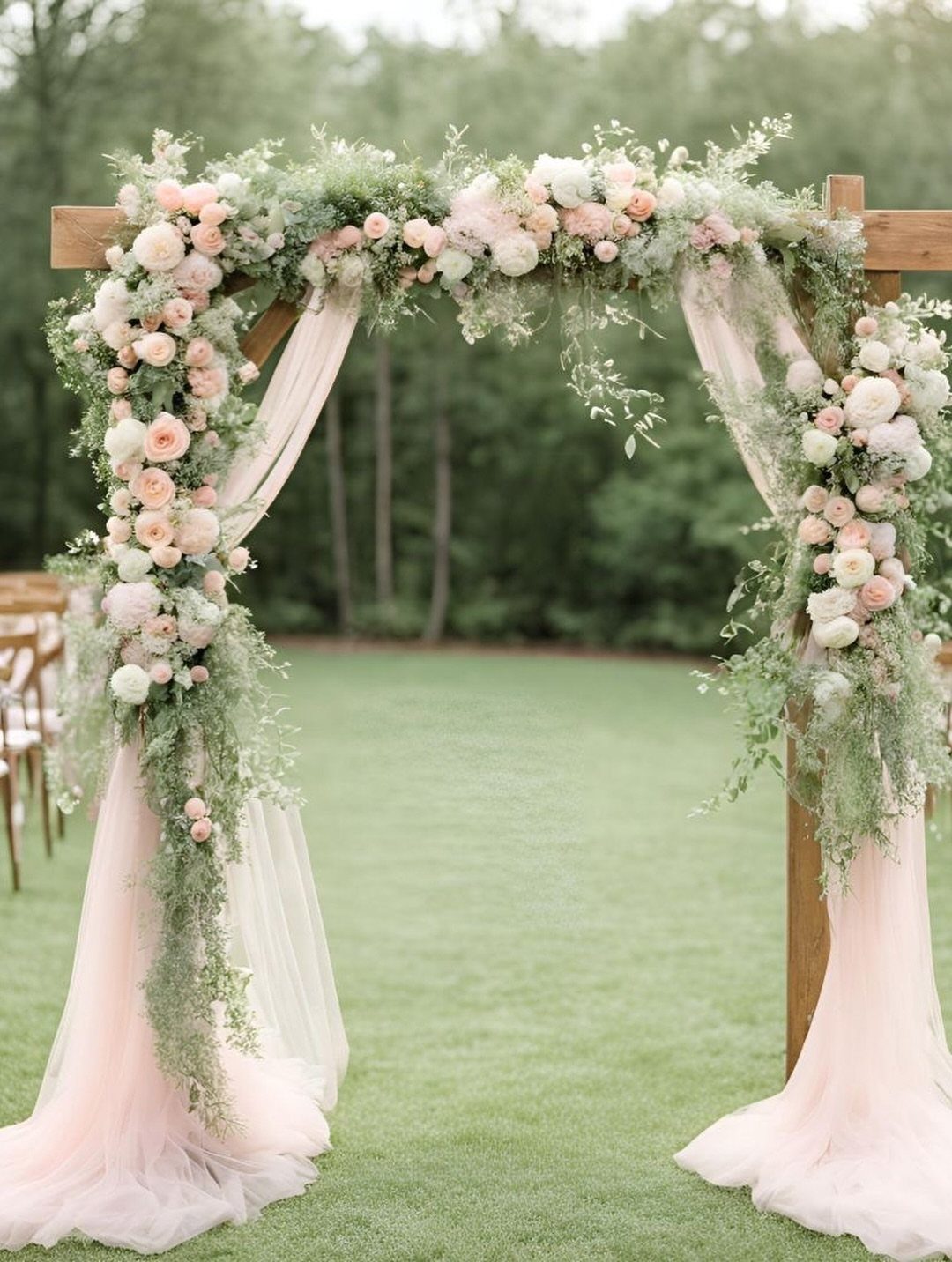
Peach and green is a spring-leaning pairing that happens to look lovely in fall, especially when the peach is soft and the greenery stays leafy and fresh. Few couples choose it for October, which is half the appeal.
If you worry it feels off-season, add a few deeper orange blooms and the calendar catches up.
5. Fall Oranges
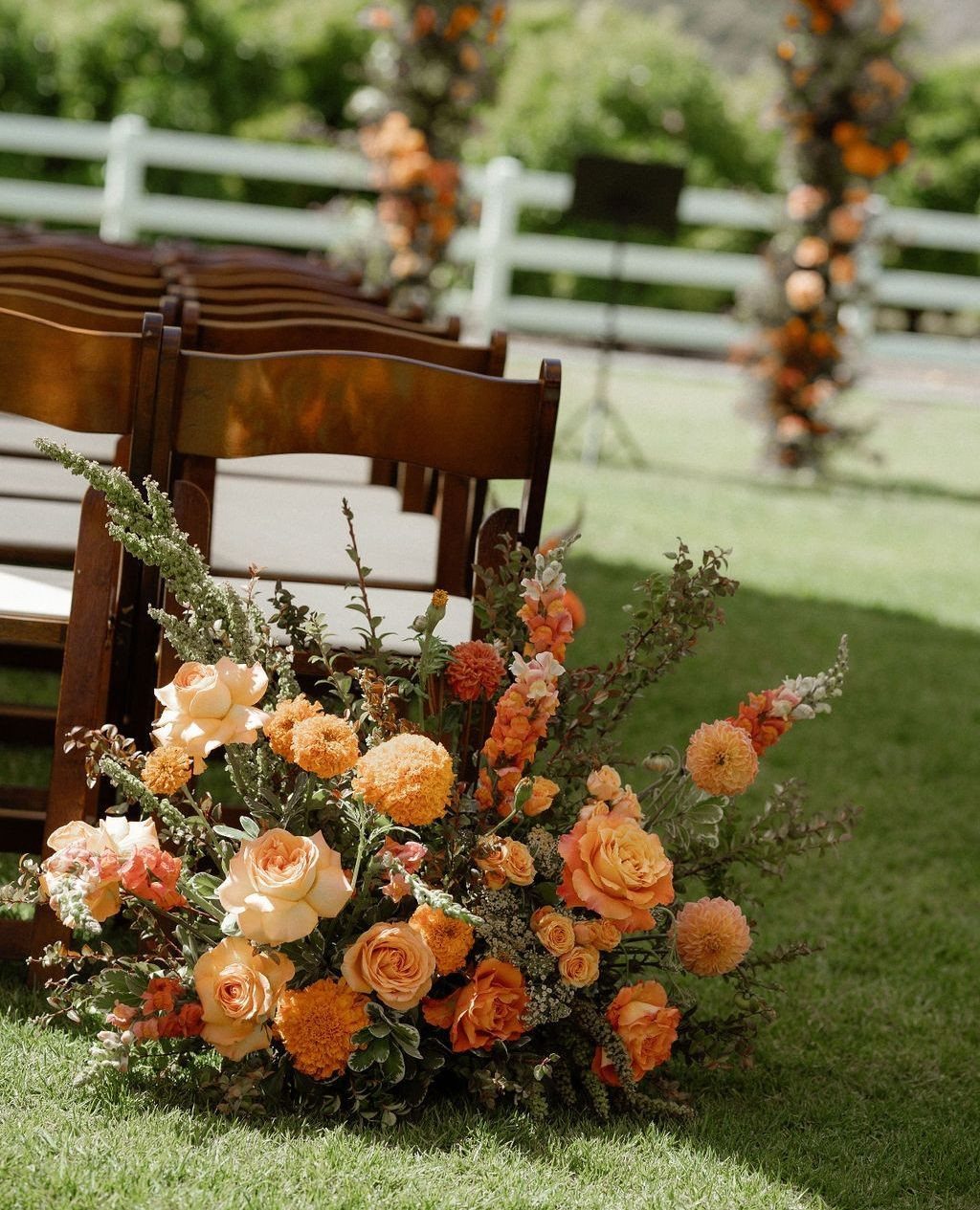
Orange is the color most people picture first for fall, and a mix of oranges with peach keeps it from feeling like a pumpkin patch. Varying the shades matters more than the flowers themselves.
Layer a deep orange with lighter peach in each arrangement, then let wood chairs and a green lawn supply the neutral backdrop. It is traditional, yes, but it is traditional because it works.
6. Dusty Blue and Rust Orange
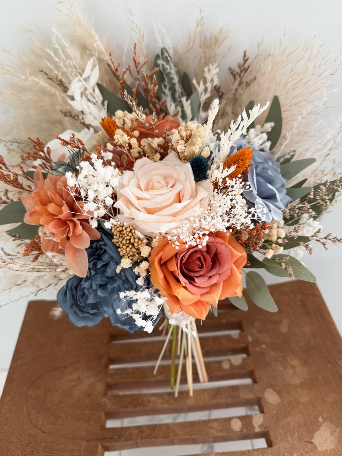
Rust orange and dusty blue sit opposite each other on the color wheel, so they pop without needing bright saturation. Both are muted, which is why the pairing feels calm.
The dried grass also adds a neutral beige that bridges warm and cool, and I would use it in the arch or centerpieces too.
7. Dusty Rose, Plum, and Antique Gold
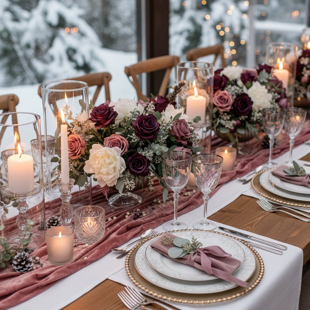
Plum is the anchor here, dusty rose softens it, and antique gold keeps the pair from looking sweet. On a table, the rose runner carries the lightness while plum blooms supply the depth.
Gold works best limited to the plates and candle holders, where the metal reads as a quiet warm glow. With a dark winter-toned room behind it, the plum holds its own and the rose stays gentle.
8. Neutral Palette
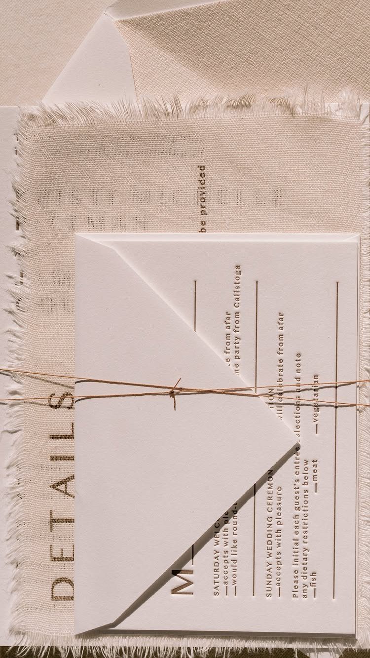
Beige linen, natural twine, and plain white paper make a palette that asks for almost no color at all. Texture does the work: frayed fabric edges and rough string look rich next to smooth cards.
Start with the stationery, since it sets the tone for everything after it. Match the table linens to that same beige, then add one slightly deeper tan so the day doesn’t go flat.
Soft and cozy, yes, but it needs those textures to avoid looking blank.
9. Burgundy and Olive Green
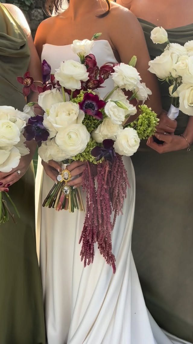
Burgundy against olive green is a moodier fall pairing than most, and I like it for that. Olive bridesmaid dresses make a muted backdrop that lets a burgundy and ivory bouquet stand out.
Keep the ivory in the bouquet, because it gives the dark red some air.
One maker of this look notes that burgundy is among the most popular wedding flower colors for 2026, so blooms in that shade should be easy to find.
10. Dark Purple and Lavender
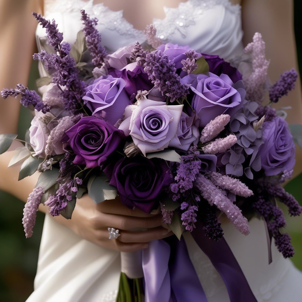
Dark purple with lavender is a single color at 2 depths, which makes it forgiving to arrange. Mix deep plum roses with paler lavender ones and a few purple sprigs, and the bouquet gains dimension without adding a third hue.
I would choose this over a bold contrast if you want a romantic fall look that stays calm. Keep the dress a clean white so the purples carry all the color.
Deep colors, like a rich plum and beautiful burgundy, are bound to warm up any crisp fall evening.
Tips for Choosing Colors
A palette that leans all warm can feel heavy by dinner, so mix in a cool tone like dusty blue or sage and see how the swatches sit together first.
A deep burnt shade with a cool counterpart feels inviting, while all warm or all cool can feel heavy.
Texture adds depth for very little money: think velvet ribbon, linen runners, or dried pampas grass instead of another paid color.
Velvet napkins, silk ribbon, wooden charger plates, and metallic candlesticks all make a color look richer without adding another one.
Repeat your colors in small places: menus, escort cards, even signature drinks. Those small repeats are what make a palette look planned rather than assembled.
Choose seasonal blooms too. Dahlias, ranunculus, and mums come in autumn shades, so the flowers do half the palette work for you.
Using Color Palettes
Pick the spots where your colors must appear, then check each one. Decor, florals, and attire are the big three, and a palette that shows up in only one of them looks accidental.
Carry it into the smaller items as well: stationery, escort cards, favor packaging, and signature cocktails. Spiced cider and fig desserts echo fall shades on the menu without any extra decor spending.
A reader on a tight budget can lean on this: paper goods and drinks are cheap places to repeat color.
Seasonal Considerations
Let the season set the limits. Fall already supplies a lot of color, so the best palettes sit alongside it rather than competing with it.
Plan your accents after the main colors are settled.
With bright colors or jewel tones, go lighter on the accents. With a simpler scheme, dark purple or dark red makes accents stand out.
Neutrals earn a spot, too. Natural browns and cream are easy to overlook, yet they add quiet highlights that pull the whole palette together.
Frequently Asked Questions
What colors are acceptable for a fall wedding?
Deep reds, oranges, yellows, and earthy tones are the classics, and they match an outdoor fall setting.
Burgundy with olive green, or deep orange layered with lighter peach, are 2 combinations that follow that tradition well. Neutrals like beige, cream, and natural brown are also acceptable, as long as you add texture so they don’t look blank.
What are the trendy fall wedding colors for 2026?
Jewel tones, muted pastels, and earthy neutrals are the trends.
Emerald with ivory covers the jewel side, and dusty blue with rust orange is a muted pairing. Burgundy shows up on most florists’ 2026 trend lists, which means you’ll have options when you start calling for quotes.





